 The Brand Monograph
Caran d'Ache brand identity by Base Design
↗Few identity projects ask a typeface to carry a company's origin story, and fewer make that work across a business as broad as this one. For Caran d'Ache's centenary in 2015, Base Design took a Swiss name known for school supplies, office products, artist materials, and luxury writing instruments, and gave it one voice instead of several.
The studio created a new logotype and, with typographer Matthieu Cortat, a custom typeface that nods to how the company began. Anthony Franklin and Matteo Venet worked on design, and Hervé Rigal on strategy. The same letterforms now run through the Haute Écriture, Office, and Colors divisions, giving each a shared signature and supporting the brand's international growth plans.
Why it works
A company that sells tools for writing is well served by an identity built from letters. Because the typeface is custom, the name belongs to Caran d'Ache alone, which matters in a category where many brands rely on similar scripts and serifs. It also solves a practical problem: a child's pencil case and a collector's fountain pen need to feel related without looking identical, and one typographic voice lets them. Tying that voice to the founding story gives a hundred years of history a form people can see.
Applications
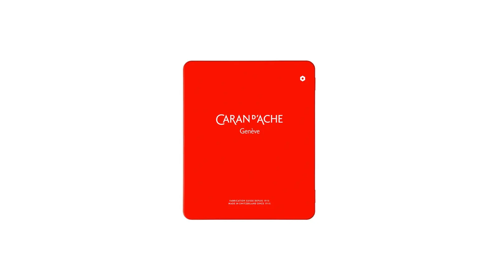


Images and video from basedesign.com, by Base Design.


