 The Brand Monograph
Gage & Tollner brand identity by Order
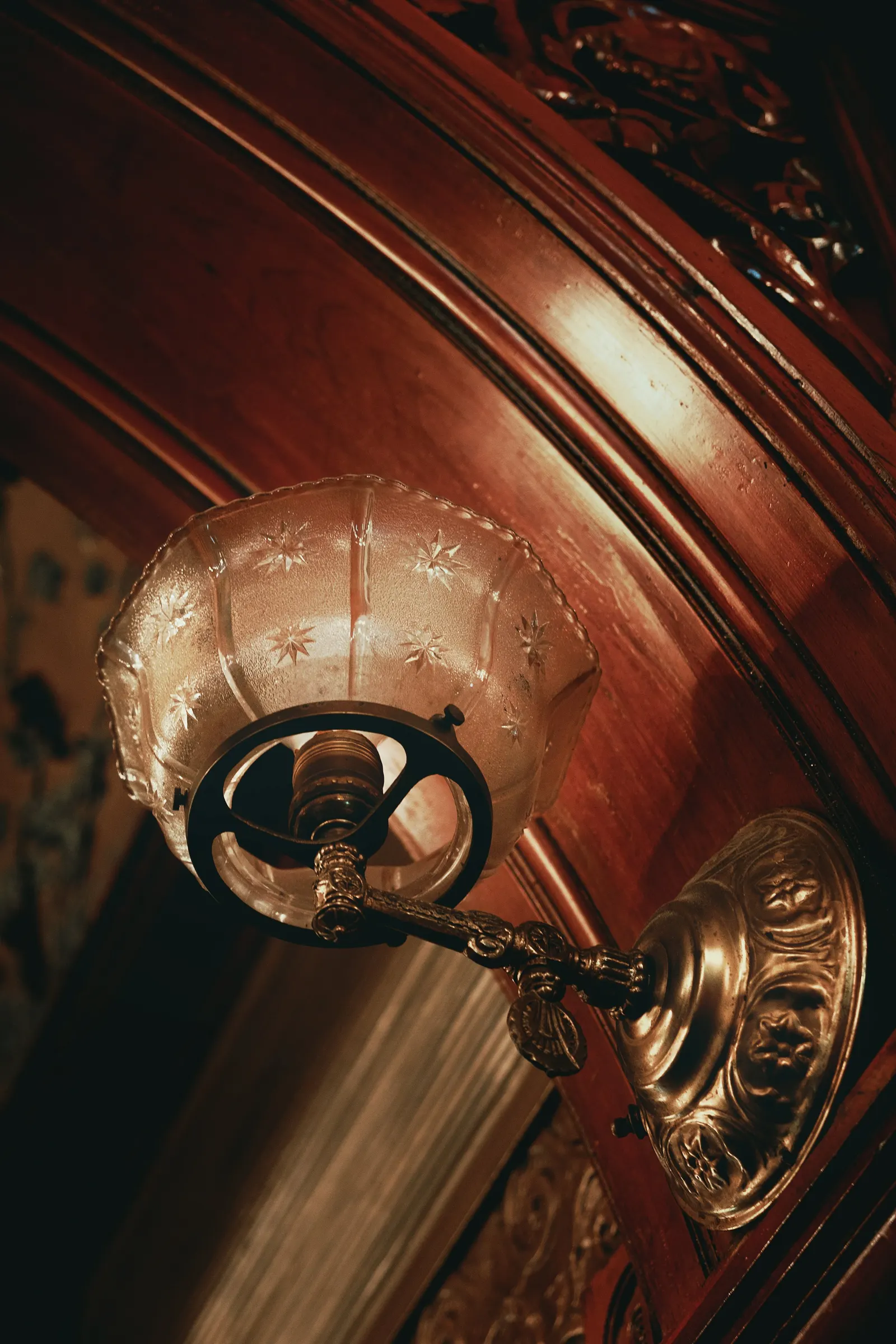
↗Order's identity for Gage & Tollner treats history as working material rather than costume. The Brooklyn oyster and chophouse opened in 1879 and closed in 2004. Its landmarked Victorian interior survived behind walls through later tenants, including a clothing store, a TGI Fridays, and an Arby's. Order joined while the restoration was underway, with a brief to make the restaurant look like itself again.
The studio started with the oldest printed logo it could find, set in Art Gothic. Jesse Ragan of XYZ redrew it from American Type Founders specimens, and Travis Fitzsimmons of Travis Signs applied it in gold leaf on the facade. A G&T monogram handles smaller jobs. For menus, Order worked from an 1890 example, pairing DeVinne Standard BT with Proto Grotesk from Production Type. Staff received guidelines for updating menus, and guests get postcards with historic images alongside the check.
Why it works
The strongest decision is building on a real logo instead of inventing a vintage-looking one. A restaurant whose main asset is a genuine nineteenth-century room needs an identity that doesn't contradict it. Pairing a period serif with a sturdier grotesque keeps menus atmospheric but easy to read at the table. Gold leaf links the sign to the craftsmanship inside. The staff guidelines matter too, because they let the typography hold up as the menus change.
Logo


Typography

Graphic elements

Applications



Images and video from order.design, by Order.


