 The Brand Monograph
BAM Labs brand identity by Red Antler
↗Red Antler's work for BAM Labs makes a good case for looking backward to launch something new. Instead of dressing a guided strength studio in the usual fitness-class energy, the studio reached for classical statuary and let the age of strength training do the talking.
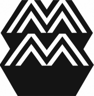
BAM Labs already ran studios in Mexico City, Torrejón, and Madrid, and it needed a distinct voice for its New York debut. Red Antler built the brand around the idea that pushing past the point of failure shows what a body can do. The identity centers on a symbol of three escalating strikes, a literal picture of progressive overload, supported by moody imagery and blunt copy. Out-of-home work referencing ancient Greek sculpture appeared in SoHo, NoHo, and Flatiron, followed by social content and a second round of placements after the studio opened.
Why it works
The symbol does the heavy lifting. Rather than a dumbbell or a flexing figure, it explains the method at a glance: effort that compounds. A mark that demonstrates how the product works is ownable in a category full of similar gym iconography. The Greek statuary gives a newcomer instant gravity and tells the audience this is a lasting practice, not a trend to try for a month. Blunt copy keeps that heritage from feeling like a museum piece, so the brand reads as confident and a little demanding.
Applications


Images and video from redantler.com, by Red Antler.