The Brand Monograph
Hinge brand identity by Red Antler
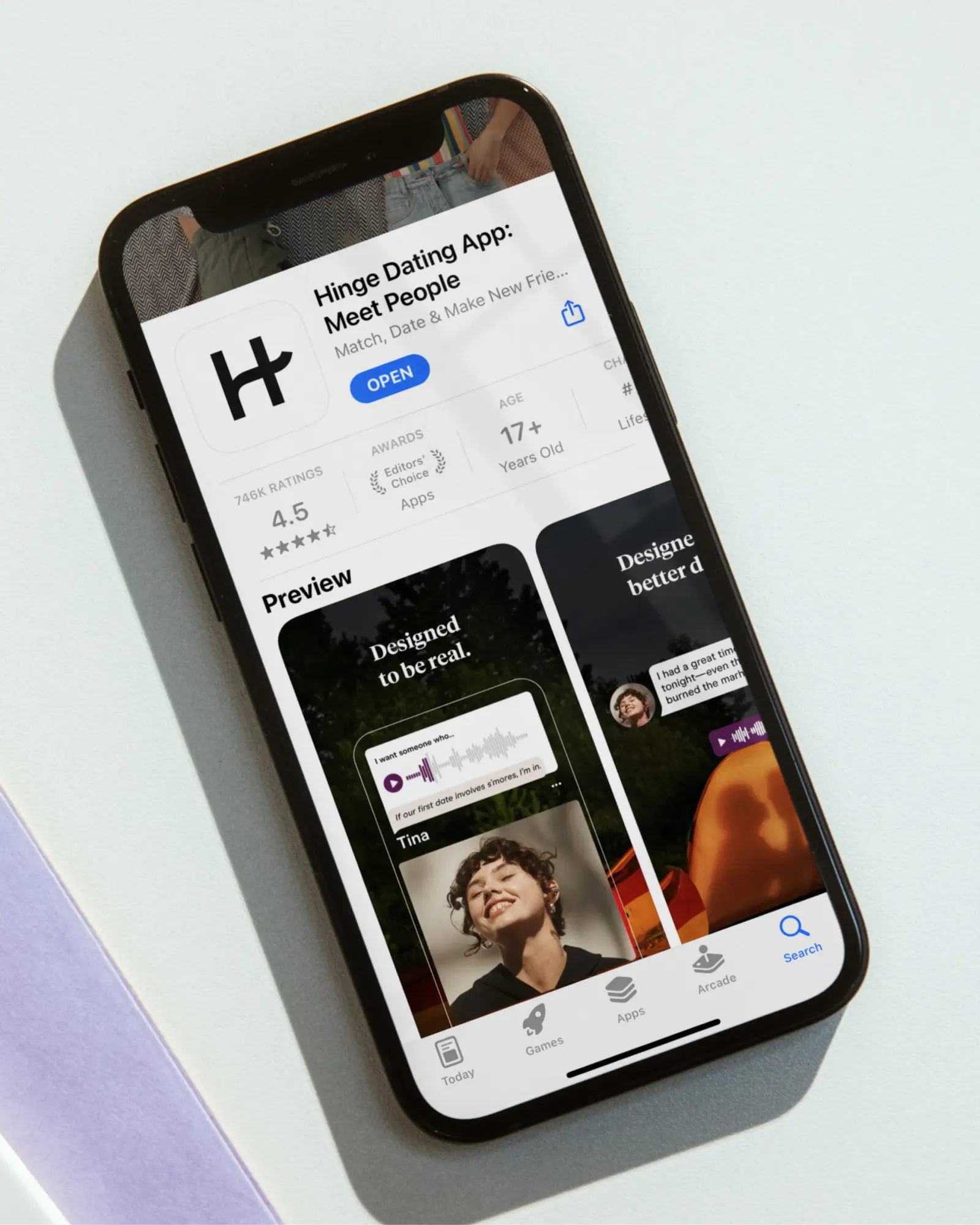
↗Few dating brands would let their own logo get flattened for a laugh. Red Antler's work for Hinge does, and that nerve is what makes it memorable. The studio first worked alongside Hinge's team while the app's interface was rebuilt away from swiping, evolving the brand toward something warmer and less like a game.
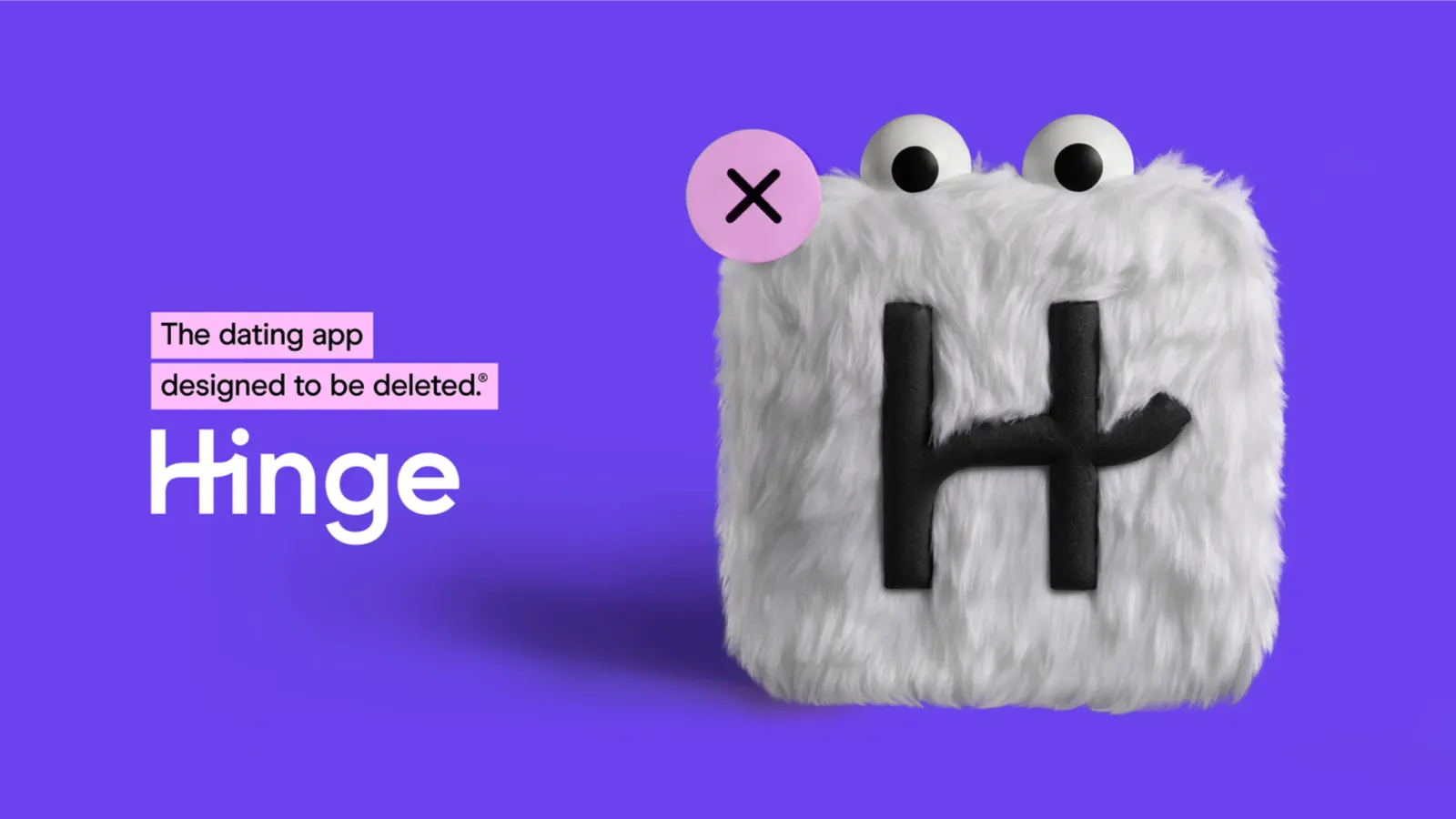
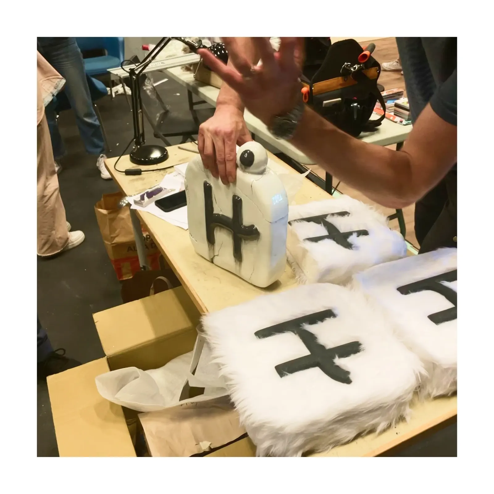
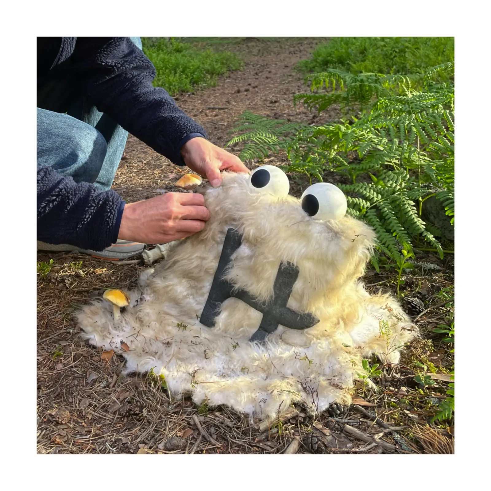
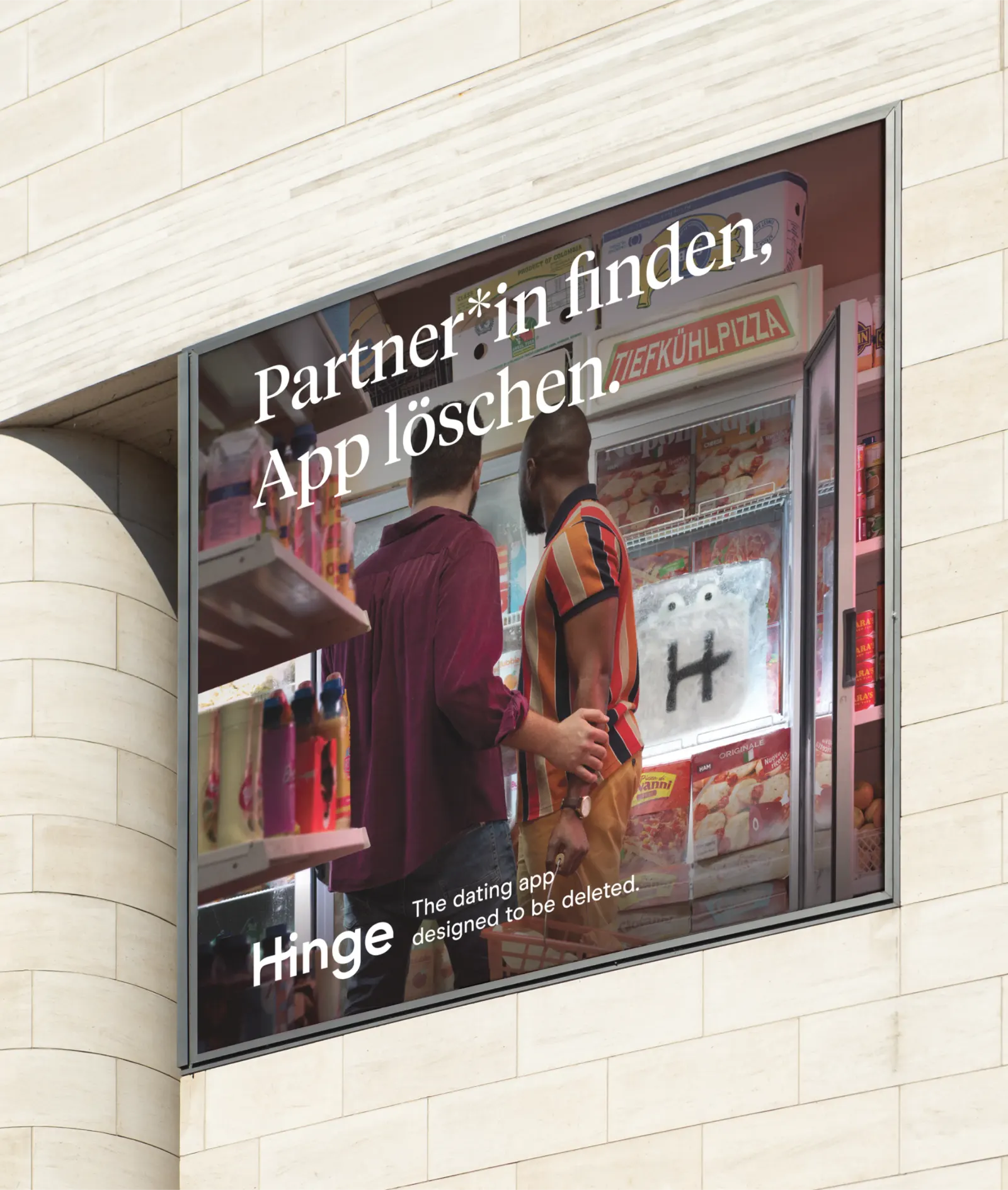
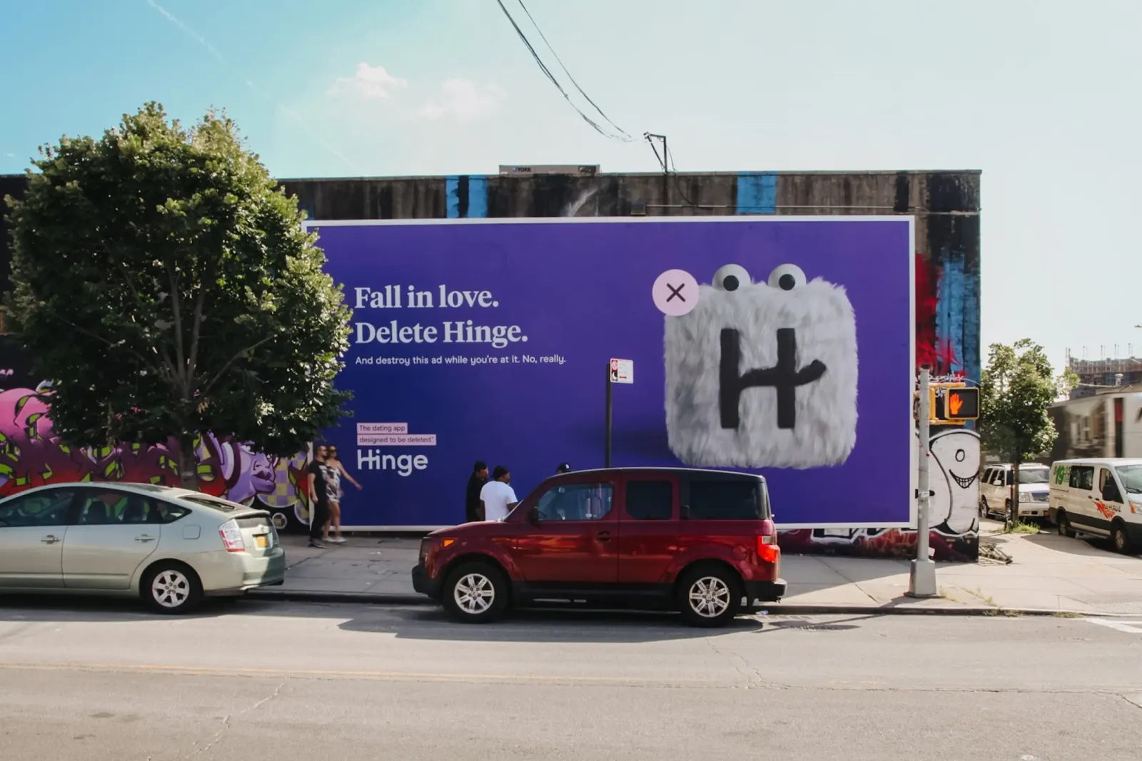
After the Match Group acquisition, Red Antler turned the app icon into Hingie, a character who meets a grim end whenever two people hit it off. Motion from The Studio, photography by Gustav Almestål, production by Aspekt, and film from Mackcut, Michelle Eismann, and RBG6 (Joel Nordstrom and Lars Ohlin) carry the joke. The campaign has since run through three versions, including an international rollout and a Gen Z update voiced by TikTok creators.
Why it works
Most dating brands promise endless possibility, which quietly rewards staying on the app. Hinge's mascot says the opposite, and it says it with the brand's most recognizable asset. Because Hingie is the icon itself, every spot builds recognition while making the promise that success means leaving. The dark humor also gives Hinge a voice that sits apart from the earnest romance around it. And the premise is simple enough to repeat, which is why it could be adapted for new markets and a younger audience without losing its logic.
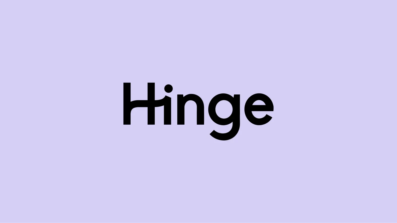
Logo
Applications
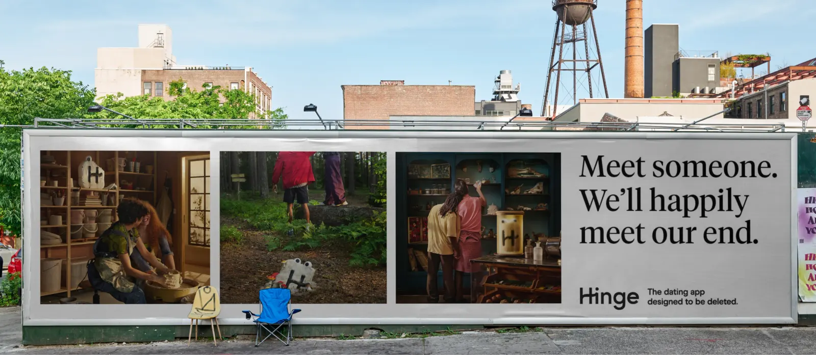
Images and video from redantler.com, by Red Antler.