The Brand Monograph
Fyxer brand identity by Red Antler
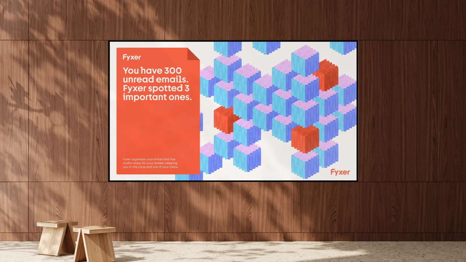
↗Most AI products announce themselves with glows, sparkles, and abstract shapes. Fyxer, an email assistant that sorts your inbox and anticipates your replies from past conversations, got something more tactile from Red Antler: an identity built on the marks people leave on paper.
The brief had a built-in tension. The product works best when you hardly notice it, yet the brand still needed a presence. The studio's answer is a system drawn from three gestures: the highlight, the note in the margin, and the folded page corner. Each one is translated for the screen rather than copied literally, so together they act as a flexible visual language. Typography, developed with Dinamo Typefaces and Newglyph, gives that language a distinct voice.
Why it works
Red Antler picked gestures that map to what the product does. Highlighting suggests prioritizing, a margin note suggests a suggested reply, and a folded corner suggests holding your place. That makes the AI feel like a sharp colleague with a pen instead of a black box. It also sets Fyxer apart in a category that leans on futuristic clichés. For busy professionals who live in their inboxes, familiar marks read as calm and trustworthy, and custom type from respected foundries adds credibility.
Images and video from redantler.com, by Red Antler.