The Brand Monograph
Ramp brand identity by Red Antler
↗Red Antler's identity for Ramp makes thrift look like the more desirable thing to own. In a category where prestige has long meant excess, the studio commits to that idea with a brand that feels confident rather than flashy.
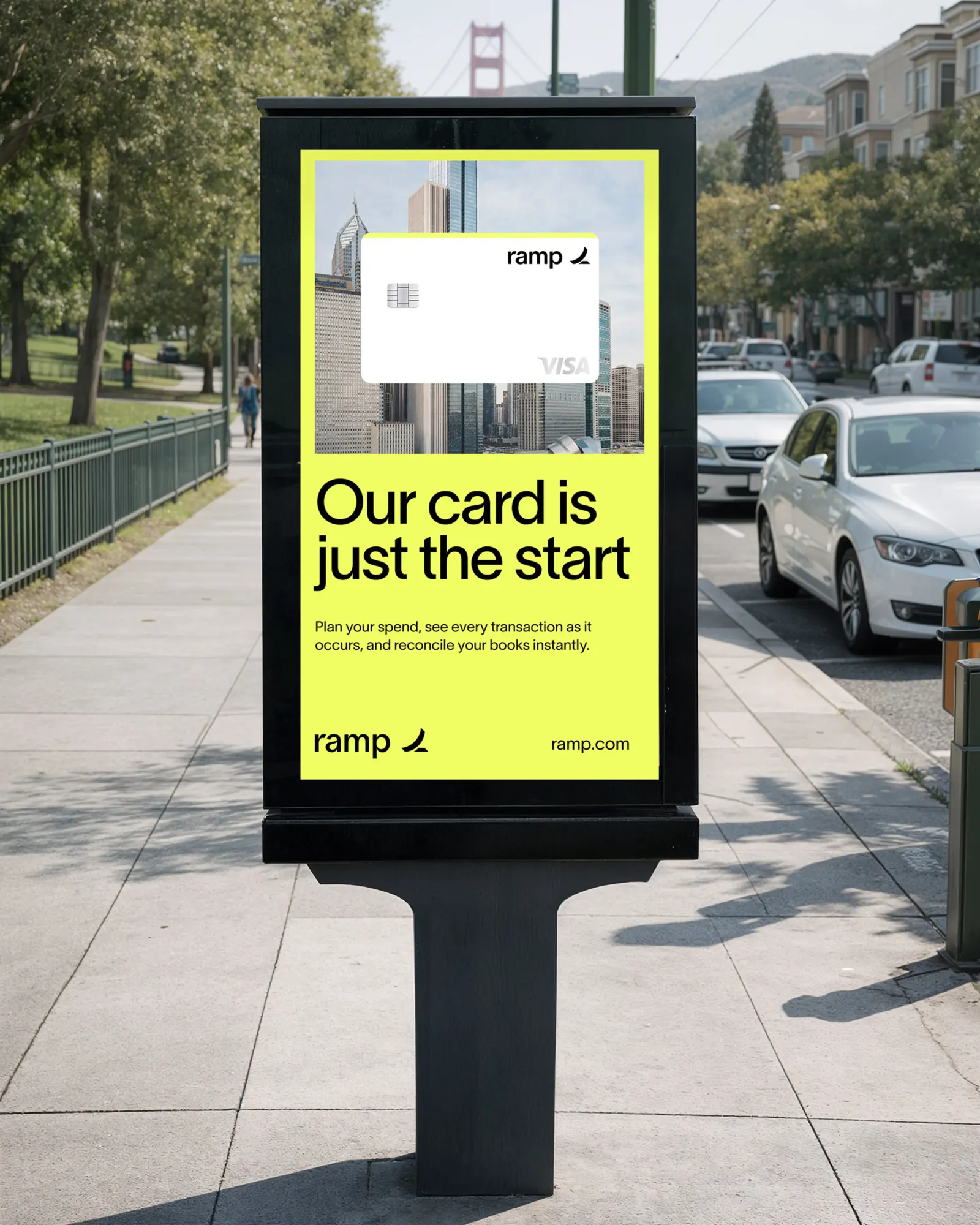
Ramp, founded by Eric Glyman and Karim Atiyeh, pairs a corporate card with financial software. It had to stand apart from legacy cards whose points programs reward spending more. Red Antler answered by changing what a premium card signals. Oversized scale gives the identity presence, a bright highlight color adds energy to an otherwise restrained look, and the physical card gets as much attention as the screens. Ramp has since reached a $60 billion valuation and is described as New York's fastest-growing startup.
Why it works
The strength here is contrast. A disciplined system with a loud accent suits a product finance teams must trust, while the big scale keeps it from feeling like dull software. The card matters most, because it's one of the few B2B products that gets used in public. Designing it to be shown off turns frugality into something people want to be seen choosing. That gives Ramp a clear, memorable position against the heritage cues legacy cards rely on.




Images and video from redantler.com, by Red Antler.