The Brand Monograph
Precision brand identity by Red Antler
↗Neurotech usually comes with a familiar visual shorthand of glowing synapses and glossy futurism, which makes it easy to file under "someday." Red Antler's work for Precision Neuroscience pushes the other way. It presents the company's brain-computer interface as something people could encounter soon, and the identity carries that conviction throughout.
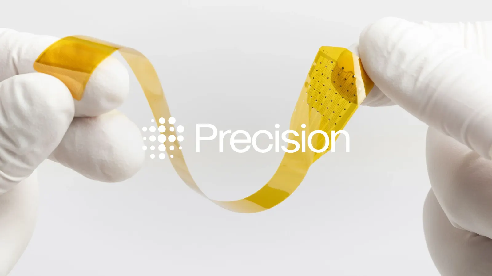
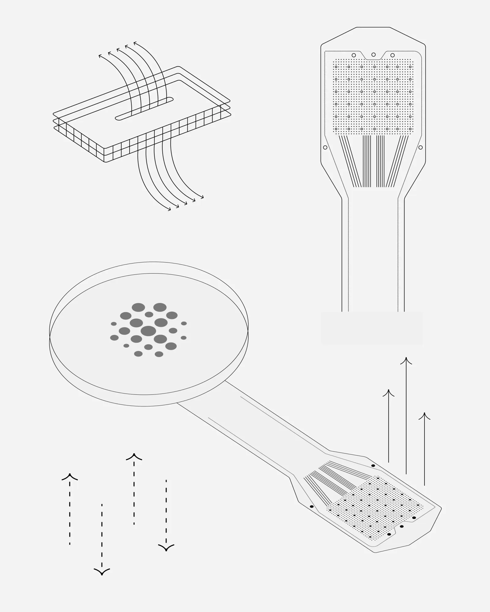
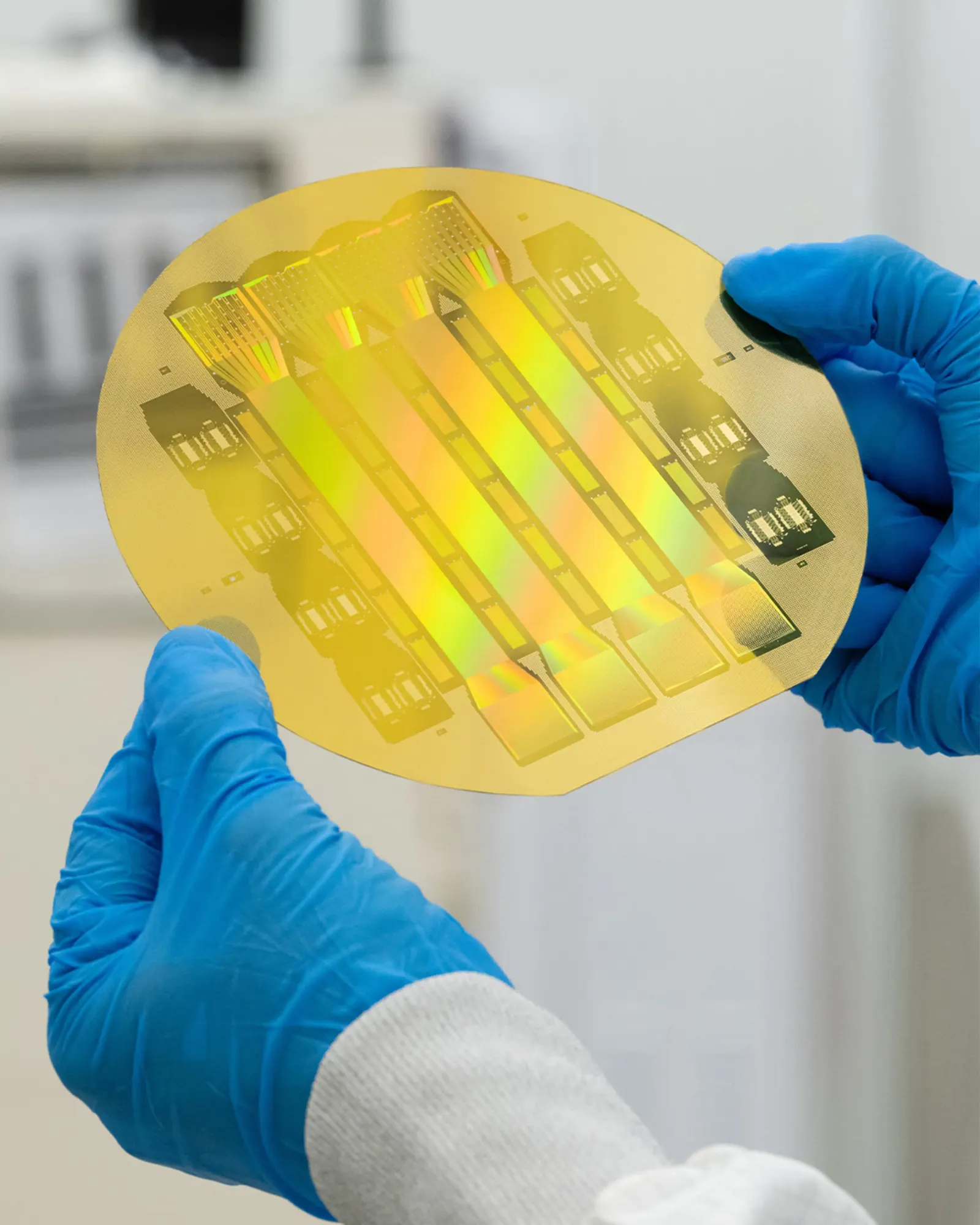
The brief was to give a healthcare breakthrough a brand with both scientific weight and human stakes. Precision's implant connects deeply with the brain while staying minimally invasive, and its first goal is helping people with paralysis regain independence. Red Antler paired immersive renders of the technology with photography centered on the people it is meant to serve, then drew the palette from the technology itself. The system moves between device and person, so the larger therapeutic ambition always stays tied to a real use.
Why it works
The renders and photography divide the labor well. The renders show the technology as precise and tangible, while the photography keeps a person at the center of every story. Taking the palette from the product also makes the brand feel like it came out of the device rather than a category template, which helps it avoid both clinical medtech coldness and neon futurism. That warmth matters for an audience that likely includes patients, families, clinicians, and investors, all of whom need to trust something unfamiliar.
Applications

Images and video from redantler.com, by Red Antler.