The Brand Monograph
MedExpress brand identity by Pentagram
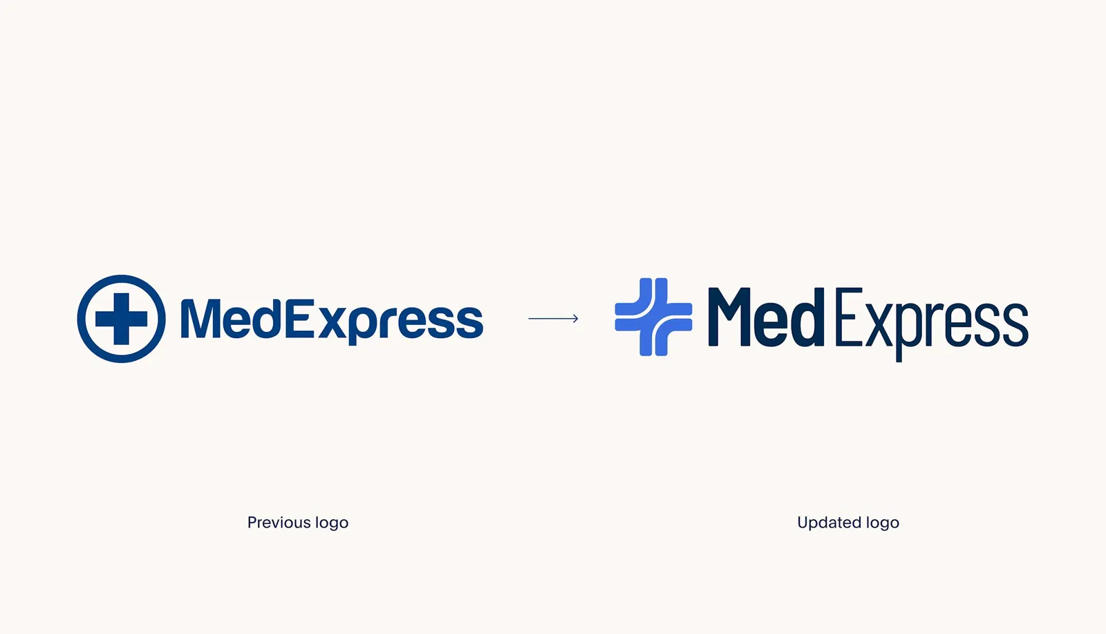
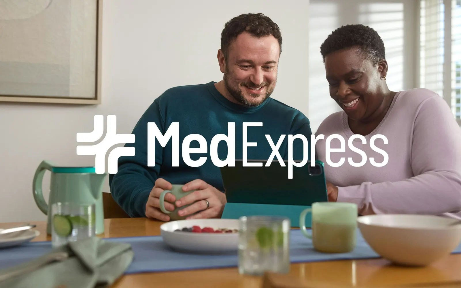
↗Pentagram's work for MedExpress shows how much a familiar healthcare symbol can still do when it is redrawn with intent. The UK online pharmacy, part of HeliosX, grew fast as demand for GLP-1 treatments surged. Its early identity had been built for a narrower job and struggled to stretch across markets, channels, and audiences while sharper digital-first rivals pulled ahead.
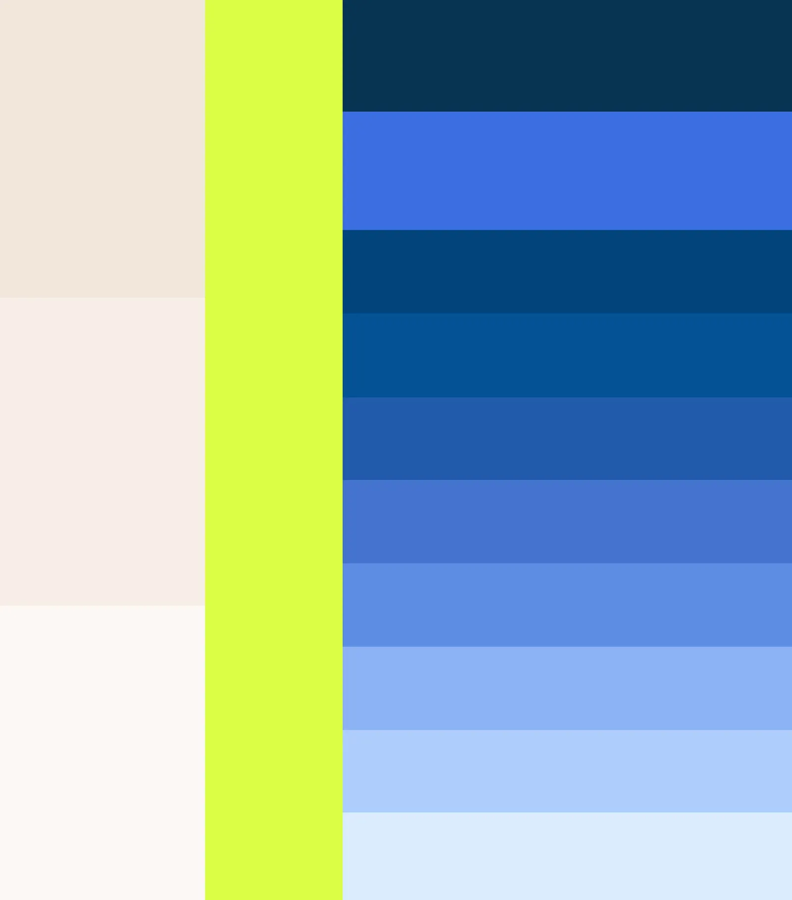
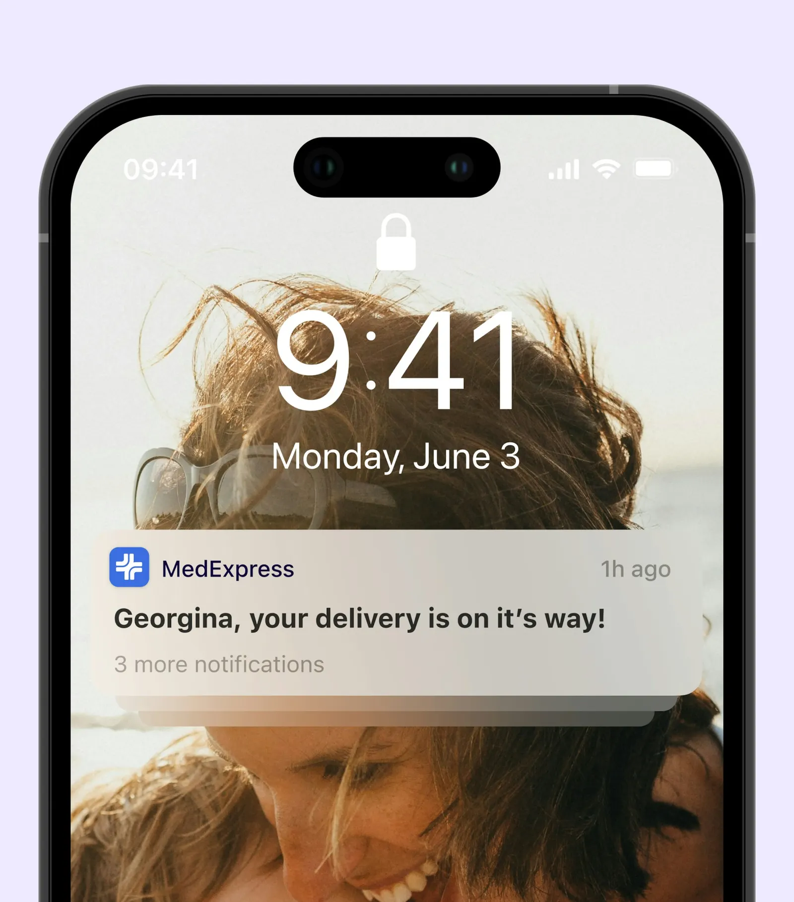
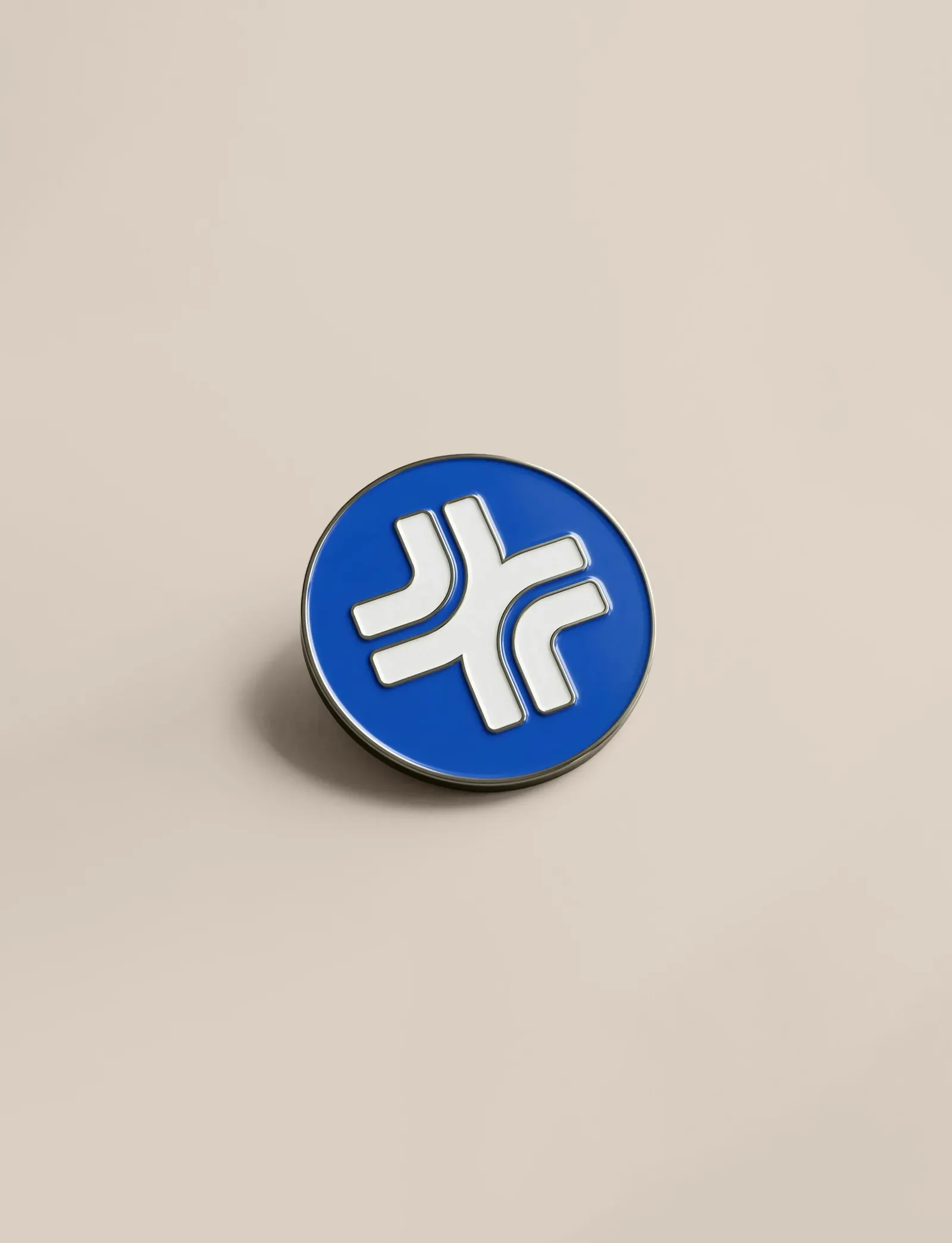
The studio began with strategy, including customer focus groups, then moved through a new tagline, verbal and visual identity, packaging, campaigns, and digital output. The reworked cross anchors the system. Lozenge shapes tie copy to photography and video of clinicians and patients, and custom icons cover each treatment area. Blues are warmed with additional tones, and Barlow's rounded forms echo the symbol. Claire Berthet led strategy, with Andrew Roberts and Sam Smith on development alongside a design team that included Angus Hyland and Alex Wright.
Why it works
Online pharmacy branding tends to drift toward either sterile or overly breezy, and this identity avoids both. The cross keeps the instant read of medicine, while softened geometry makes it feel approachable rather than institutional. Barlow repeats that roundness, so mark and type sound like one voice. Warmer tones sit against the blues to keep the brand from feeling cold in a crowded feed. The lozenge is the smartest tool here: a simple, flexible container that lets fast-moving social and ad content change constantly while still looking unmistakably like MedExpress.
Logo
Color
Applications
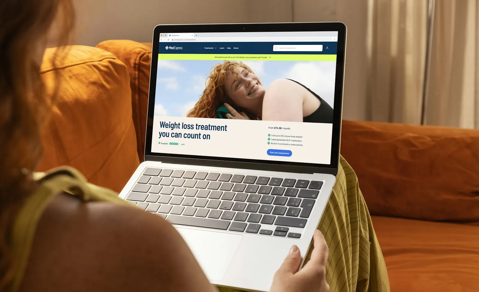
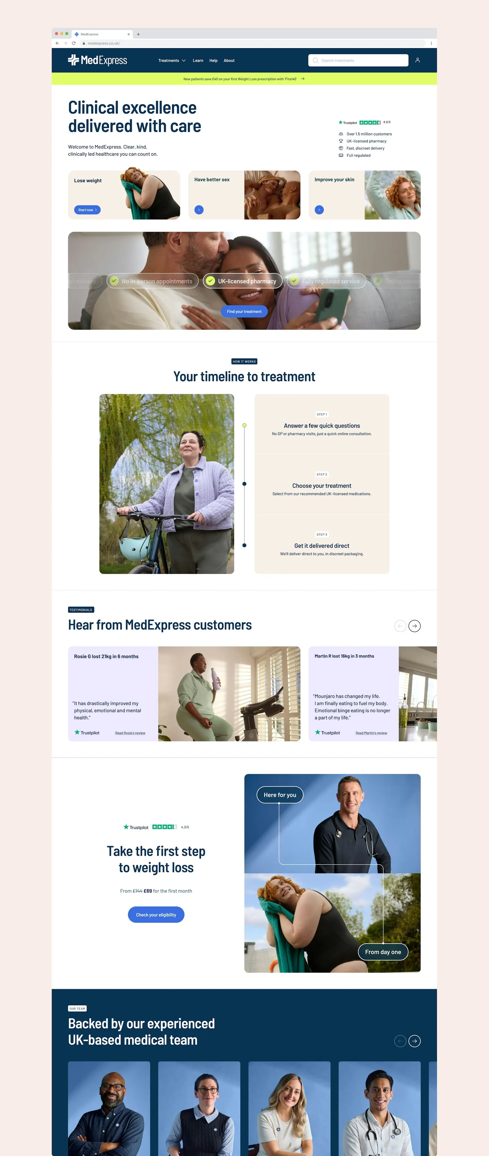
Images and video from pentagram.com, by Pentagram.