The Brand Monograph
Huntington Bank brand identity by Koto
↗Koto's work for Huntington Bank gives a 150-year-old institution the poise of a challenger without borrowing the look of a fintech. Huntington already had a reputation for Fair Play and was the first bank to drop overdraft fees. The task was to carry that reputation nationally, in a market split between apps selling speed and older banks selling safety.
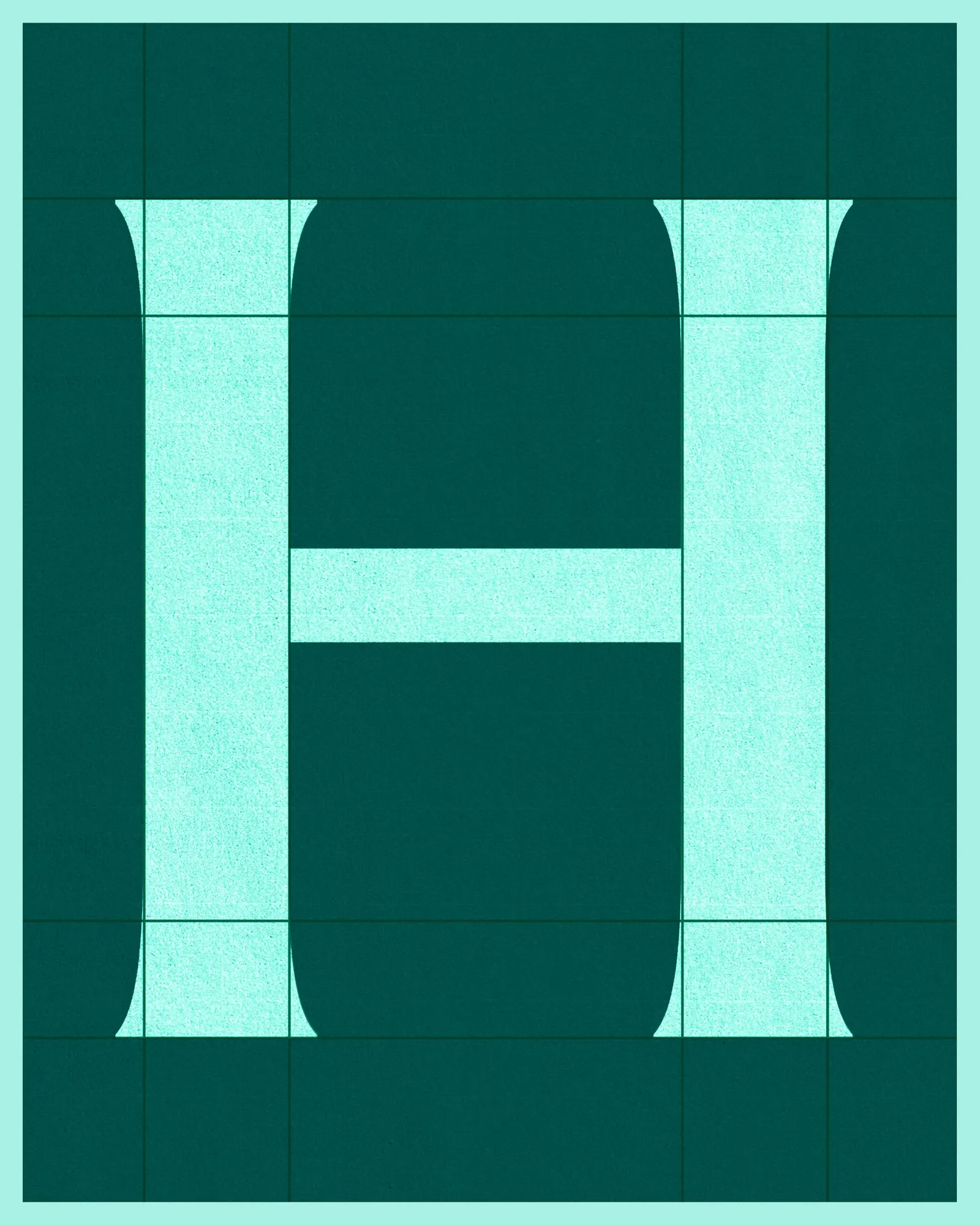
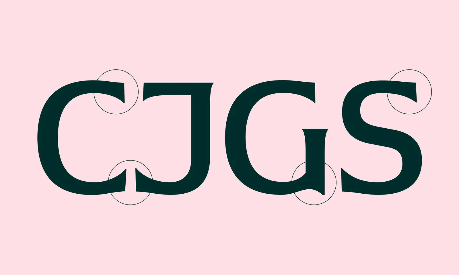
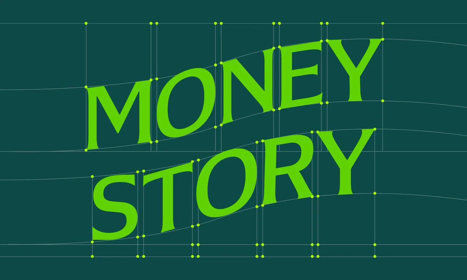
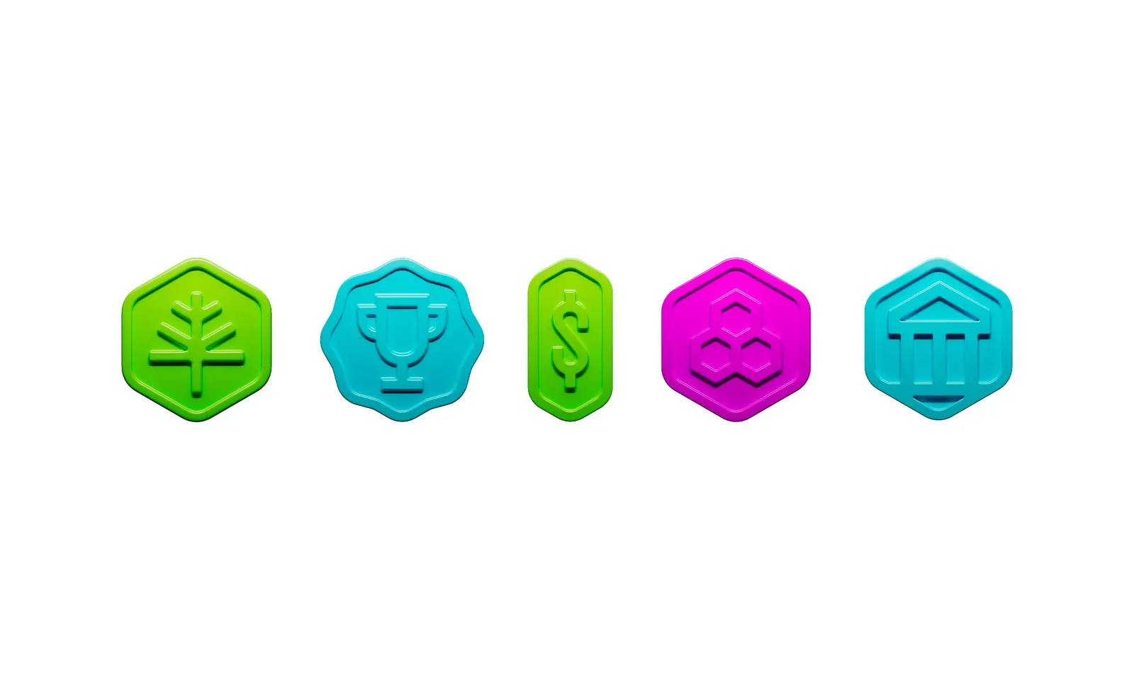
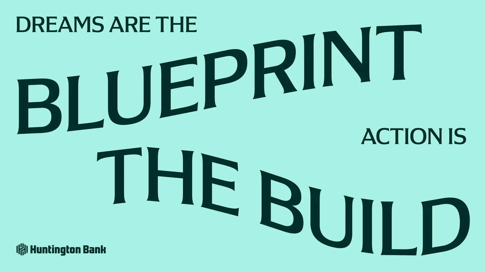
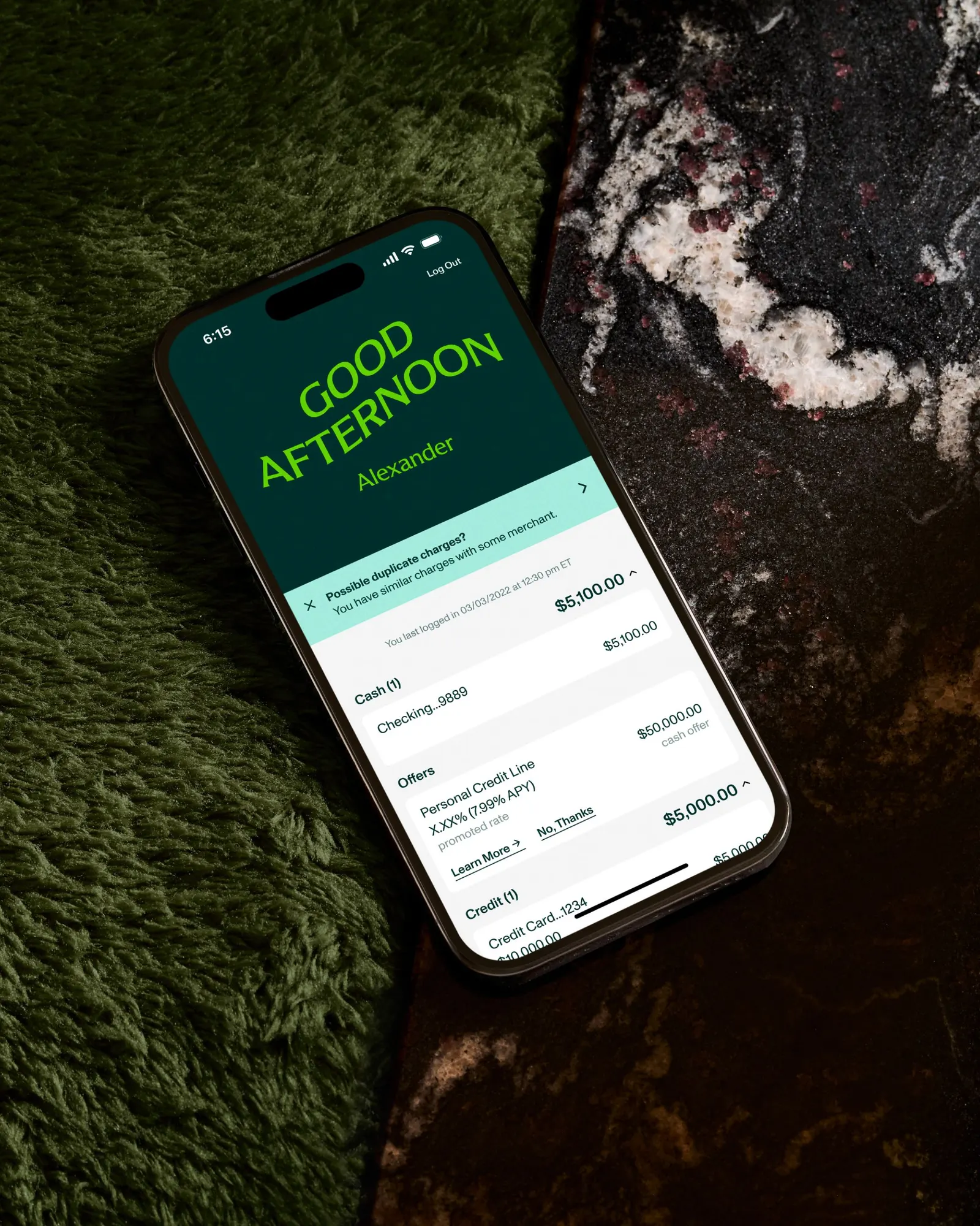
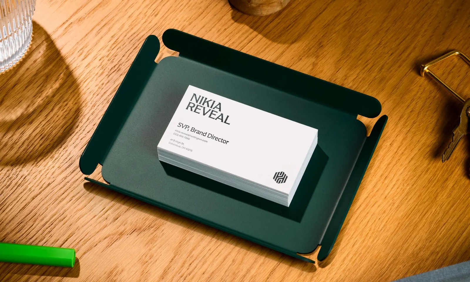
Koto built its answer on a simple observation: most people feel out of their depth with money. Rather than promise effortless banking, the studio framed money as a skill you can get good at. That attitude shows in the details. Huntington Serif, a custom typeface developed with Lewis McGuffie, has flared edges and a considered rhythm. 3D badges mark milestones, motion adds warmth, and the system shifts tone between Commercial Banking and Wealth Management.
Why it works
A serif is a bold choice in a category where fintechs tend toward clean sans serifs and traditional banks toward stiff, corporate type. The flared edges give Huntington a recognizable voice that feels human and a little tailored, which suits a promise built on fairness rather than speed. The badges make abstract progress tangible, so customers get acknowledged instead of lectured. And because the same typographic and motion habits run through both business lines, the bank can change register without looking like two different companies.
Logo

Typography

Applications

Images and video from koto.com, by Koto.