The Brand Monograph
San Francisco Symphony brand identity by COLLINS
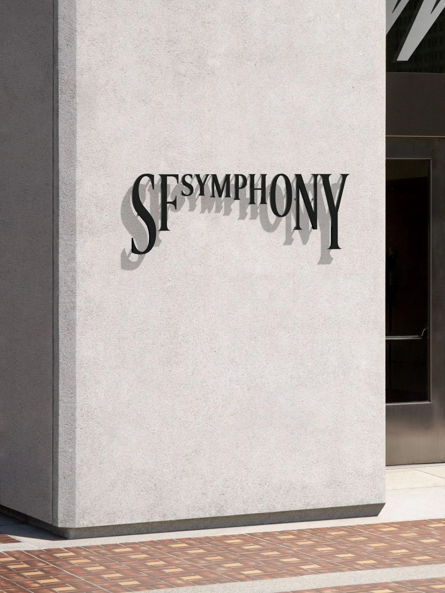
↗San Francisco Symphony's identity is built on letters that react to the music rather than sit still on a poster. COLLINS took on the project at a turning point: Esa-Pekka Salonen was succeeding Michael Tilson Thomas after 25 years, and the orchestra was rethinking its programming, its structure, and its artistic leadership.
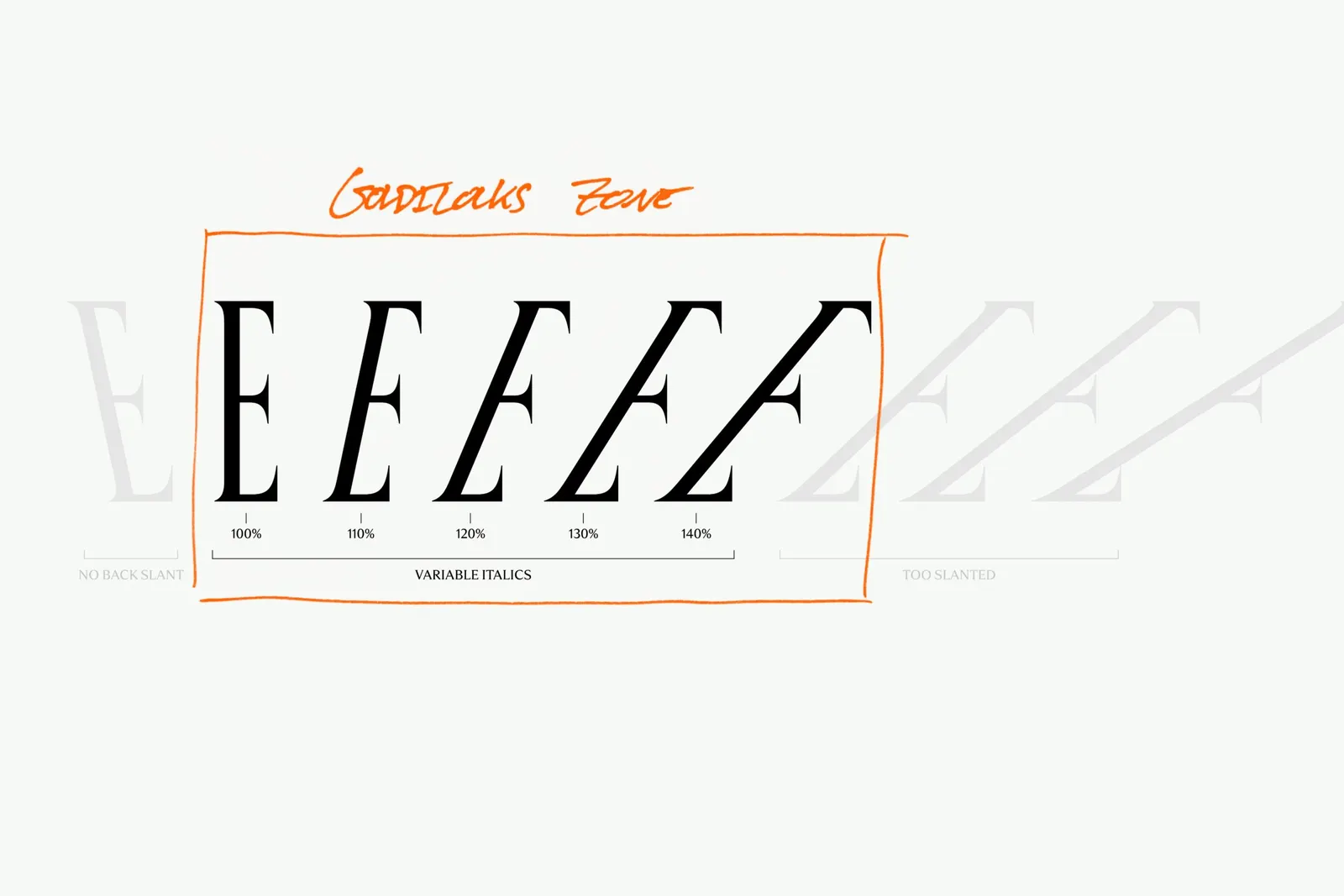
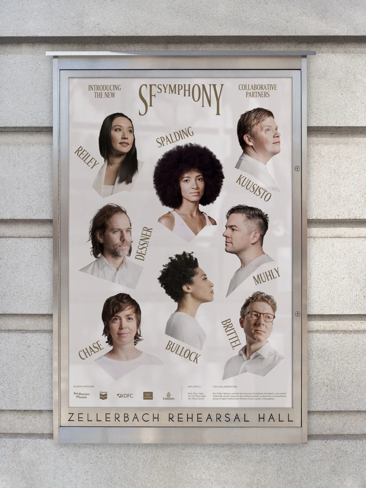
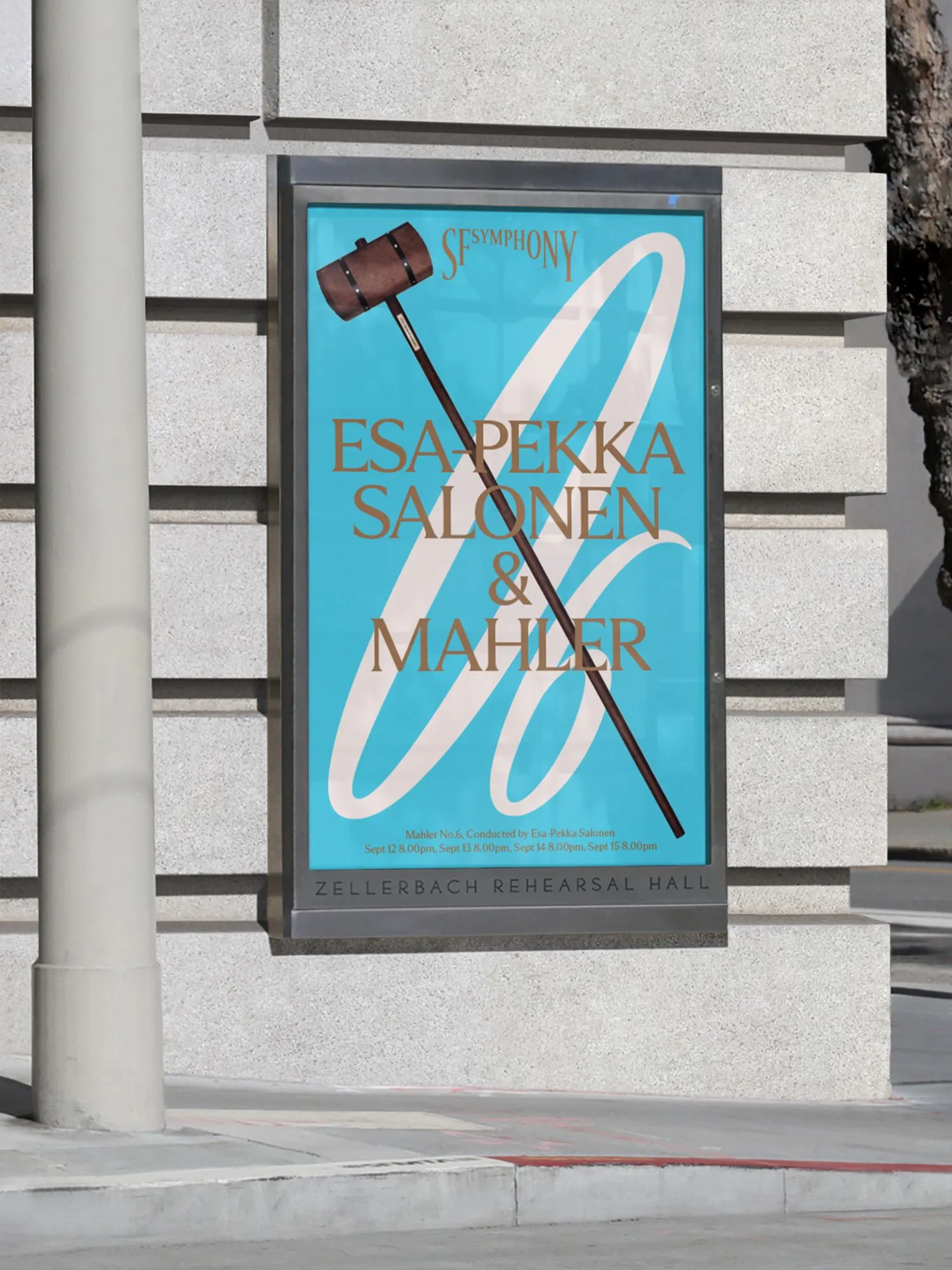
The studio began by working with musicians, audiences, staff, and board members on a shared vision, then moved into type. With DINAMO, it started from classical letterforms and built them on variable font technology, so each character can change shape in response to sound. Black and white provide a formal base, and colors drawn from the Bay Area sit on top. Reported results include a 19% year-over-year rise in donor participation and seasonal attendance reaching 74% of capacity.
Why it works
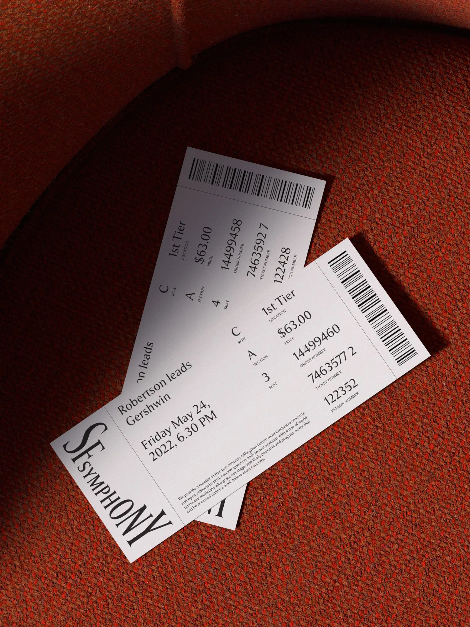
The smartest decision is keeping the letterforms recognizably traditional and putting the novelty in how they behave. The Symphony still looks like an institution with a century behind it, but it no longer looks fixed. Type is also the right carrier, because an orchestra's brand lives in programs, posters, and screens, and the music itself is never visible. Black and white keeps the formality of the concert hall, while the regional color keeps the brand tied to its home and sets it apart from the usual orchestral palette.


Images and video from wearecollins.com, by COLLINS.