The Brand Monograph
Trustpilot Brand Identity and Design System brand identity by Further
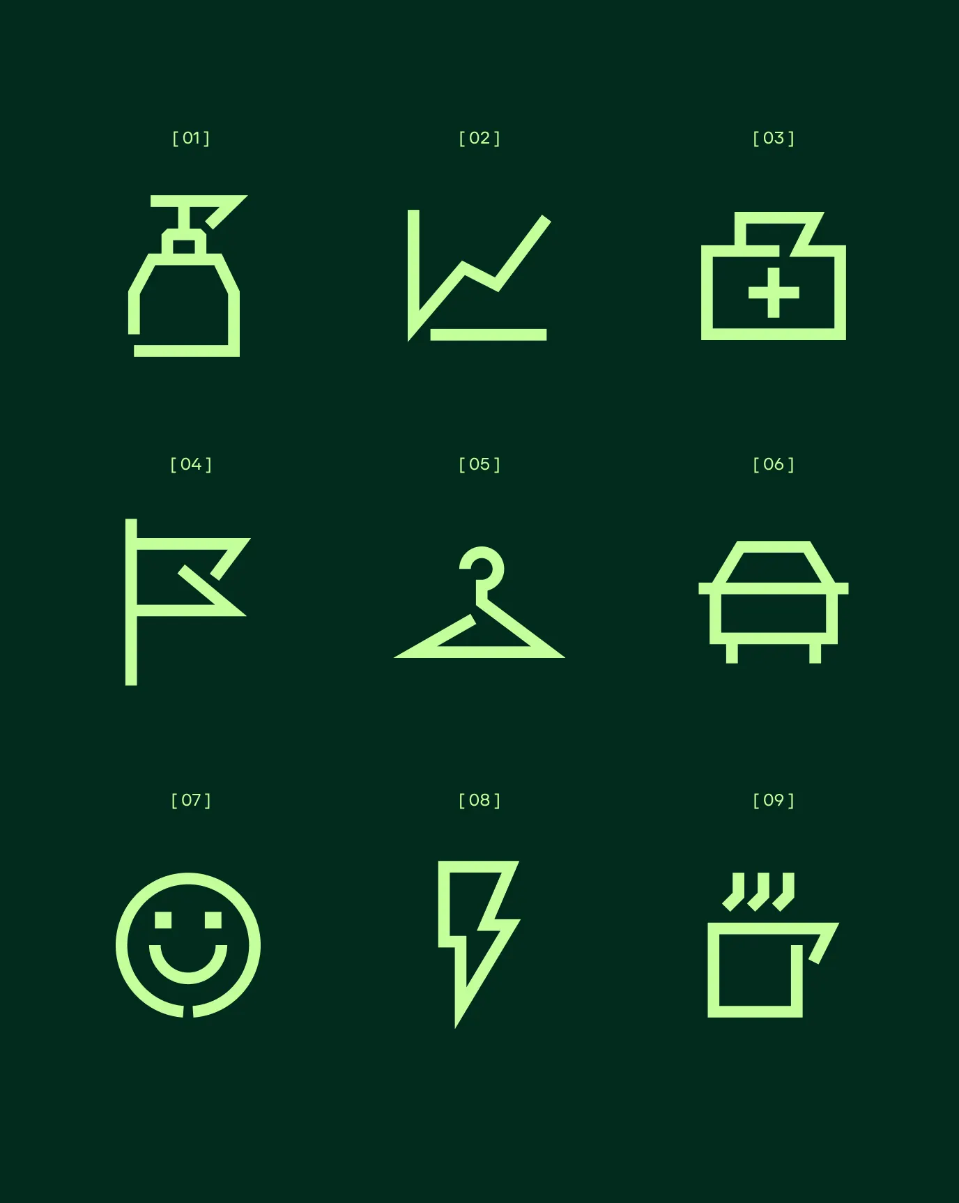
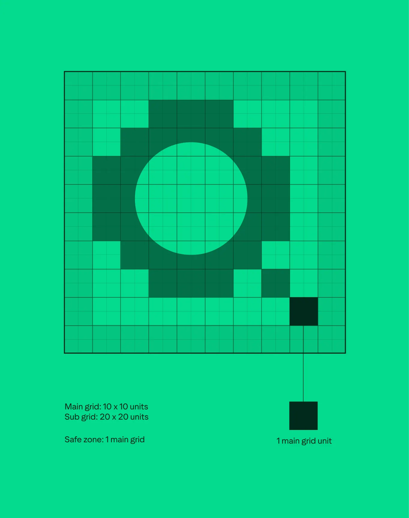
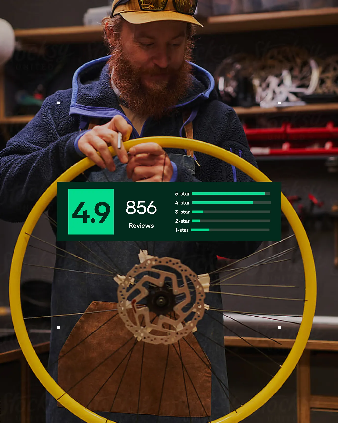
↗Few brands own an asset as recognizable as Trustpilot's star rating, and Further treated it as raw material rather than something to polish. The studio took the star's proportions and square geometry and built a full visual language from them: blocks, layouts, and behaviors that carry a familiar signal into every corner of the brand.
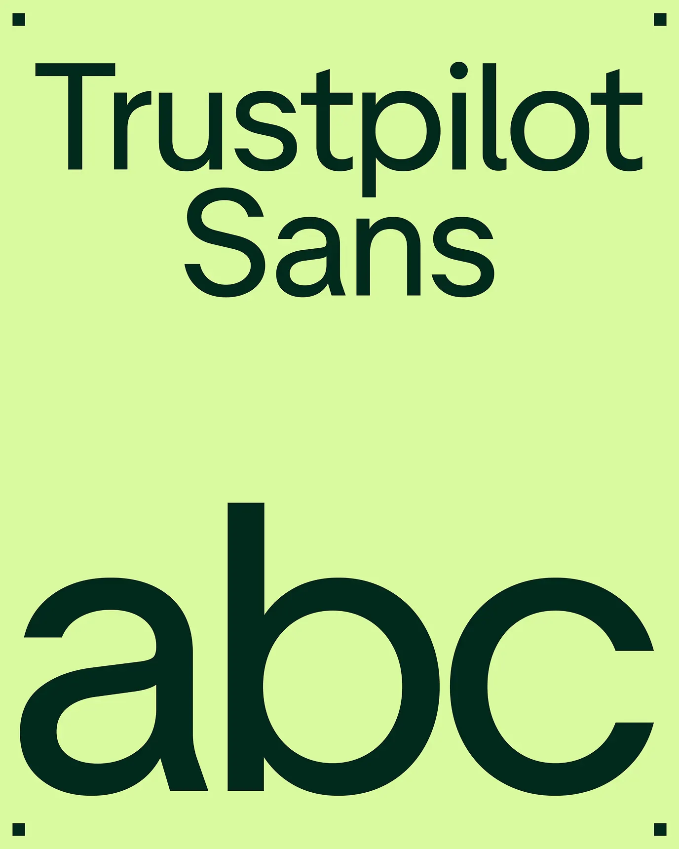
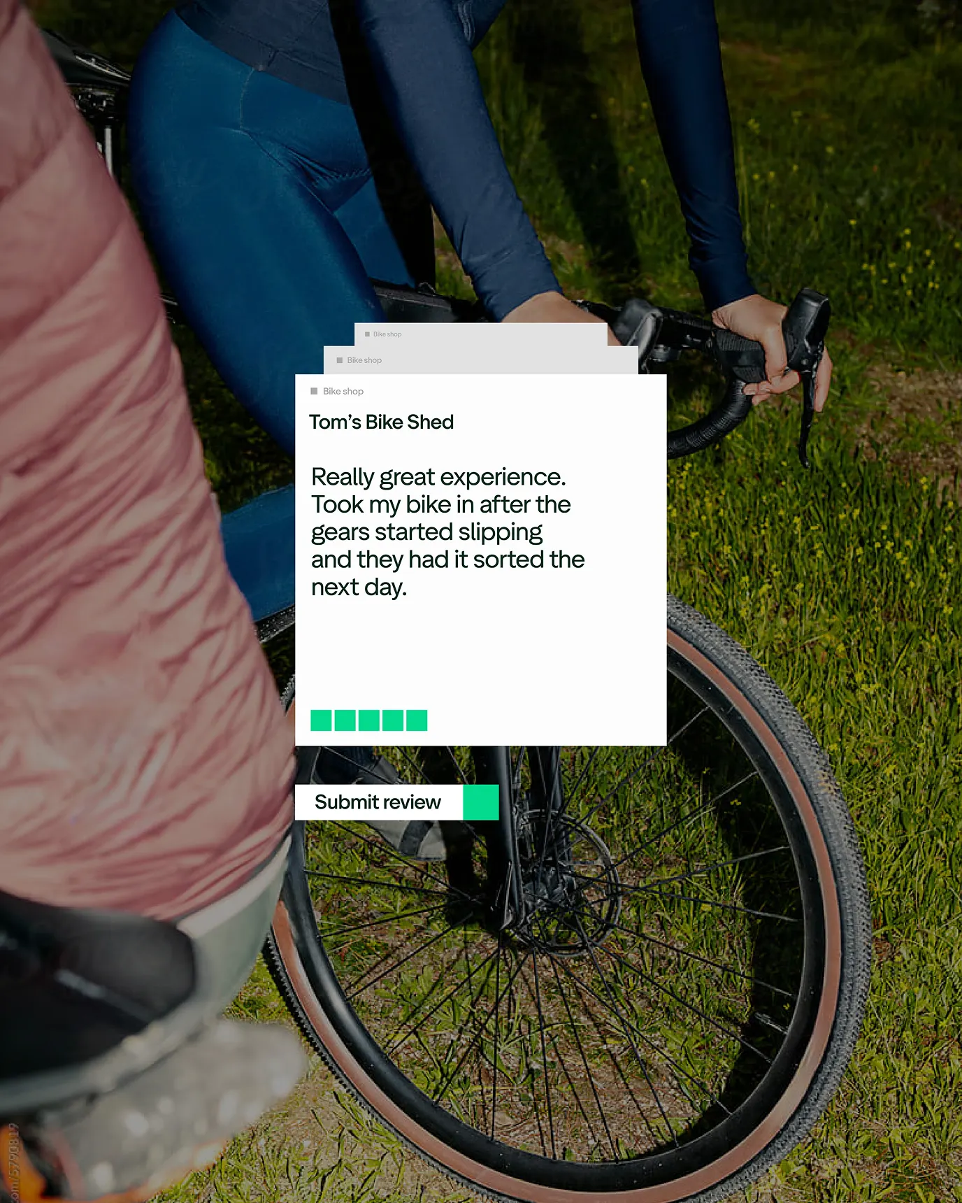
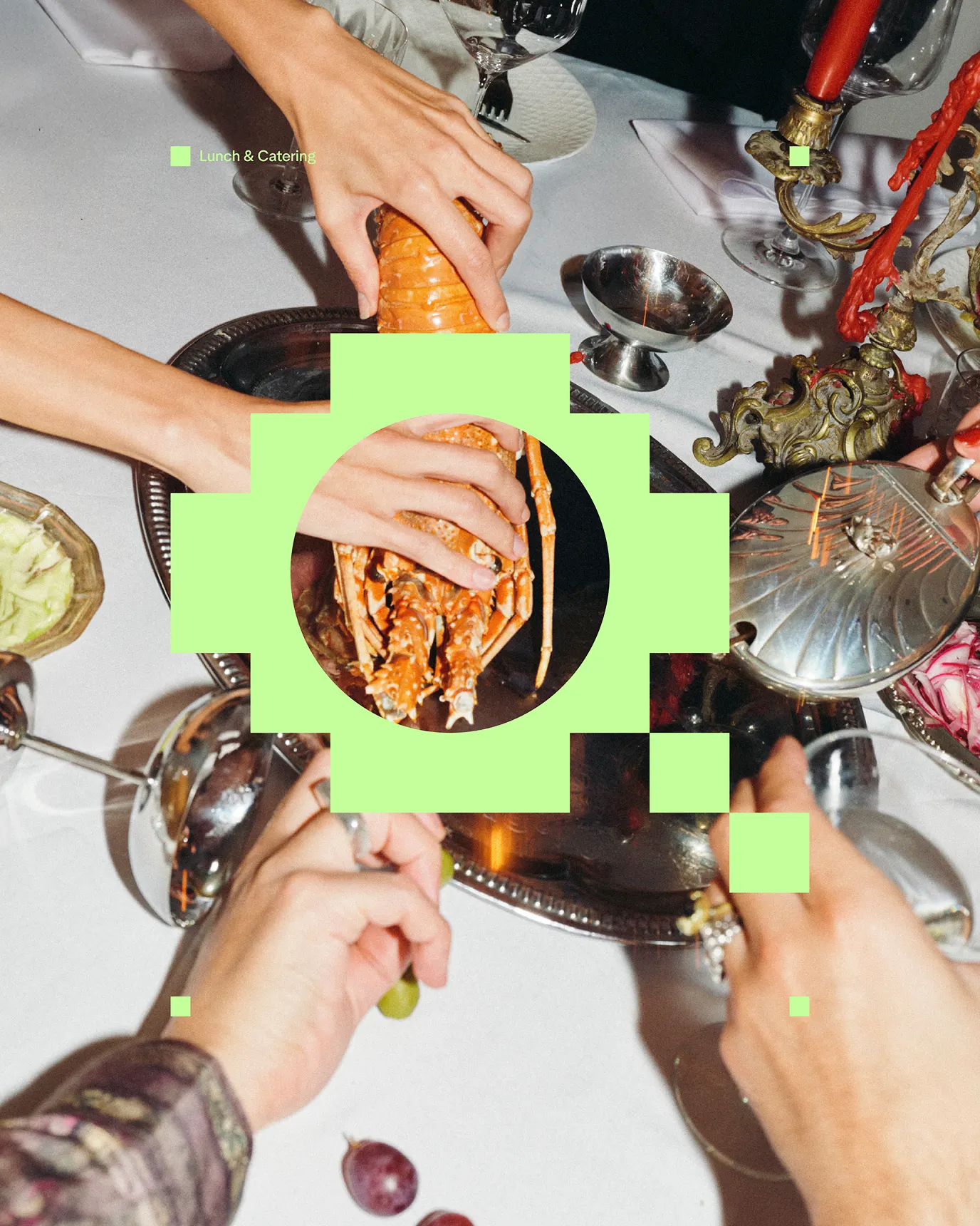
The challenge was making a company built on reviews feel like one connected brand across product, campaigns, and both consumer and business touchpoints. Further puts real reviews and ratings up front, and lets type change scale so a single comment can own the page or sit inside a crowd of others. Trustpilot Sans covers both expressive headlines and functional detail. The Signal Device adds depth at key moments, pushing color, imagery, and type into more dramatic compositions, while warm, recognizable photography keeps the system human.
Why it works
Rating platforms tend to use stars as decoration. Here the star's geometry sets the rules, so the system reads as Trustpilot even without a logo in sight. Square, modular blocks also suit the real material: reviews vary in length and tone, and the grid absorbs that without fuss. Shifts in type scale do the strategic work, making one review feel personal and many feel like consensus. The Signal Device keeps that order from going flat, and the photography softens it.
Applications

Logo
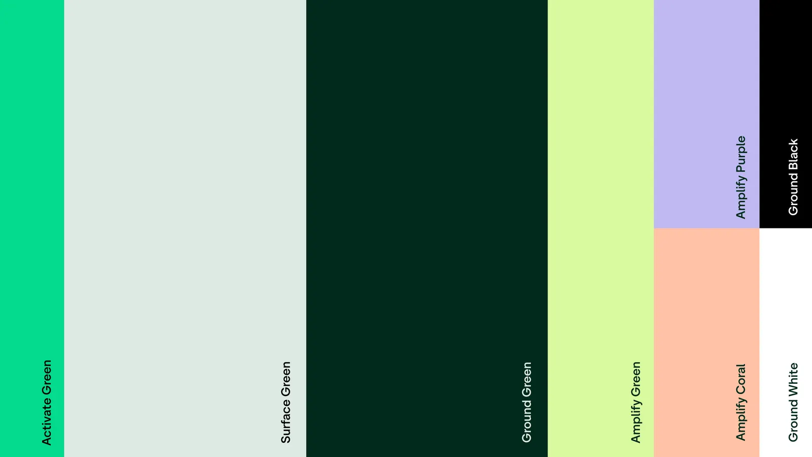
Color

Images and video from further.group, by Further.