The Brand Monograph
Little Caesars brand identity by Turner Duckworth
↗What stands out in Turner Duckworth's work for Little Caesars is how much it gets from a mascot people had stopped really noticing. A decade of top value rankings had left shoppers equating cheap with lesser, even though fresh ingredients and efficient distribution were what kept prices down. The studio's answer was to make the brand feel more crafted, not more expensive.
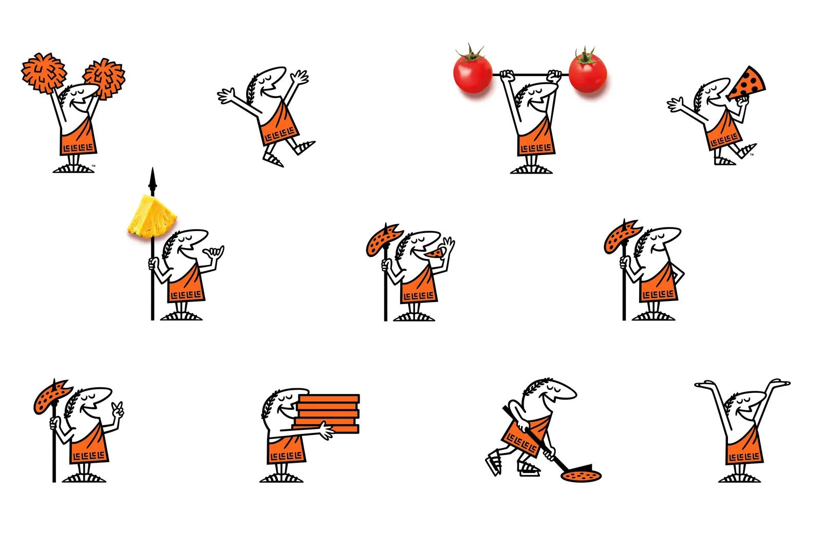
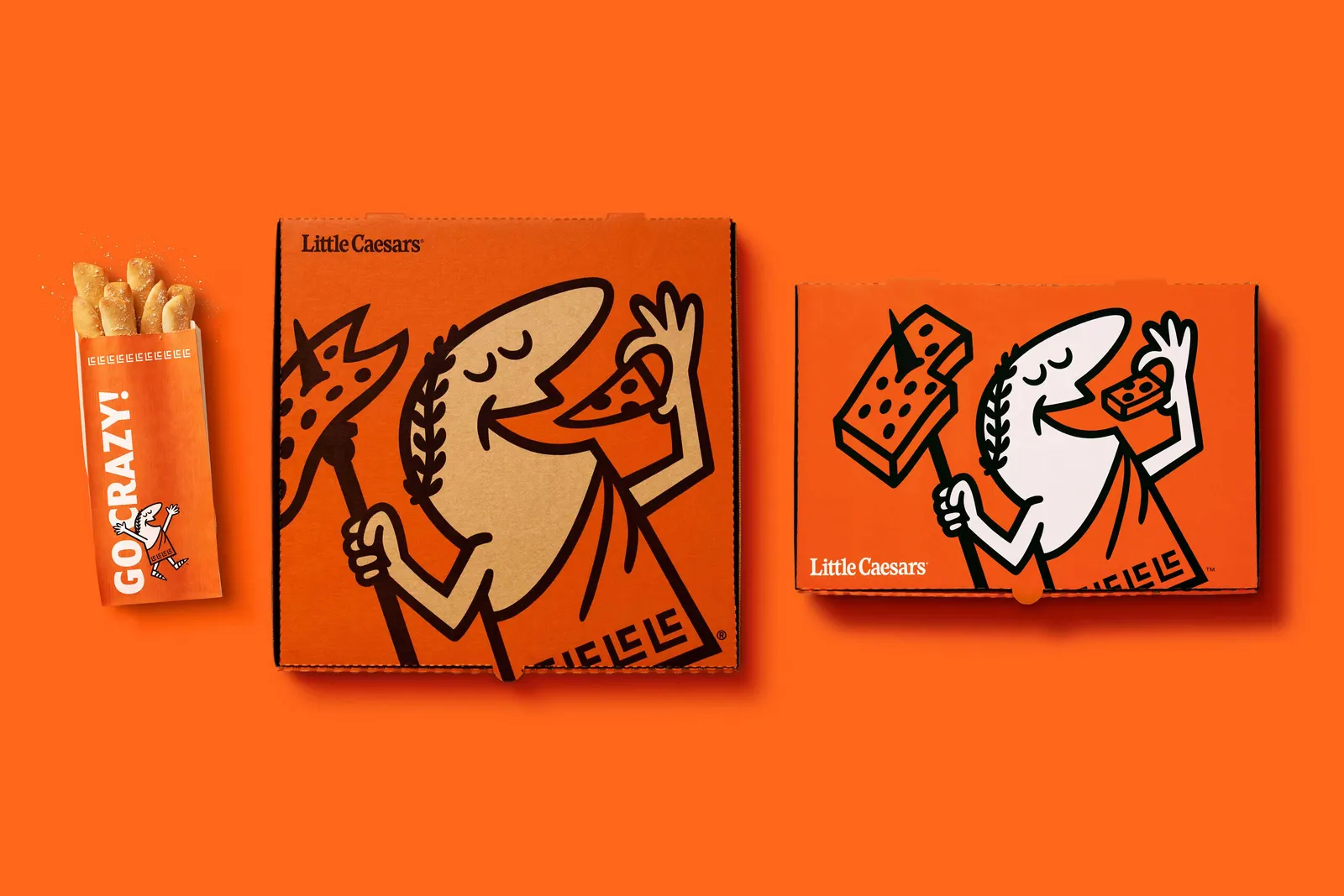
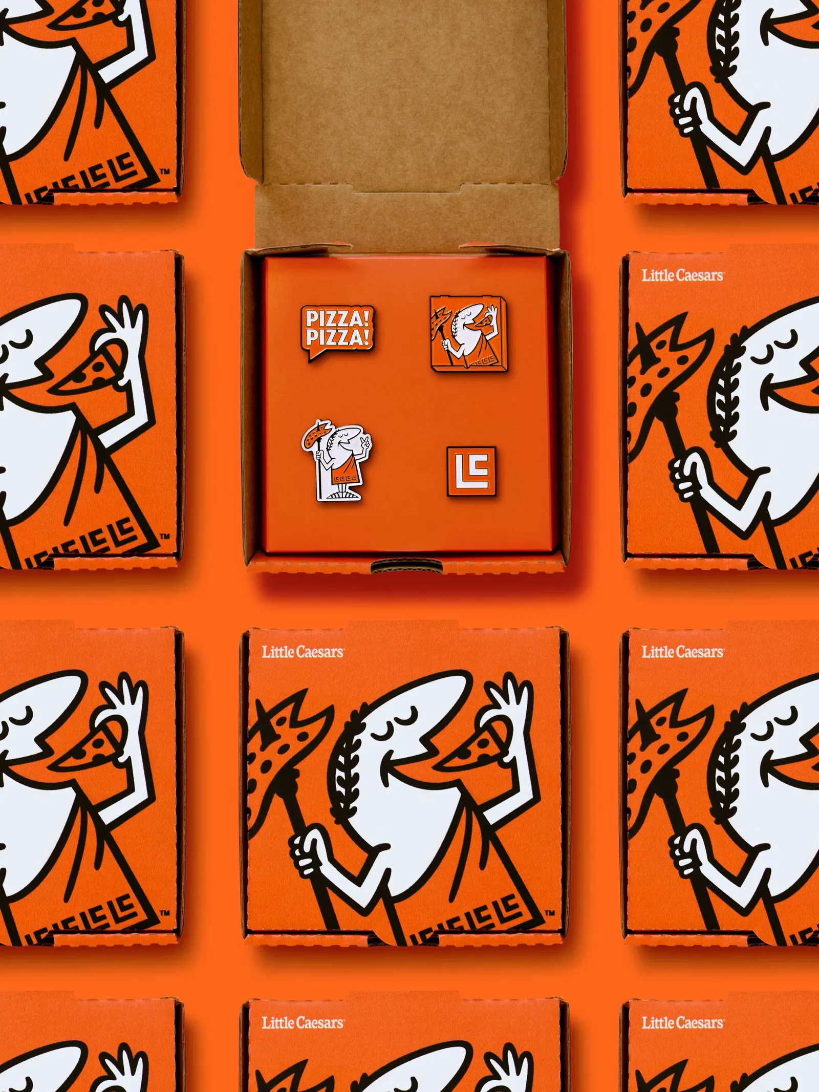
Turner Duckworth cleaned up the 1950s cartoon Caesar into one consistent figure and refined the wordmark, with versions for different global markets. It also paired the mark with a custom typeface and typographic style, developed with Arley Torsone and MCKL. Jonathan Dahl and Jonathan Warner animated Caesar for social, TV end cards, the ordering app, and the arena, with sound by Dan Wool. Orange leads a tighter palette, the food photography looks richer, and his spear, laurel crown, and toga monogram now work as brand symbols.
Why it works
Value brands often try to fix a quality perception by moving upmarket, which risks losing the customers they already have. This identity avoids that by keeping Caesar's cartoon humor and tightening everything around him. Consistent drawing, sturdy custom lettering, and appetizing photography read as care without any pretension. Committing to orange gives the brand a color of its own in a category full of reds. The small props reward repeat exposure, so familiarity builds into affection.
Logo

Applications

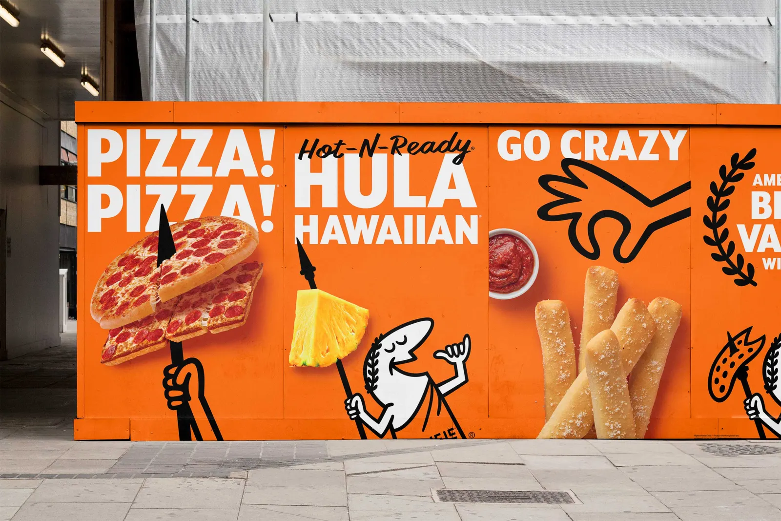
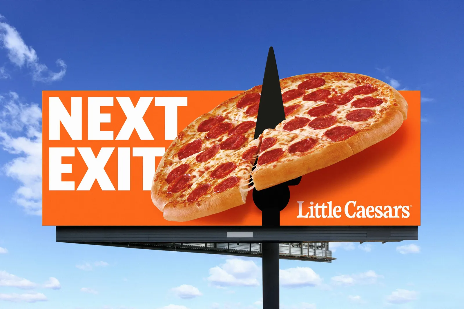
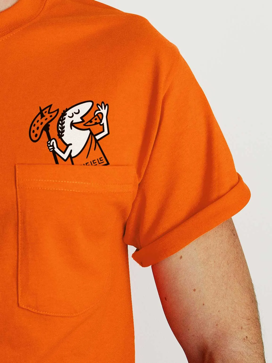
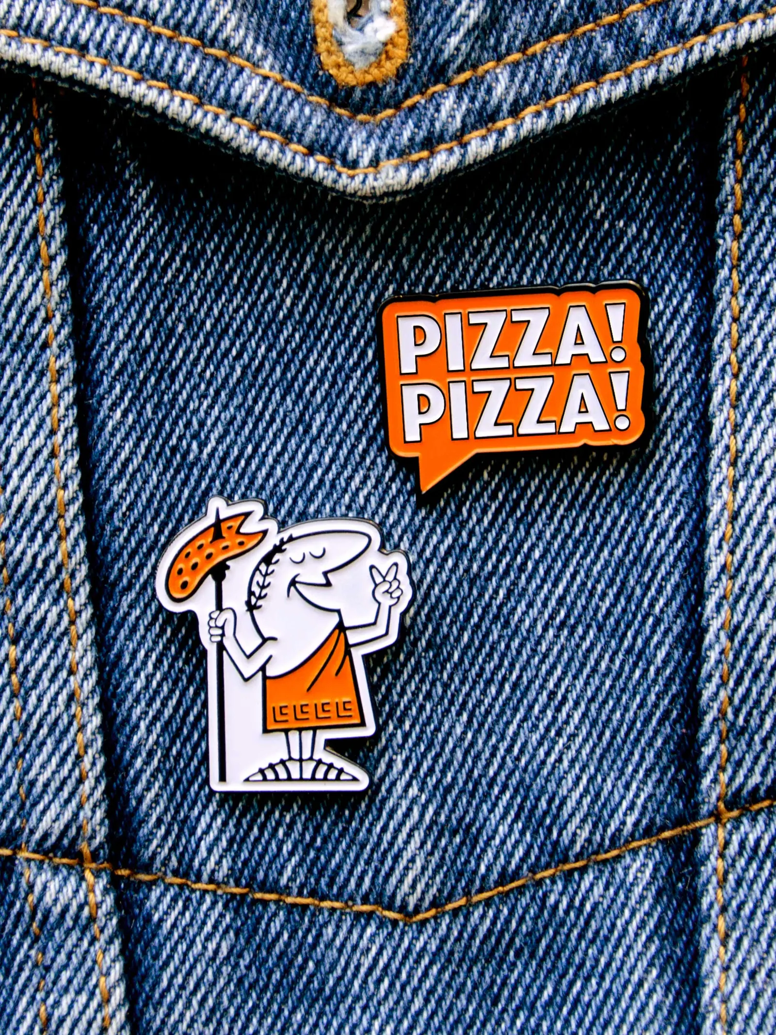
Images and video from turnerduckworth.com, by Turner Duckworth.