The Brand Monograph
Bolt brand identity by Koto
↗Few brands can tie their identity to a number as concrete as Bolt's: its checkout completes in 50 milliseconds. Koto set out to give the company a look and sound with the same sense of pace. Rather than chase speed for its own sake, the studio built the idea around ease. Shoppers meet less friction, and merchants gain customers who come back.
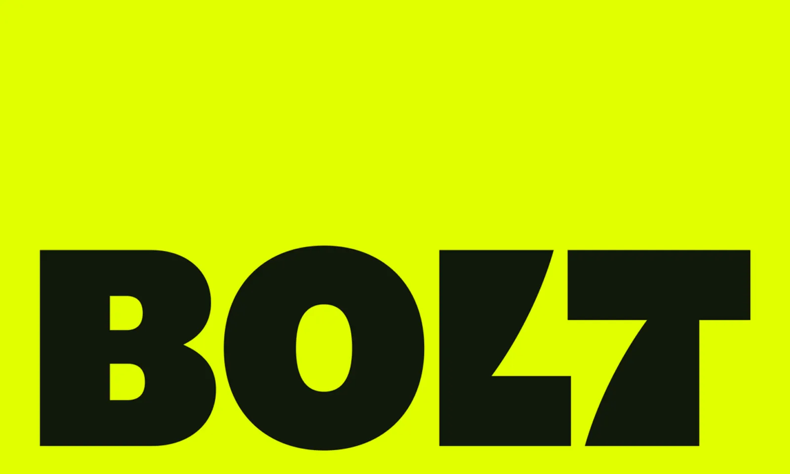
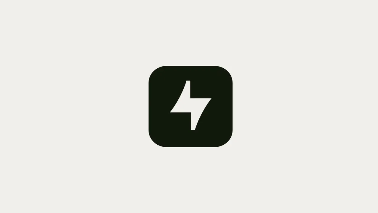
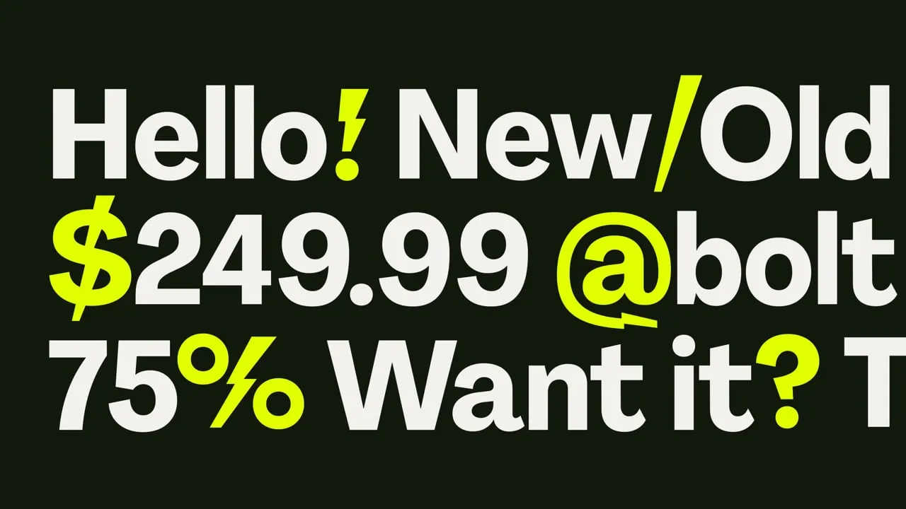
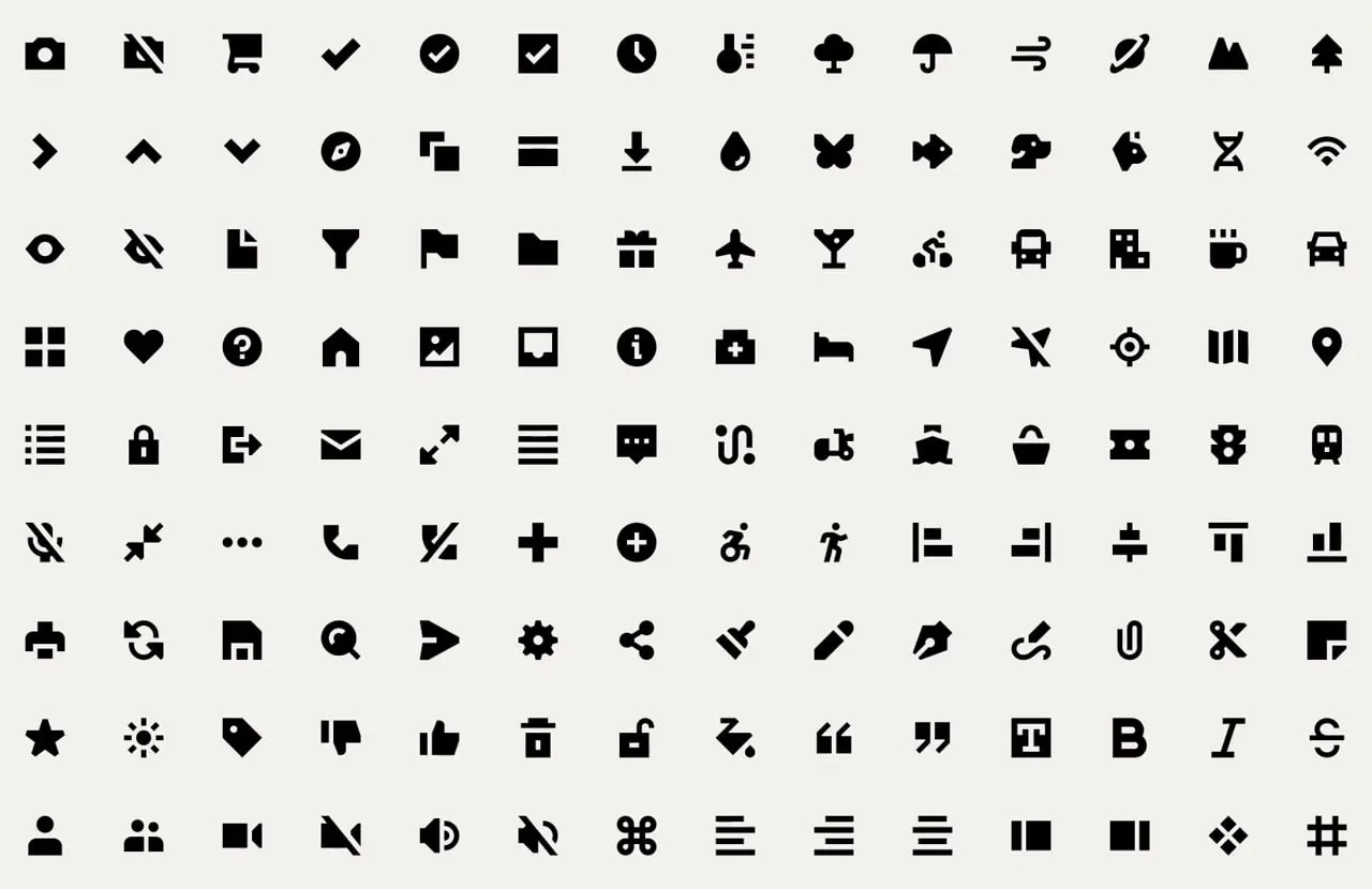
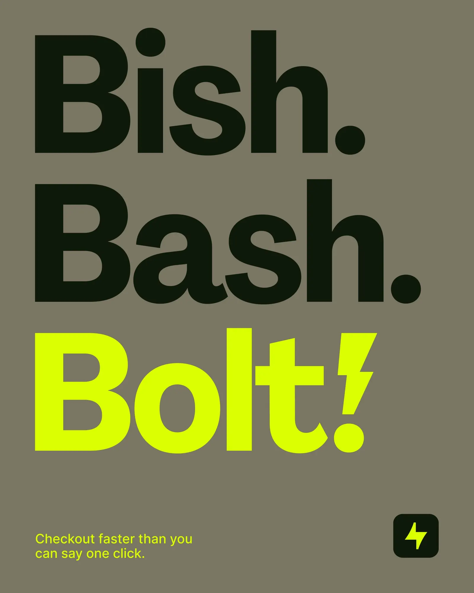
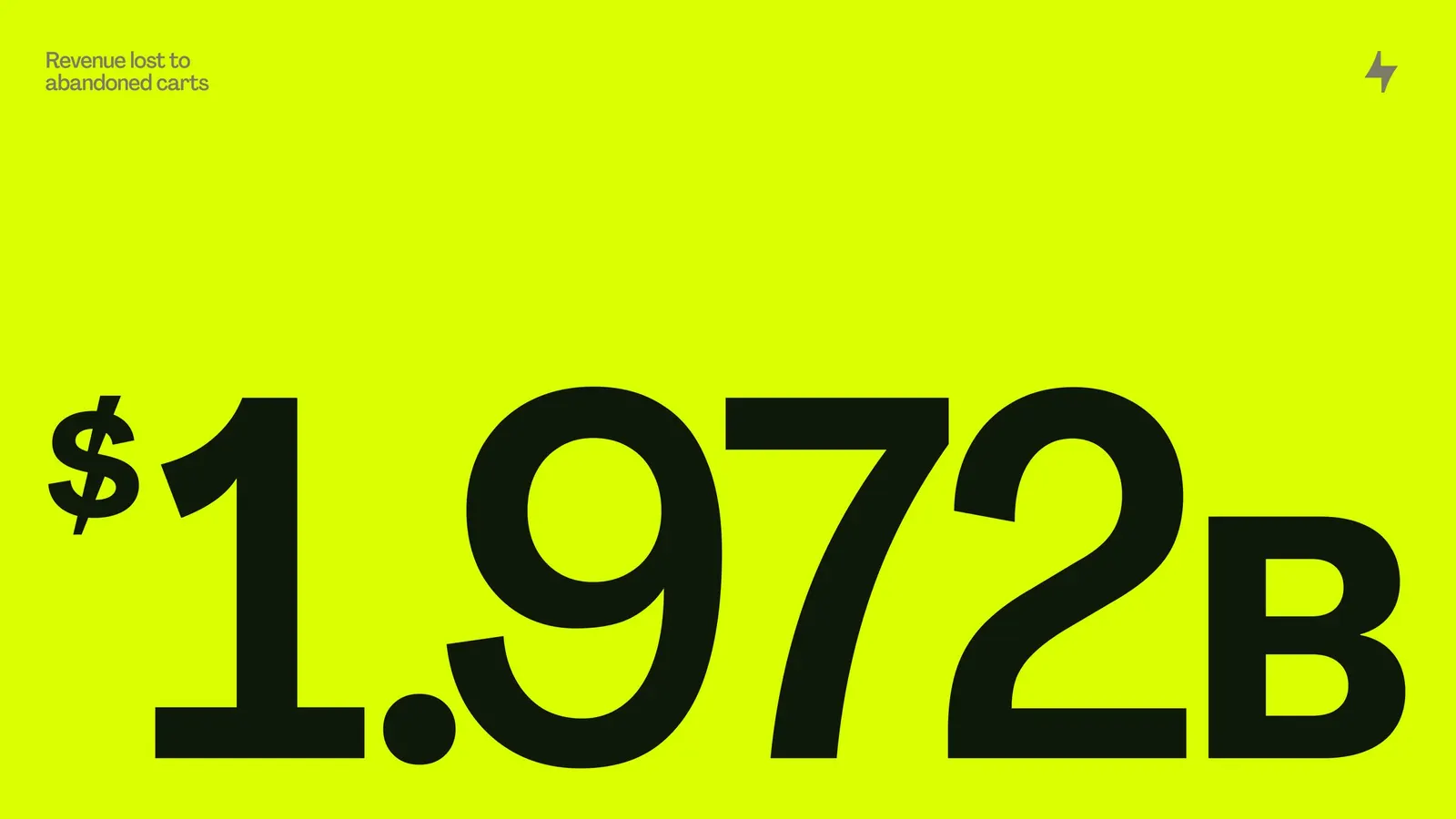
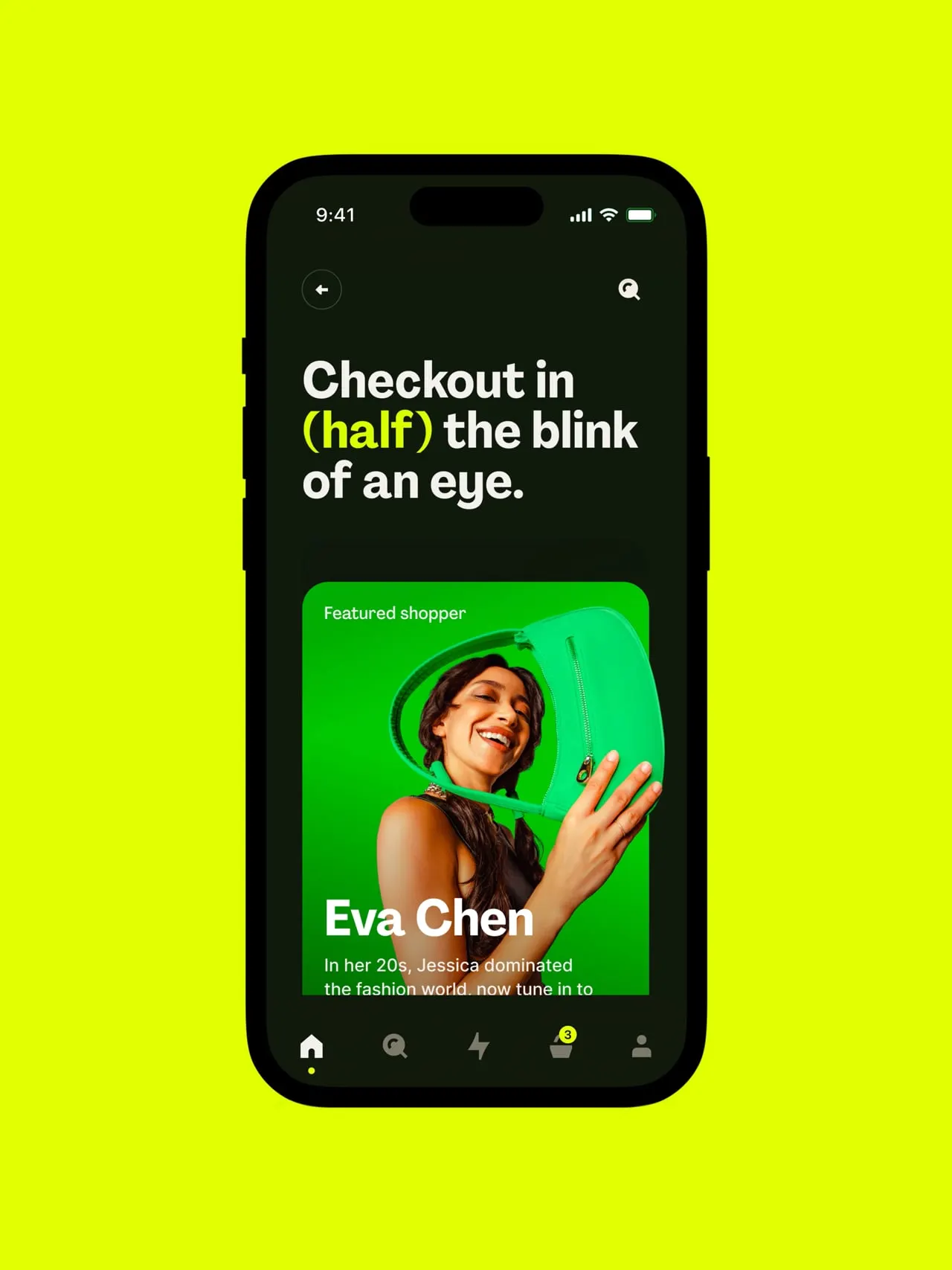
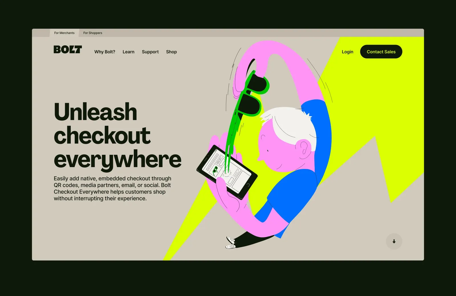
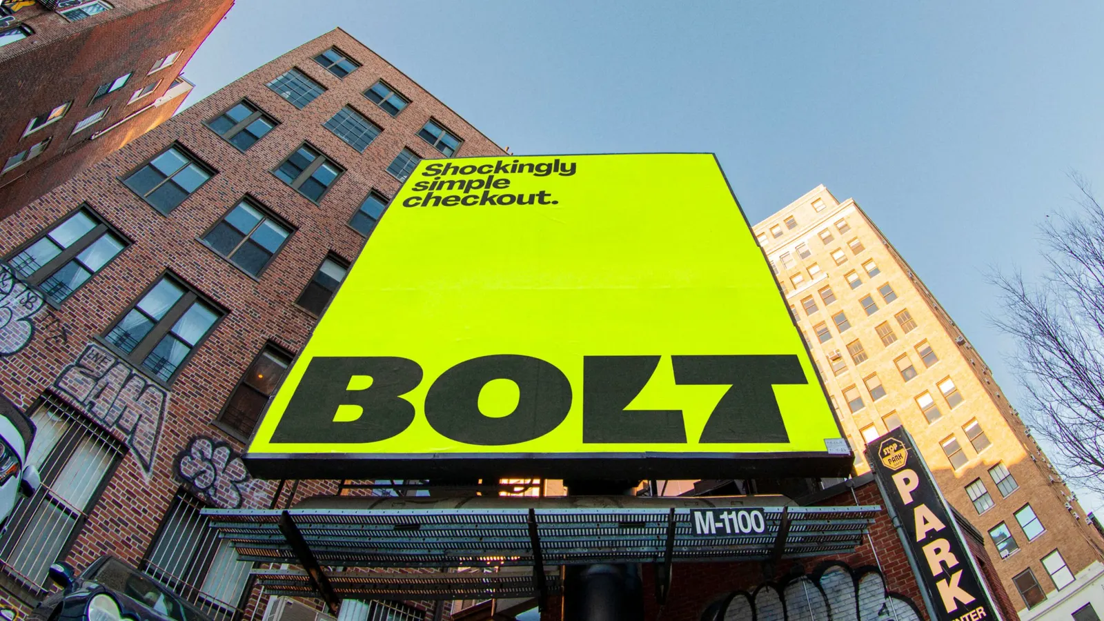
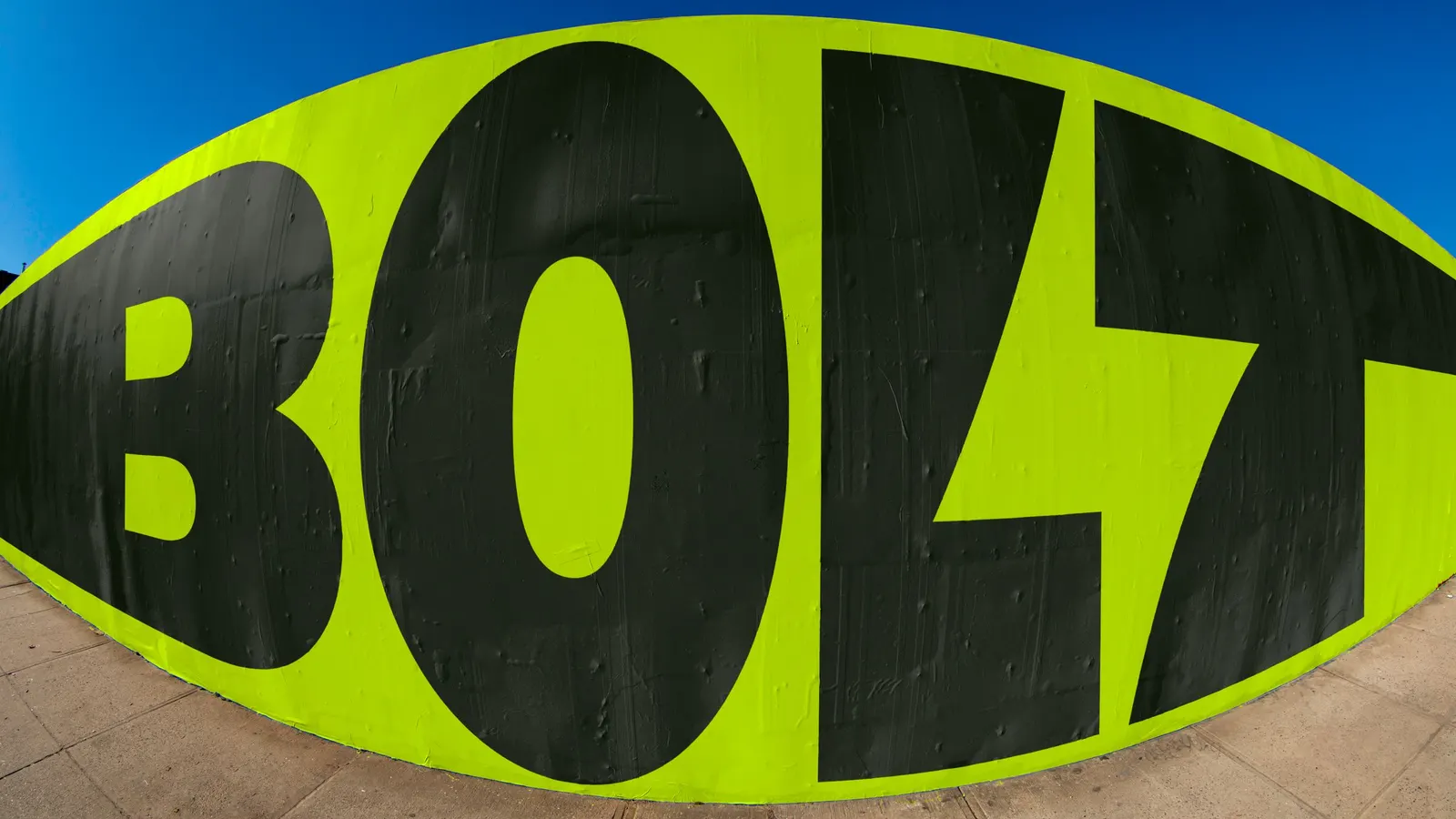
The identity starts with a sharp new logo and custom typography developed with Pangram Pangram Foundry, paired with a bold, saturated palette. Motion and sonic branding carry it beyond the static page, while photography and illustration add a human note. Koto applied the system across the interface, campaigns, motion, sound, and code, so the brand behaves the same way wherever the product appears.
Why it works
Payments technology often defaults to cool, reassuring, interchangeable visuals. Bolt's name offers a literal symbol, and Koto commits to it with a pointed mark and custom type that read more like a consumer brand than back-end infrastructure. That suits an audience of merchants who need confidence and shoppers who barely notice the product. Sound and motion do the heavy lifting on speed, so it is felt rather than claimed. The restraint in the system keeps the energy from tipping into noise.
Images and video from koto.com, by Koto.