The Brand Monograph
Cresta AI brand identity by Motto®
↗Motto® gives Cresta, an enterprise AI contact center platform, a brand that finally sounds as sure as its product. The company had a Stanford AI lab pedigree, a $125M Series D, and a new generation of AI agents to sell, yet its visual system held it back in a crowded category.
The studio started from the name, a wave at its peak, and from the idea that AI and human agents work best as partners. Lissajous curves, the looping traces that interacting signals make, shape the wordmark through a stylized C and a flowing A, and the identity gains a standalone symbol. Diatype by Dinamo anchors the typography, and a broader accent palette is built for interfaces and data visualization. Motto® extended the system into a motion pack, pitch deck, guidelines, and press release, with Antinomy building the website.
Why it works
Much of the AI and contact center space leans on generic tech cues. A mark drawn from signal curves is more ownable, and it describes what the product does: two parties exchanging information in rhythm. Building that curve into the letterforms means the wordmark carries the idea on its own, while the separate symbol gives product screens a compact option. The accent palette, designed with data visualization in mind, shows the brand was made for the interfaces buyers actually use.
Logo
Typography
Applications
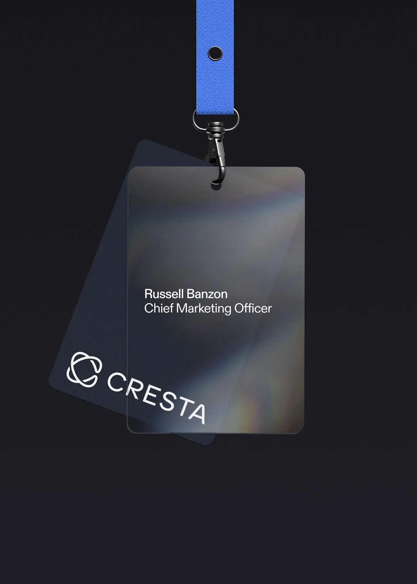
Images and video from wearemotto.com, by Motto®.