The Brand Monograph
Attend brand identity by Motto®
↗Home services is a category built on invoices and emergencies, and Motto® set out to make Attend feel like the opposite. The studio worked with the home concierge company from naming through launch, using its Flagship® process to shape a brand for two audiences at once: homeowners who want less to worry about, and tradespeople who deserve better treatment.
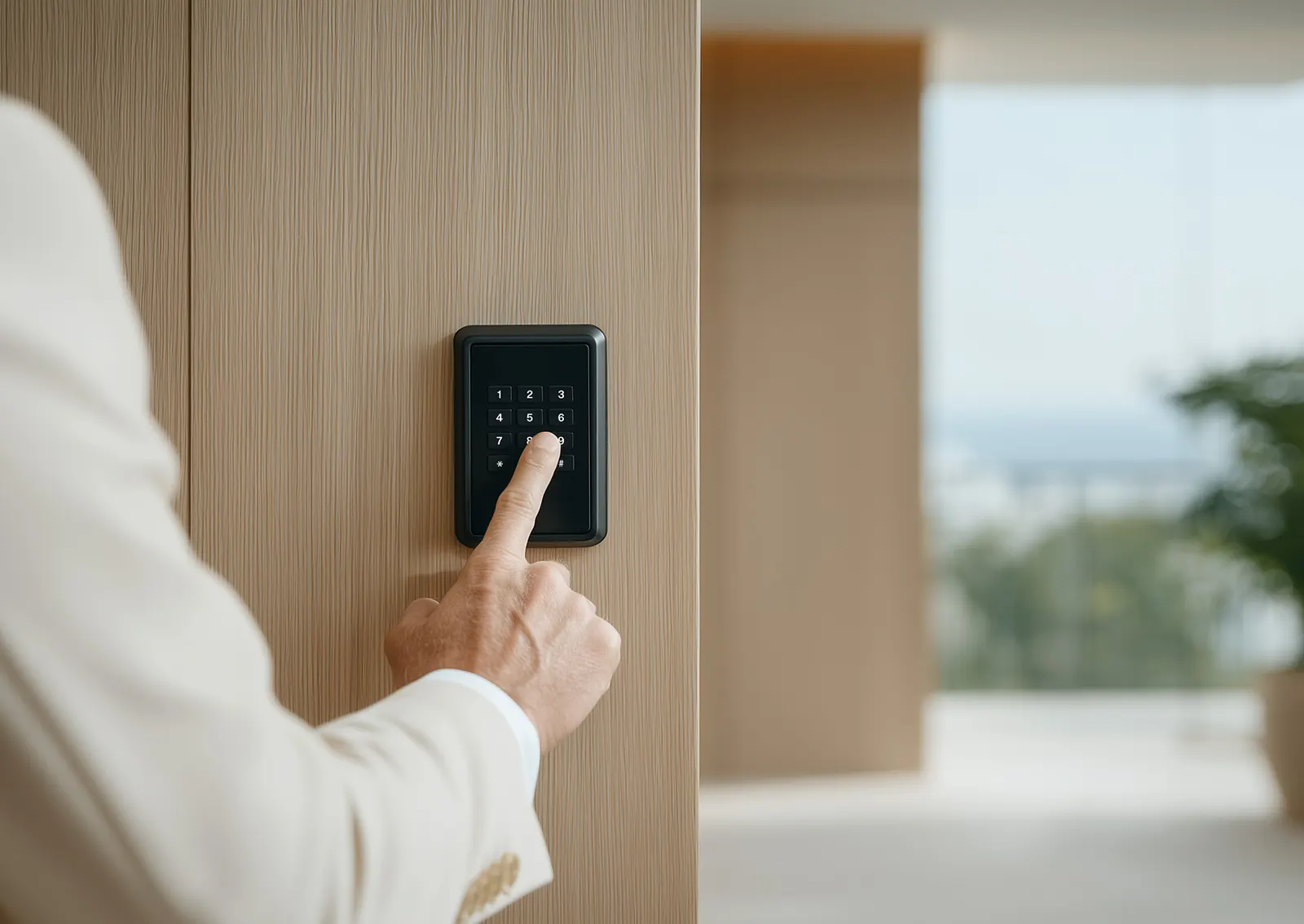
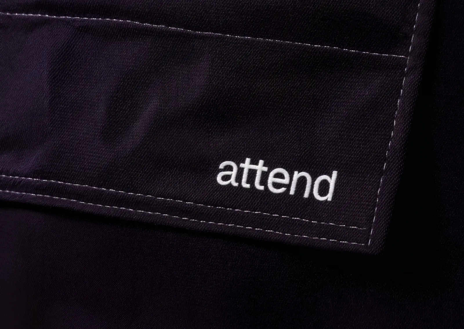
Motto® positioned Attend against transactional incumbents like American Home Shield, building on the Nurturer archetype to center care and stability. The name signals presence, and the voice stays measured and plain. The identity pairs a soft-geometry logo with custom type and a natural palette. Before production, the studio used Midjourney and Krea to render lifestyle environments, which gave the team a fast way to test imagery across user types and markets.
Why it works
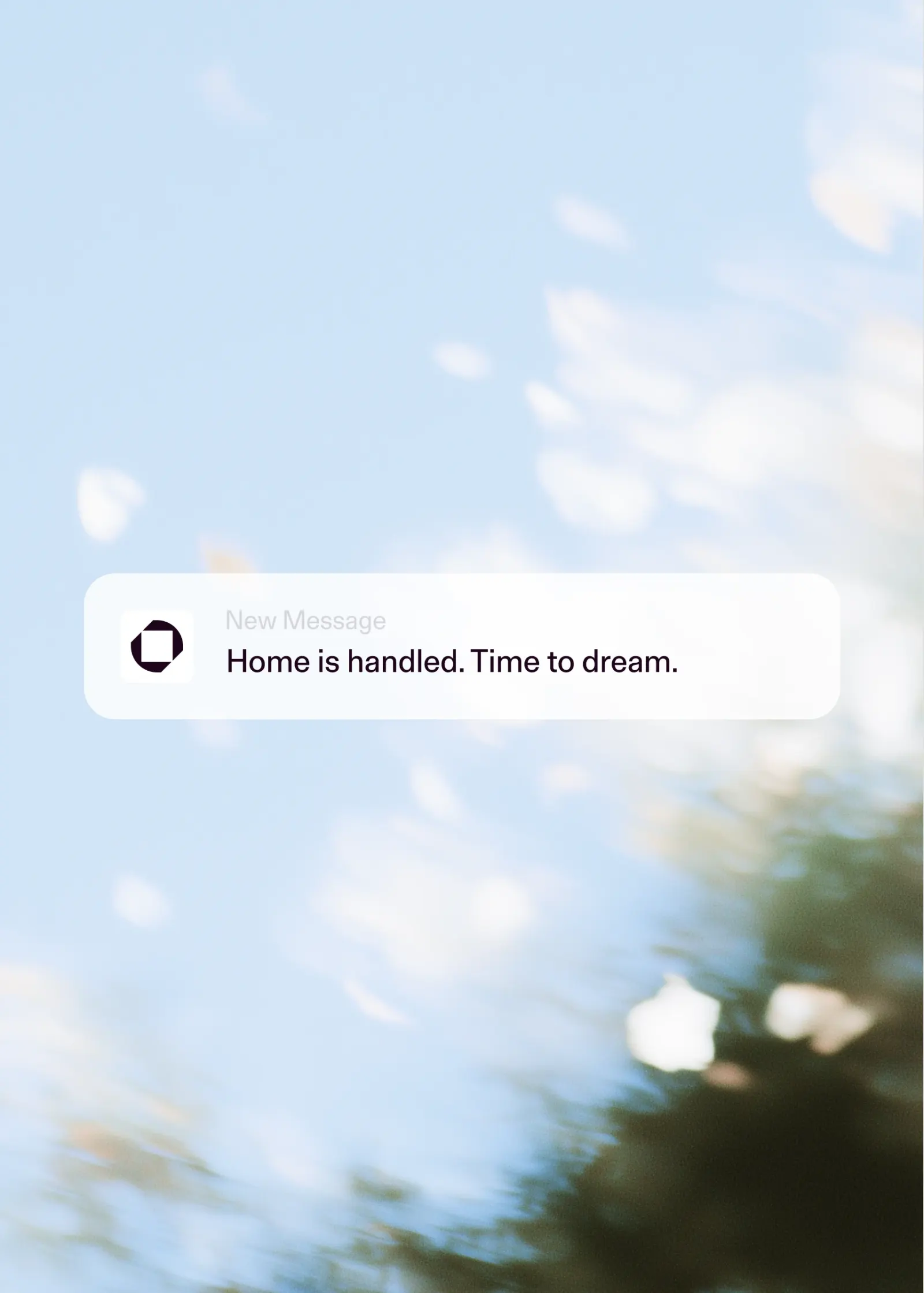
Most home services brands lean on urgency, saturated color, and stock-photo smiles. Attend's restraint is what sets it apart. The rounded, structured forms of the mark feel approachable yet dependable, which matters for a company people let into their homes. Custom type gives the brand a voice no off-the-shelf face could, and the earthy palette keeps the warmth from tipping into cute. The light-filled imagery sells the feeling of a home running smoothly rather than the repair itself, and that shift is the whole proposition.
Images and video from wearemotto.com, by Motto®.