The Brand Monograph
Klaviyo brand identity by Motto®
↗Motto® rebuilt Klaviyo's brand around a simple tension: the company sells data, but its story is about people. Klaviyo, a CRM platform for consumer brands, had the product and the loyal customers, yet its voice had turned cautious and its identity impersonal. After interviews, workshops, and audits, the studio concluded that the entrepreneurial streak was still there and only needed room. Motto® sharpened the positioning, chose the Magician as the brand's archetype, and framed numbers as a way to understand individual customers.
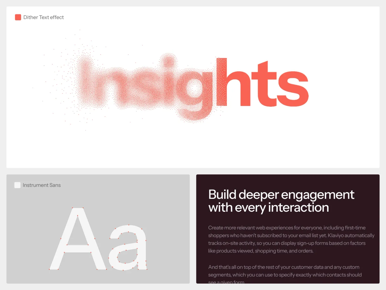
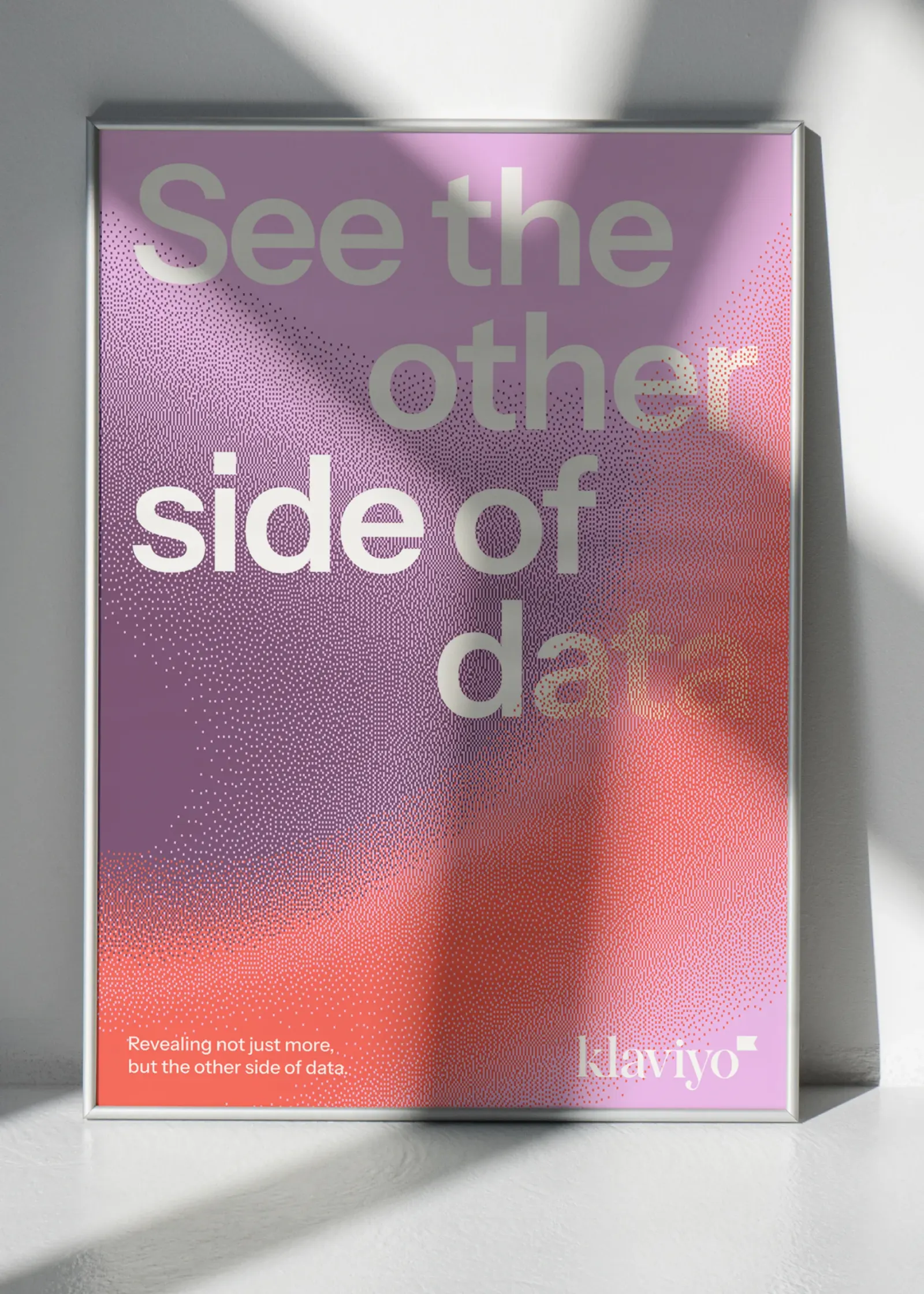
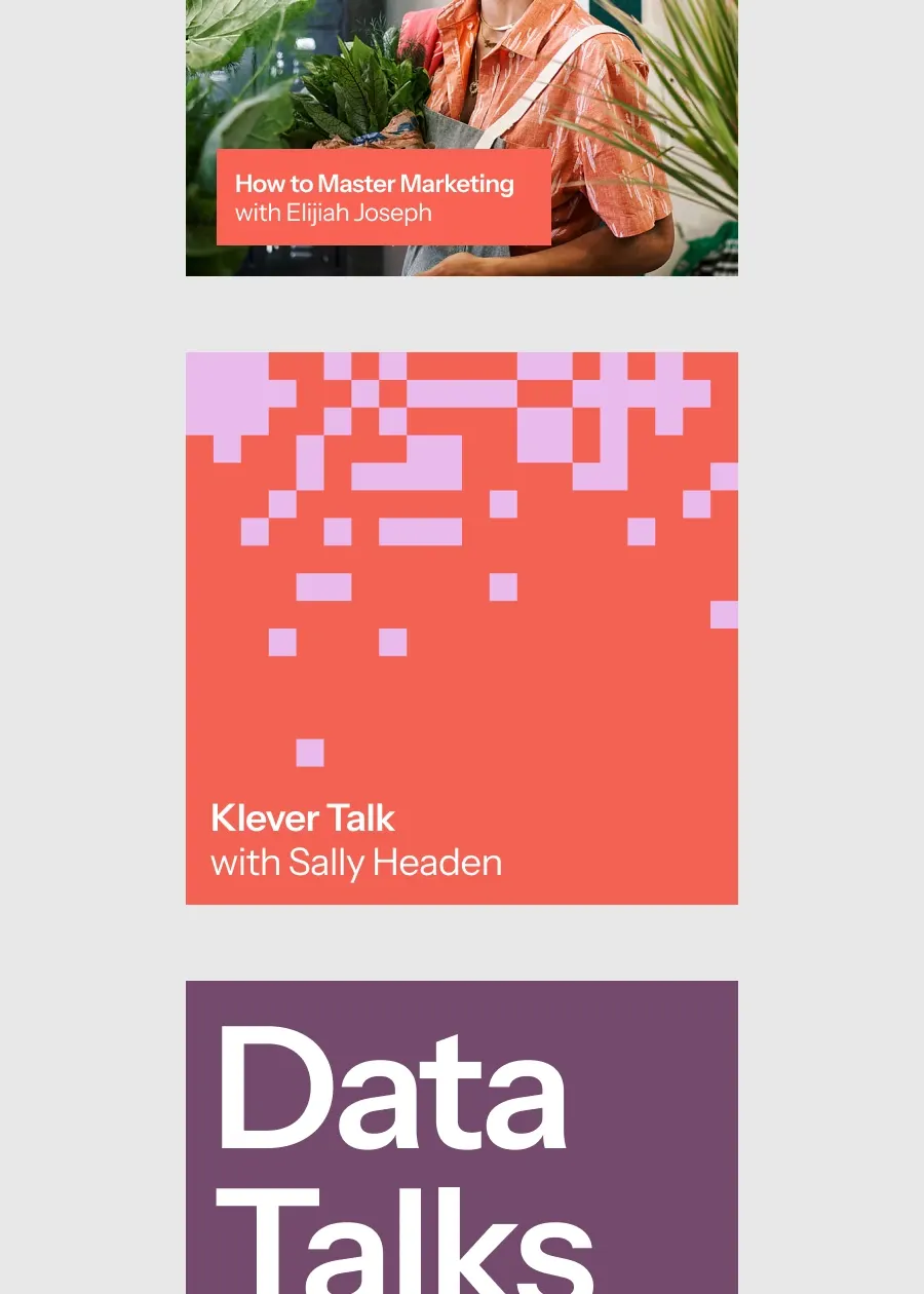
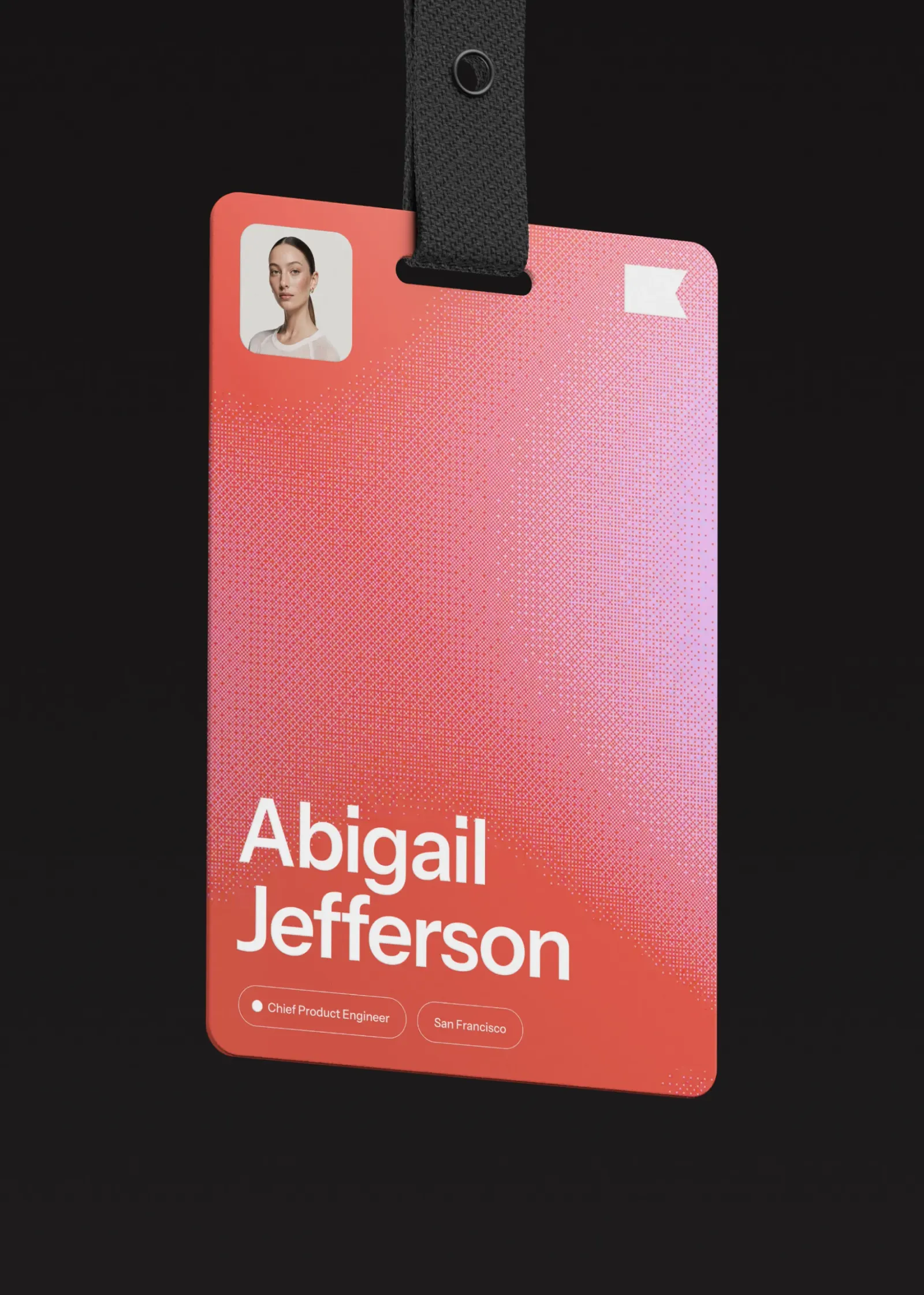
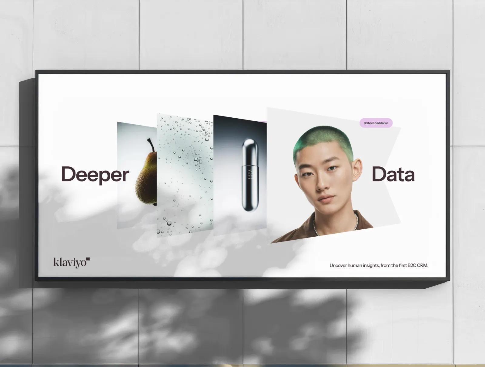
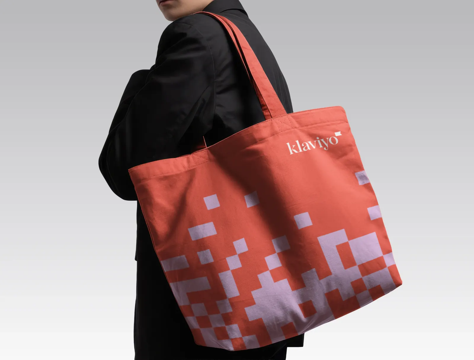
The identity carries that thinking into the details. A dither pattern, meant to read as insight surfacing from layers of data, sits alongside graphic frames, product imagery, and photography of real marketers and customers. Motion and video extend the stories. A refined logotype and a flag icon suggesting new frontiers anchor a type system that pairs precision with warmth.
Why it works
The dither pattern is the smartest move here. It comes from the texture of digital imagery, so it feels native to a data company, yet it looks tactile and slightly handmade, which is far from the cold dashboard look common in marketing software. The flag gives the brand a compact, ownable symbol with some optimism in it. Precise typography tells marketers the product can be trusted, while candid photography keeps the people behind the metrics in view.

Images and video from wearemotto.com, by Motto®.