The Brand Monograph
Lloyds brand identity by Wolff Olins
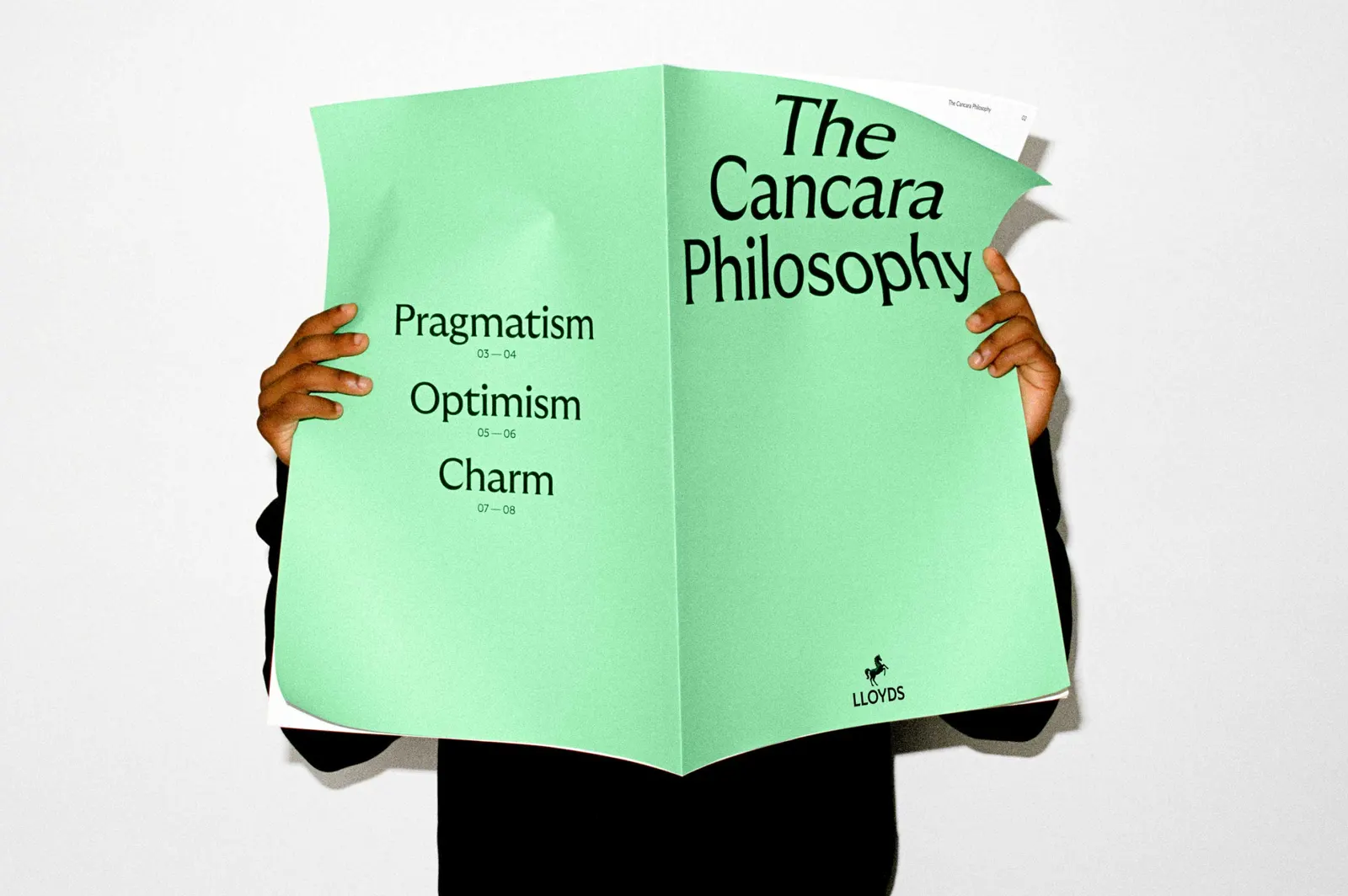
↗Few banks let a mascot steer the whole brand. Wolff Olins built the Lloyds identity around Cancara, the original black horse, and turned that history into a design philosophy that governs the mark, motion, type, color, and voice.
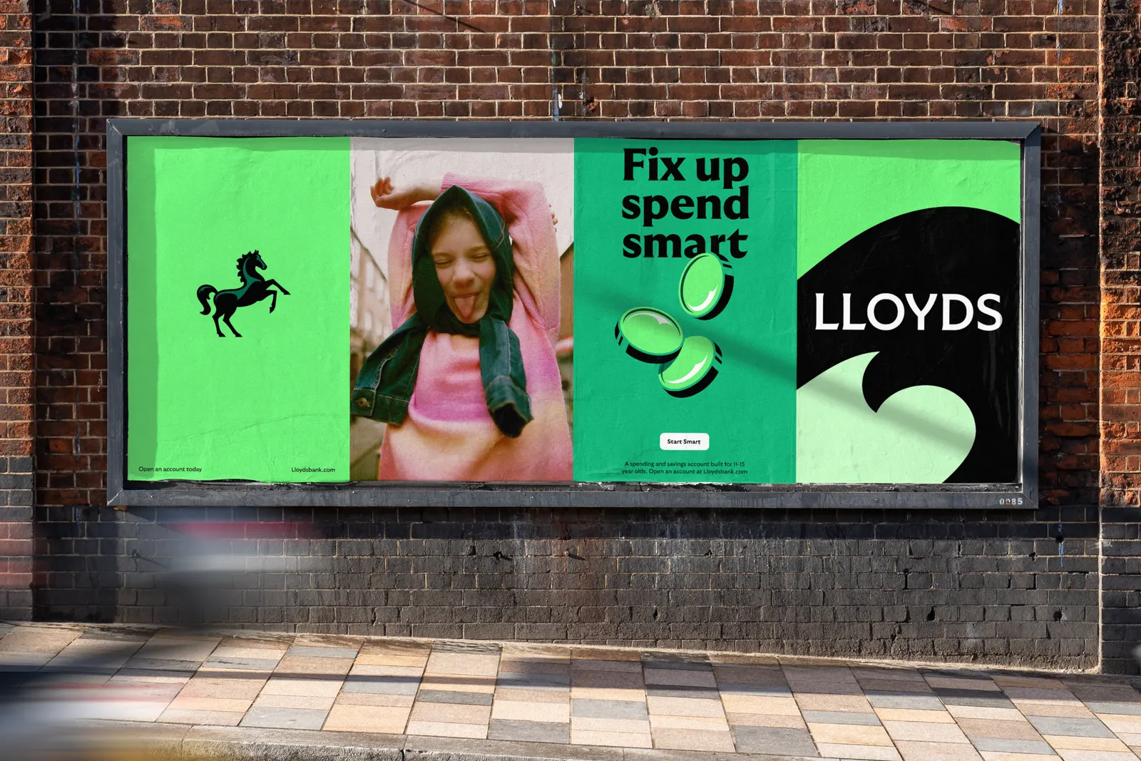
The brief arrived as the nearly 330-year-old bank set out to become digital-first under new CMO Suresh Balaji, with its many products presented as one offer. The studio answered with a flexible positioning about forward momentum, usable by consumer and business teams alike. The craft shows in the details. An equine expert was consulted so the stylized horse could move believably, and the motion borrows from real gaits. Grilli Type's GT Ultra was customized with early 20th century British character, and Lloyds green was reclaimed rather than replaced. Photography from Kintzing and Sophie Green reflects present-day culture.
Why it works
Most banks end up with abstract marks and interchangeable palettes. Lloyds has a real animal with a pedigree, and Wolff Olins treats it as a source of behavior as well as a logo. Movement makes "forward" something people see in an app, not just read in a line. The British-flavored type feels established without turning stiff, and keeping the green preserves recognition while the rest of the system modernizes. Together, these choices make the brand easy to spot and hard to imitate.

Images and video from wolffolins.com, by Wolff Olins.