The Brand Monograph
Uber brand identity by Wolff Olins
↗Few identity projects are measured in years rather than launches, and Wolff Olins's work with Uber is one of them. The studio joined in 2017, when a new CEO set out to repair a company whose aggressive growth culture was starting to show cracks. Wolff Olins treated the brief as cultural before visual, working on the unmet needs of drivers, employees, and riders, from a regional mindset in Latin America to a global employee proposition.
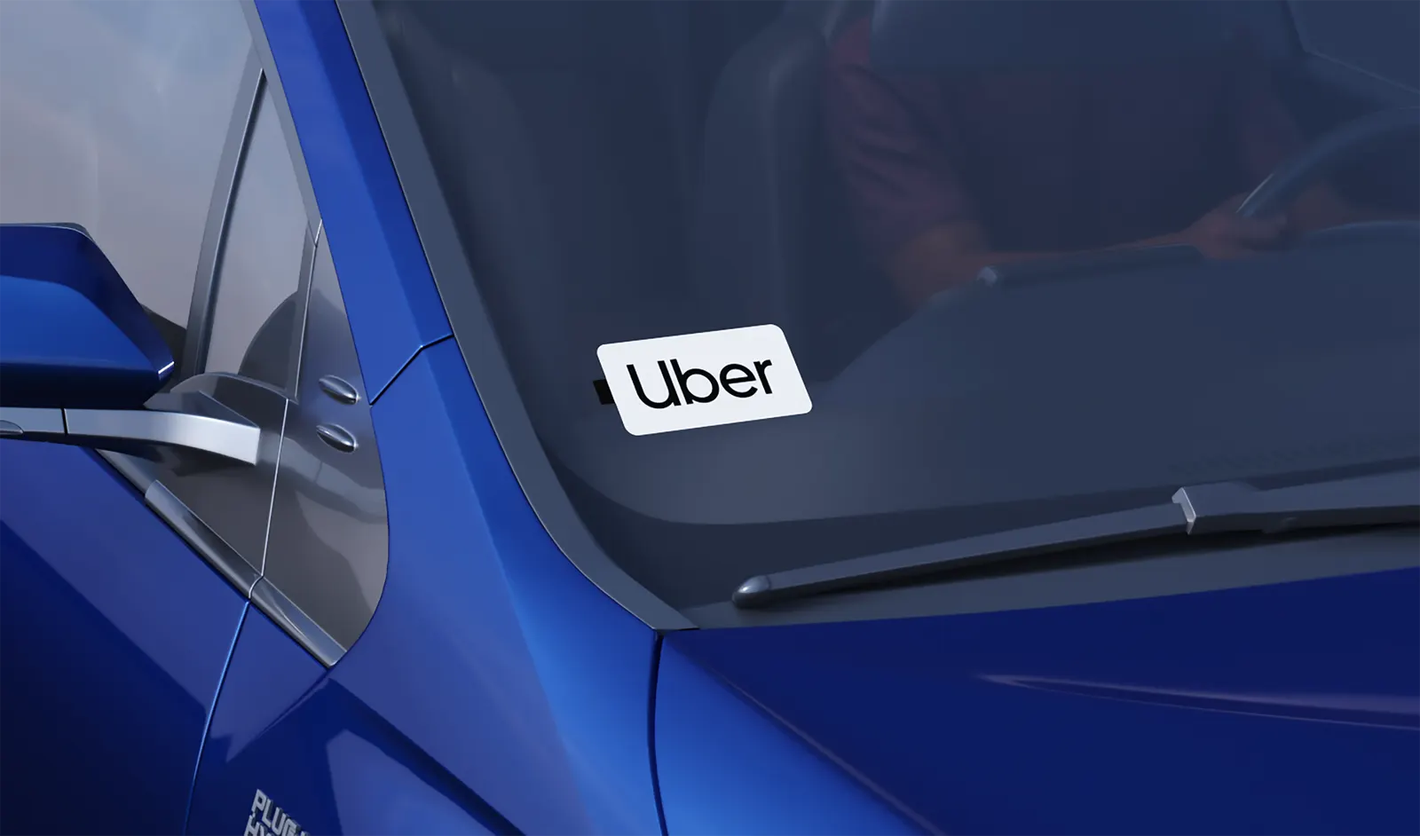
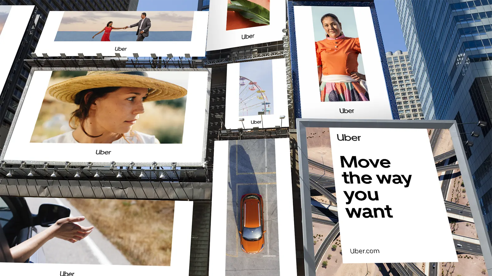
That thinking carried into the identity. The studio gave the brand a dedicated blue to signal its renewed commitment to safety, simplified the brand architecture ahead of the 2019 IPO, and built a global design language informed by 200+ stakeholders across 11 functional teams and five territories. MCKL Type Foundry collaborated on the typography. The partnership later reached office and driver center environments, Uber Boat, and a travel proposition launched in the UK. Brand value rose 51% ahead of the IPO.
Why it works
Ride-hailing apps look alike, and Uber's advantage is that its identity was built on a promise rather than a flourish. Giving one color a clear job, safety, makes a utilitarian product feel accountable, and it is easier to own than a logo tweak. Typography developed with a foundry gives the brand a voice that is recognizable in any city. A design language shaped for localization acknowledges that people meet Uber in very different places. The fieldwork behind it is visible in how coherent the system feels.
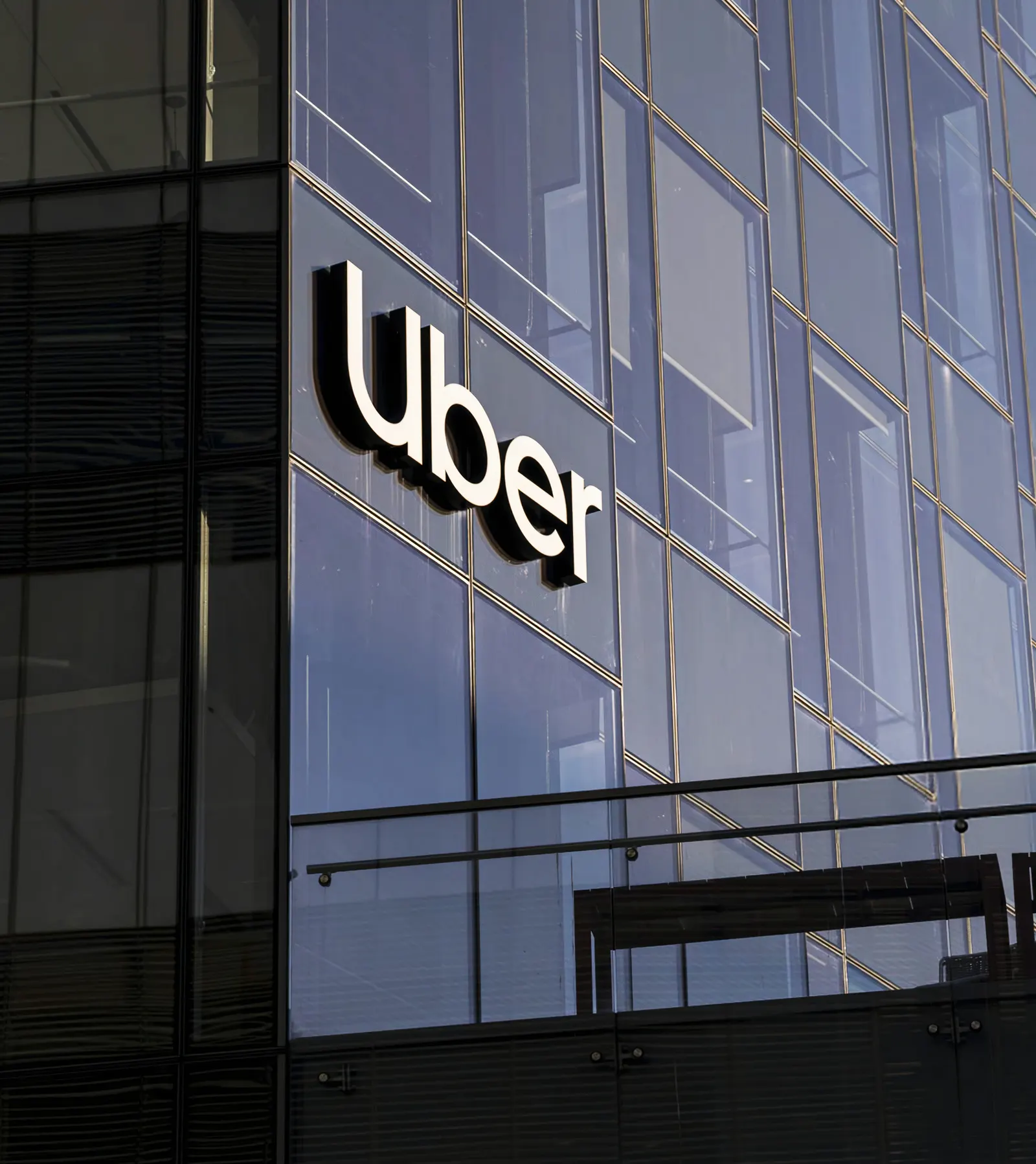
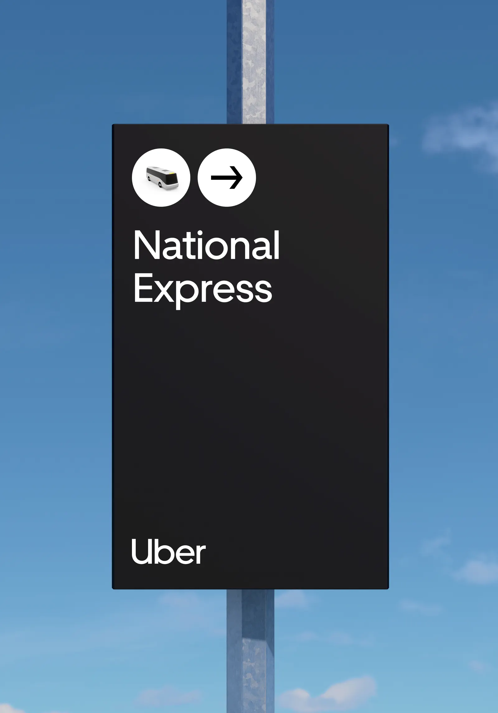
Images and video from wolffolins.com, by Wolff Olins.