The Brand Monograph
GSK brand identity by Wolff Olins
↗Few rebrands have to do as much quiet work as this one. When GSK began separating from its consumer healthcare arm in 2020, it became a pure biopharma company, and Wolff Olins was brought in to give that narrower focus a face, a voice, and a shared culture. The centerpiece is a logo the studio calls the signal, drawn to point forward.
Around it, Wolff Olins built a system of curved forms that nod to the human immune system, paired with bioscientific imagery that gives the brand a distinct visual world. F37 Foundry supplied the typography, and Neverbland handled development so the identity could move across digital, social, and physical settings. It launched in June 2022 and drew 247,000 social mentions in its first month, 97% of them positive.
Why it works
The strongest decision is the clarity of the idea. A mark that simply faces ahead gives GSK a direction rather than a decoration, and it stays recognizable while everything around it moves. The curves borrowed from immunology tie the look to what the company actually does, which helps it stand apart from pharma identities that default to generic clinical cues. Because the system was built to flex, one visual language can speak to patients, scientists, employees, and investors without feeling like four different brands.
Logo

Color
Applications
Typography
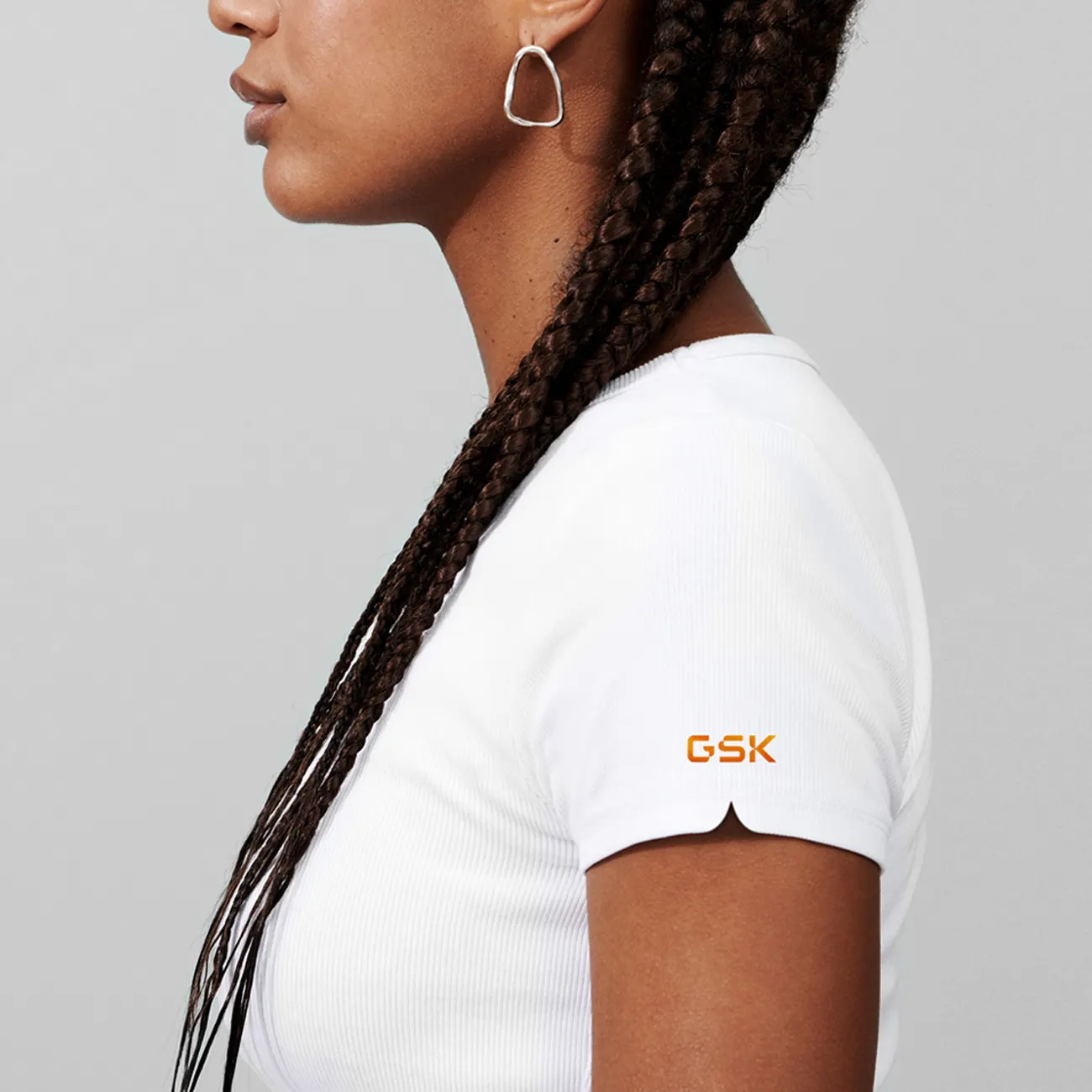
Images and video from wolffolins.com, by Wolff Olins.