The Brand Monograph
Blank Street brand identity by Wolff Olins
↗Wolff Olins gave Blank Street an identity that treats a coffee order as a small piece of everyday theater, and what stands out is how disciplined the system stays while doing it. The brand started as a Williamsburg cart in 2020 and grew into a multi-city chain, and its scrappy challenger look no longer matched its ambitions.
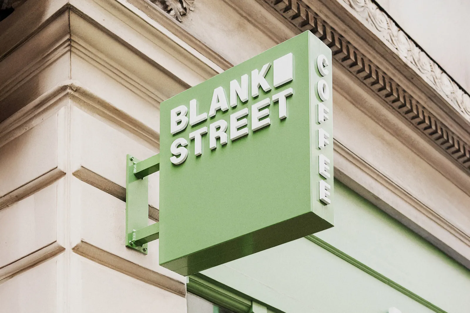
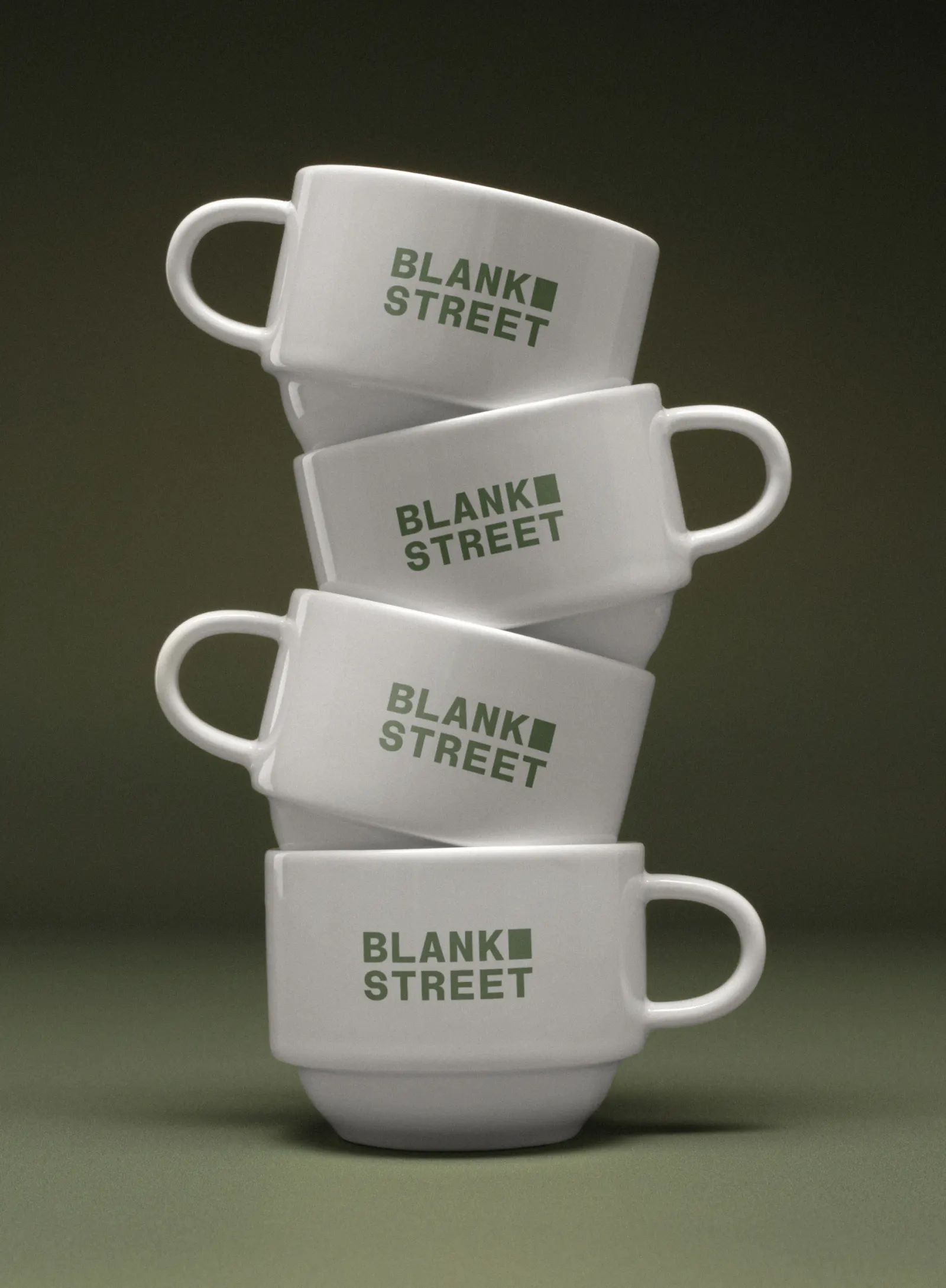
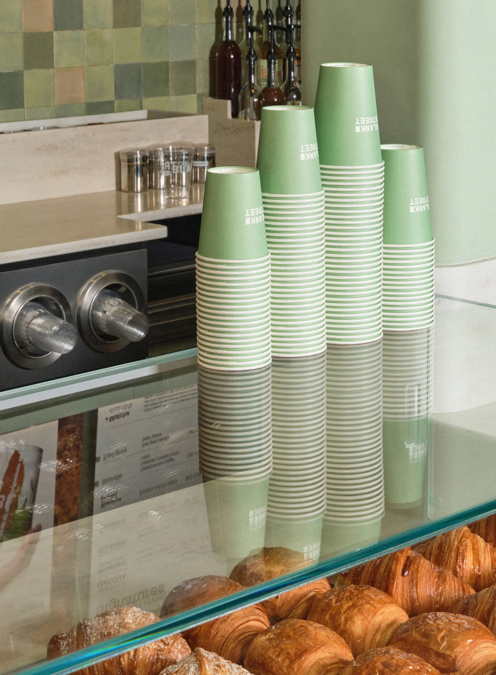
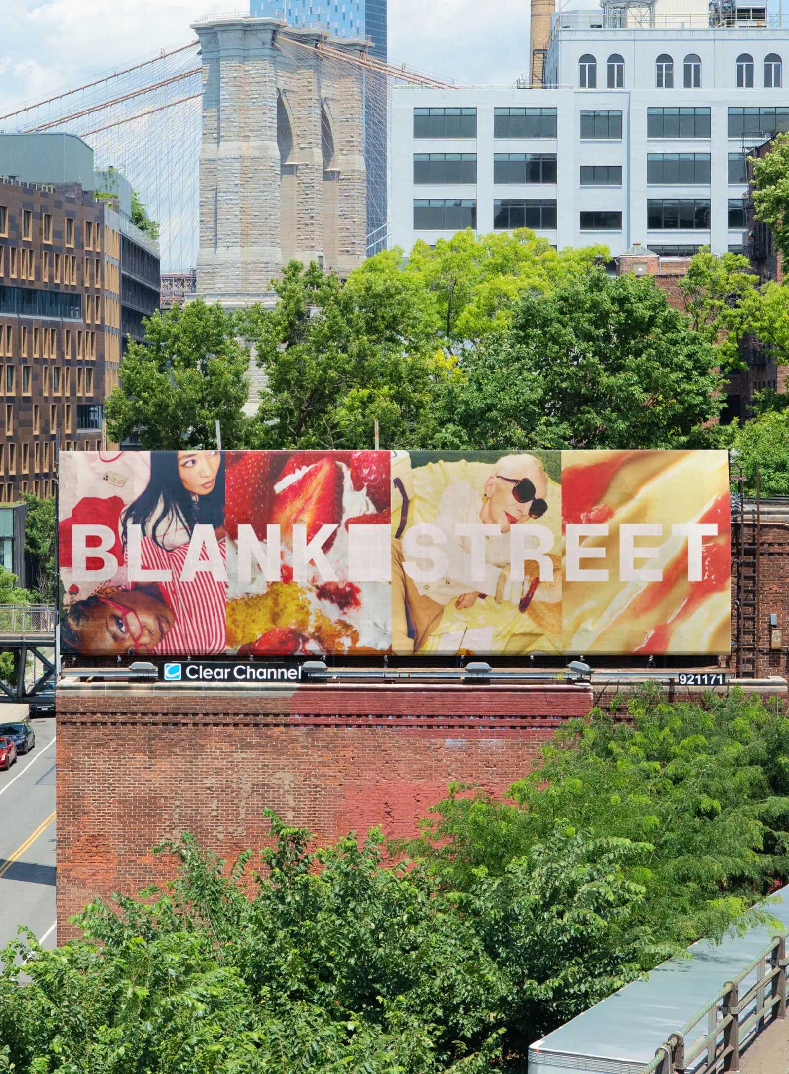
The studio rebuilt the brand from strategy through verbal and visual identity, plus an employer proposition, around the idea that ordinary moments can be worth showing up for. The logo system borrows the rectangular window of the original cart. The palette travels from a morning green to an evening green. Typography, developed with Due Studio, splits roughly 70/30 between a plain sans and a more expressive one. Photography leans on fashion and vintage editorial rather than stock café imagery. In Glasgow, Gen Z accounted for 60% of first-month sales.
Why it works
The 70/30 type split is the smartest move here. It gives the brand a default of calm utility and lets personality arrive in measured doses, so the system stays recognizable without turning loud. Anchoring the mark in the cart's window keeps a real origin story in the identity, which most chains in this category replace with generic warmth. The time-of-day greens tie color to the ritual itself. And editorial-style imagery makes an affordable daily habit feel aspirational, which suits an audience that shares what it orders.




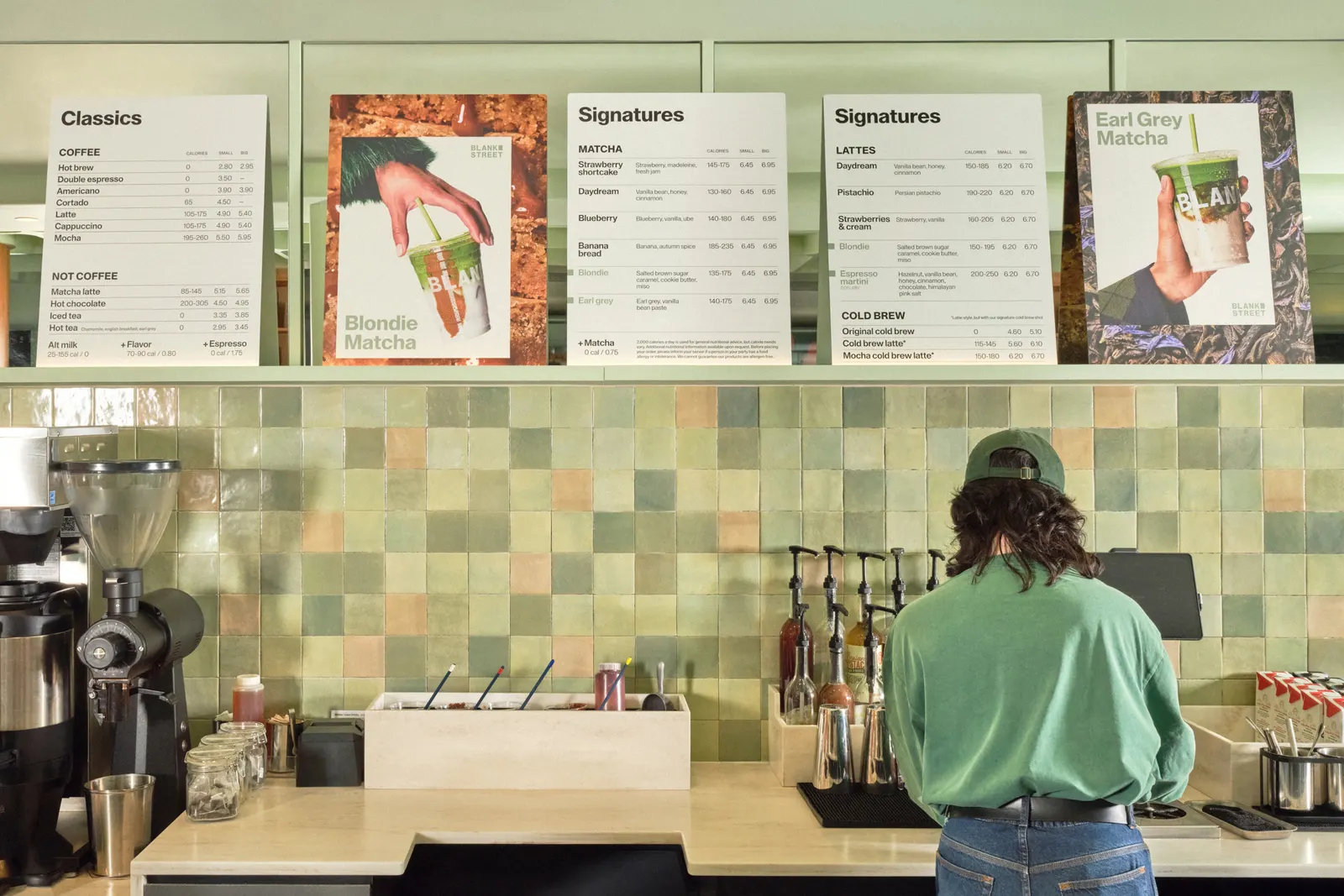
Images and video from wolffolins.com, by Wolff Olins.