The Brand Monograph
Decathlon brand identity by Wolff Olins
↗Few rebrands ask a sprawling retailer to become something people feel affection for, and fewer pull it off at this scale. Wolff Olins took on Decathlon, the world's third-biggest sports company, and folded 85 brands into one that has to work in 70 markets and across 85 sports.
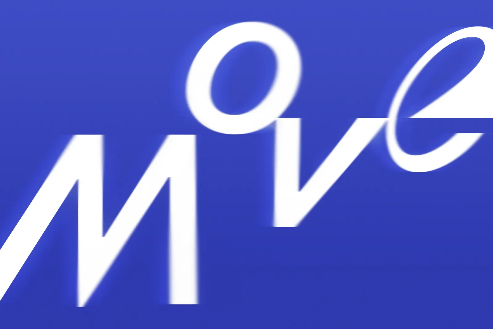
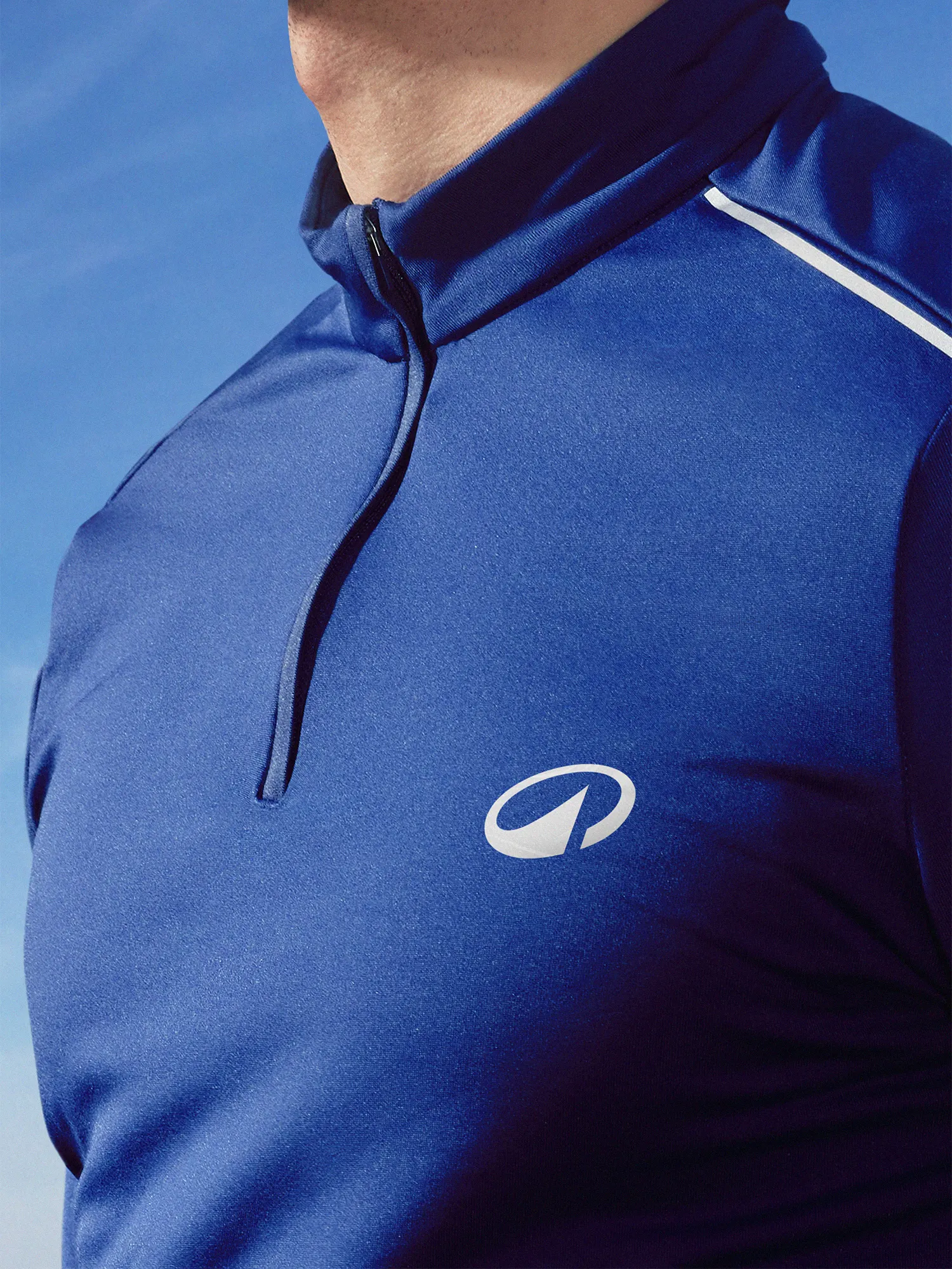
The studio's research showed that people keep playing because they enjoy it, not because they win, and that became a strategy built on wonder. Its centerpiece is L'Orbit, a symbol that suggests circular movement and adds a peak for the outdoors. Around it sit a refreshed blue, a tuned wordmark, and Decathlon Sans, a custom typeface from Grilli Type and Alistair McCready whose alternate characters bend the rules to create motion. Wolff Olins also shaped the voice, art direction, motion, and iconography, with Work & Co on development and Father on sound.
Why it works
Sport branding tends to be loud about victory, so a mark built on circularity feels refreshingly open to everyone. Keeping the blue and taking the symbol's angle from the wordmark preserves recognition while still signaling change. The peak is the smartest detail: it ties an abstract shape to the outdoors without turning it into a literal icon. The typeface's small disruptions give a very large system personality without volume, which matters when the same brand has to sit comfortably on a beginner's kit and a pro's.

Images and video from wolffolins.com, by Wolff Olins.