The Brand Monograph
Instacart brand identity by Wolff Olins
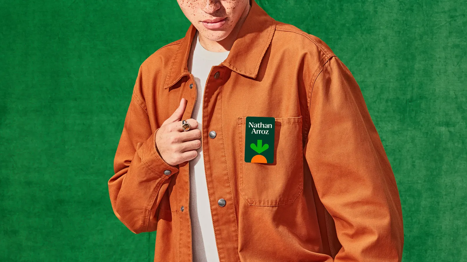
↗The detail that sticks in this Instacart identity is a carrot whose leaves have been pared back until they read as an arrow. It's a small move that lets a grocery icon point toward everything else a cart might hold. Wolff Olins led the work, with Ryan Bugden on typography, after the pandemic pushed delivery into the mainstream and left Instacart with far more competition.
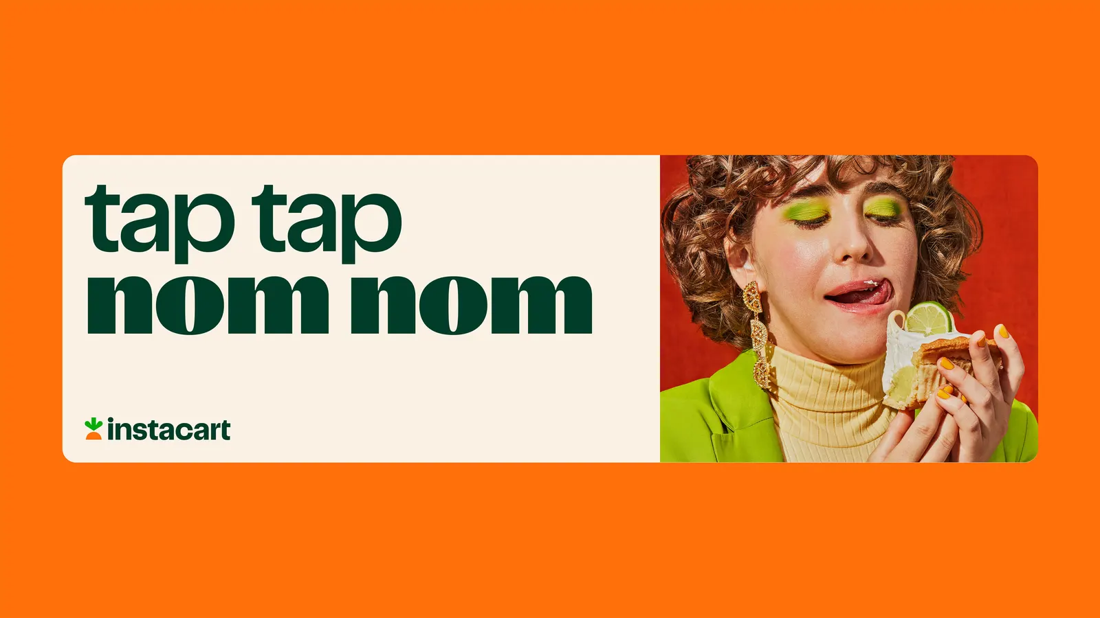
The studio's task was to stretch a grocery brand into broader delivery without losing its warmth. It began with an ethos, Shop+Savor, that pairs the chore of buying with the pleasure it frees up, then carried that pairing into a flexible carrot symbol and type with real appetite. Wolff Olins also helped Instacart form its first creative team and branded the Instacart+ membership. The identity launched in 2022 and won a D&AD Yellow Pencil.
Why it works
Instacart had to broaden without turning generic, and the carrot handles that well. Keeping a friendly, recognizable object protects familiarity, while the arrow adds direction and room to grow beyond produce. The typography stays sensory in a category that can feel like logistics and interface design, so the brand still feels closer to food than to freight. The two-sided idea also shows up in the mark itself, with function and pleasure sharing one simple shape.
Images and video from wolffolins.com, by Wolff Olins.