The Brand Monograph
Nybolig brand identity by Kontrapunkt
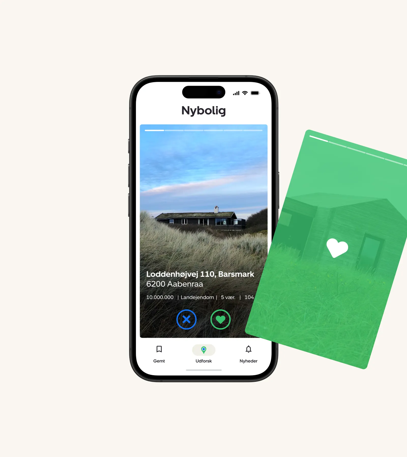
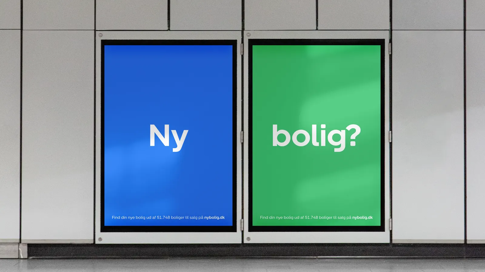
↗Most category leaders coast on recognition. Kontrapunkt's work for Nybolig does the opposite, treating the size of the brand as a reason to make its identity work harder. The Danish estate agent's logo was once a fixed stamp. Now it behaves like a system, with small animated moments, memorable devices, and a communications framework that stays recognizable without turning rigid.
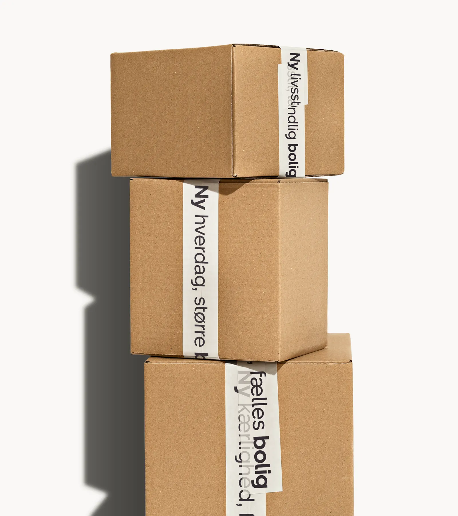
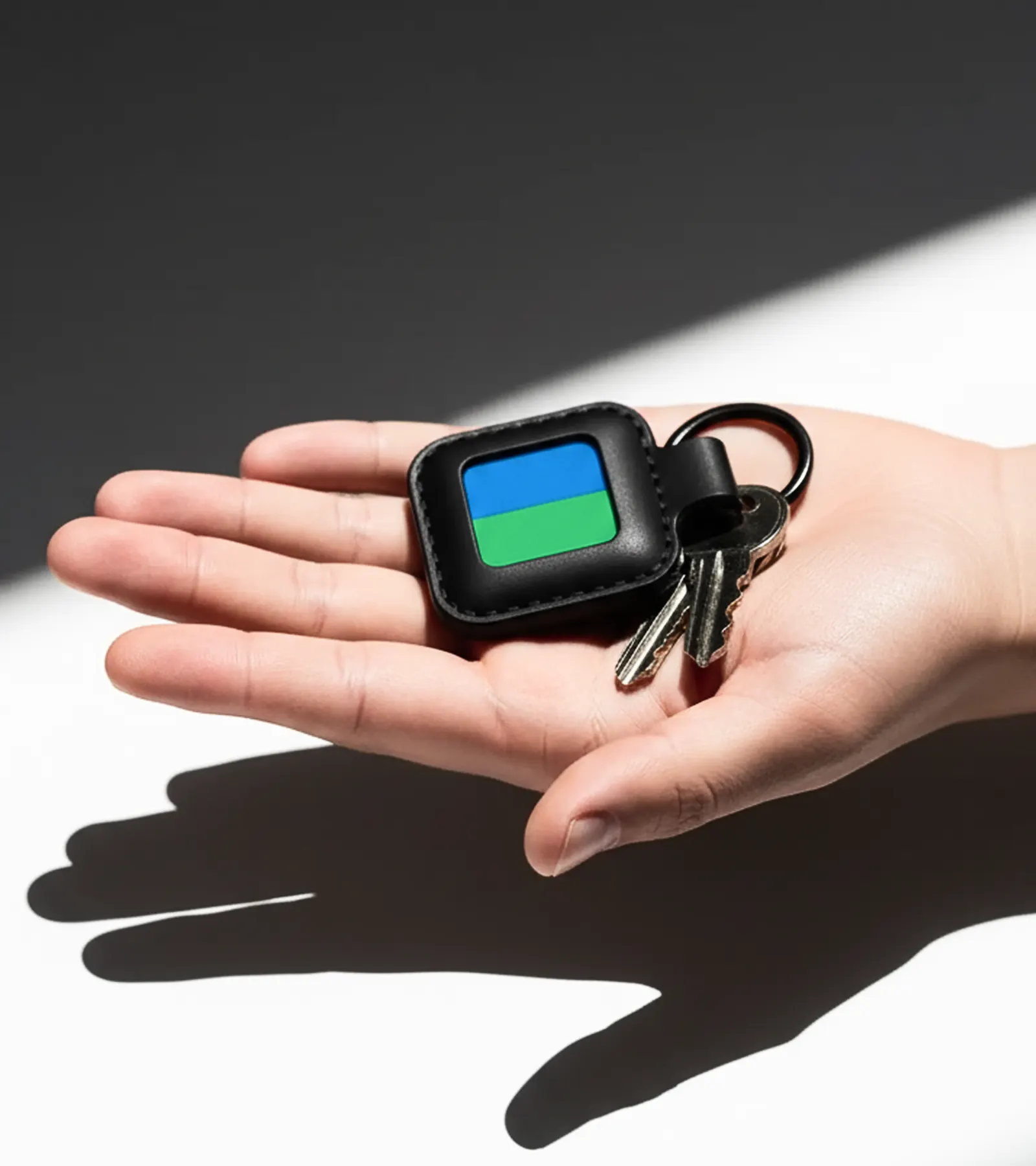
The brief was to carry Nybolig's established assets into far more places than they were first made for. Kontrapunkt answered with a bespoke typeface, reworked digital platforms, merchandise, and signage, all drawn from one toolkit. The street-level "for sale" signs deserve a close look: according to the studio, they bring listings many more views than before.
Why it works
An estate agent is seen in two very different moments: a glance from the pavement and a long scroll on a phone. Turning the logo into a system lets one identity handle both. The bespoke typeface gives Nybolig a voice no competitor can license, which counts in a category where brands often blur together. Putting real design effort into the sign, the most public object an agent owns, shows a clear understanding of where attention is actually won. Leadership here is shown through craft, not just scale.
Logo
Applications
Images and video from kontrapunkt.com, by Kontrapunkt.