The Brand Monograph
Royal Copenhagen brand identity by Kontrapunkt
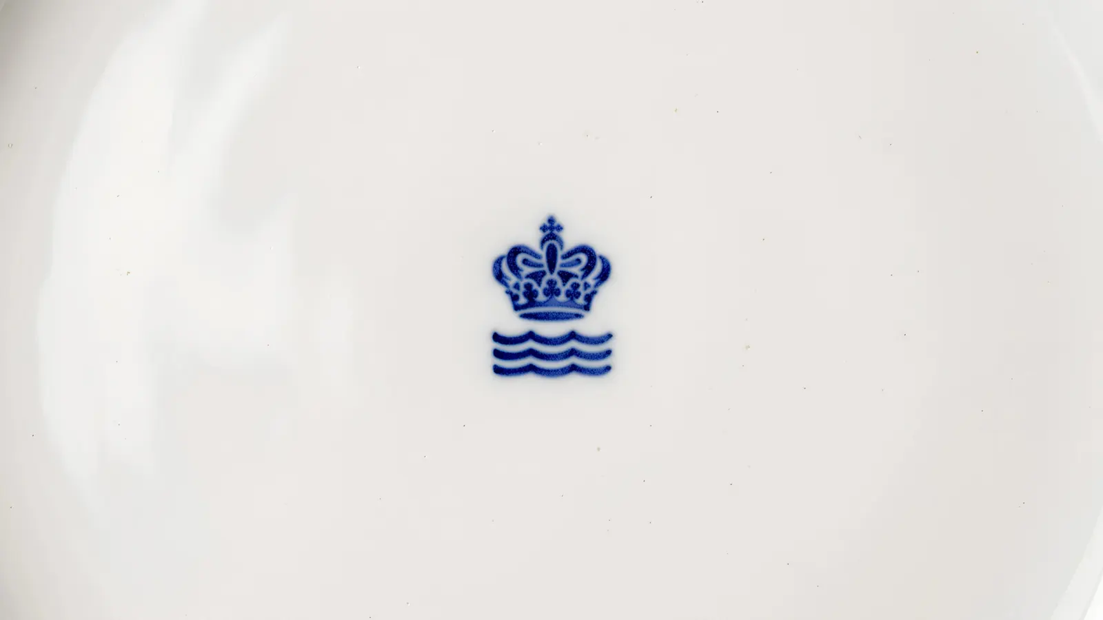
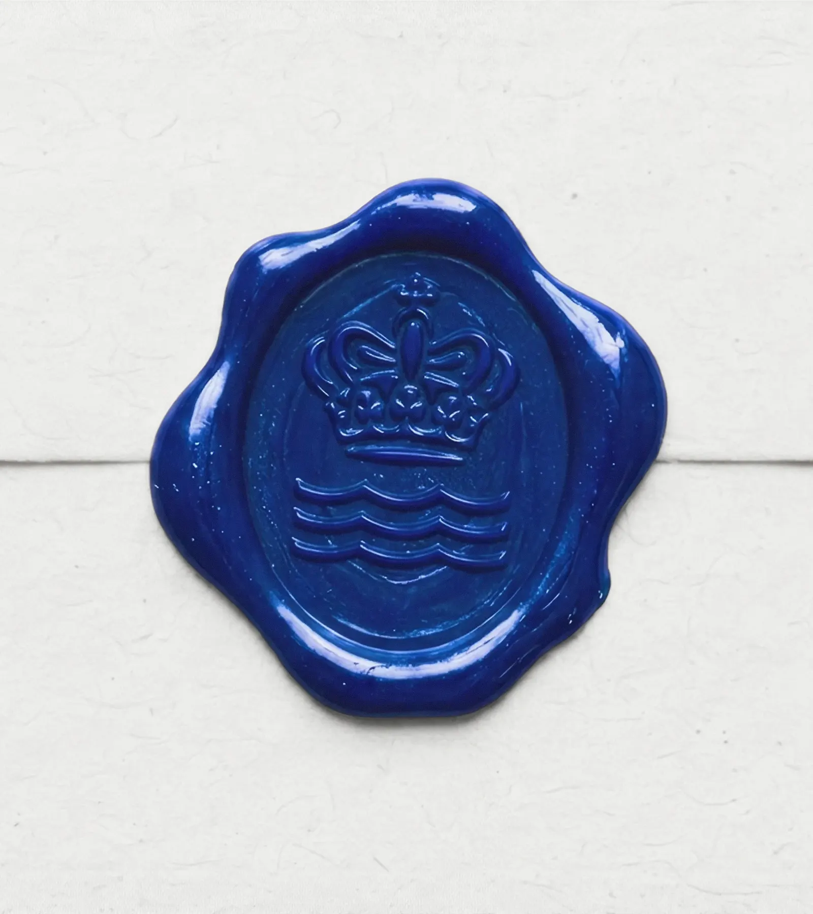
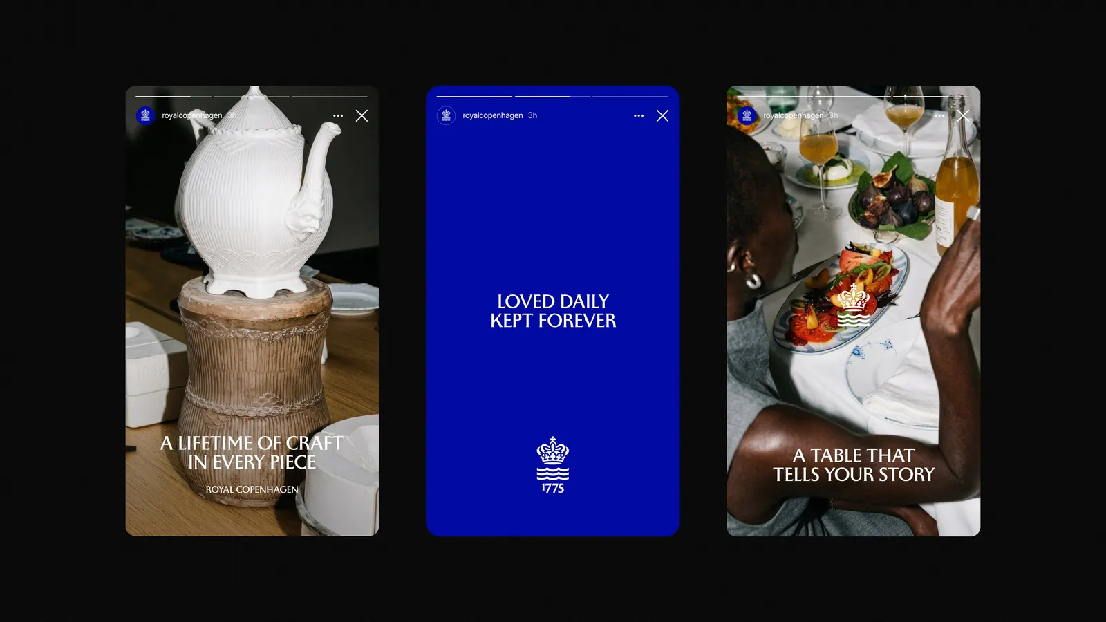
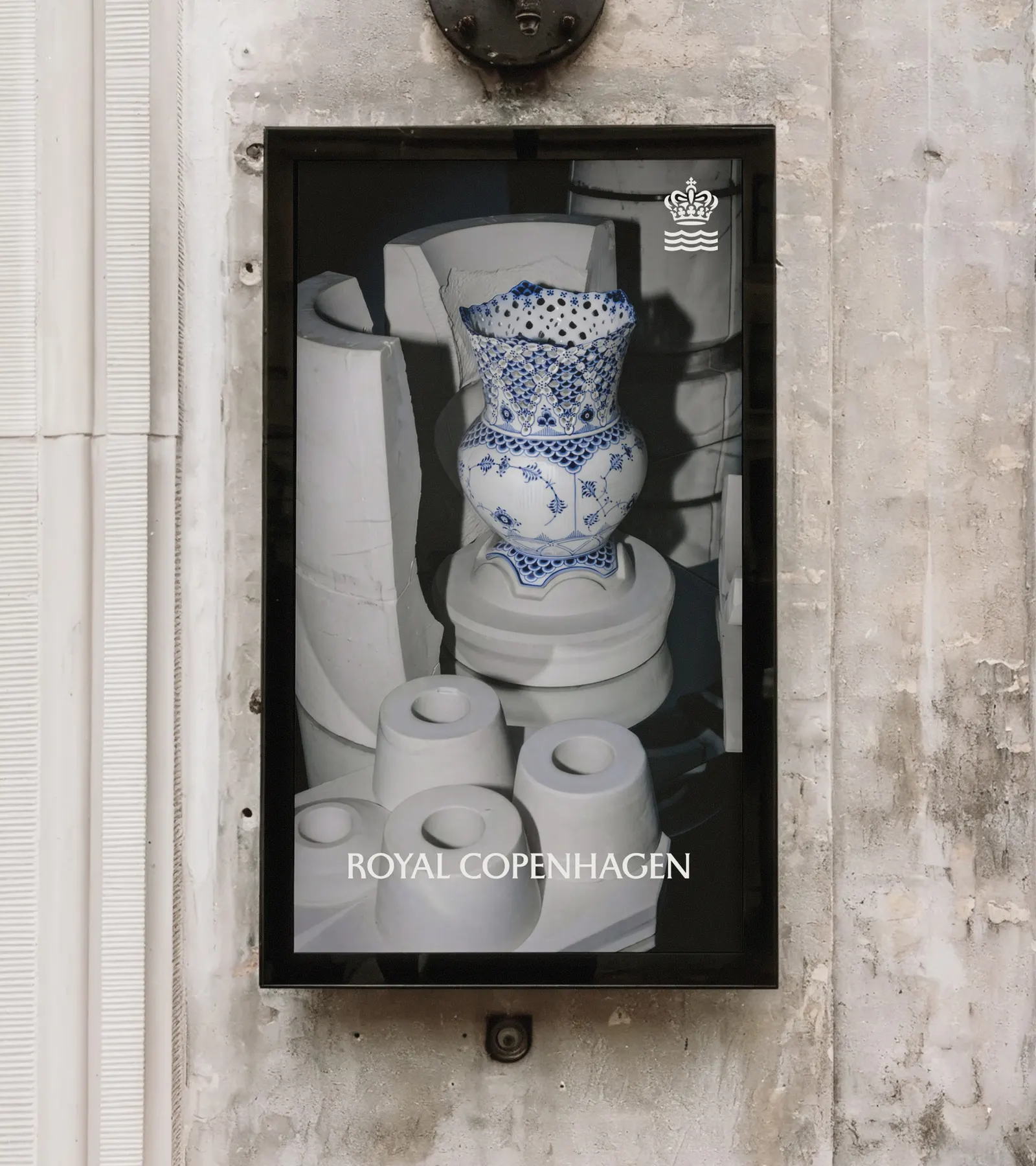
↗Few redesigns carry as much risk as updating a 250-year-old brand, and Kontrapunkt's work for Royal Copenhagen handles it with restraint. Rather than replace the symbols the Danish porcelain maker has used for centuries, the studio redrew them with greater precision.
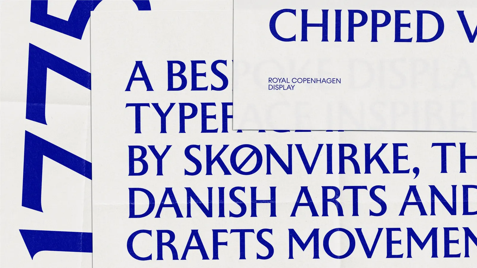
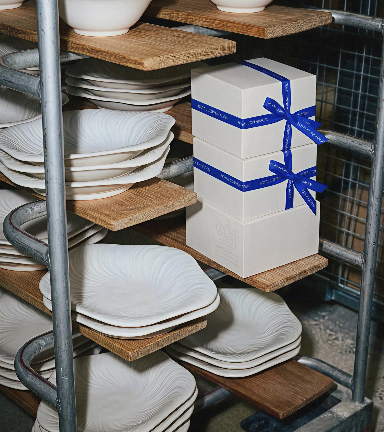
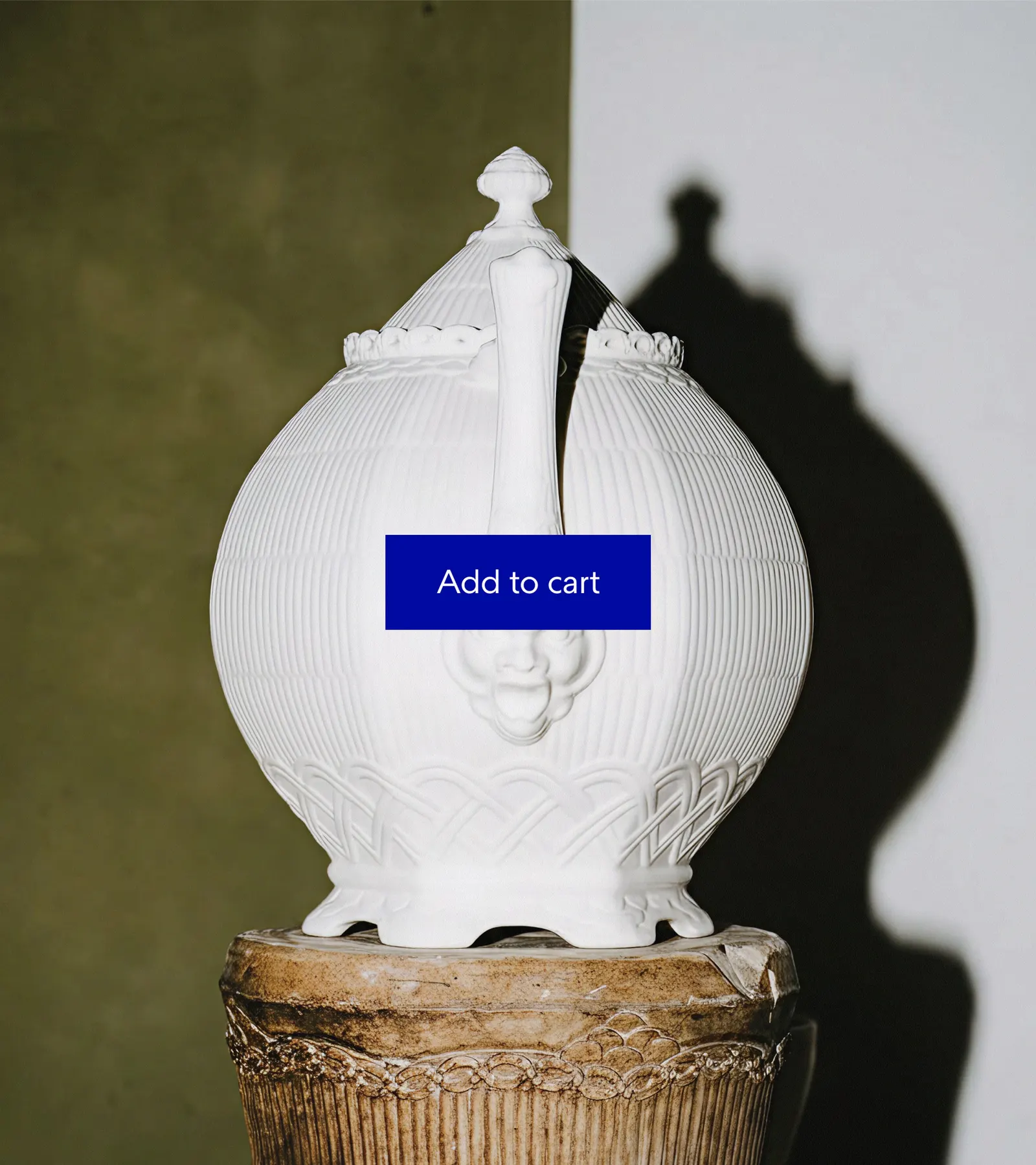
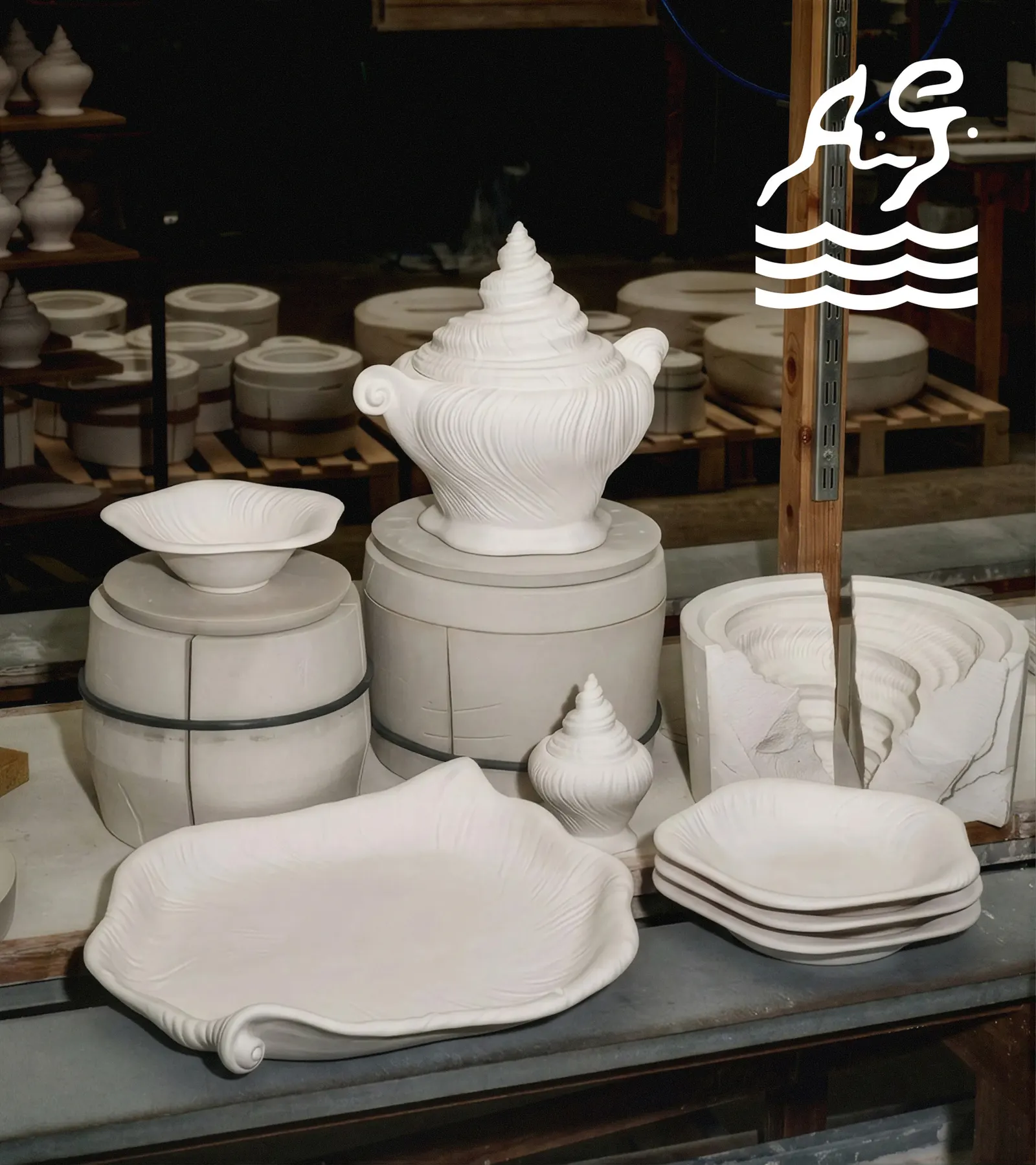
The brief was to bring the visual identity in line with the handwork behind the porcelain, which is now known worldwide yet still turns up at family dinners, holiday tables, and coffee dates. Kontrapunkt's idea is that each piece is shaped by the lives around it, from the painter's brush to the generations that inherit a set. That thinking shows up in a sharpened crown and wave, paired with a bespoke typeface drawn to match the fineness of the china.
Why it works
Heritage tableware often leans on ornament or nostalgia to signal age. Here, the crown and wave carry the history, and the refinement does the modern work, so the brand feels current without disowning its past. A custom typeface is a smart move for a maker whose appeal lies in how things are made: lettering drawn for the brand reads as another crafted object, not a generic label. For people who give and inherit these pieces, that continuity is reassuring, and the lighter touch suits a product defined by fine detail.
Logo
Typography
Applications
Images and video from kontrapunkt.com, by Kontrapunkt.