The Brand Monograph
Jyske Bank brand identity by Kontrapunkt
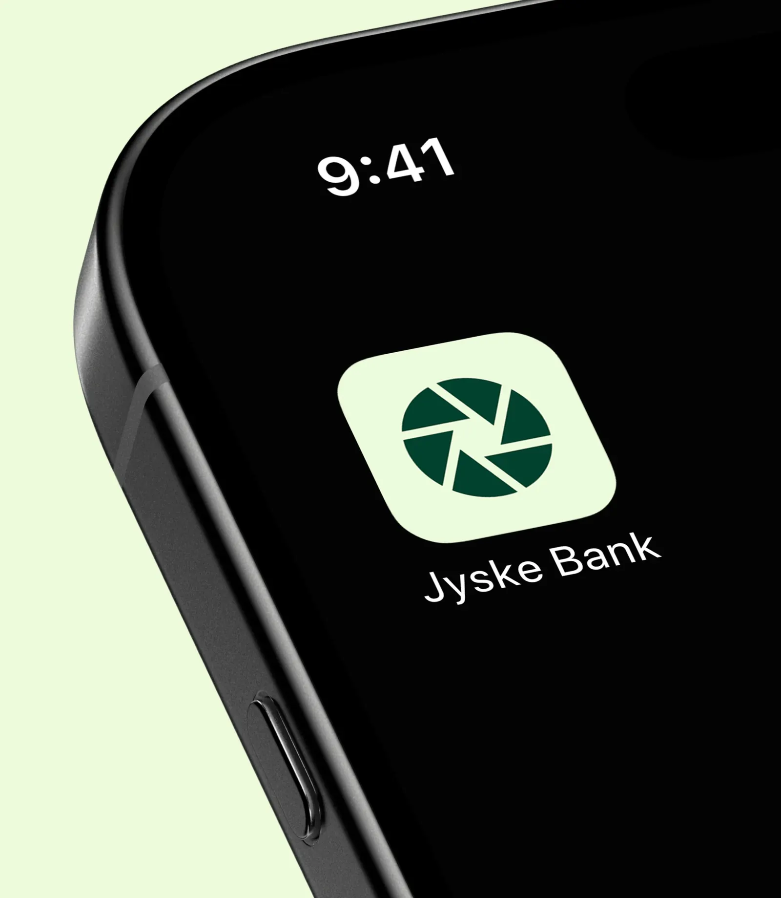
↗Jyske Bank is now one of Denmark's largest banks, but it began as a regional one, and Kontrapunkt's identity work keeps that history in view. The brief was to refresh the foundations rather than replace them. So the studio took the iris, a symbol the bank has carried for decades, and redrew it as a more precise, more dynamic mark. The idea behind it is a lens that can focus on a single detail and just as easily take in the whole picture.
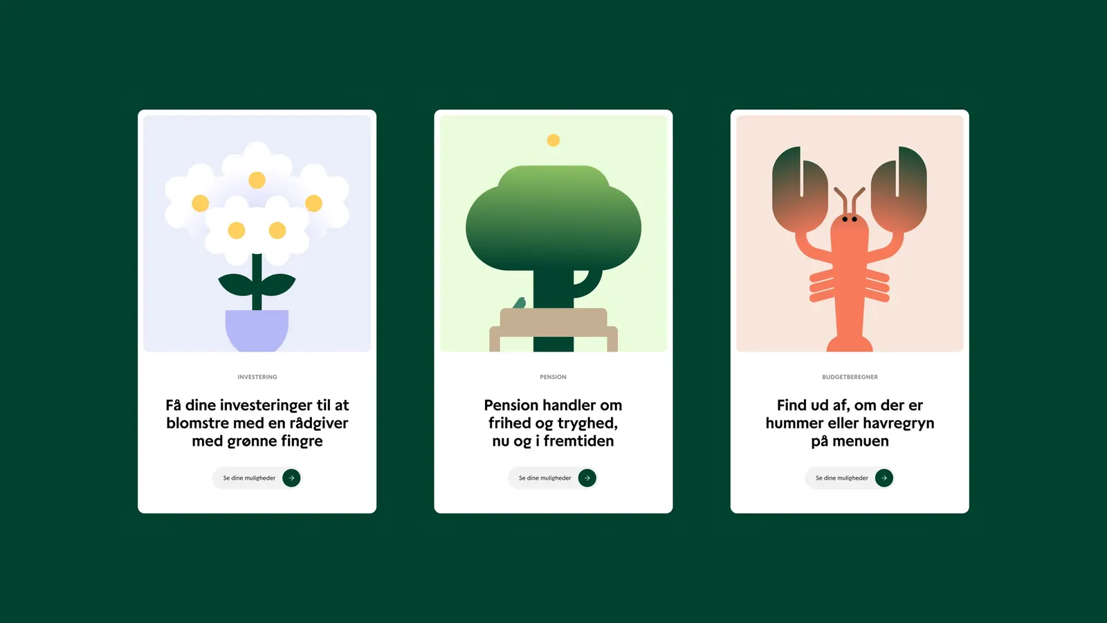
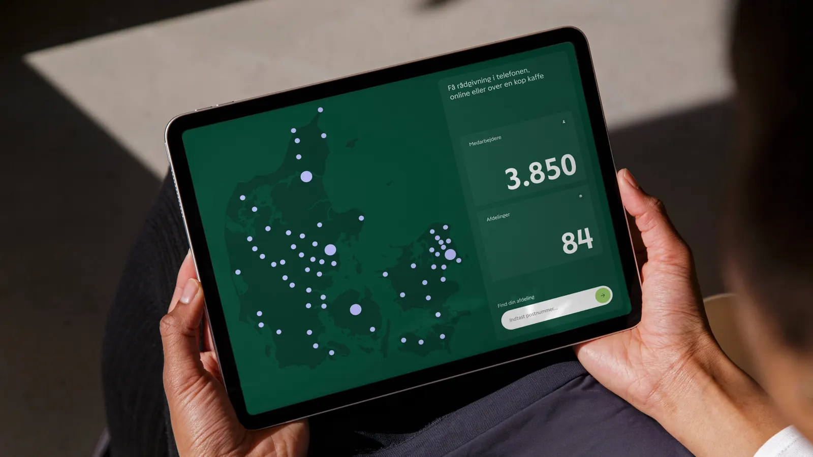
Around the symbol, Kontrapunkt strengthened the wordmark and gave the bank a typographic voice that feels warm and self-assured. A green palette with an expressive tone of its own completes the system. Together, the pieces are meant to express a personality built on competence, informality, and action.
Why it works
An eye is an apt symbol for a bank: it suggests attention and scrutiny, but it also means being seen. Keeping the iris and sharpening it lets the identity read as evolution, so longtime customers still recognize it while it looks more current. The warm typography softens the mark's precision, and green gives the bank a clear visual position in a category where many players default to cautious, interchangeable palettes.
Applications
Typography

Images and video from kontrapunkt.com, by Kontrapunkt.