The Brand Monograph
Ubisoft Anno brand identity by Wolff Olins
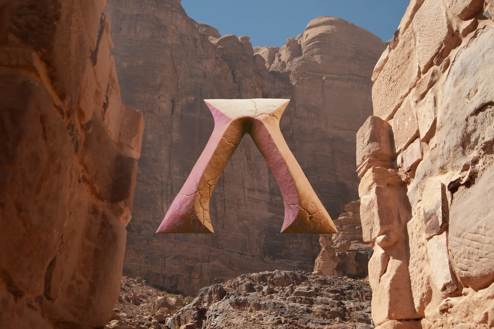
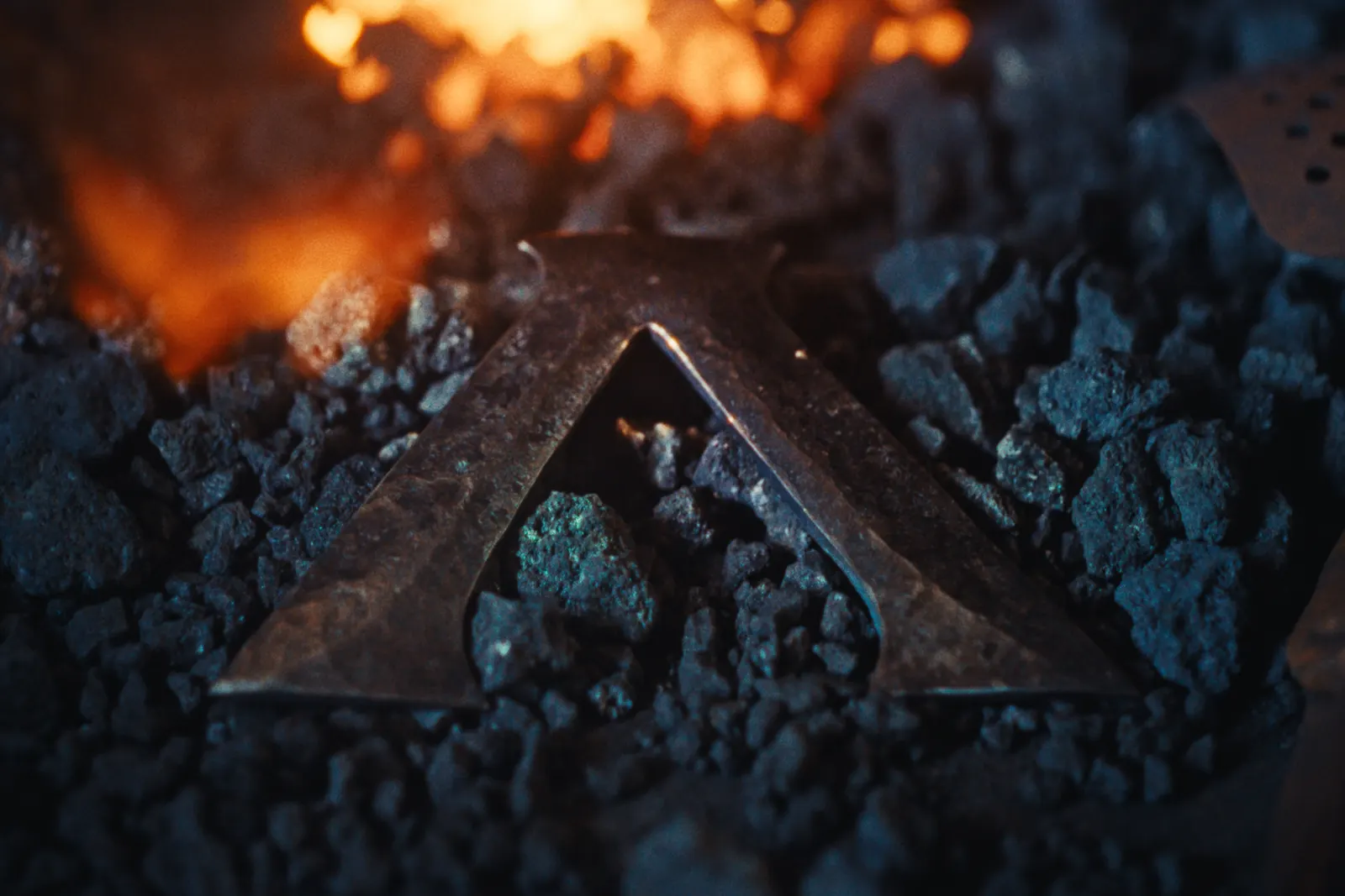
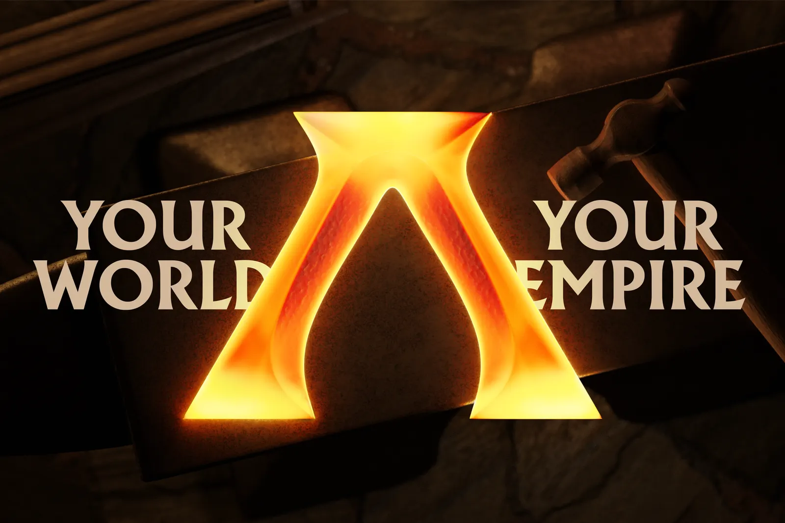
↗Most game brands lean on glow, gradients, and screen-bound spectacle. Wolff Olins took Anno, Ubisoft's long-running city builder, to a forge instead. Working with metalsmith Owen Phillips of Gate Foot Forge, the studio made a physical version of the new "A" symbol, then carried what it learned about the material back into the digital mark.
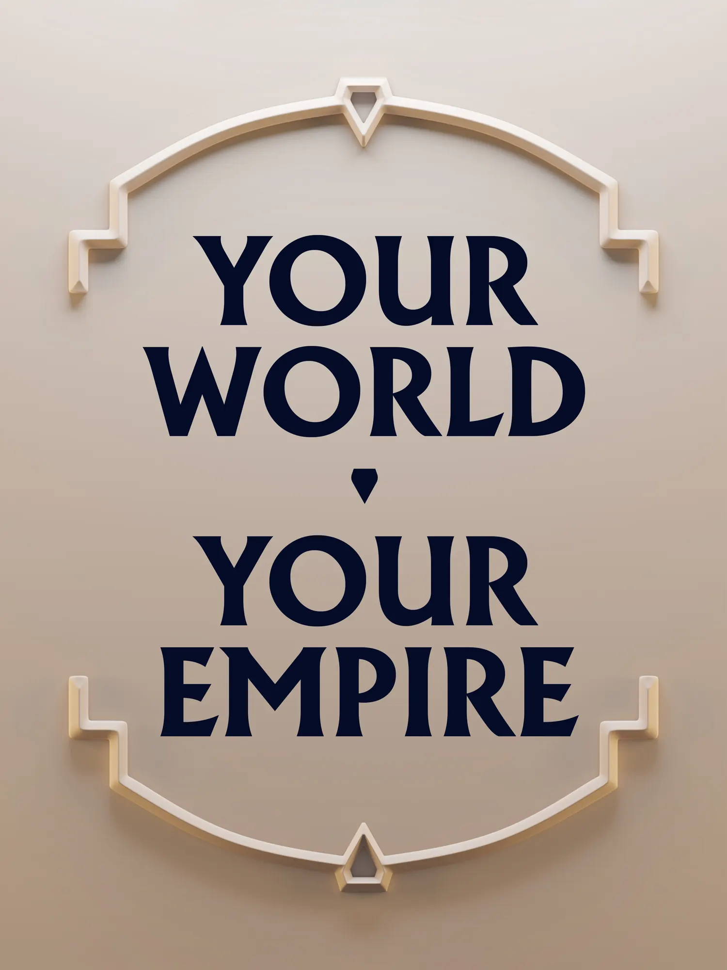
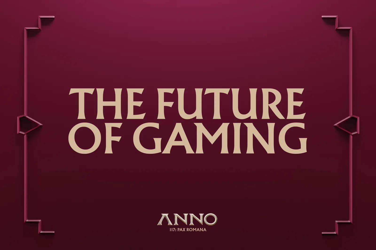
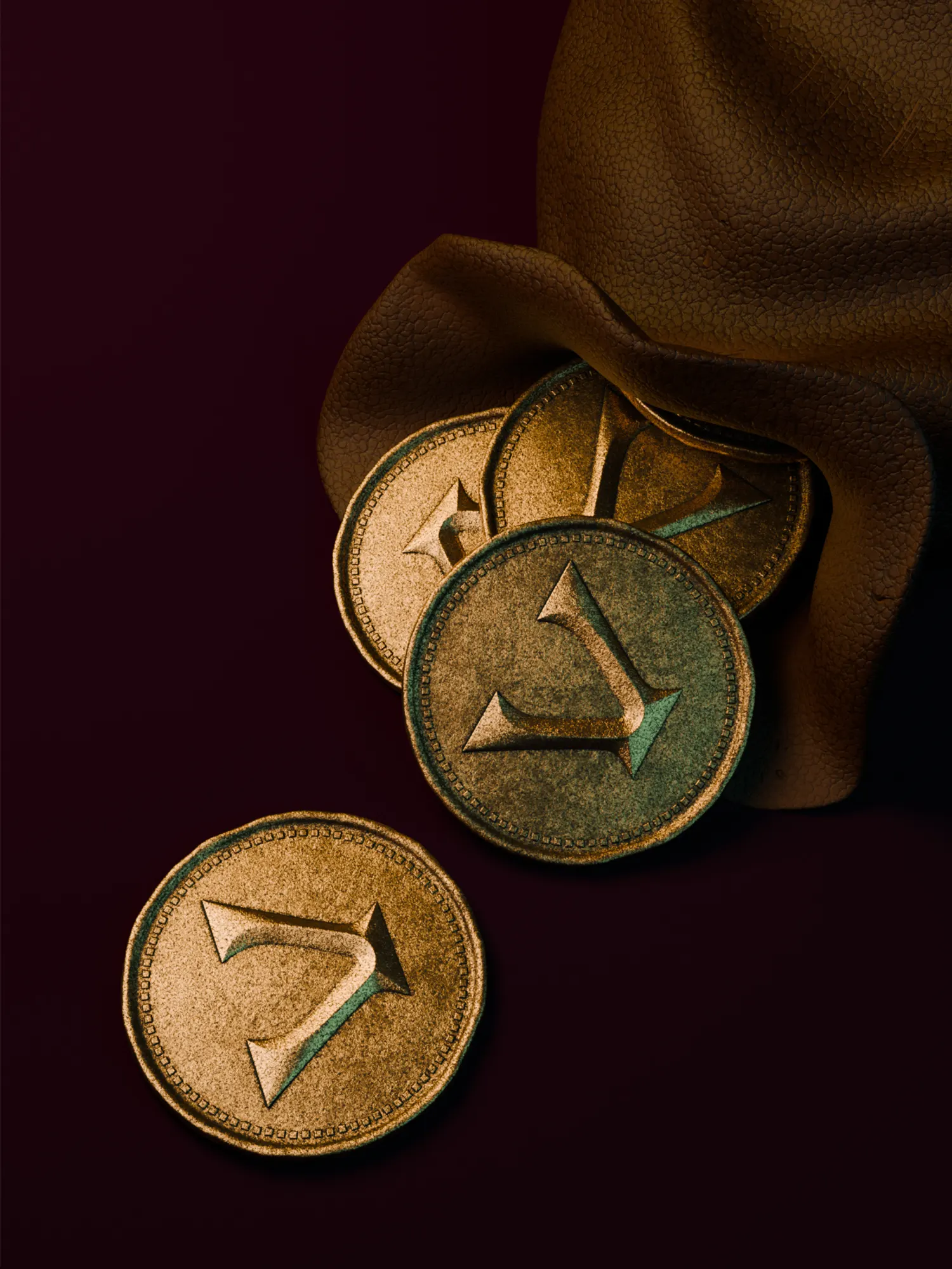
The brief arrived after seven games and 25 years, when Anno had more than 4 million players but no unified identity. With strategy from Wieden+Kennedy Amsterdam, Wolff Olins built a system that shifts with each era. The symbol changes texture by setting, and its negative space shapes the in-game cursor. Bronze Blue and Stone anchor the masterbrand, while Tyrian Purple, Plum, and Scroll mark the Roman-era release. Type and graphic language also draw on the classical period, and the identity extends to Twitch emotes, desktop icons, and the game pack.
Why it works
Anno's players spend hours placing things carefully and planning ahead, and a hand-made identity respects that patience in a category full of digital sheen. Forging the symbol first gave the mark a weight that holds up even at cursor size. Splitting the palette between a timeless masterbrand pair and period-specific dyes lets each sequel look new without breaking the family. Fans casting the mark in metal and wearing it as nail art suggests it is simple and sturdy enough for people to make their own.
Applications
Logo
Typography
Images and video from wolffolins.com, by Wolff Olins.