 The Brand Monograph
Goodnotes brand identity by Motto® Branding Agency
↗Motto® Branding Agency gave Goodnotes a mark that grins without losing its old self. The rebrand arrived ahead of Goodnotes 6, as the product grew from a handwriting app into an AI-powered digital paper platform with more than 21 million monthly users. The studio's challenge was to make that shift feel like a natural next step rather than a reset.
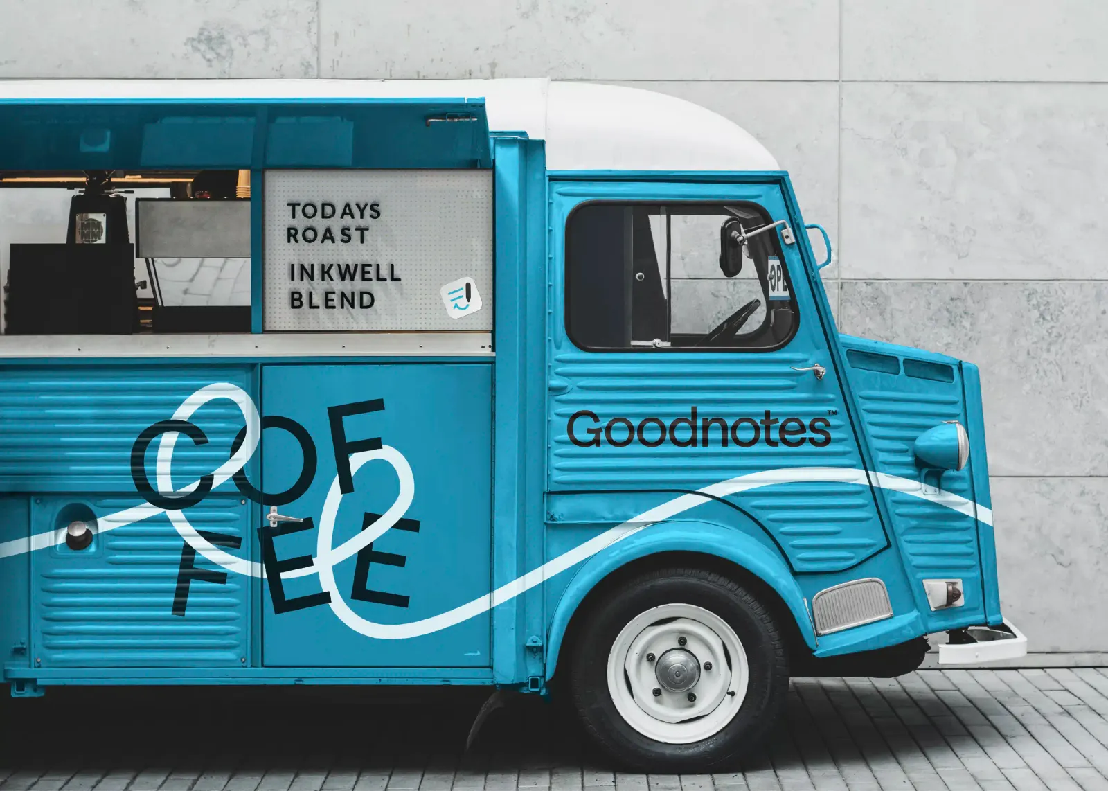
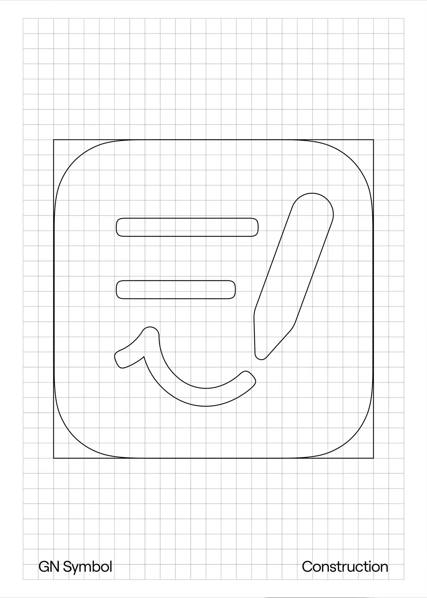
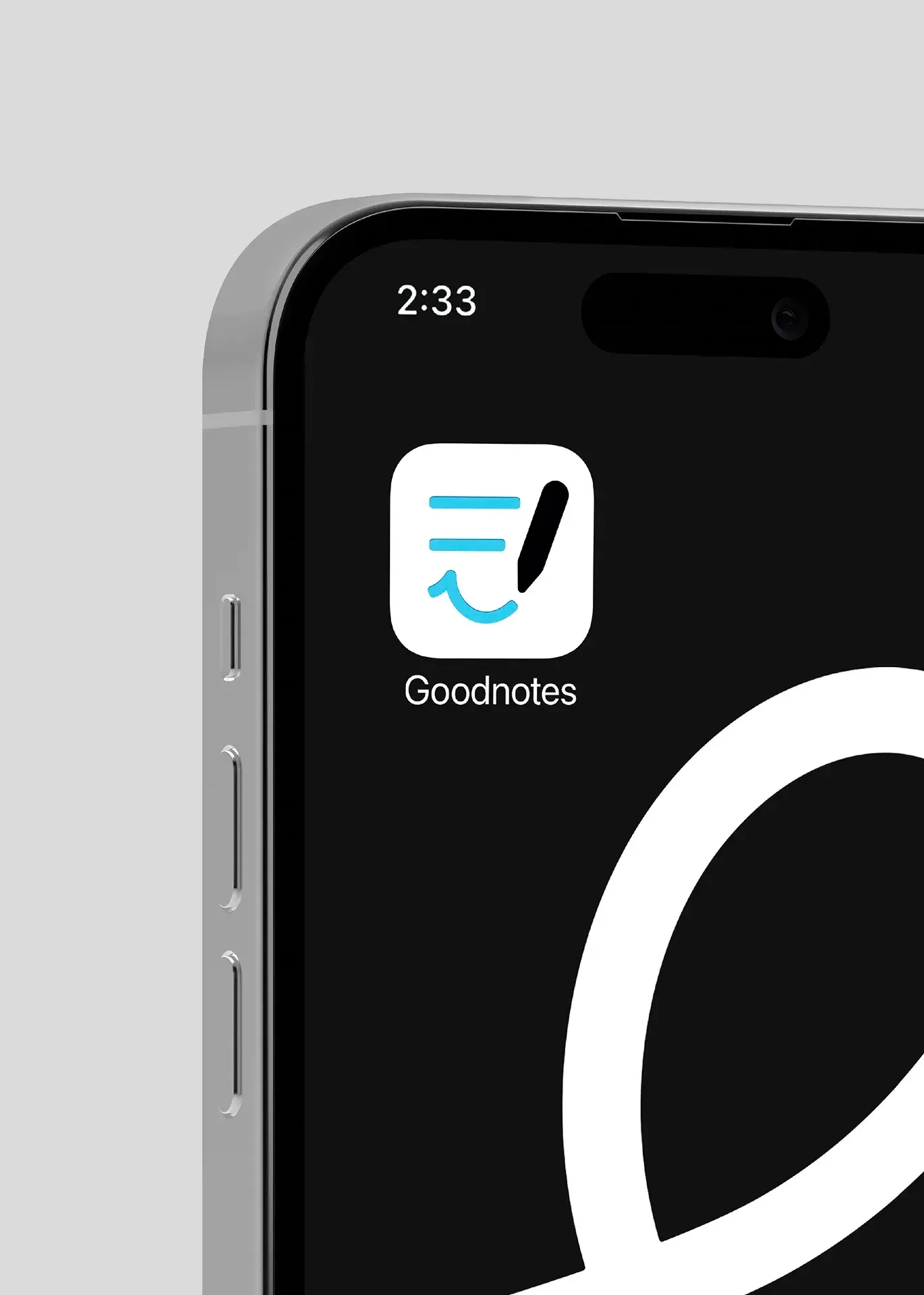
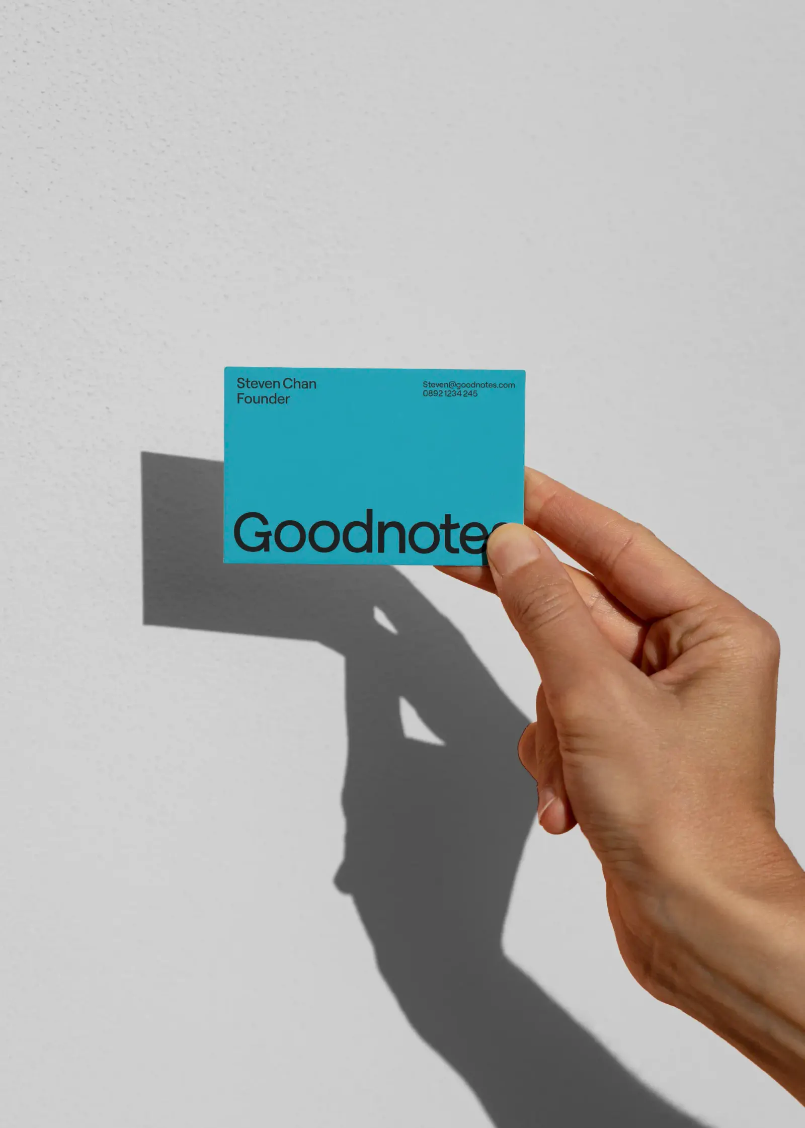
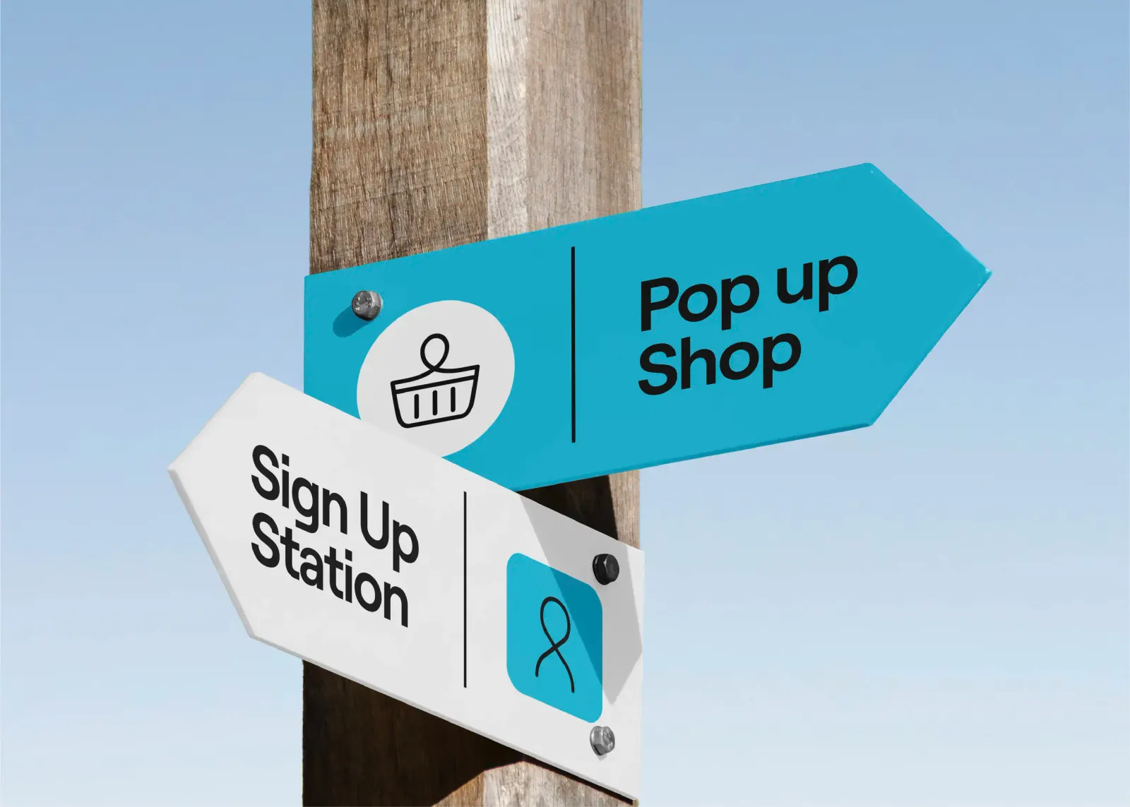
Its answer is evolution over replacement. The primary teal and cues from the original symbol stay, while a new scribble symbol, drawn with Jonathan Mak, curves into a smile that the wordmark's letterforms pick up. A single line runs through the wider system as a quiet nod to progress. Motto® paired the look with a sage-like voice, written guidelines, and a launch campaign spanning web and app copy, a press release, an influencer kit, and social.
Why it works
A scribble is the most honest symbol this product could have, because handwriting is what people actually do in it. Turning that gesture into a smile adds warmth to a category that often defaults to cold, efficient productivity cues. Keeping the teal protects recognition for people who open the app every day, so the change reads as a confident step forward rather than a stranger arriving. Because the smile also lives in the wordmark, the personality doesn't depend on the icon alone.
Images and video from wearemotto.com, by Motto® Branding Agency.


