The Brand Monograph
Oxford Street brand identity by Koto
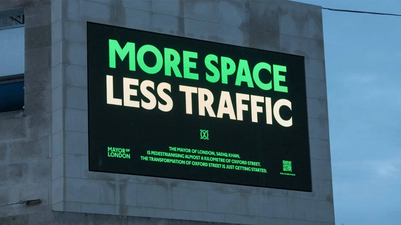
↗Koto's identity for Oxford Street treats one of London's busiest retail streets as a participant in the scene rather than a brand imposed on it. The brief came with pedestrianization, which opens the street to a broader mix of visitors and calls for a look that can change as the street does.
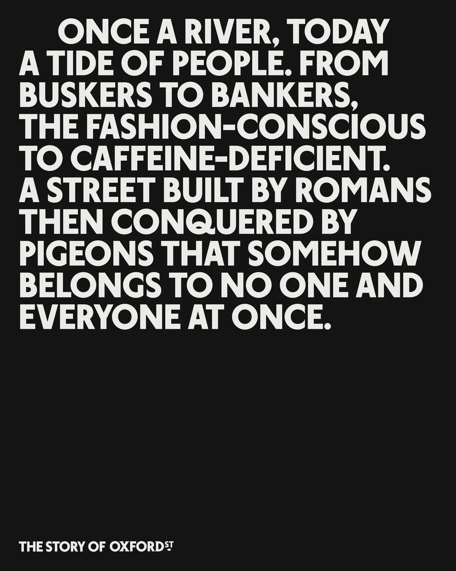
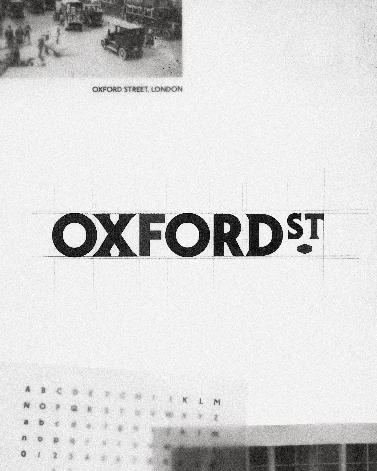
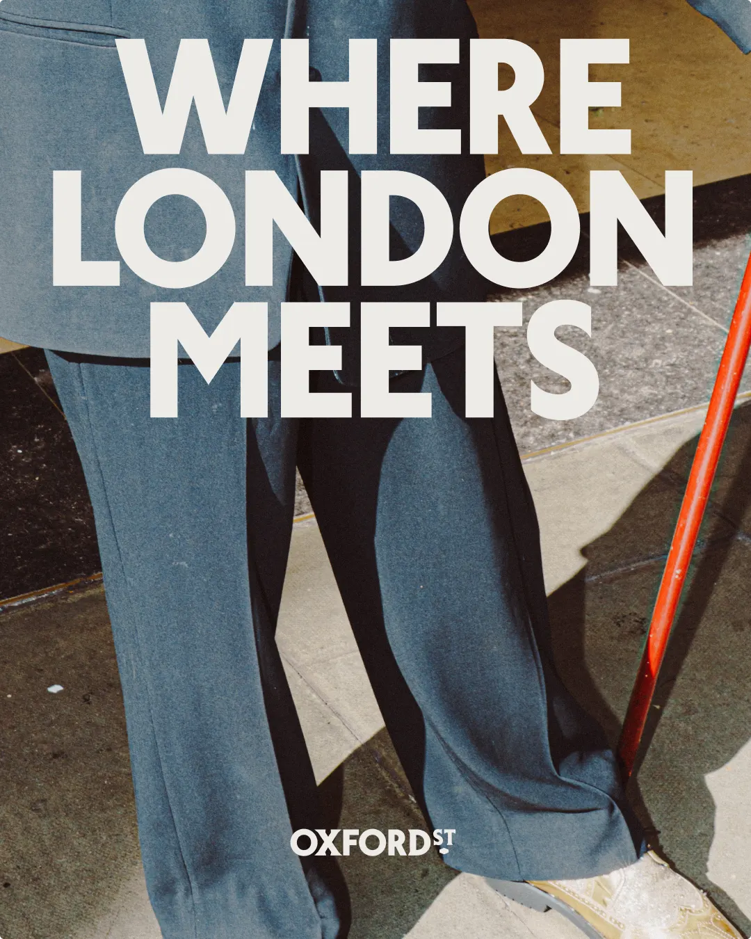
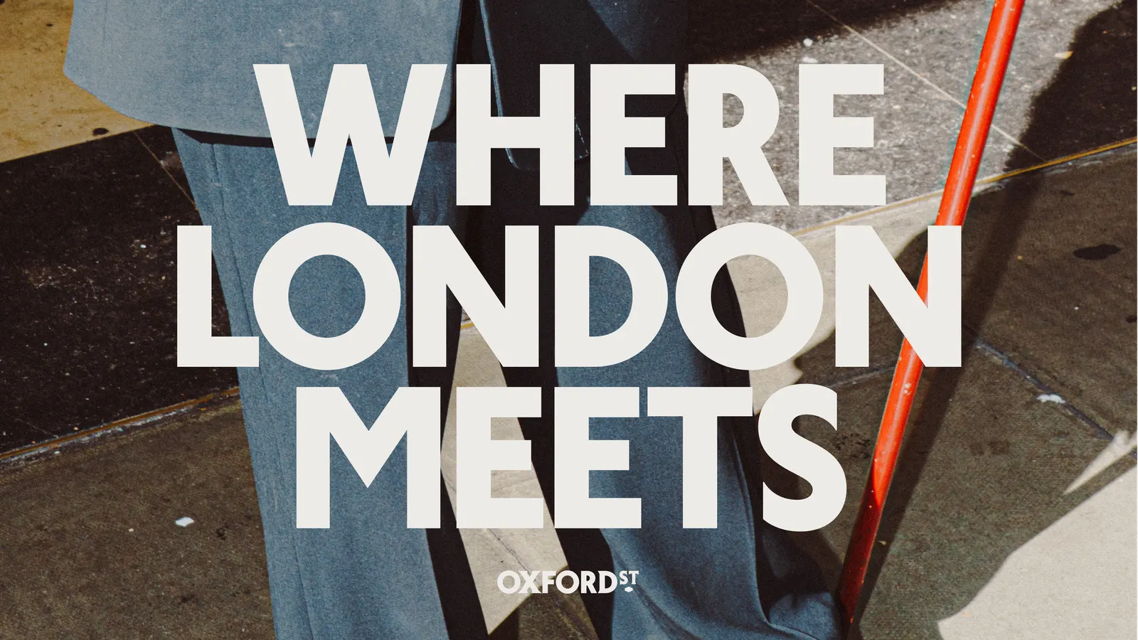
Working with St Bride Foundation, Koto developed London Sans, a custom typeface rooted in the city's lettering traditions. In the wordmark it sits beside a contrasting serif and a lozenge borrowed from historic signage. Type bends and wanders across layouts, and a monogram of interlocking letters references local architecture and shop fascias. Photography stays candid, catching ordinary faces and passing moments. Campaign headlines follow a flexible copy formula that plays on the street's eclectic reputation, and a set of icons drawn from familiar local sights helps with wayfinding.
Why it works
Most shopping-district branding defaults to polish and luxury. Koto went the other way, anchoring the identity in London's own lettering. The serif, sans, and lozenge combination is distinctive enough to own, yet loose enough to hold a lot of different content. Letting typography carry the movement means the system doesn't need a gimmick to feel alive. Candid photography and good-humored headlines make the street feel welcoming to tourists, workers, and locals alike, while the icons give the brand a practical job beyond looking good.
Logo
Applications
Images and video from koto.com, by Koto.