The Brand Monograph
Masters brand identity by Braconnier
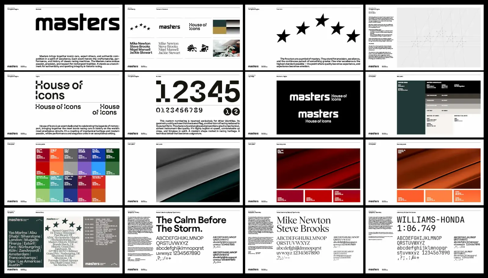
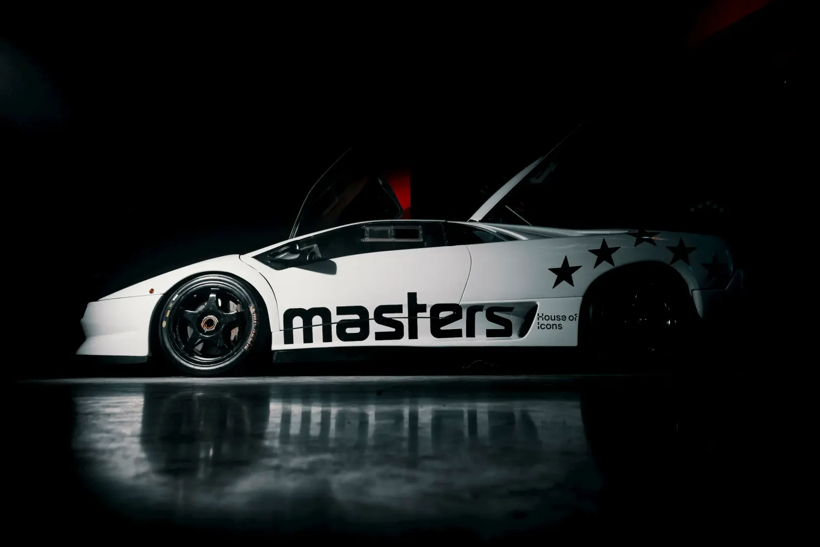
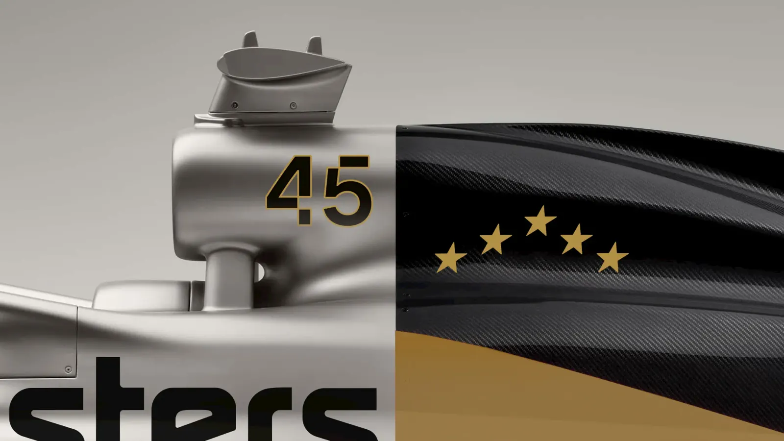
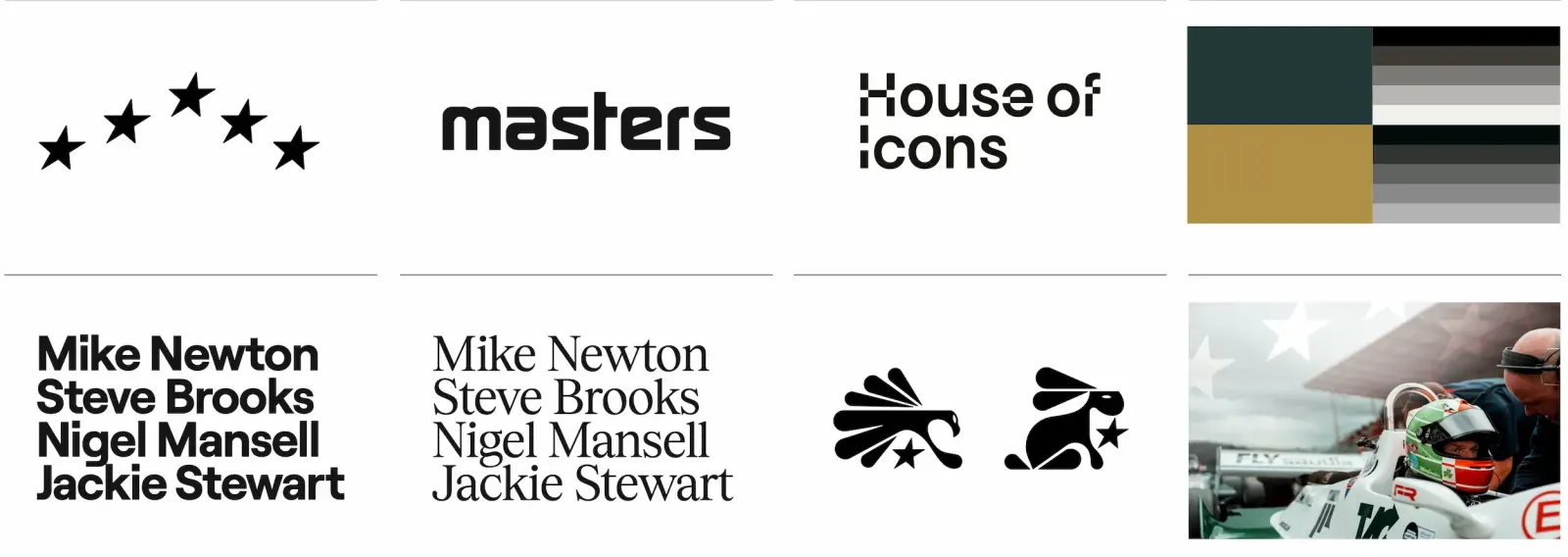
↗Most racing brands lean on speed. Braconnier's work for Masters leans on people, and the result feels closer to a cultural institution than a championship. The studio handled the full rebrand, from Emilie Colleye's strategy through the logo, visual system, and digital ecosystem built with Epic Agency. All of it is organized around the idea of Masters as a House of Icons.
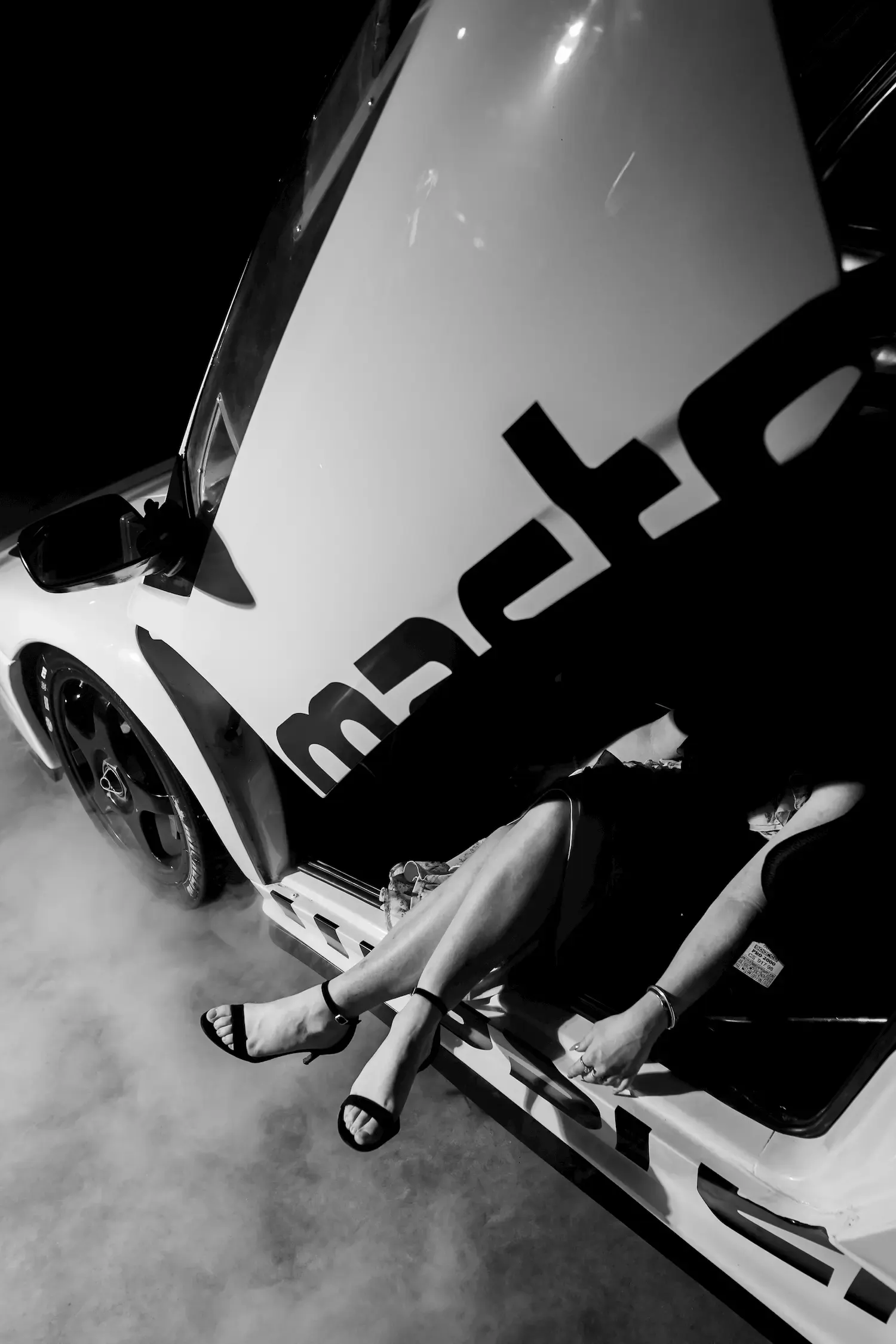
The reveal got the same care as the identity. Braconnier made a brand film with Matthias Krafft and The Crew Media that mixes footage shot in Europe and the Middle East with constructed sequences. It opens on Jann Mardenborough and Oliver James Webb, then lets sound, machinery, and gesture do much of the talking. The gala scenography carried that tone into the room. Photography by Antoine Sedran, Armand Maertens, and François Asal, motion by Createdbymille, and design by Laurent Poignot, Nicolas Bebronne, and Romain De Pape all speak the same language.
Why it works
Framing Masters as a house rather than a series is the smartest move here. It lets drivers, machines, and lifestyle sit under one roof without competing. The film puts people first, then hands over to texture and sound, which suggests a brand meant to be felt before it is explained. That suits an audience who care about racing culture more than spec sheets. Treating film, photography, and motion as one system, not separate deliverables, also keeps the lifestyle push from diluting the racing credibility.
Logo
Applications
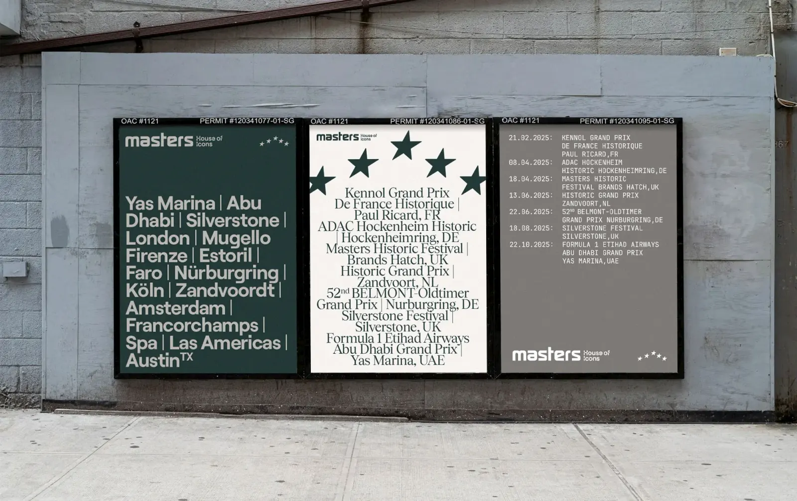
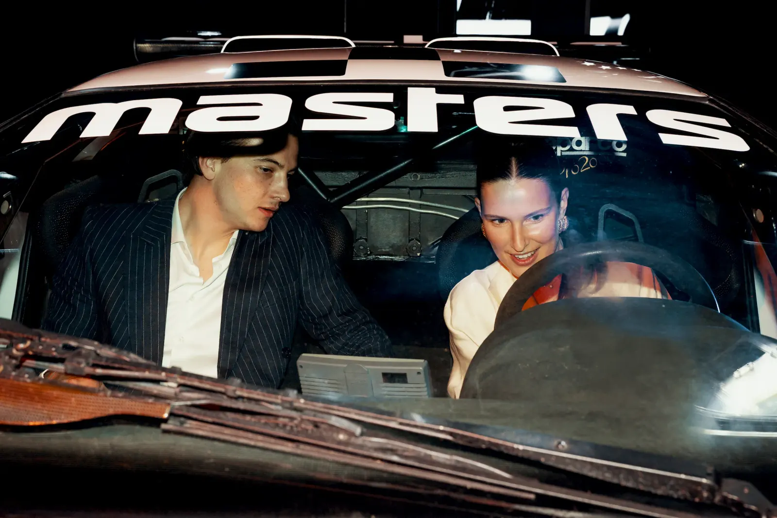
Images and video from braconnier.agency, by Braconnier.