The Brand Monograph
Ytri Island Retreat brand identity by Bielke&Yang
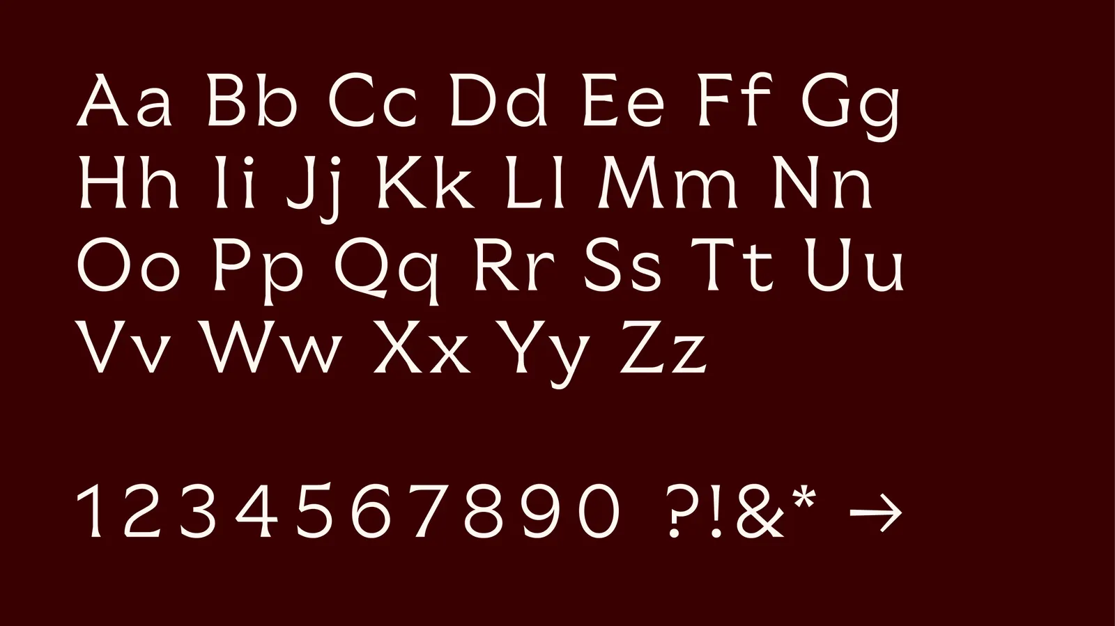
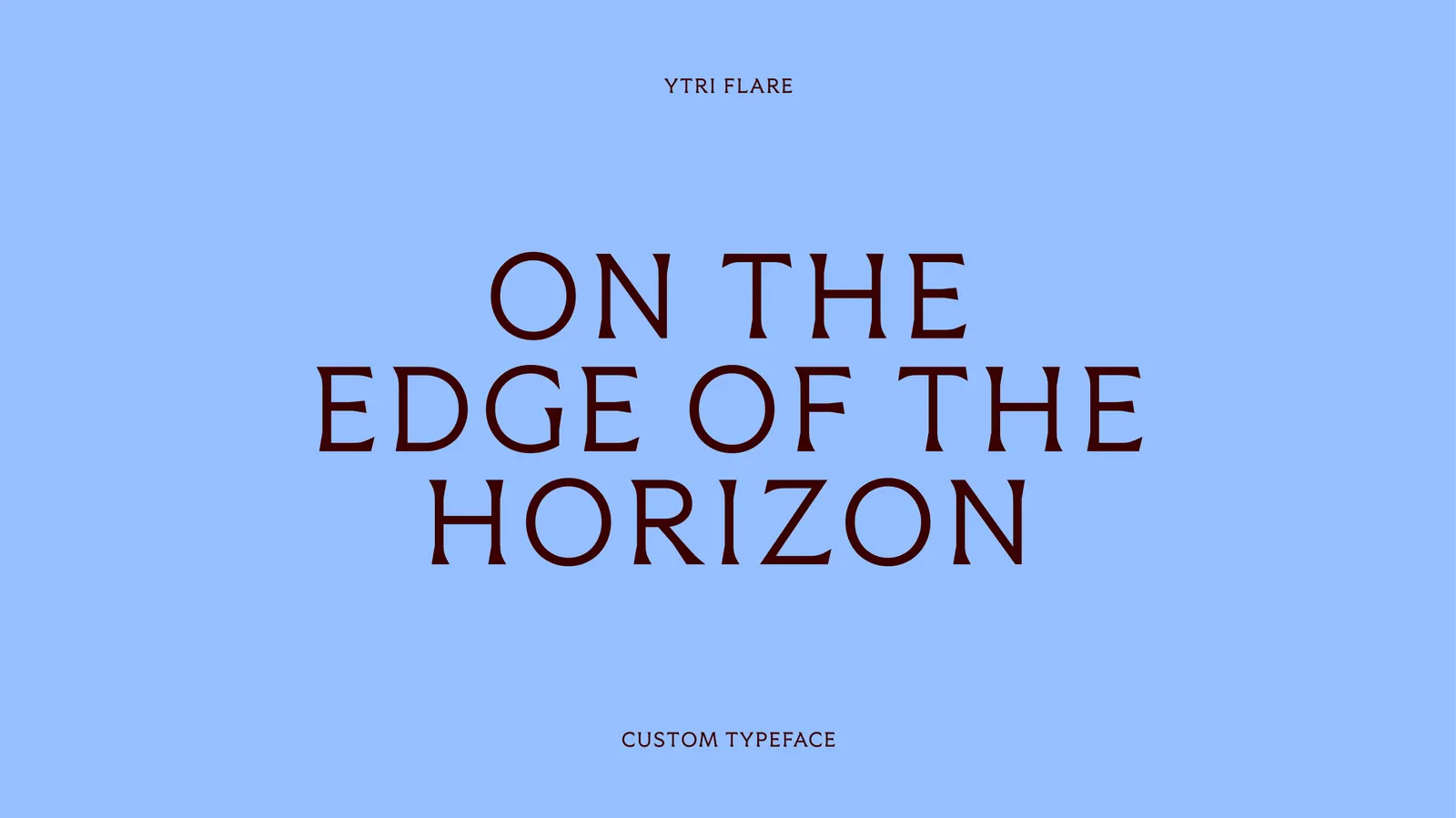
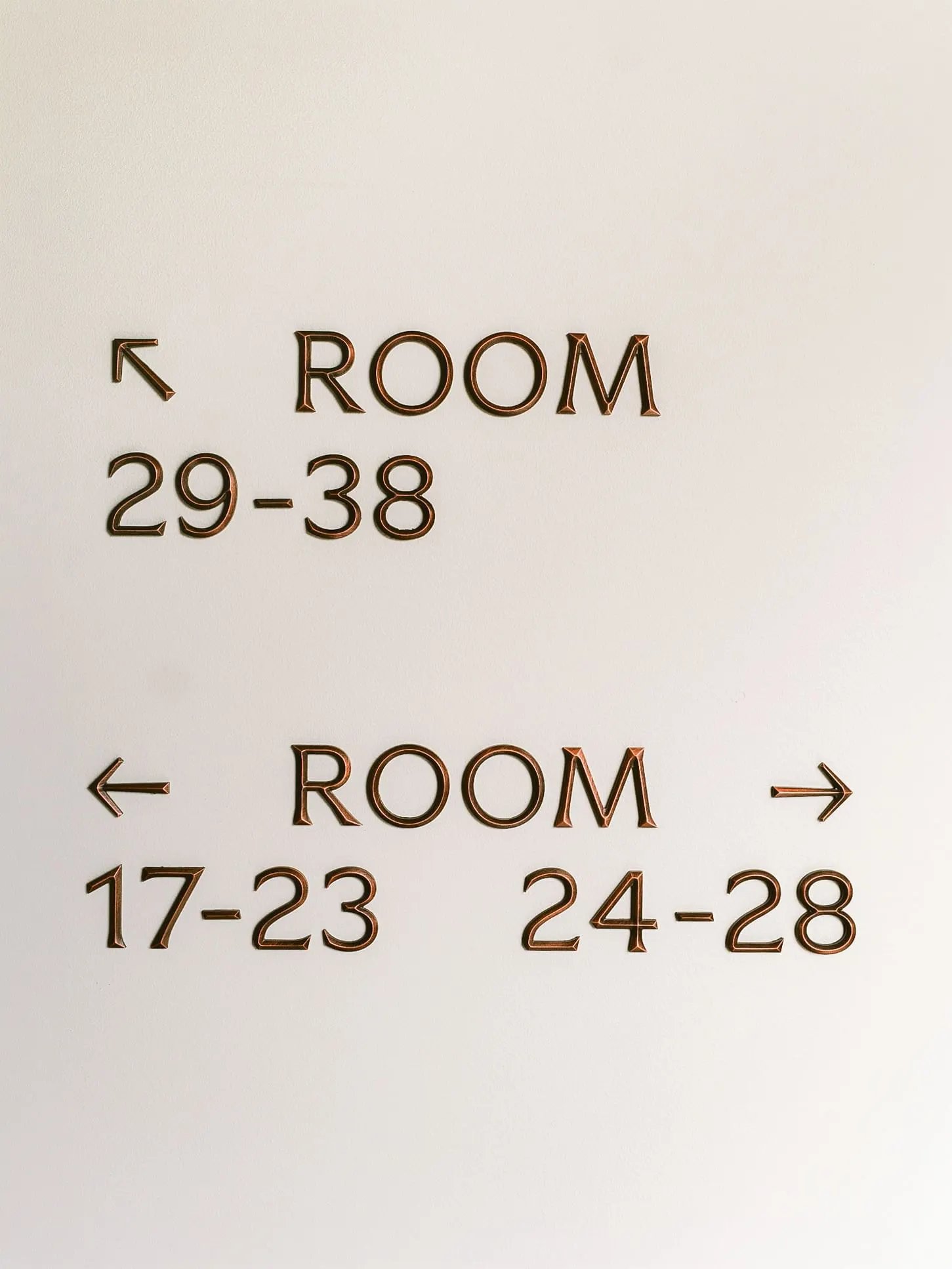
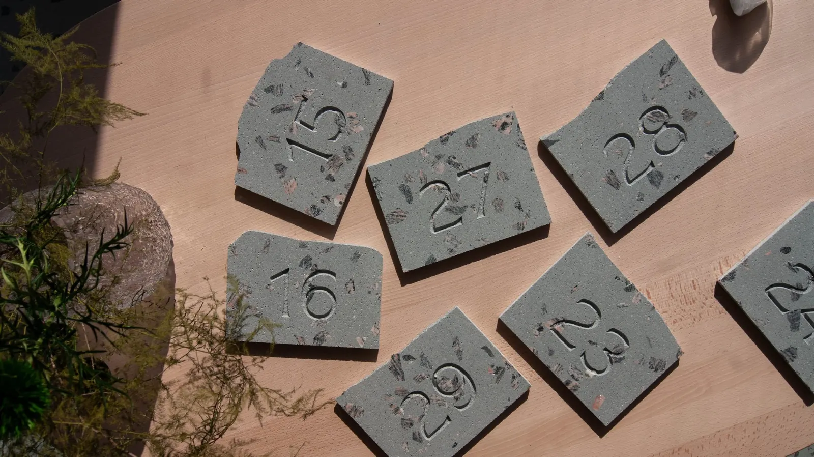
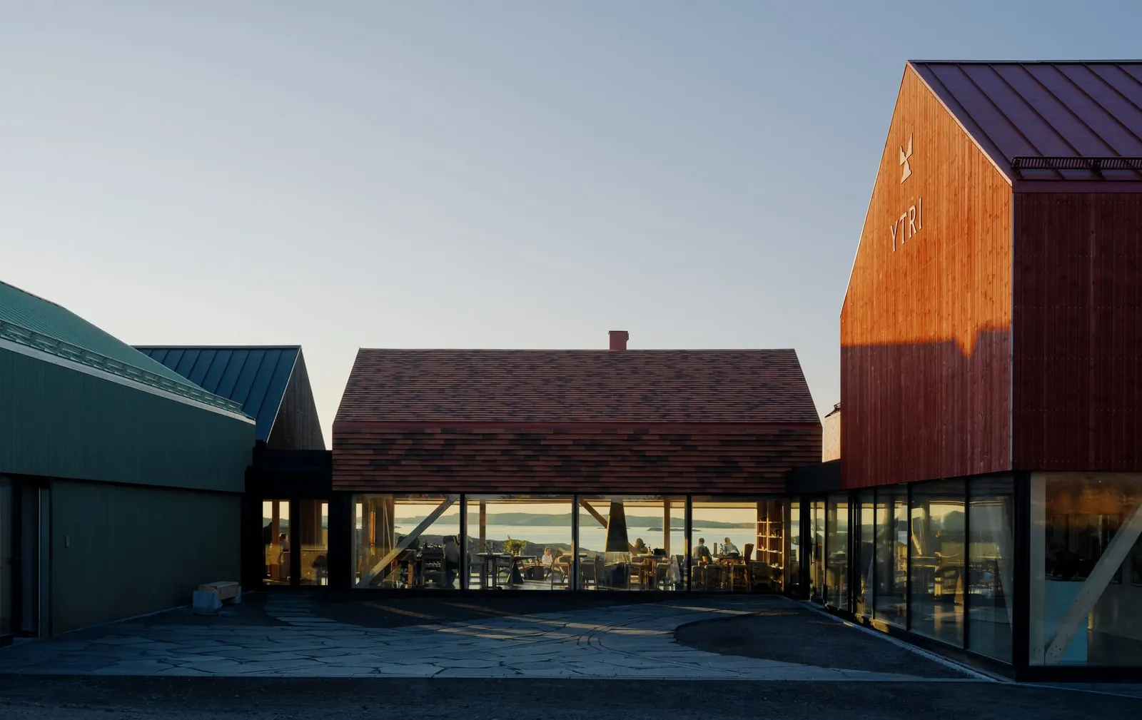
↗The room numbers at Ytri are the detail that sticks: 38 plates cut from offcuts of the hotel's terrazzo floor and engraved in a typeface made for the place. Bielke&Yang developed the brand for this new hotel on Træna, an island at the edge of the Norwegian coast, and that one small object carries the whole approach of local material, careful making, and nothing shouted.
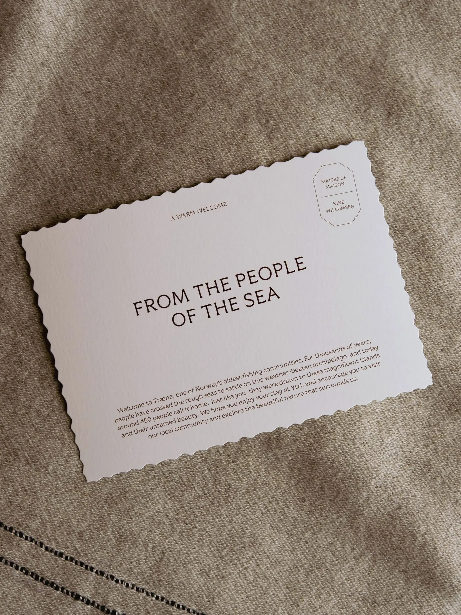
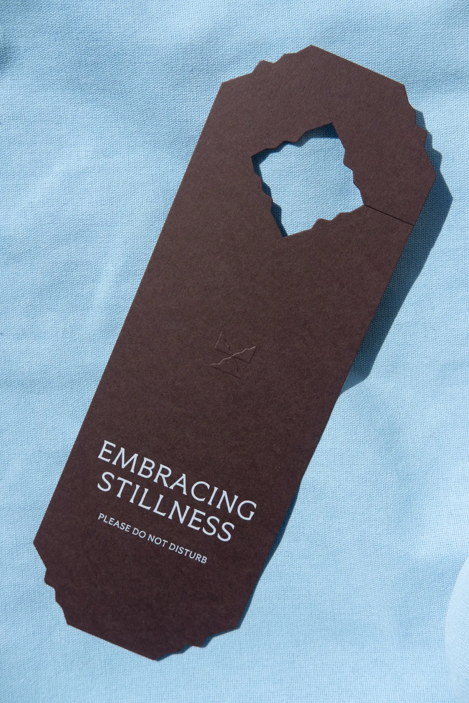
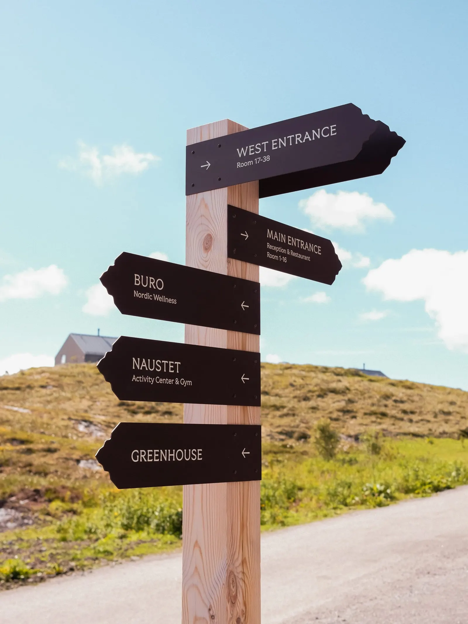
The brief called for a brand rooted in its location yet attractive to international travelers. The studio named the hotel with an Old Norse word for the outermost point, then built the story around havfolket, the sea people who have lived on Træna for 9,000 years. With Bobby Tannam on typography, BOW on copy, and Bonaparte and Vardehaugen Arkitekter on design, it created a flexible system spanning signage, menus, interiors, products, and a website that doubles as a practical guide.
Why it works
Luxury hospitality in remote places often falls back on rustic cliché or generic minimalism. Ytri avoids both by letting the building and the brand share materials. A custom typeface engraved in leftover terrazzo means the identity is part of the architecture rather than a layer applied afterward. The Old Norse name gives international guests something distinctive to remember and repeat, and it reads as heritage rather than decoration. A website that works as a real destination guide respects how much effort it takes to get there.
Applications

Typography

Images and video from bielkeyang.com, by Bielke&Yang.