The Brand Monograph
Dataforeningen brand identity by Bielke&Yang
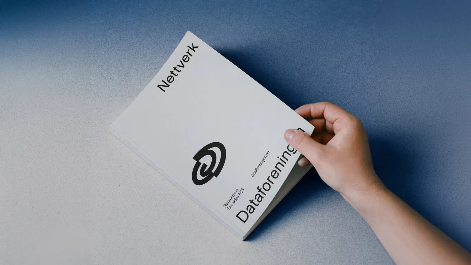
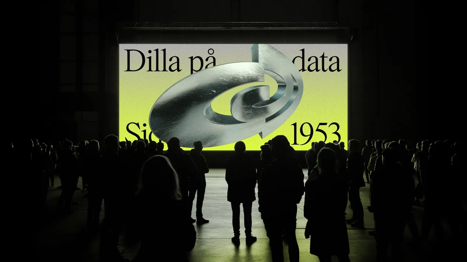
↗Most tech communities borrow the look of the industry: cool gradients, neutral sans serifs, a vague sense of the future. Bielke&Yang took the opposite route for Dataforeningen, Norway's only independent meetup for technology enthusiasts, and looked backward to find something fresh.
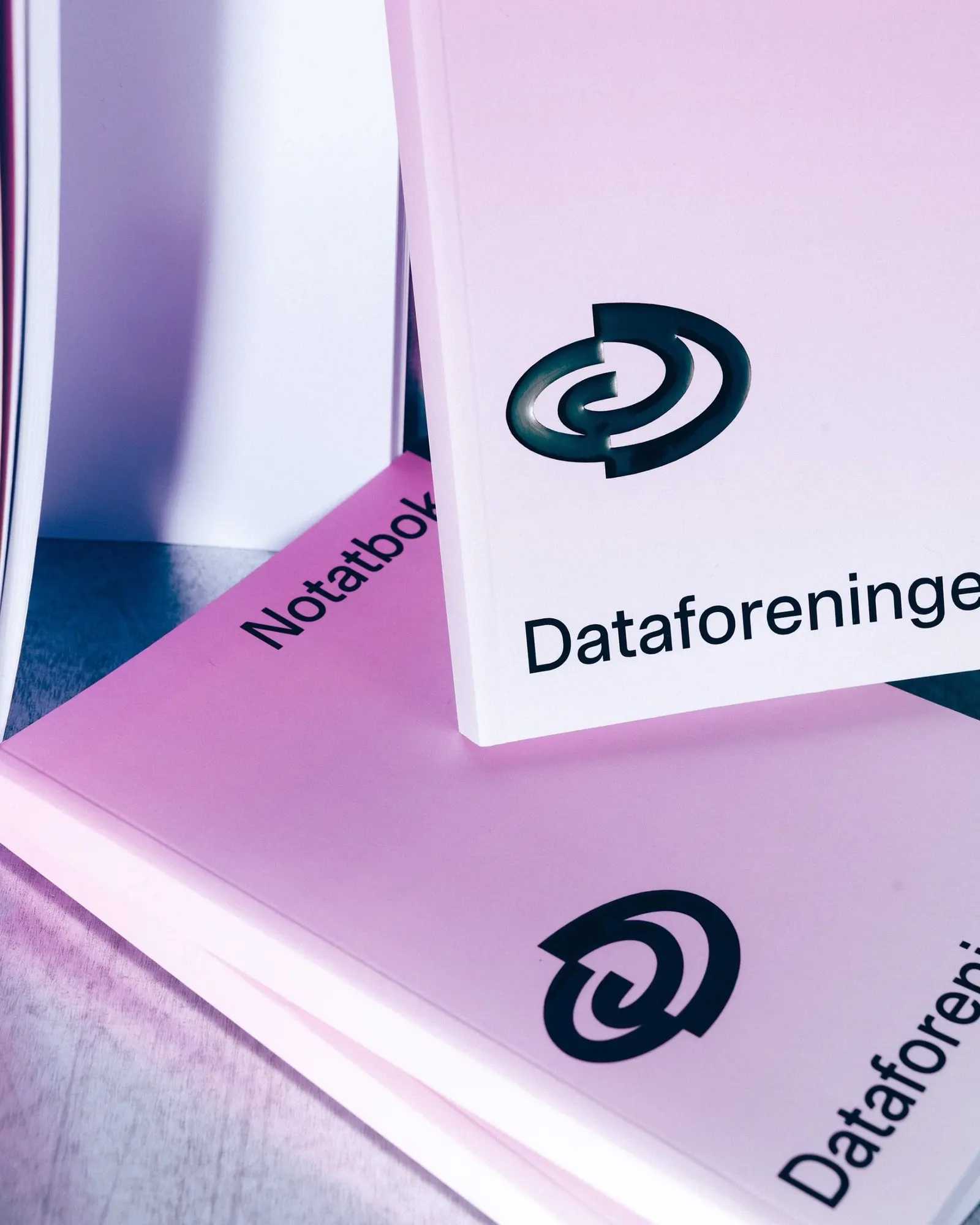
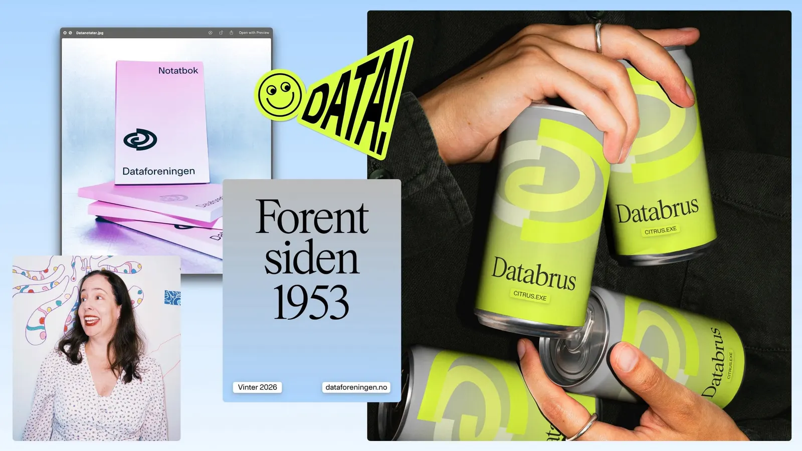
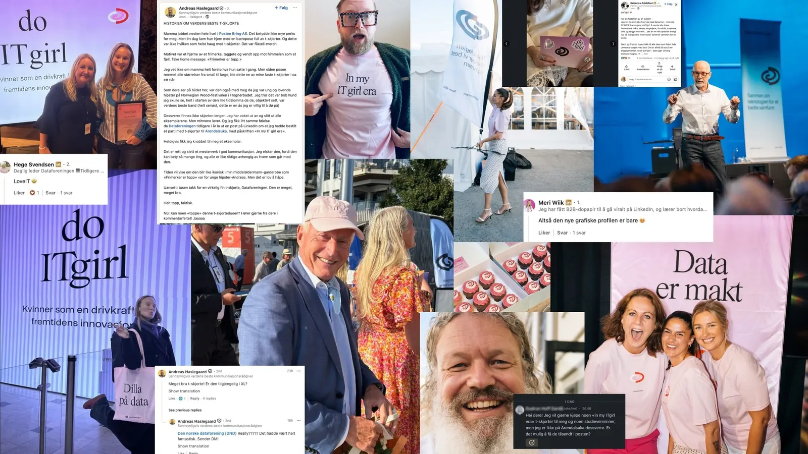
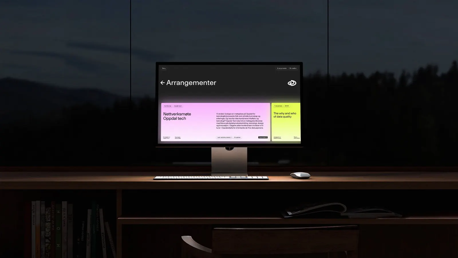
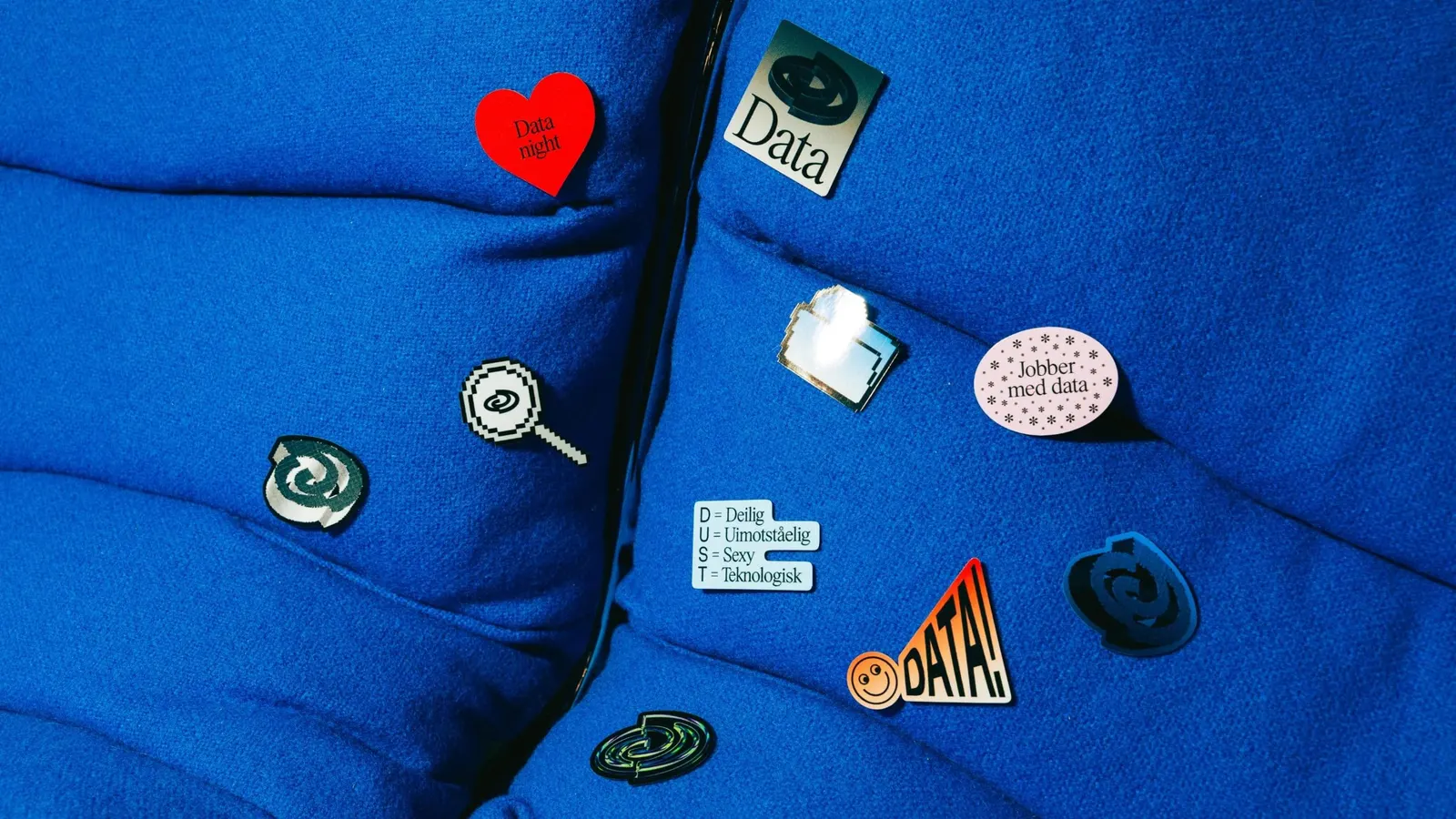
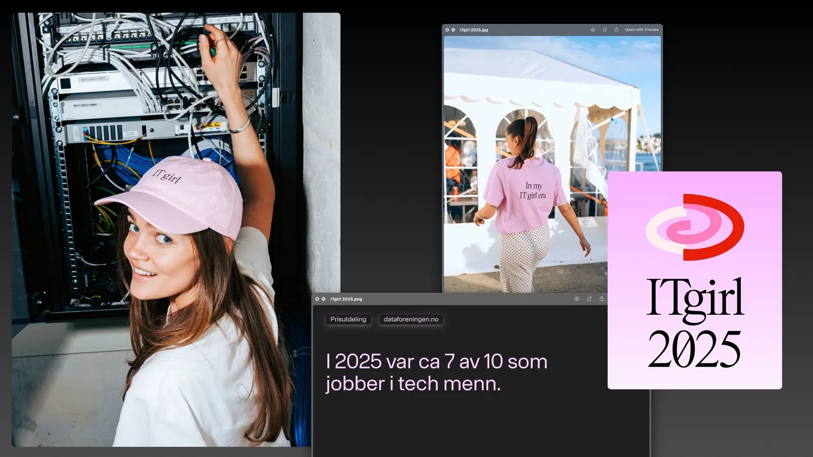
The brief was to unite a membership that runs from seasoned professionals to teenage hobbyists, and to draw in a new generation without alienating the old one. After gathering input from members across the country, the studio built the identity around Datakultur, a idea rooted in curiosity and play. Bright colors and expressive serifs carry the system, with nods to 1980s and 1990s computing and a logo symbol that holds everything together. Volunteers and members were involved along the way, and photography by Bow, Eplehagen, and Erik Ruud rounds out the work.
Why it works
Serifs are an unexpected choice in a category that defaults to sans, and here they read as human and authored, which suits a community rather than a vendor. The nostalgia is used sparingly, so it feels like shared history to longtime members and like retro curiosity to newcomers, never like costume. Bright color keeps the look energetic, while a single strong symbol lets the tone shift between a formal conference and a casual meetup without losing recognition.
Applications


Images and video from bielkeyang.com, by Bielke&Yang.