The Brand Monograph
The Norton Museum of Art brand identity by Koto
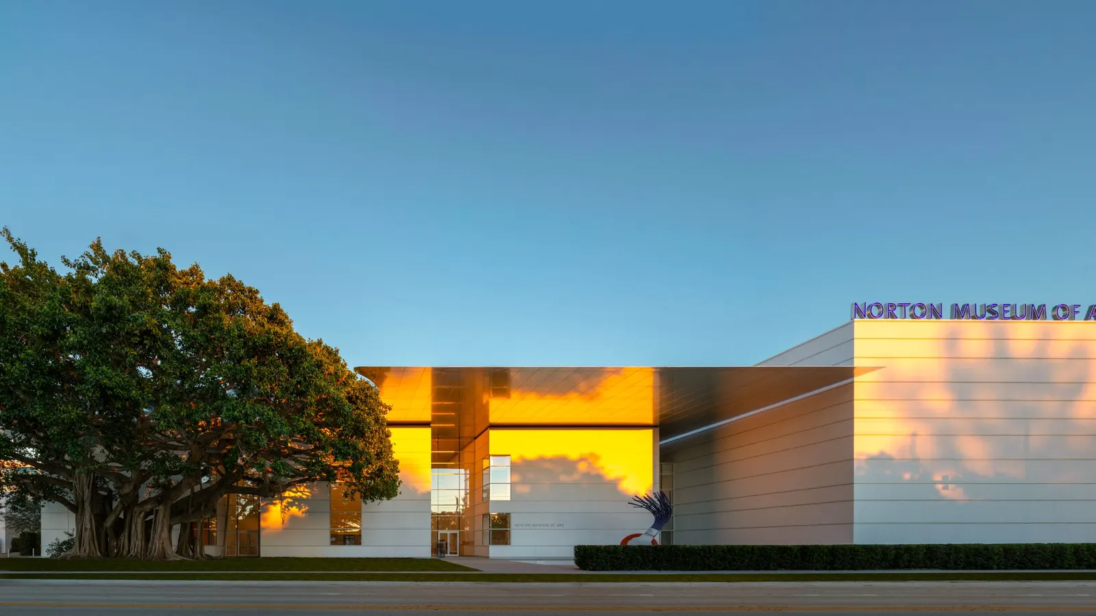
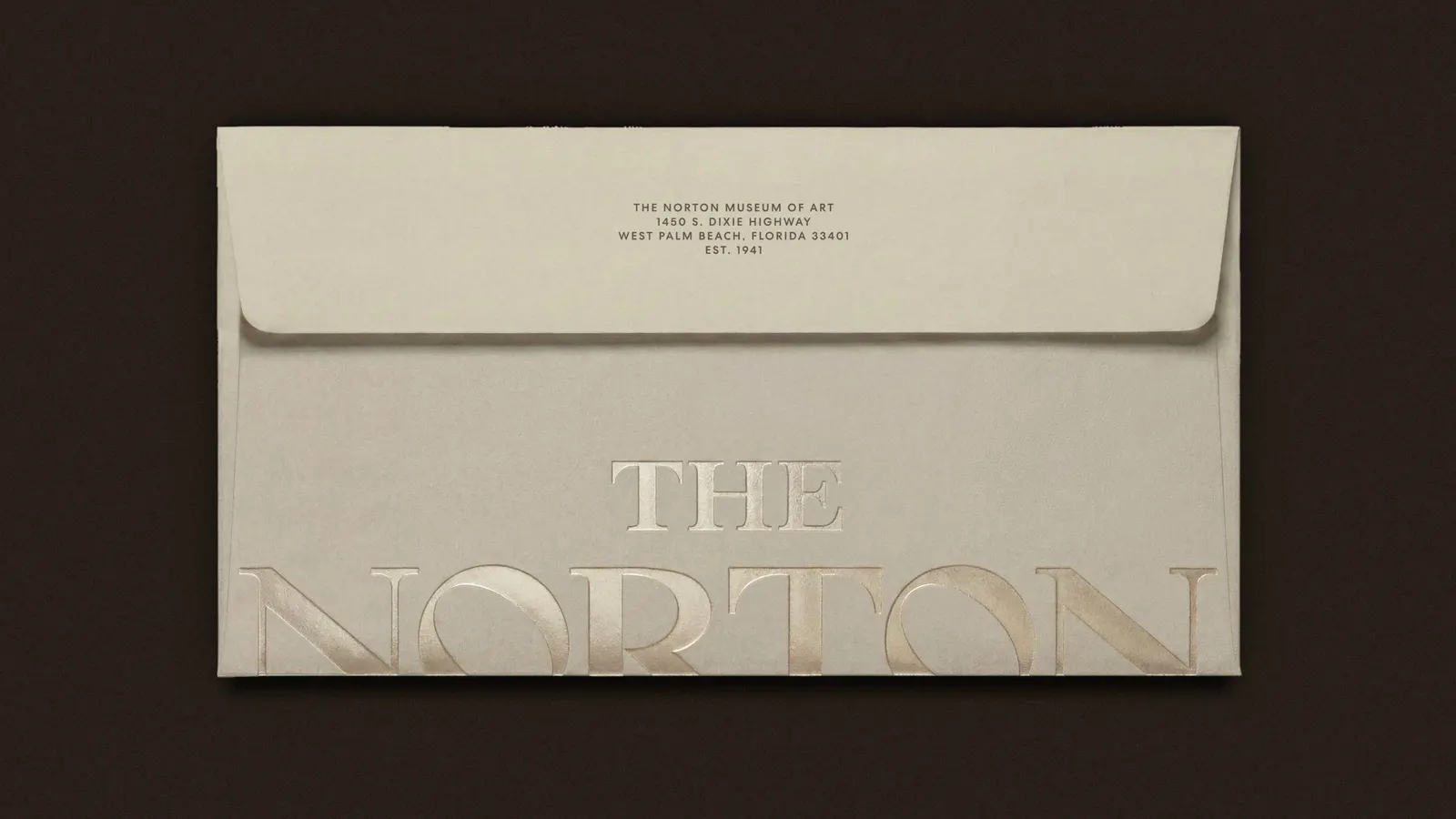
↗Koto's identity for the Norton Museum of Art starts by looking backward. Instead of drawing a new mark for an institution with more than 80 years of history, the studio dug into the museum's archive, found a wordmark with real authority, and refined it for current use.
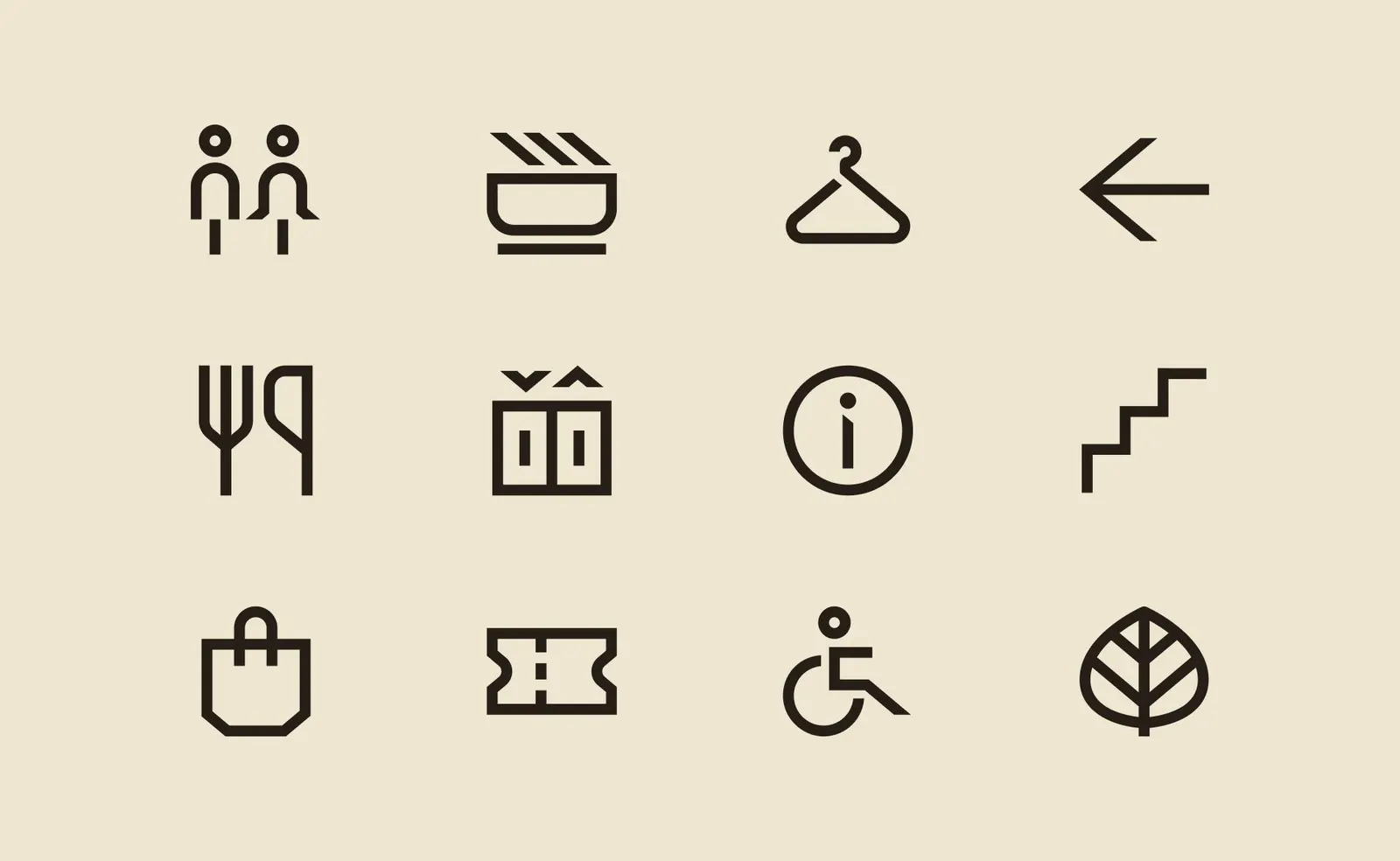
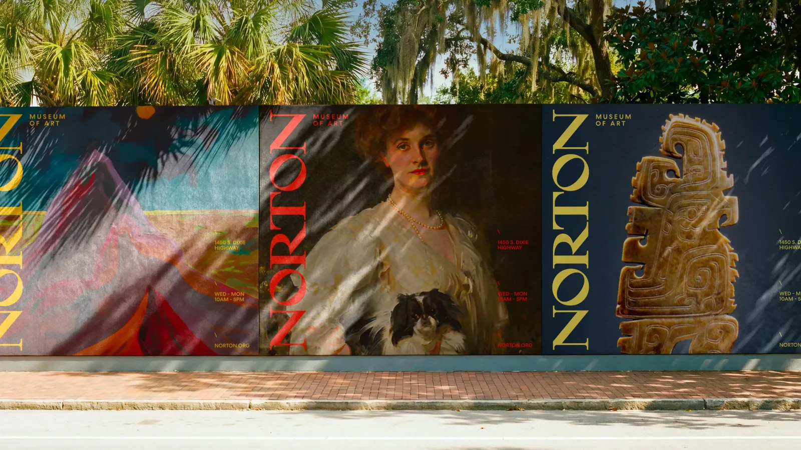
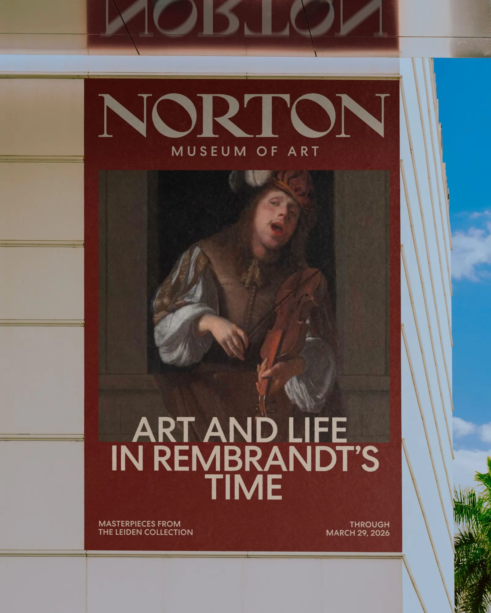
The brief was to give a museum where galleries, gardens, dining, and community programs overlap a brand that can reach national and international audiences. Koto built the idea around art and daily life sharing one space. The 40° angle in the N recurs throughout the system, and the Diana seal, adapted from the museum's 50th anniversary mark, returns alongside it. A slash device, layers of color, type, and image, and a palette drawn from Florida sunshine and works in the galleries keep the system flexible. The website keeps the art in front, with an interface colored by featured pieces.
Why it works
Museum branding often retreats into neutral type so the collection can do the talking. The Norton's approach is more confident. An archival wordmark carries institutional weight that a freshly drawn one would struggle to fake, and the repeated angle turns a single letter into a recognizable device. Pulling color from the collection is the smartest move, because brand and art share a palette instead of competing. It also lets the identity stretch from a lively evening crowd to a quiet gallery visit without feeling like two brands, which is the real test for a museum courting both locals and travelers.
Logo
Applications

Images and video from koto.com, by Koto.