The Brand Monograph
Purple Garden brand identity by Mother Design
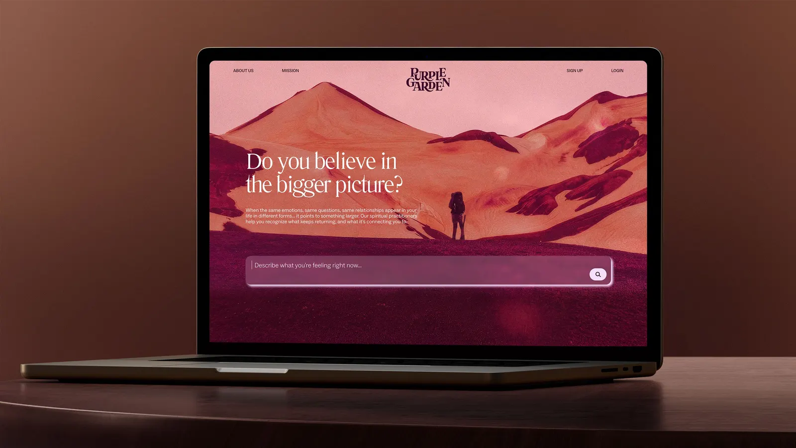
↗Few identity projects begin by sitting down with a medium, but Mother Design started its Purple Garden work that way. The platform connects people with spiritual practitioners online, in a category where sites tend to share the same imagery and push visitors to book immediately. The studio built something slower and more personal.
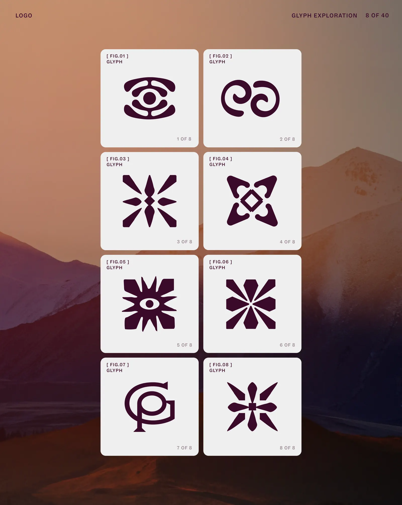
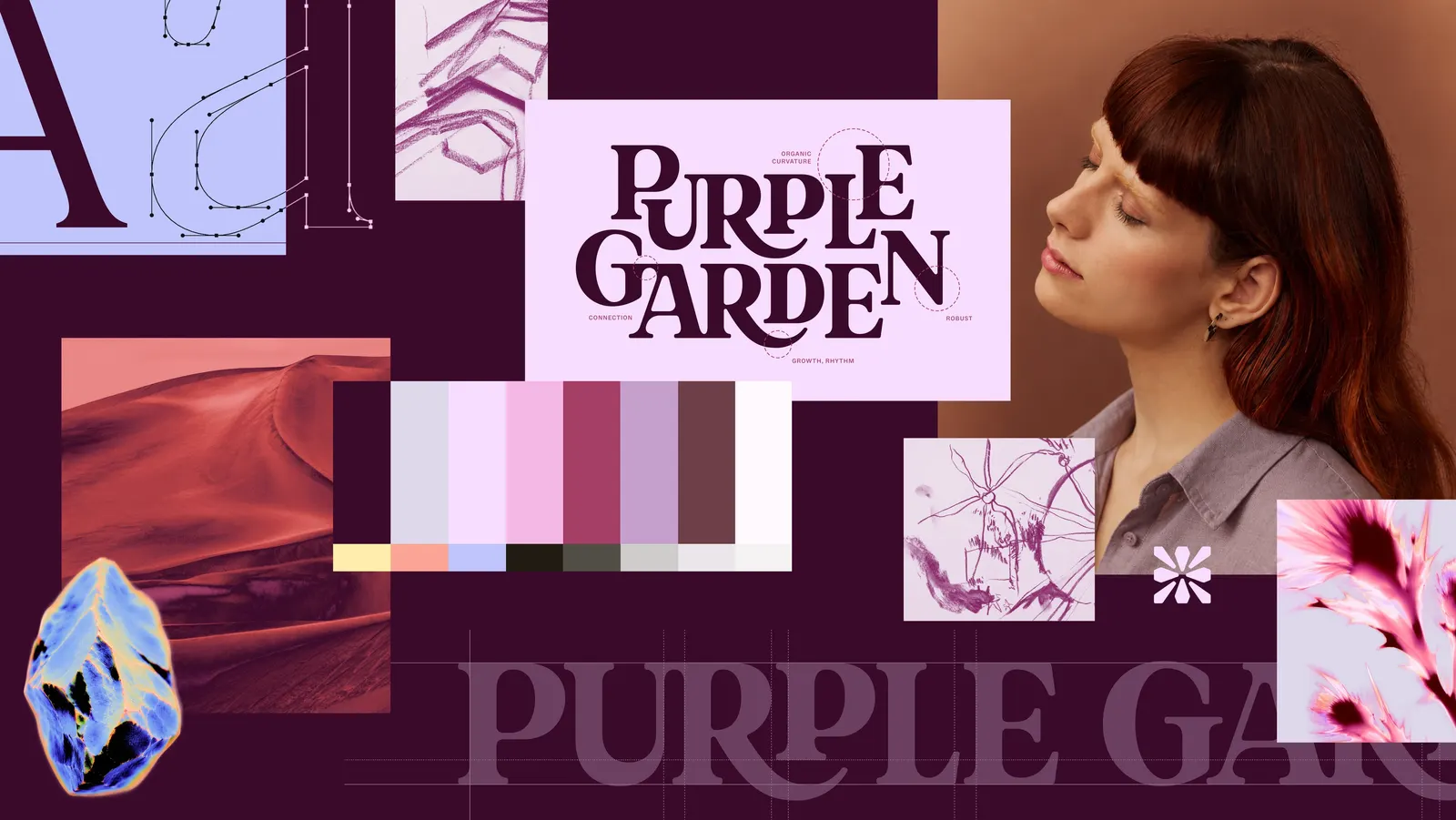
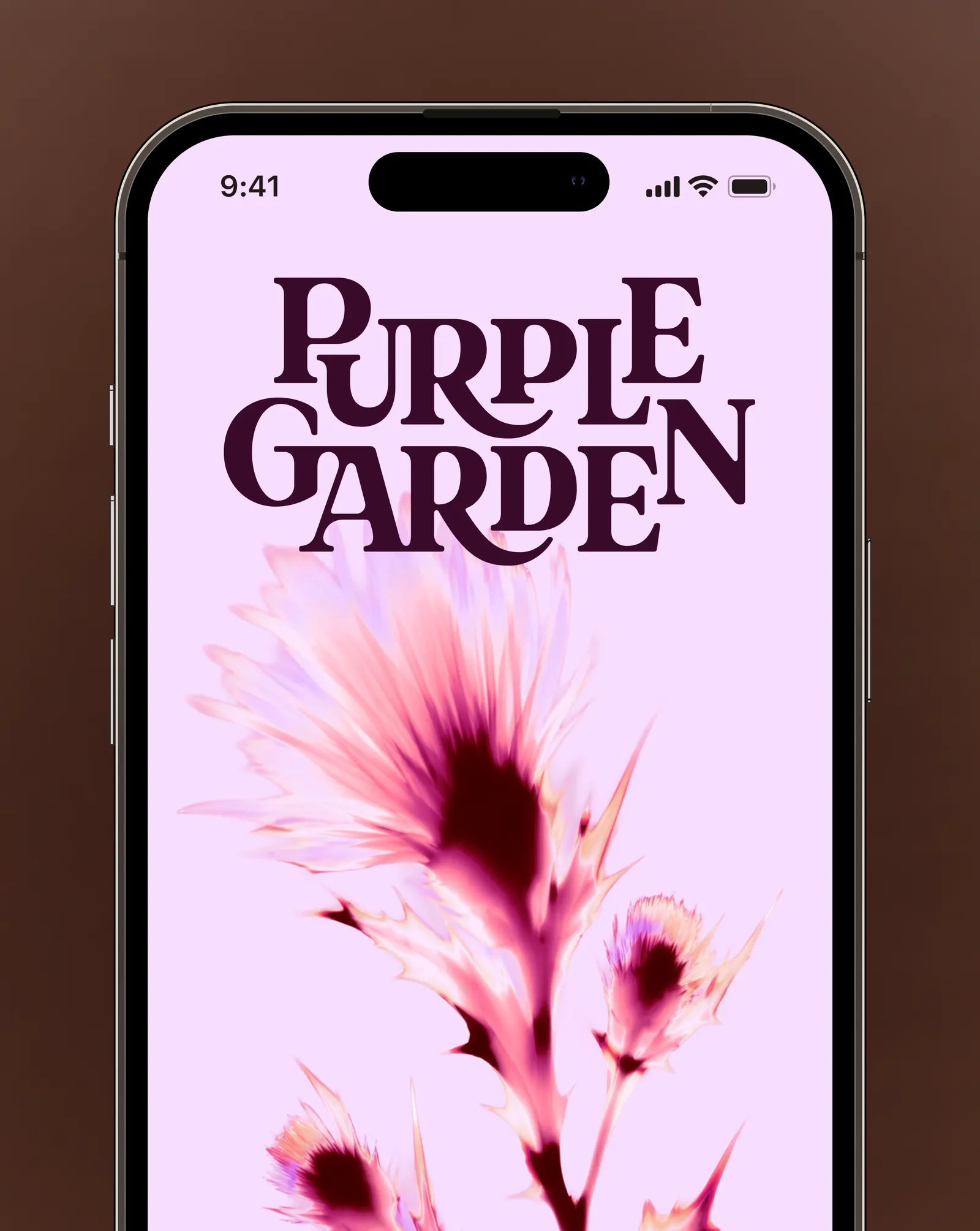
Working with a Purple Garden practitioner, Mother Design ran automatic drawing exercises inspired by Hilma af Klint, and those marks shaped the brand world. The core idea treats spiritual guidance as something you tend over time. The ornate wordmark looks grown rather than drawn yet still works on screen, and the glyph blends plant, crystal, and energy references. Seven warm purples replace the category's usual bluish tone, supported by a secondary palette drawn from dawn, dusk, and moonrise. Type shaped by cymatic patterns, neon surges, and a flexible design system carry it across platforms.
Why it works
Purple is the obvious color for this category, so the smart move was to make it warm and give it range. Seven shades let the brand shift between energized and quiet without leaving its own territory. The drawing-led origin gives the identity a human fingerprint that stock stars and moons can't match, which suits an audience that wants guidance in daily life, not a one-off novelty. The AI-assisted, energy-like motion also feels apt here, because it reads as something moving and alive rather than decorative.
Logo
Typography

Applications

Images and video from motherdesign.com, by Mother Design.