The Brand Monograph
Wimbledon brand identity by Further
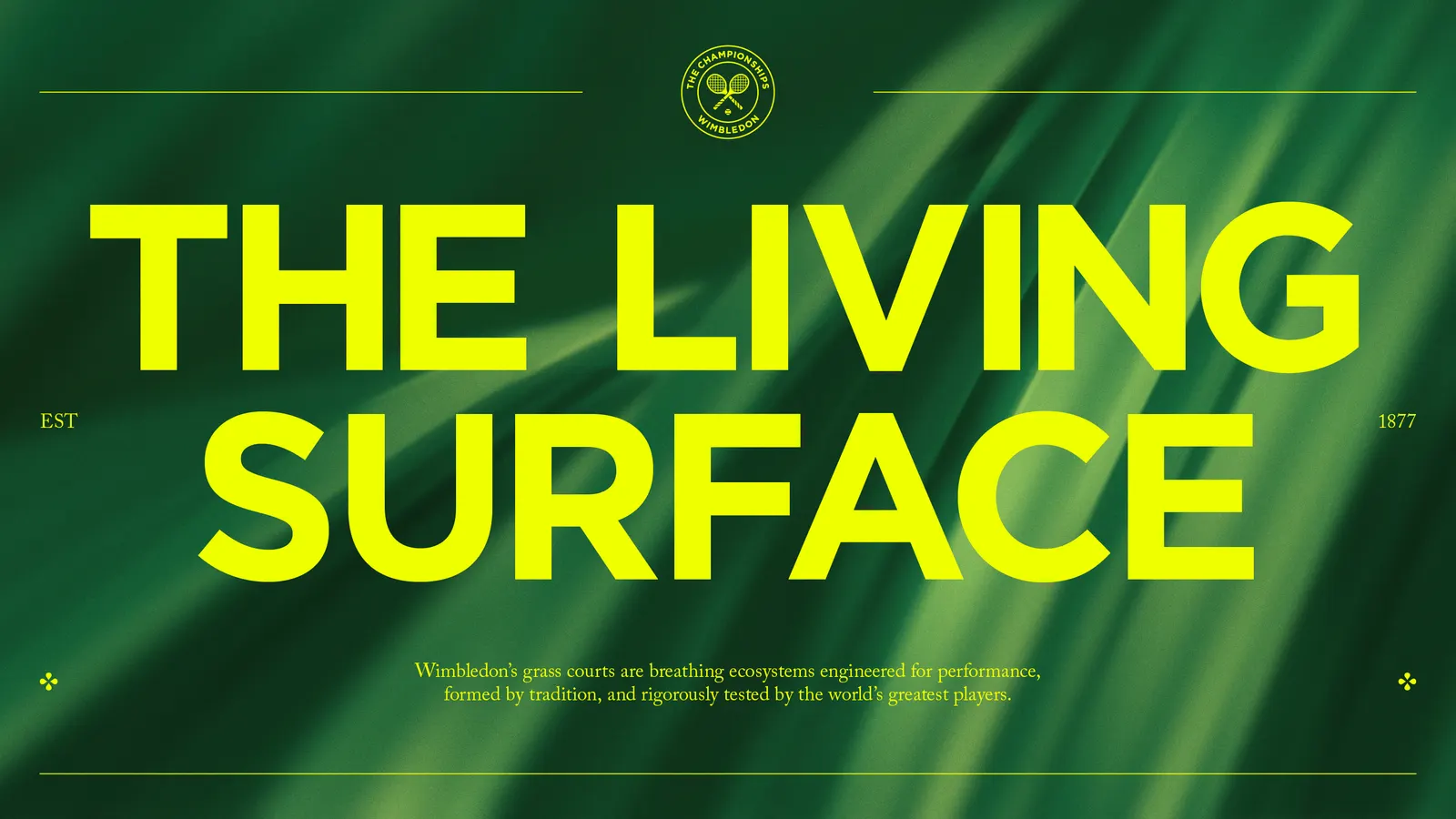
↗Further's Wimbledon work stands out because it refuses to choose between reverence and spark. Rather than modernize a beloved institution by stripping it back, the studio treated tradition as raw material. The team spent time on the courts, in the gardens, and in the library archives before building anything, and the identity shows it.
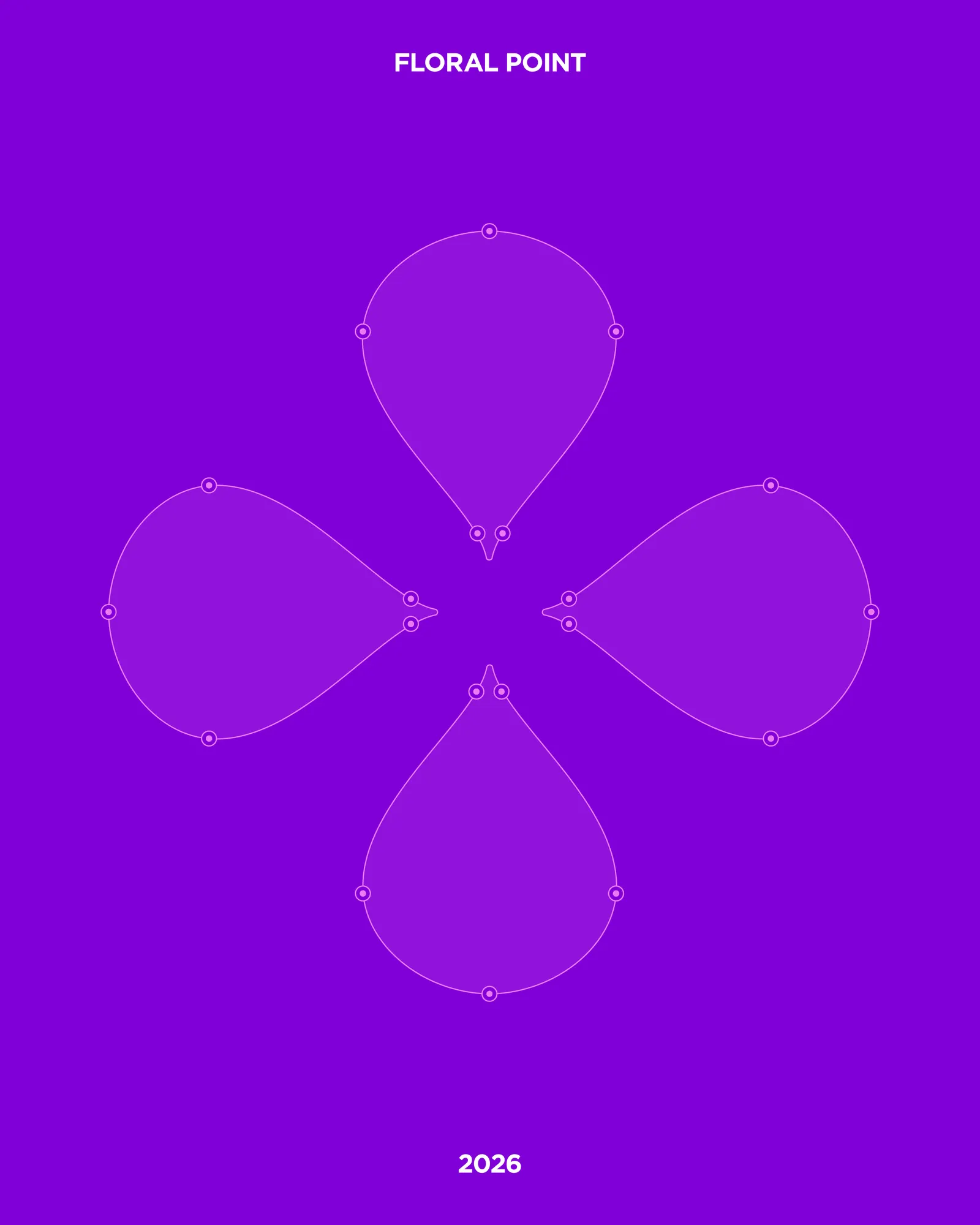
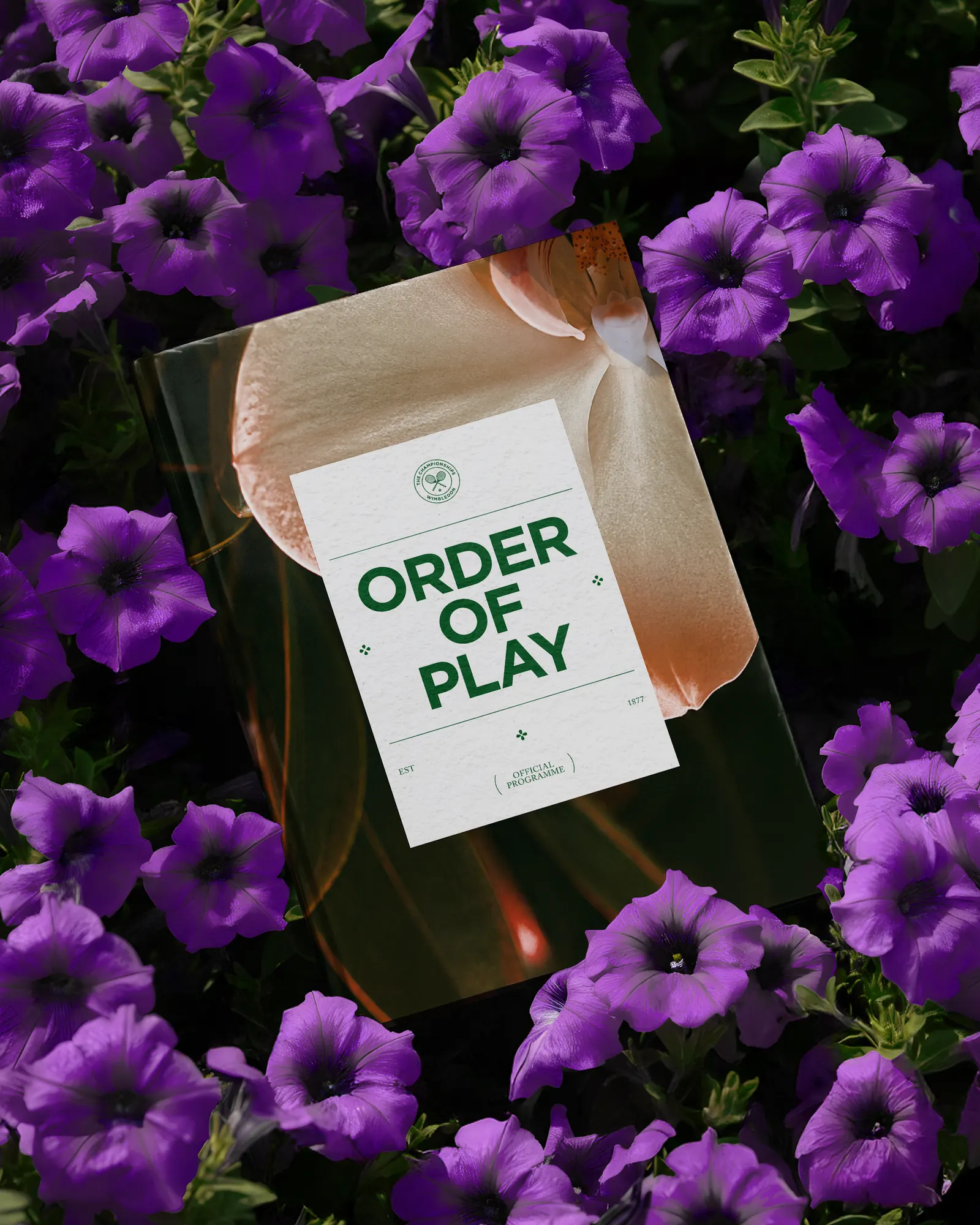
The brand idea, "Forces at Play," runs through a system centered on grass. Court and lawn textures sit alongside icons shaped like a moving blade, and a floral point system gives layouts structure. The type system shifts between ordered and playful settings. The palette draws on shades found around the grounds while keeping the familiar Wimbledon colors, and the tone of voice is written as a gracious host. The system can also turn up the energy when a match gets dramatic.
Why it works
Most sports brands reach for speed, sharp angles, and aggression. Wimbledon's identity gets its distinction from the place itself. Grass and flowers are specific to this tournament, so the visual language couldn't be borrowed by a rival. The floral points are the smartest move: ornament that also organizes a layout, so decoration does real work. Flexible typography lets the brand stay formal for its heritage audience and loosen up for newer fans, without feeling like two different brands.
Typography

Logo
Applications


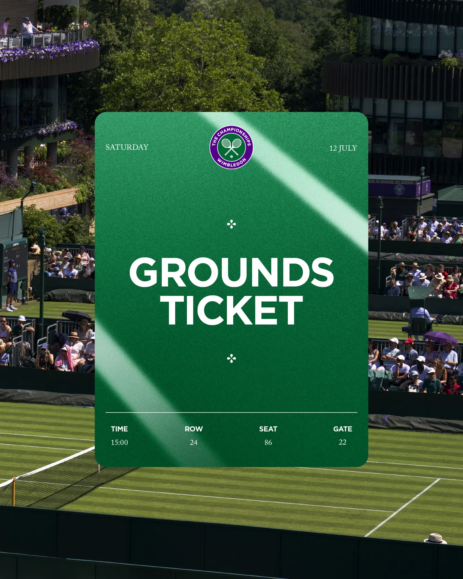
Images and video from further.group, by Further.