The Brand Monograph
Kleenex® brand identity by Turner Duckworth
↗Few identity projects begin with a mark as well known as Saul Bass's 1961 Kleenex® script, and fewer have the restraint to leave it nearly untouched. For the brand's 100th year, Turner Duckworth was asked to pull a scattered global presence into one recognizable system.
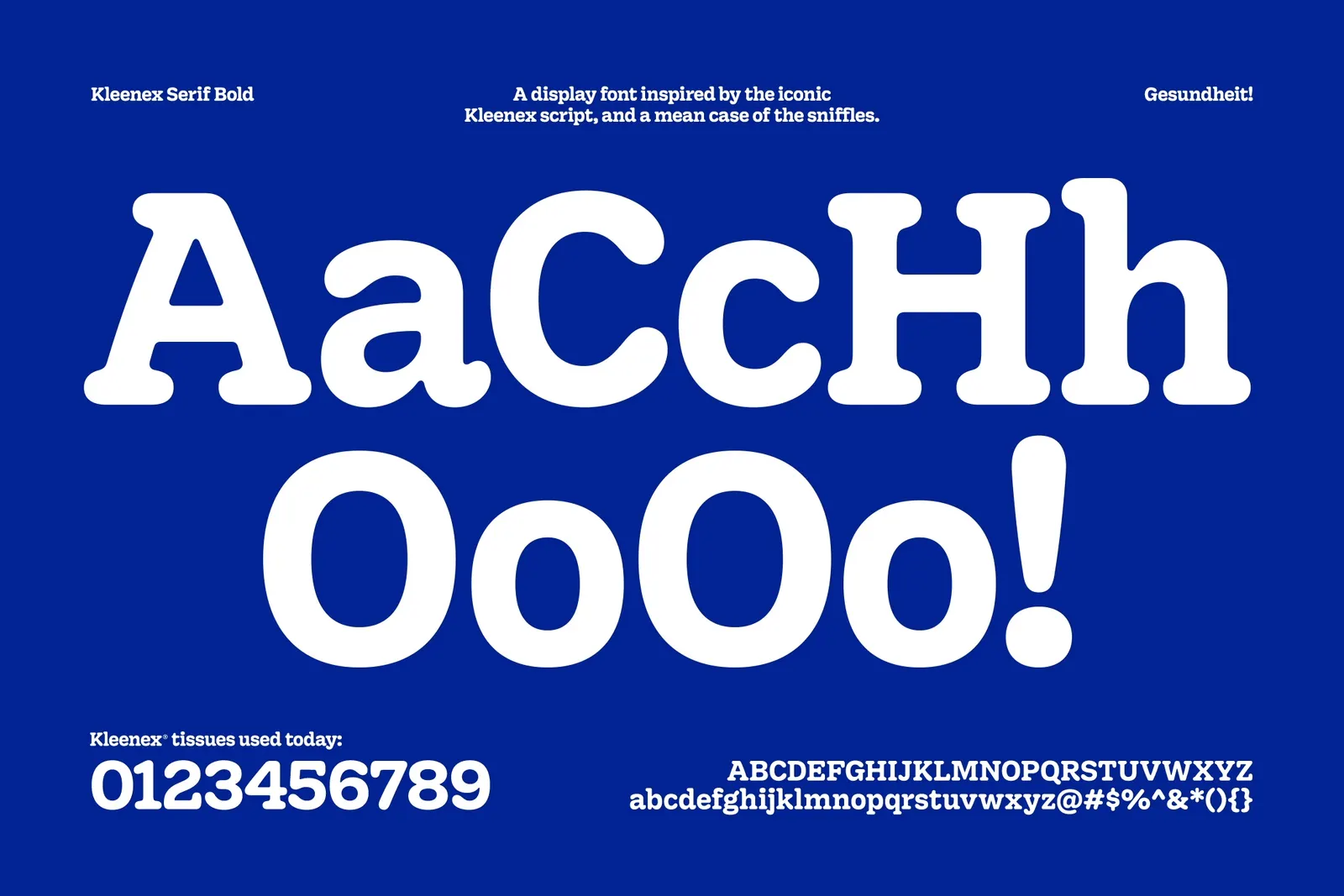
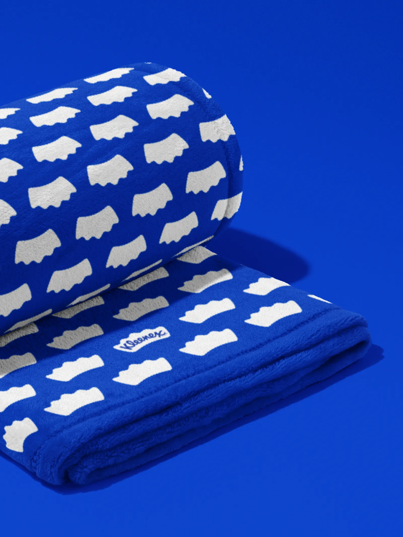
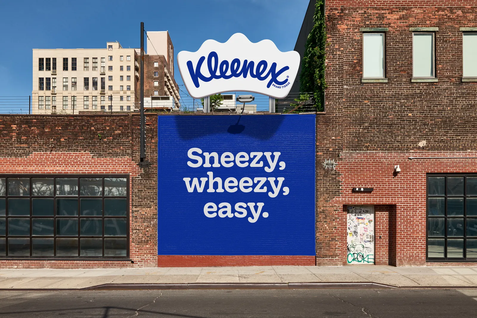
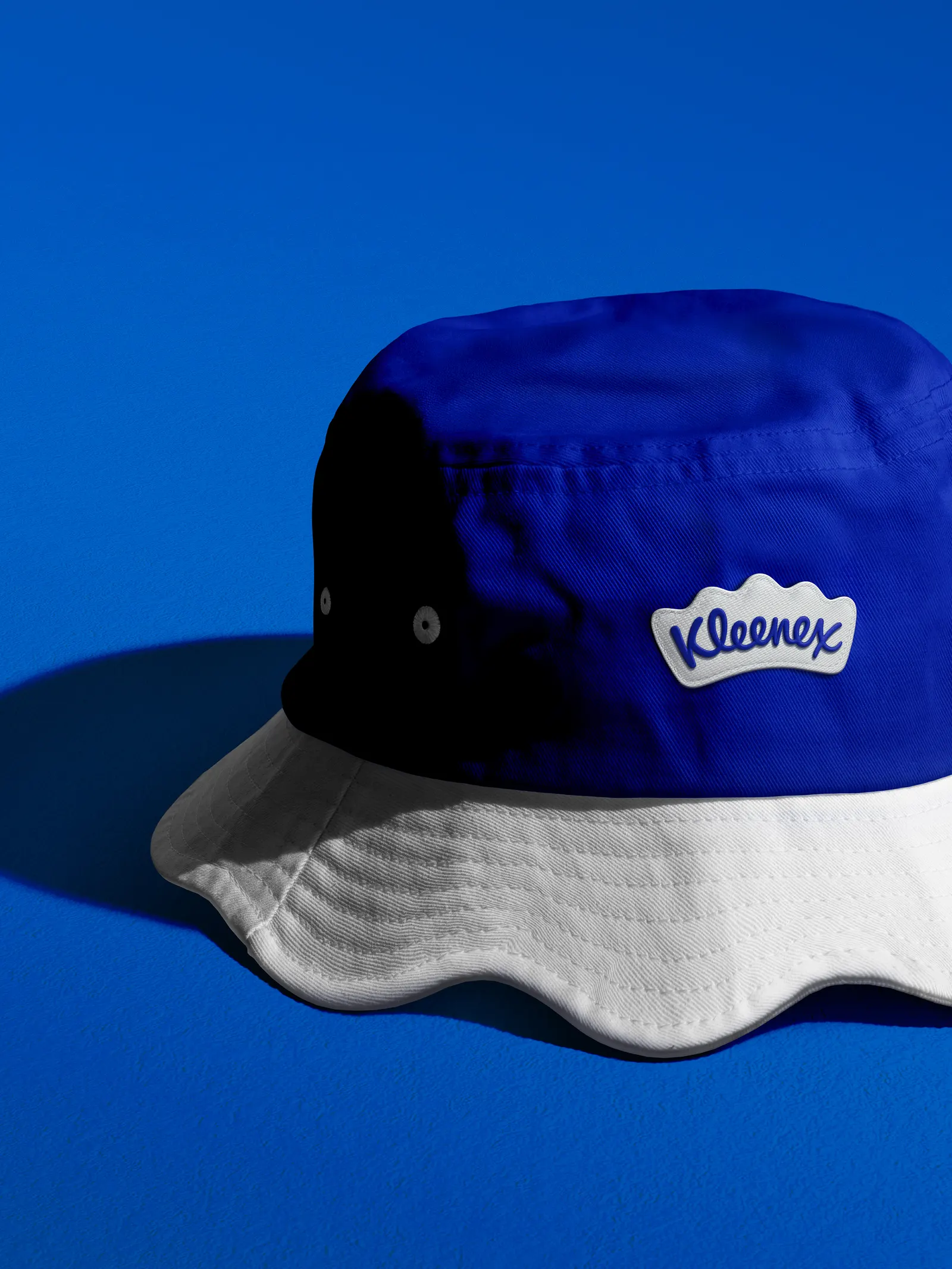
The studio's answer is a crown, its shape borrowed from a tissue, that frames the script. Alec Tear and Lewis MacDonald handled design and typography, keeping the lettering steady while the crown does the new work. Around it sits a narrower palette built on a refreshed Kleenex® Blue, along with an illustration style whose soft curves echo the crown and picture the small mishaps the product exists for: sneezes, spills, and happy tears.
Why it works
The crown modernizes the brand without risking recognition. The script carries decades of familiarity, so the new device adds stature around it instead of replacing it. Because the crown's form comes from the product itself, it feels earned rather than borrowed from luxury clichés. Against store brands, paper towels, and a handy shirtsleeve, a single ownable shape and a disciplined blue give Kleenex® something consistent to repeat everywhere it appears. The rounded illustration keeps that authority warm, which suits a product people reach for when they're upset.
Logo
Typography

Applications



Images and video from turnerduckworth.com, by Turner Duckworth.