The Brand Monograph
Crumbl brand identity by Turner Duckworth
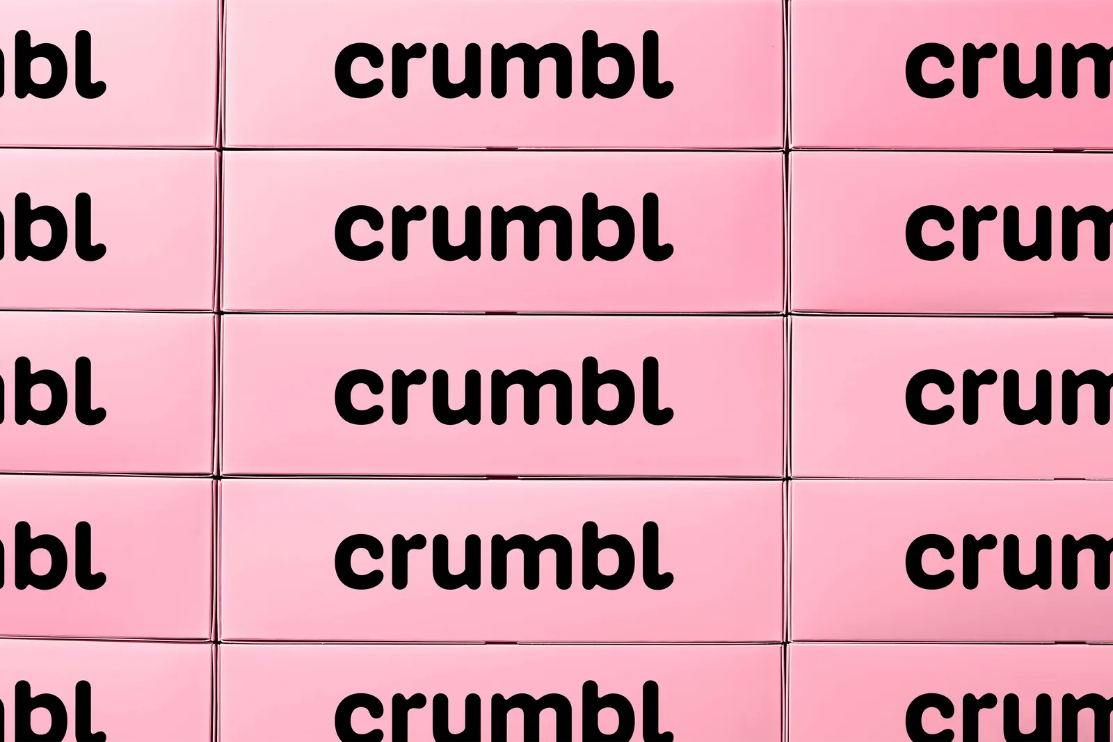
↗Crumbl's new identity treats the box as a design asset instead of just packaging. Turner Duckworth took the shape fans already know and built it into the system, so the brand is recognizable even before a word is read.
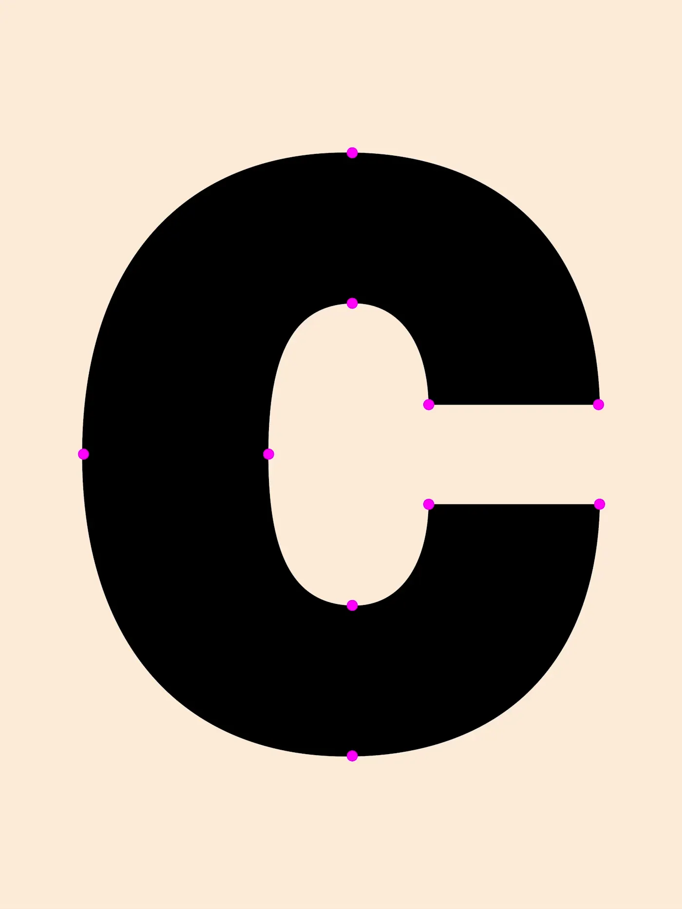
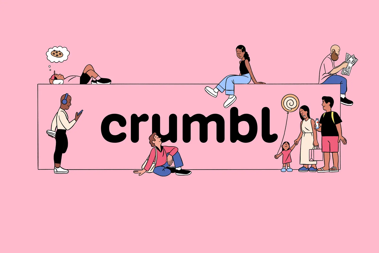
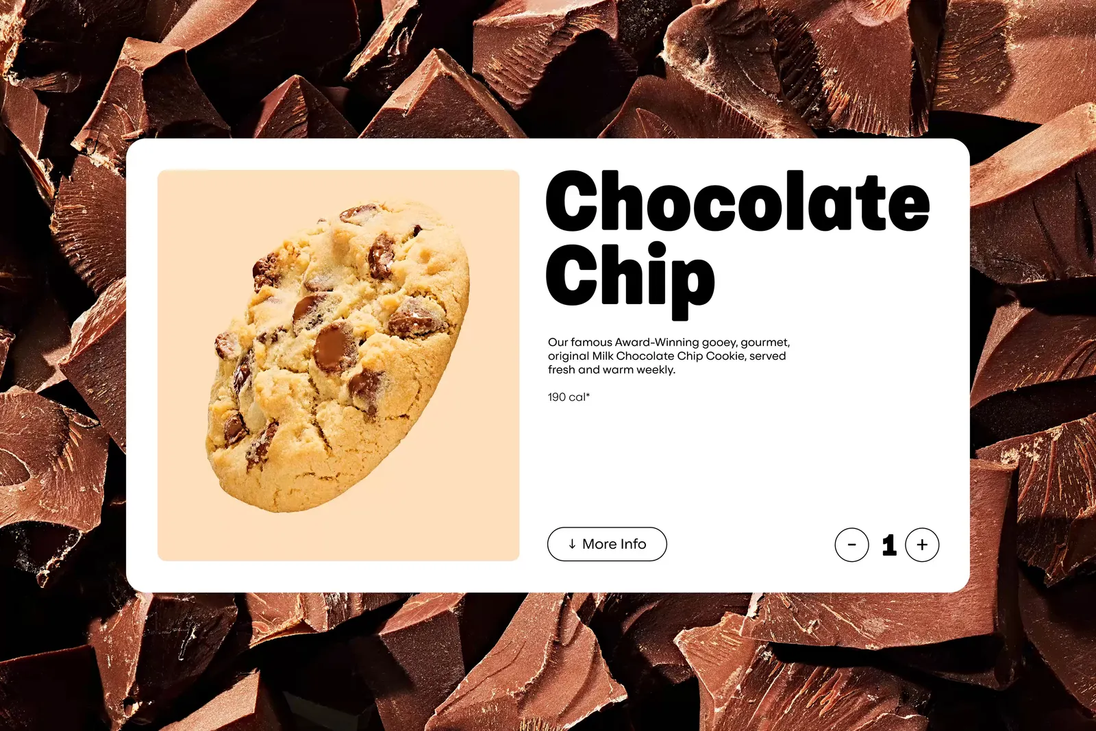
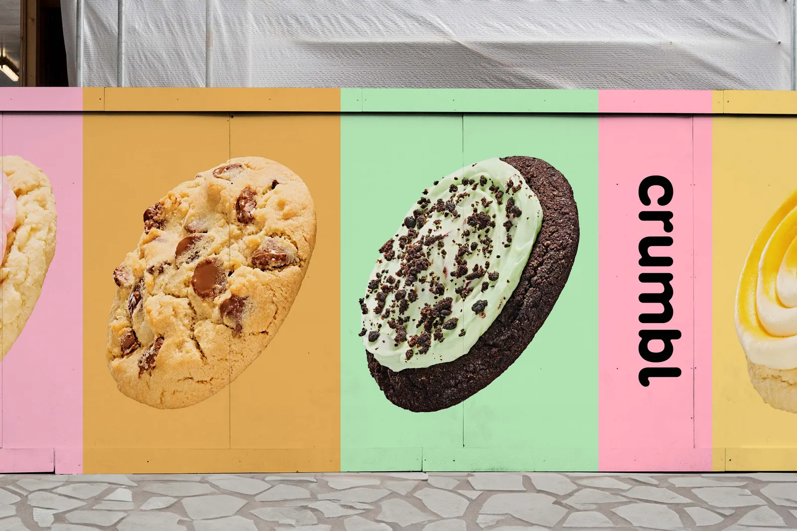
The brief was to give a cookie company that started with two cousins and one store an identity that could handle international scale. The studio reworked the existing wordmark rather than discarding it, adding small details to make it more ownable. BUCK illustrated the Crumblverse, a playful world drawn from the brand's stories, community, and bakers. Kilotype and Alec Tear helped customize Crumbl Sans, a variable typeface that stretches from functional text to expressive display. Ted Cavanaugh's photography uses carefully composed graphic setups, and the system also flexes into merchandise for the brand's most loyal fans.
Why it works
Evolving the wordmark instead of replacing it protects the recognition Crumbl has already earned, while the added details make it harder to confuse with other dessert brands. Using the box shape gives the brand a form competitors can't easily borrow. The variable typeface lets one family cover everyday information and loud, appetizing moments without the brand sounding like two different companies. The illustration adds a friendly, characterful layer that suits a business built on sharing.
Applications

Logo


Images and video from turnerduckworth.com, by Turner Duckworth.