The Brand Monograph
Amazon brand identity by Koto
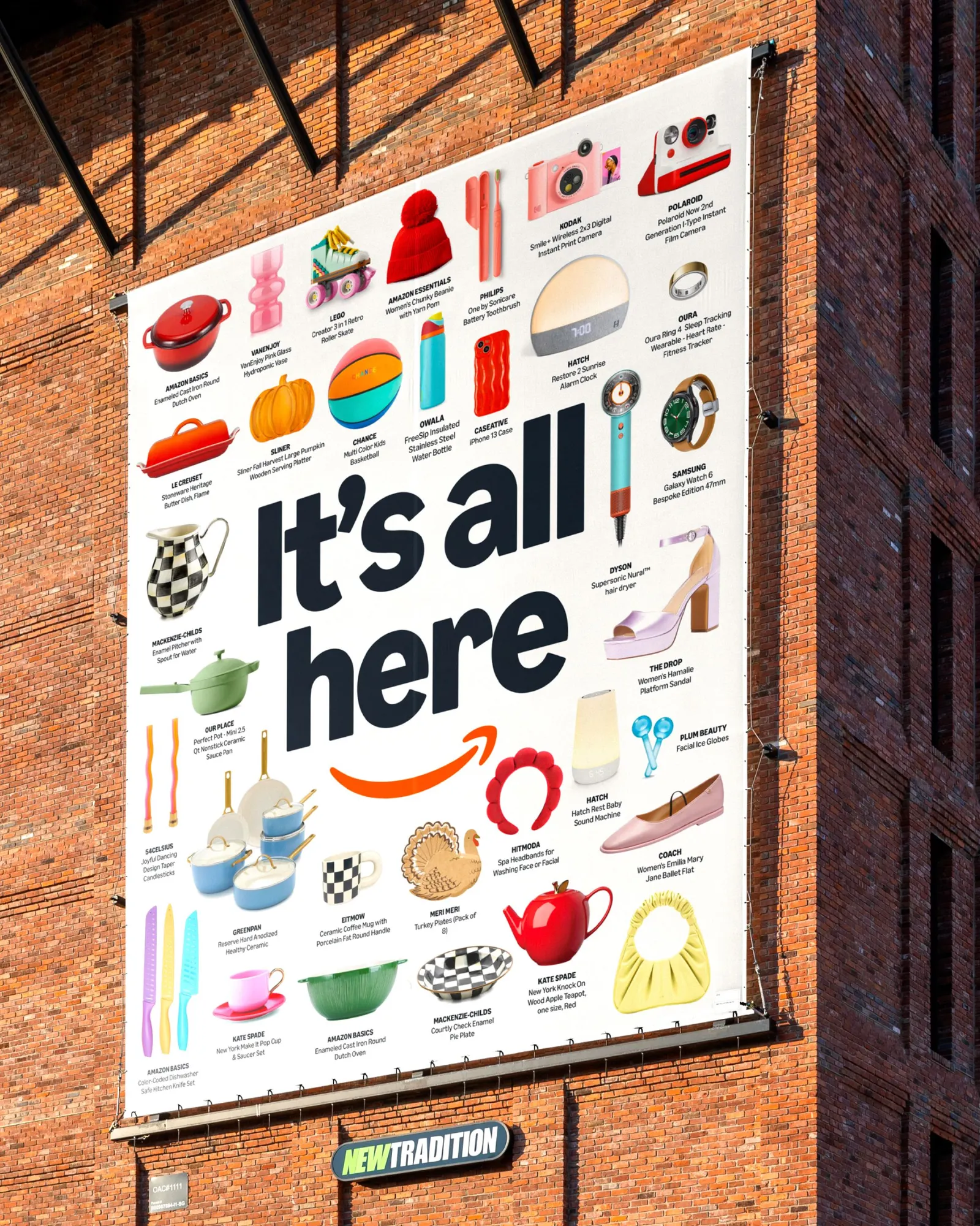
↗Few logos are as familiar as Amazon's, which makes Koto's first update to it in more than 20 years a quiet but significant move. The studio spent 18 months on the project with Amazon XCM, working across 15 markets and more than 50 sub-brands that had drifted apart over time.
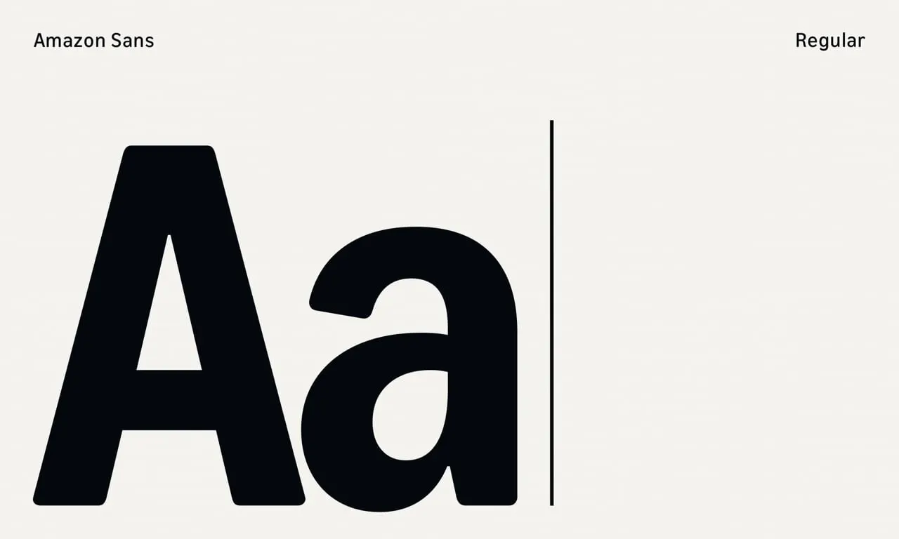
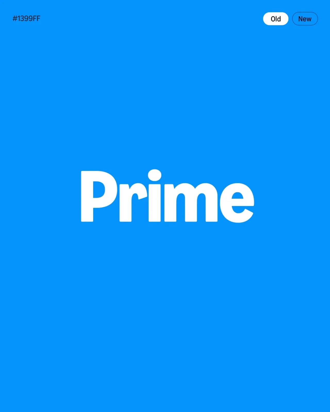
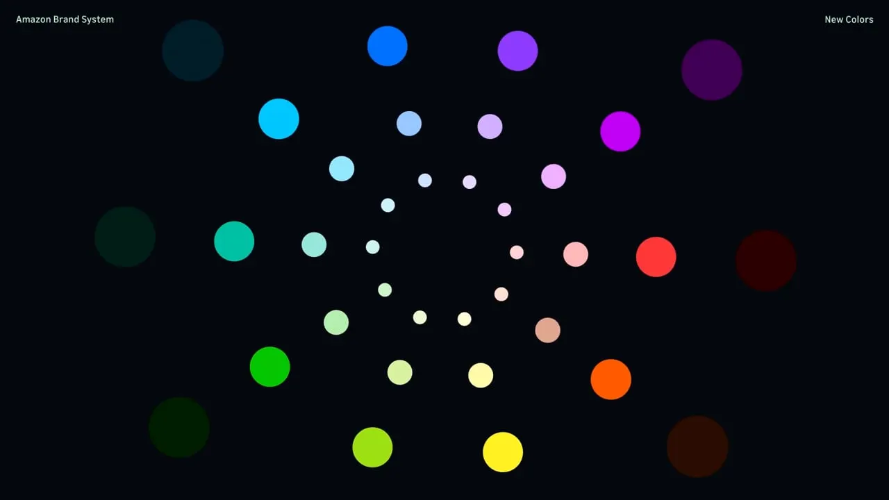
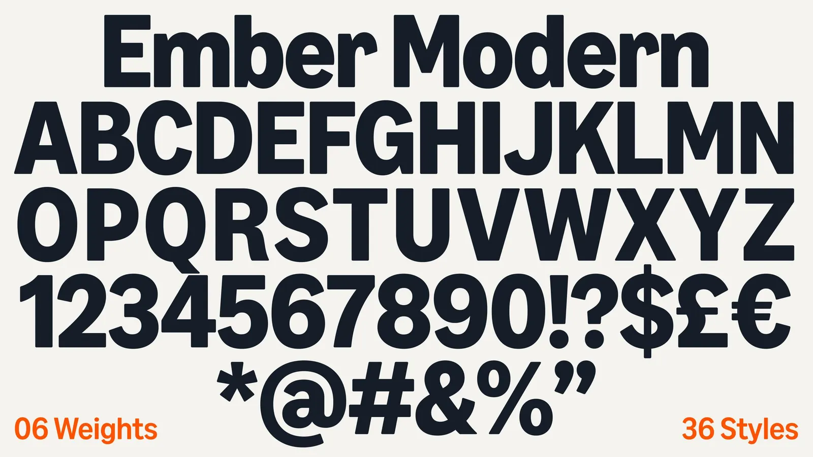
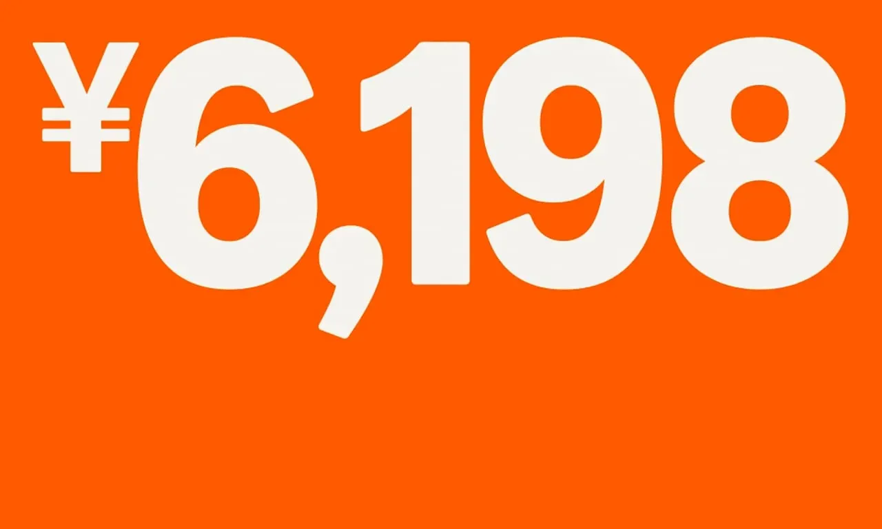
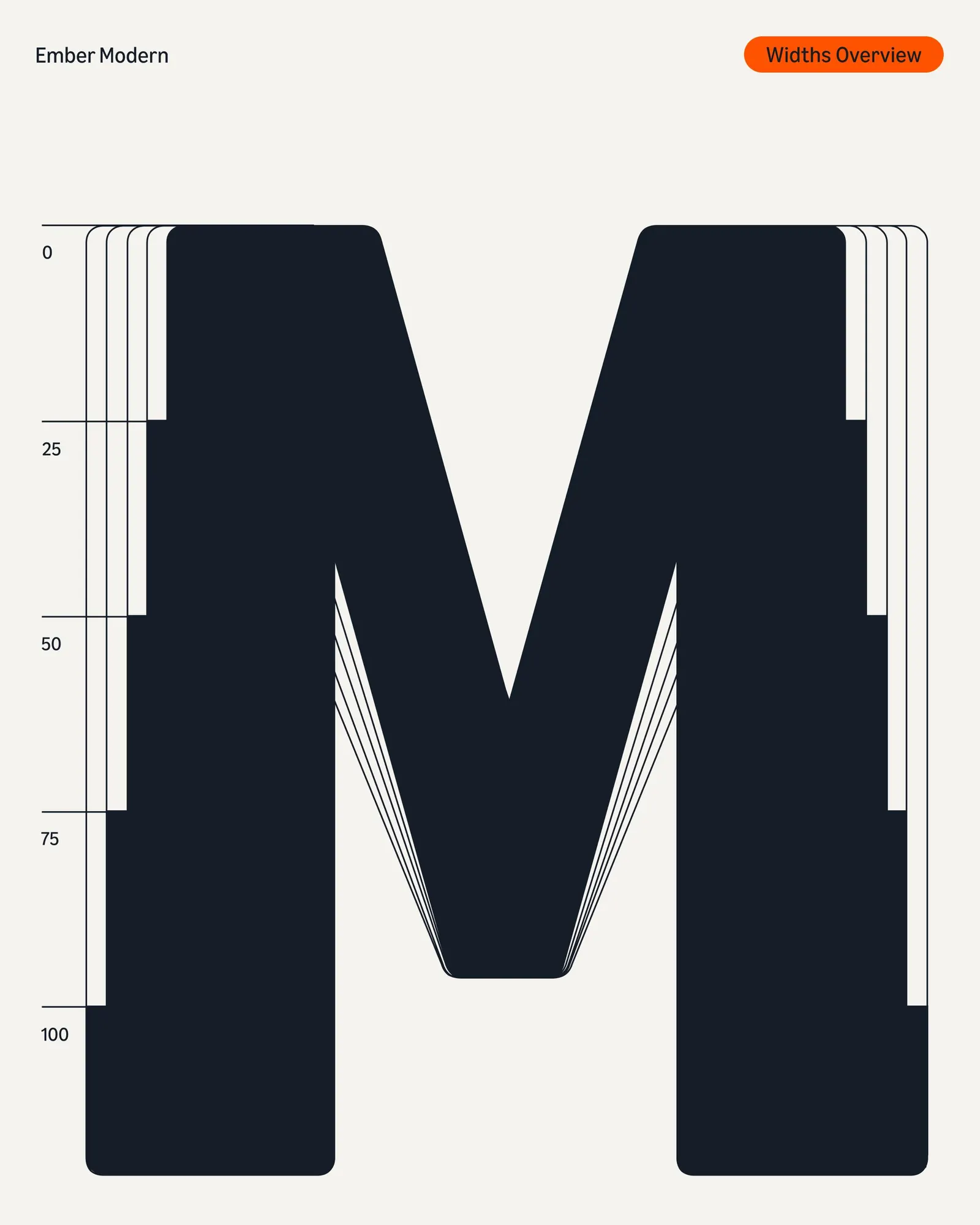
The smile now curves deeper, and Koto redrew the wordmark's letterforms into a full custom alphabet, Amazon Logo Sans, so any sub-brand logo can be built in seconds. Color was consolidated into a single Smile Orange, alongside a more saturated blue for Prime. Ember Modern, an evolution of Amazon's Kindle-era typeface, supports 364 languages and moves between loud campaign use and quiet interface work. An iconography system and photography by Mari Juliano complete the picture.
Why it works
The restraint is the smart part. Koto kept the shape people already know and shifted the emphasis from the arrow to the smile, so the mark gets friendlier without losing recognition. Building the sub-brand logos from the same custom letterforms makes the family look related at a glance, which matters when a shopper meets Amazon in dozens of contexts. One orange does more work than several near-matches, and a typeface that can turn up or down suits a brand that is both a billboard and a utility.











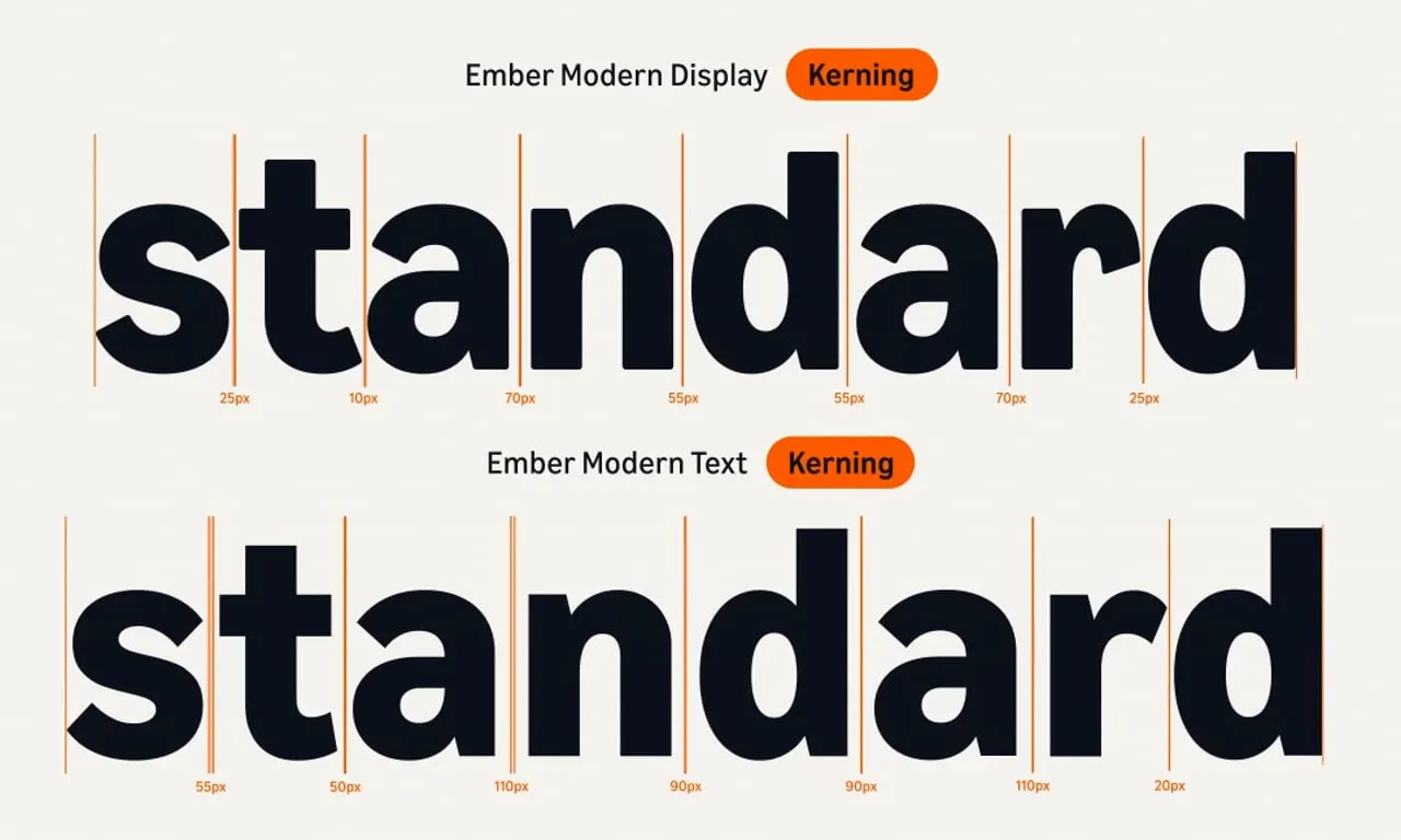
Images and video from koto.com, by Koto.