The Brand Monograph
Patreon brand identity by Wolff Olins
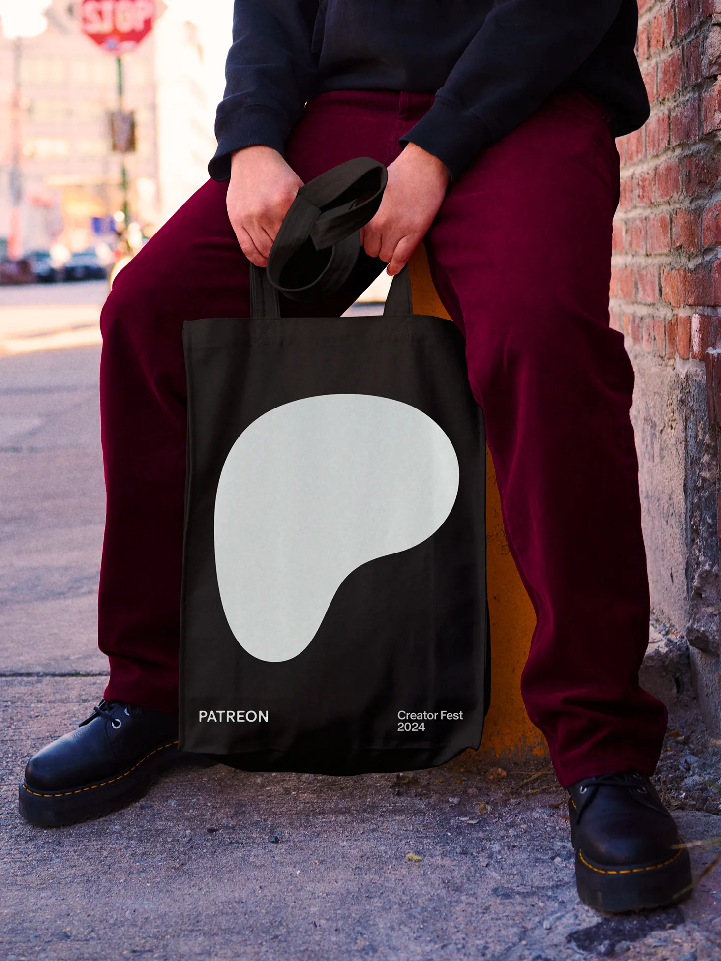
↗Most logos are made to be reproduced exactly. Patreon's, designed by Wolff Olins, is made to be reshaped. The studio began with a platform that had spent a decade changing how fans support artists, and a brief to put the people making the work ahead of the company. The result is a soft, rounded form drawn from the letter P, built as a vessel that can take on many different looks.
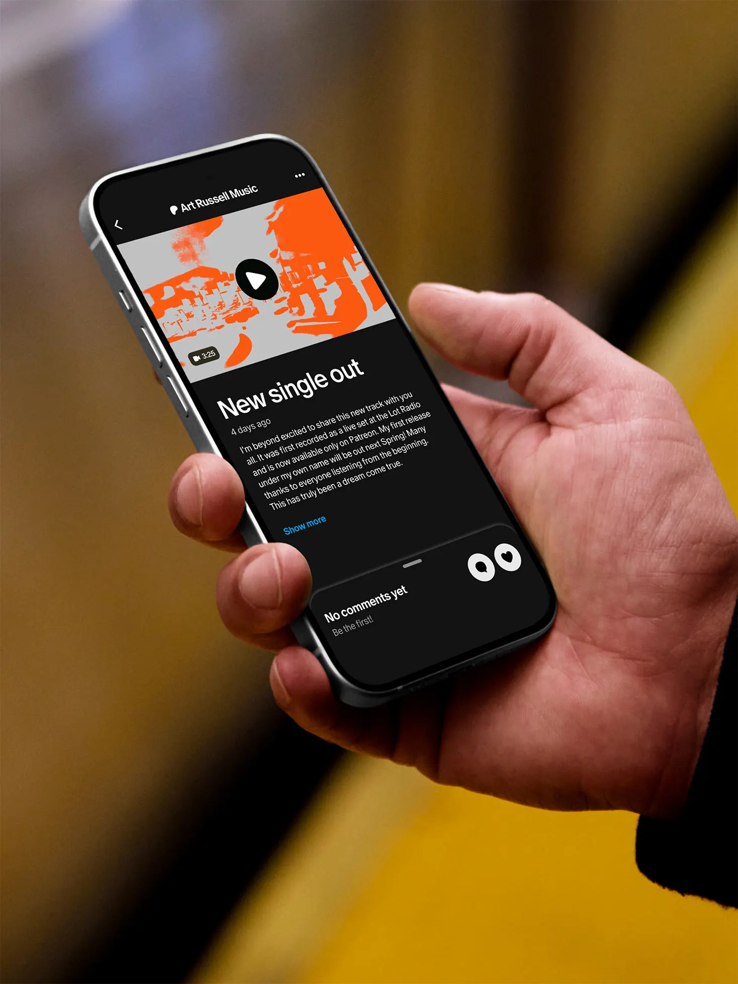
David McLeod's 3D work tested how that form might look and move as a kind of creative material, with varied textures and behaviors. Dinamo Type Foundry drew a wordmark with a wide weight range, from hairline-thin to heavy. Patreon's in-house team carried the thinking into a redesigned app and new art direction, and the identity debuted alongside the company's first Creator Fest.
Why it works
Platforms usually stamp their own logo on everything creators make. Patreon does the opposite, and the design choices carry that stance. The P keeps a recognizable silhouette but leaves room for creators to fill it, so the mark stays familiar without hogging attention. The weight range of the wordmark works like a volume dial: quiet when the creator is speaking, louder when Patreon is. It's a simple, practical way to be confident and humble at once.

Images and video from wolffolins.com, by Wolff Olins.