 The Brand Monograph
Stack Overflow brand identity by Koto
↗Few rebrands start from a problem this pointed: Stack Overflow's archive helped train the AI tools that now answer developers' questions before they ever visit. Koto turned that irony into a position, casting the platform as the source of human-verified knowledge that machine answers depend on. The portfolio was simplified into Stack Overflow for public platforms and Stack Overflow Business for products and services, tied together by an idea of perpetual construction.
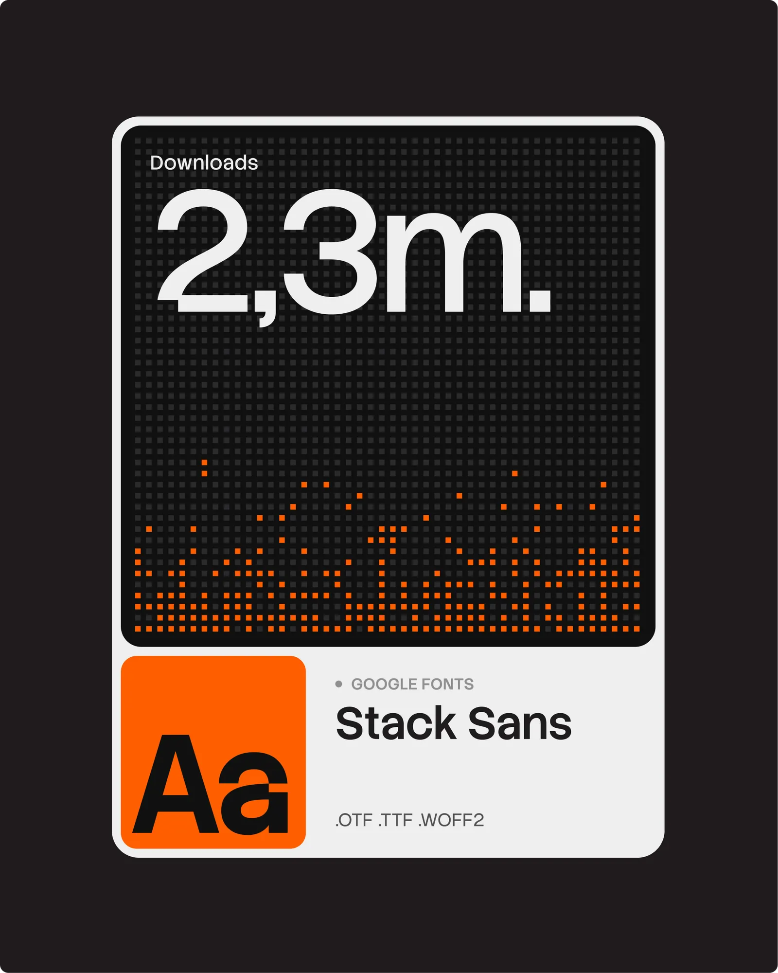
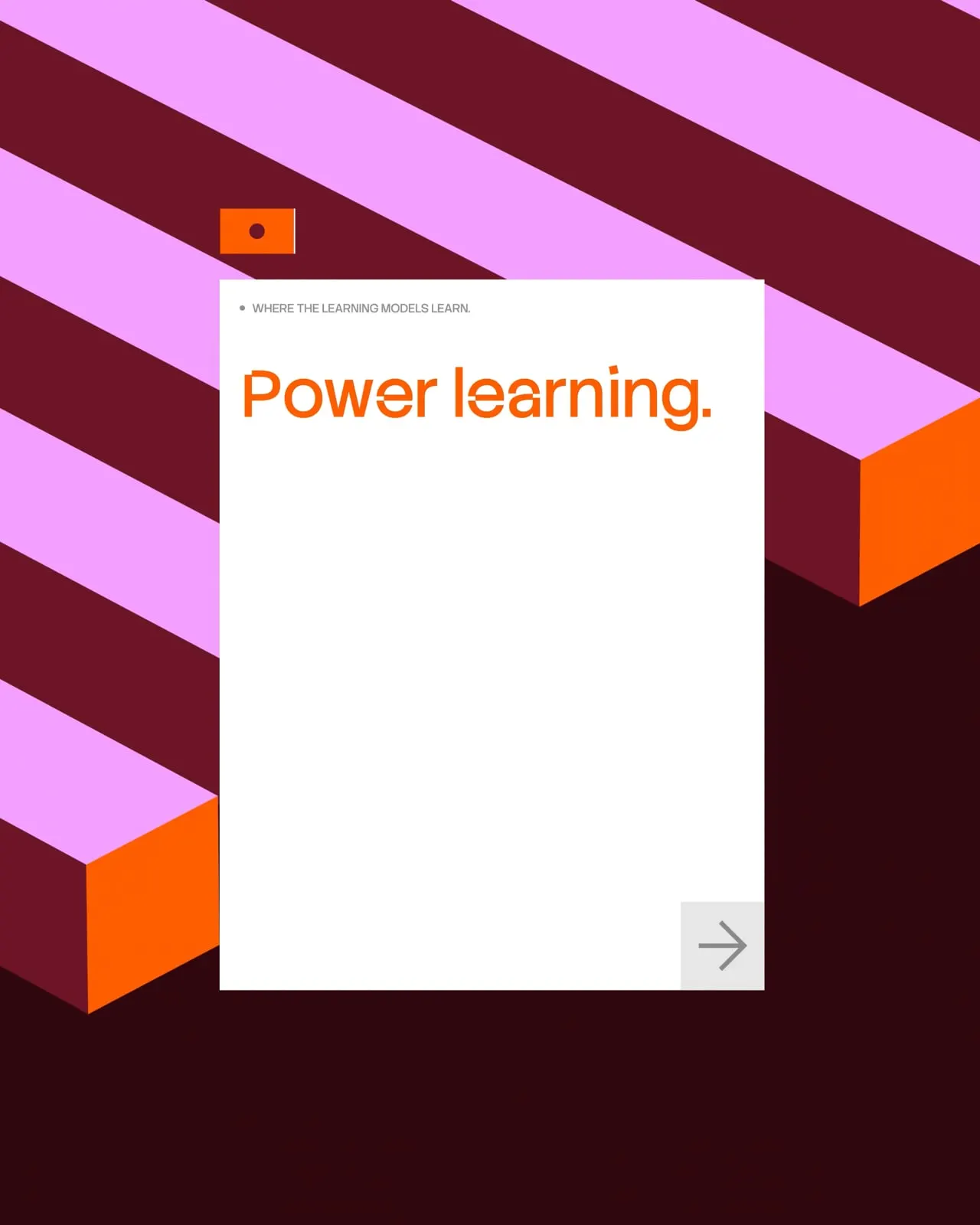
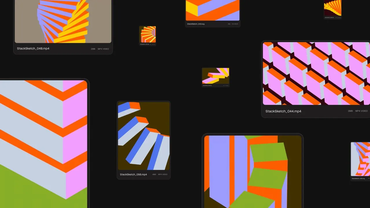
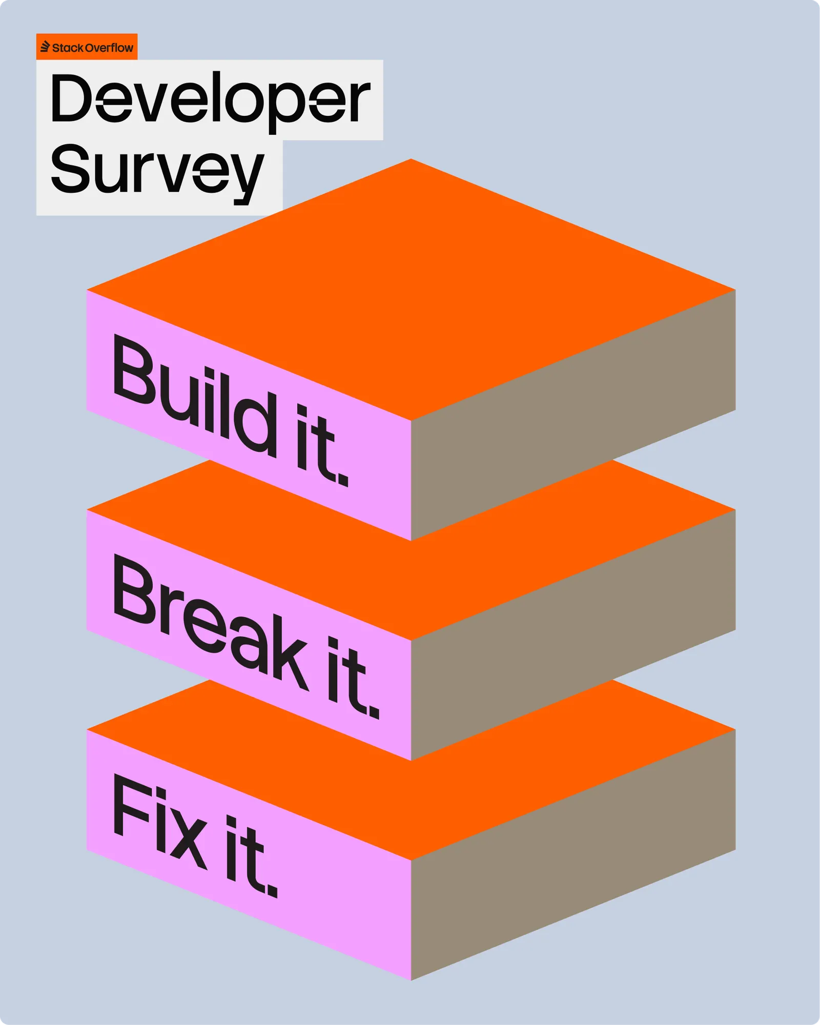
The craft carries it. Koto reduced the logo to a single-color mark of building blocks in motion, keeping the toppling tower intact as a nod to the engineering error behind the name. Its geometry feeds a fluid visual language and a custom generative tool for producing assets. Stack Sans, now on Google Fonts, adds a notch detail drawn from the building process. Volume shifts by context: restrained in product, looser in campaigns and the Developer Survey.
Why it works
Developers distrust polish, and this identity doesn't lean on it. The block mark is simple enough to live in a browser tab, and the tower joke rewards people who know the origin story without explaining it to anyone else. Stack Sans gives a category that defaults to neutral sans serifs and monospace a voice of its own, and the notch is subtle enough to read as craft, not decoration. Keeping product quiet shows the studio understands who the brand serves.
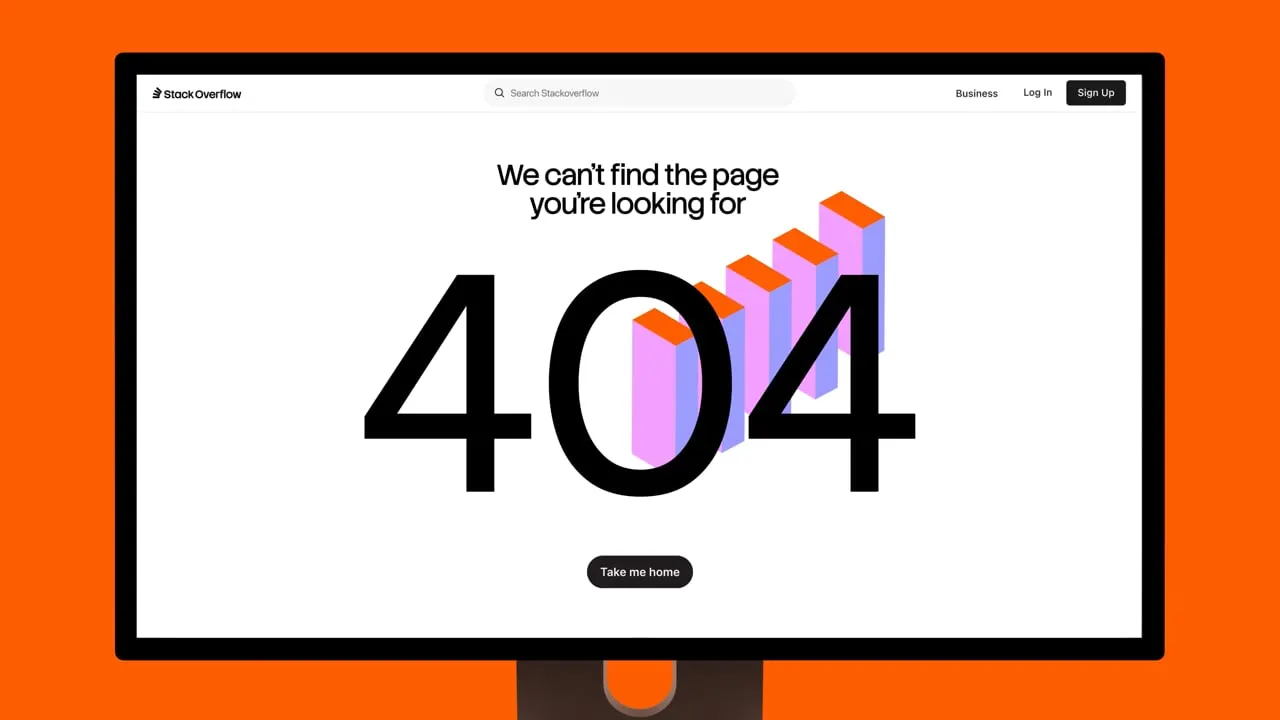

Images and video from koto.com, by Koto.

