The Brand Monograph
Innovation Endeavors brand identity by Mast
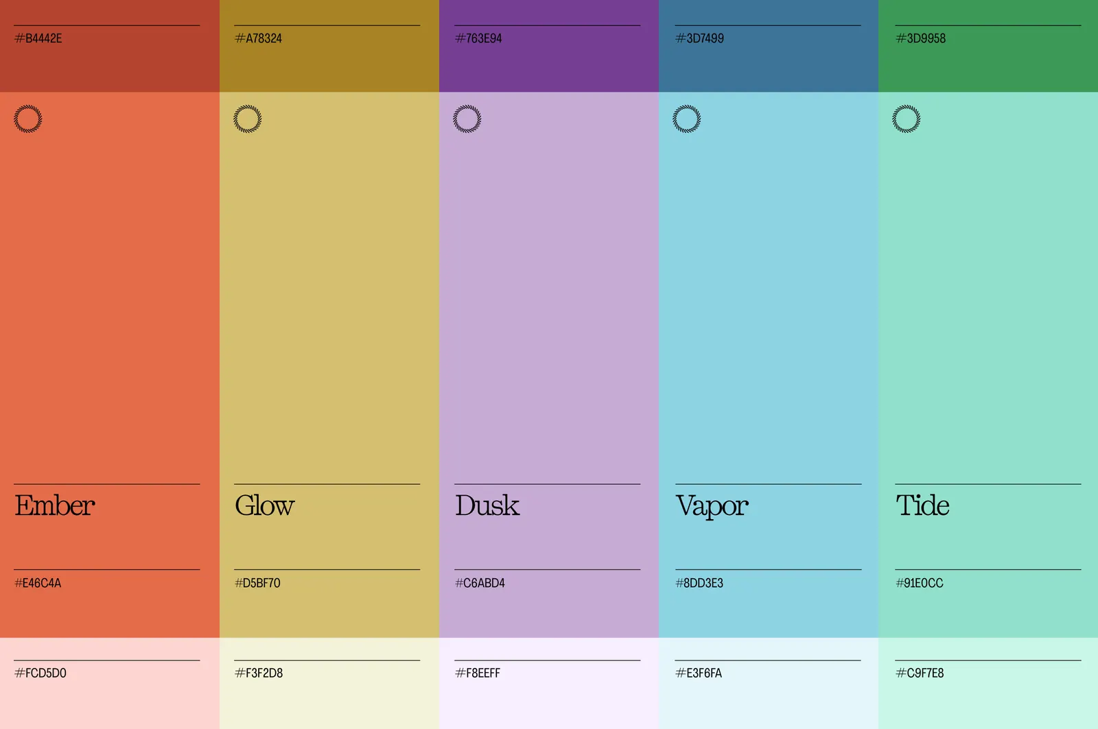
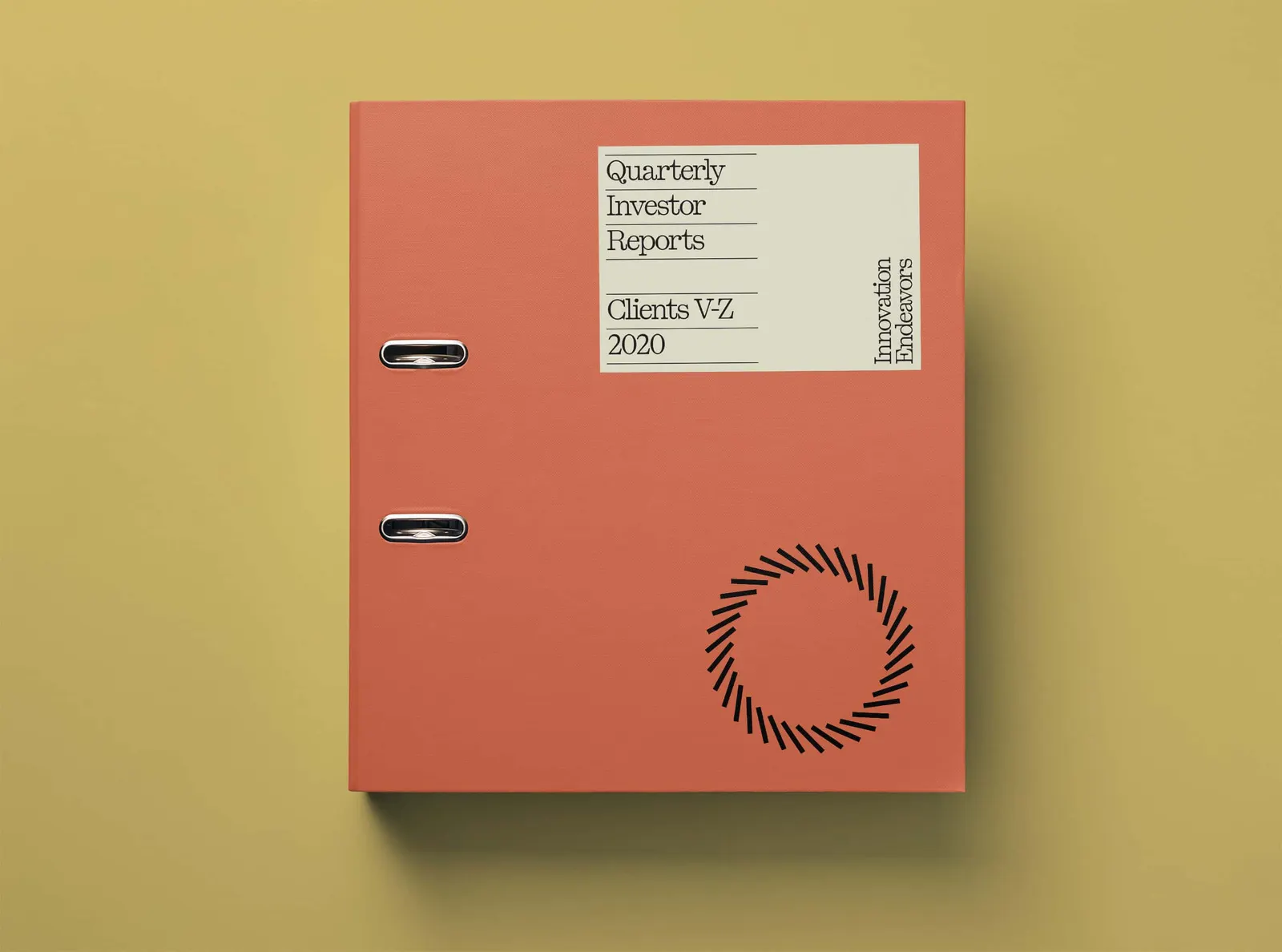
↗It's rare to see a studio return to its own work after ten years and show this much restraint. Mast went back to Innovation Endeavors, the venture firm whose identity it created at the start, and chose to edit rather than replace. The symbol stays. So do the original blue and green, now softened in saturation and spread across a wider range of tones.
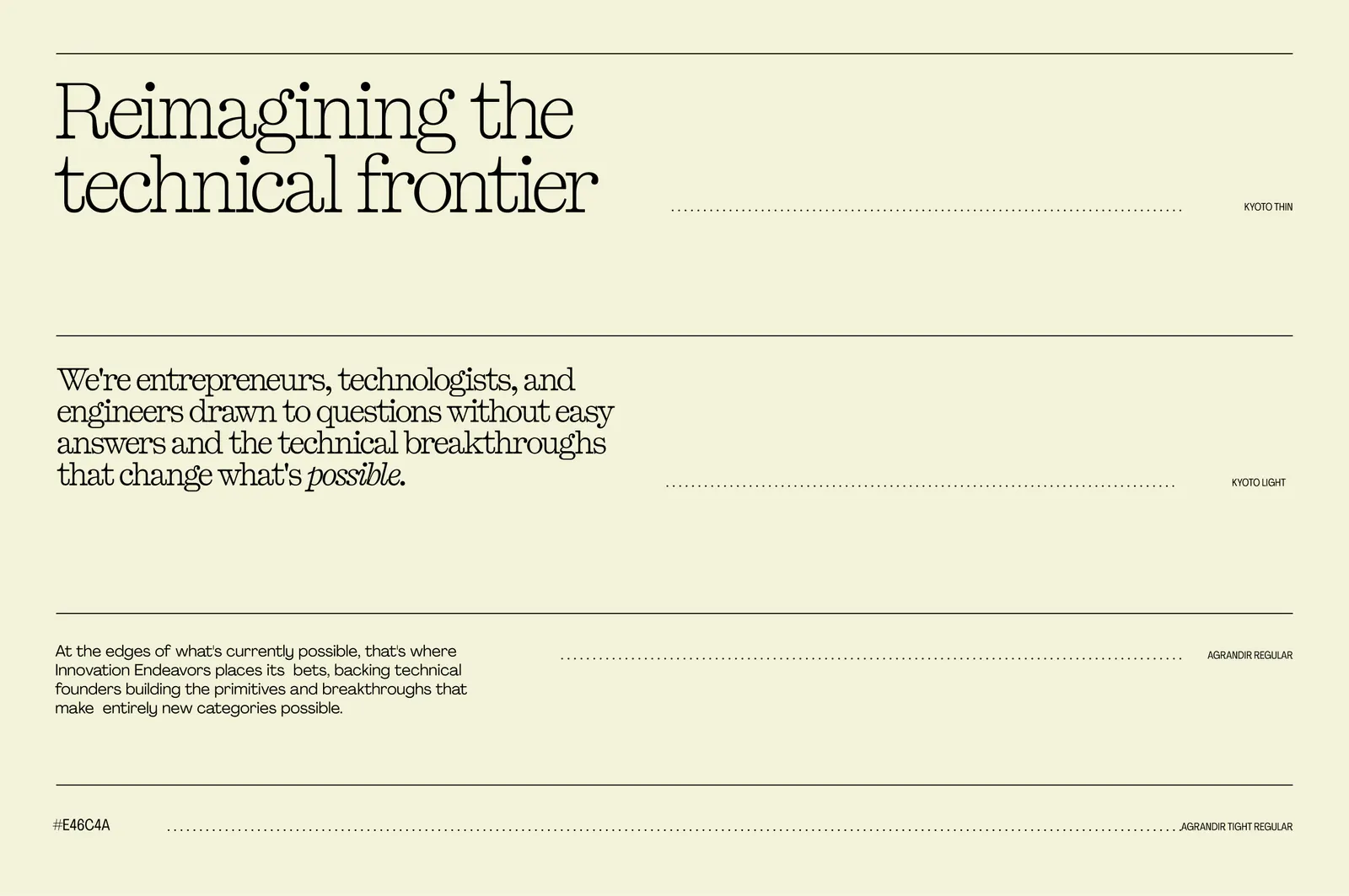
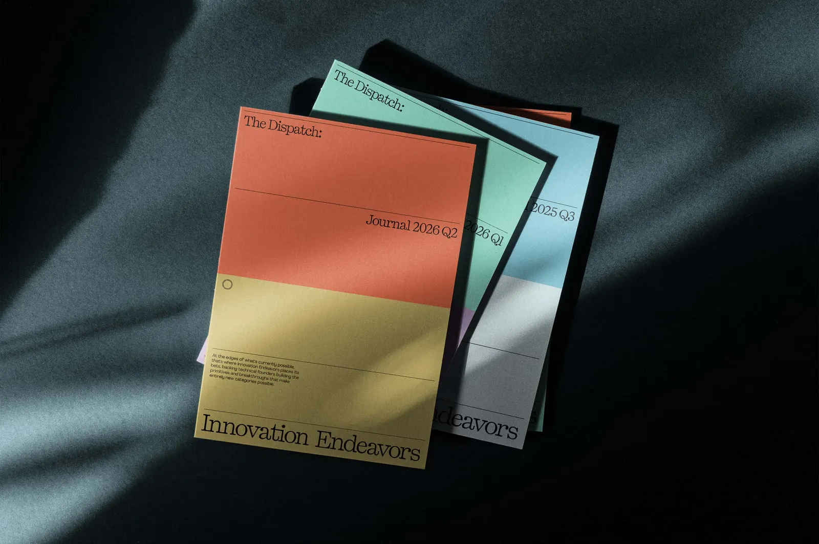
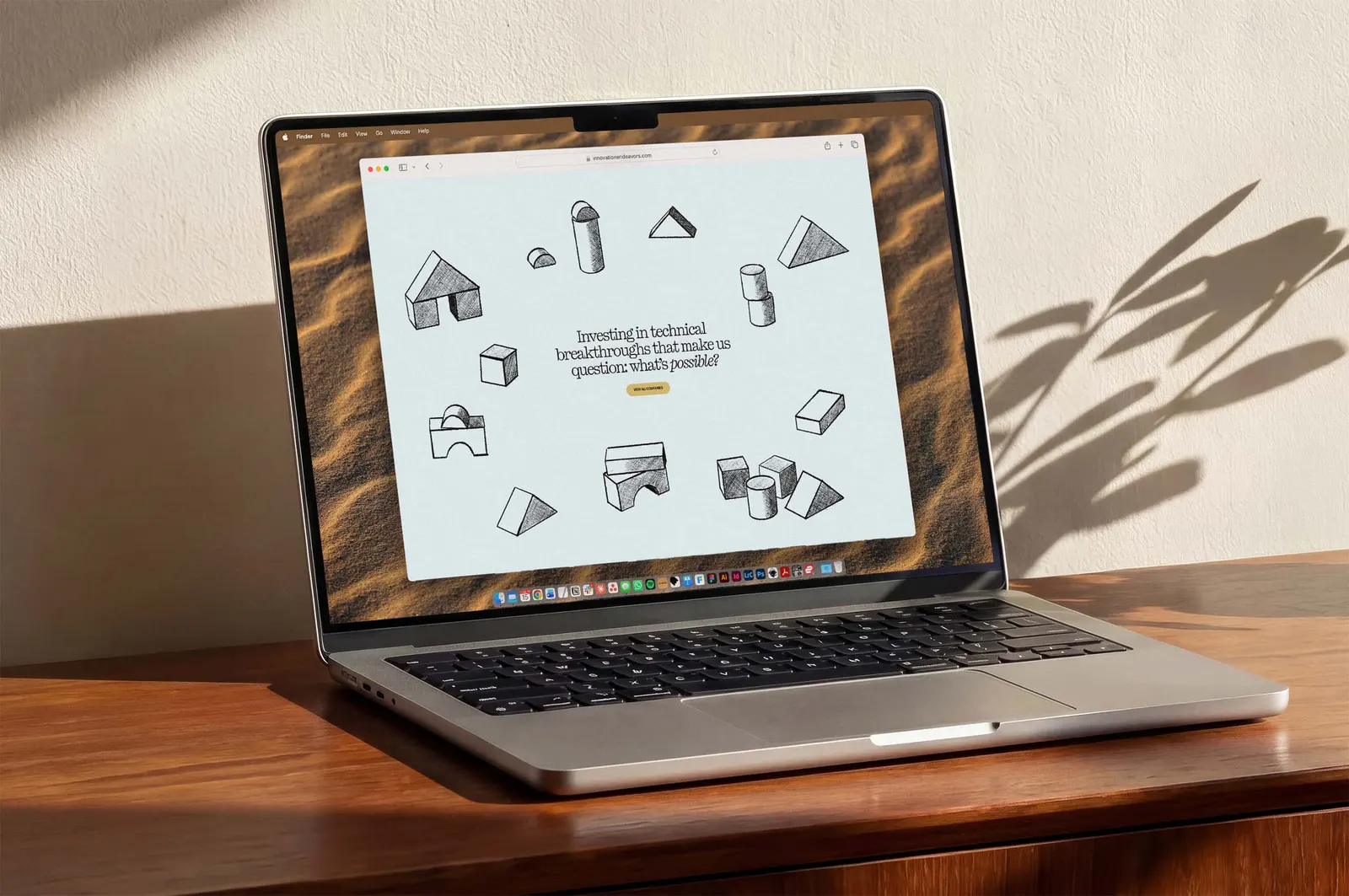
Around that core, Mast redrew the wordmark with cleaner letterforms and better proportions. It also built a typographic system on ruled lines, with Kyoto giving each layout its weight. On the website, a four-part grid organizes everything from a single quote to a full portfolio spread. Loose hand-drawn illustration brings personality, and the circle from the earlier system of moons and orbits carries over.
Why it works
Venture identities often default to cold tech polish or generic finance, and this one avoids both. Keeping the symbol respects a decade of recognition that founders and partners already carry, while the muted palette and more graceful wordmark read as confident rather than hungry. The ruled lines give the type an editorial calm that lets the portfolio companies be the loud ones. The hand-drawn illustration is the smart counterweight, adding warmth and a hint of risk to a system that might otherwise feel too composed.
Logo


Typography

Applications

Images and video from studiomast.co, by Mast.