The Brand Monograph
Parker Institute brand identity by Pentagram
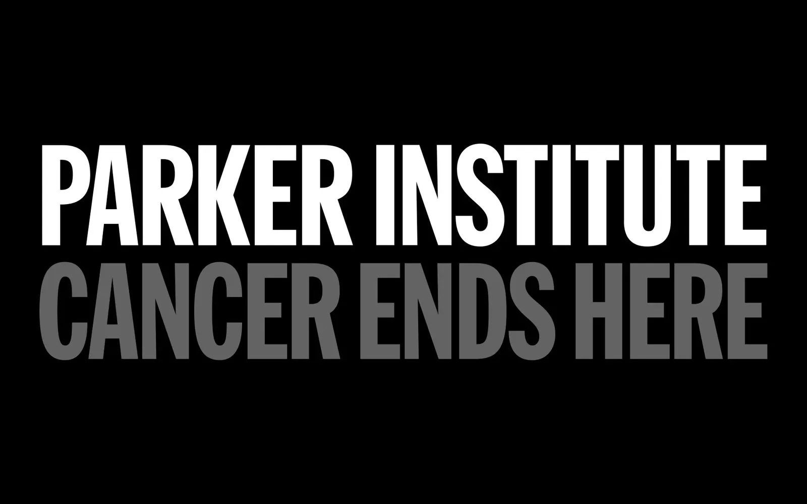
↗Few nonprofit rebrands are this direct. Pentagram cut Parker Institute for Cancer Immunotherapy down to Parker Institute and added a tagline that works as a statement of intent: Cancer Ends Here. The brief was to raise the profile of a ten-year-old network of researchers, funders, and company builders, and to draw in more partners and supporters.
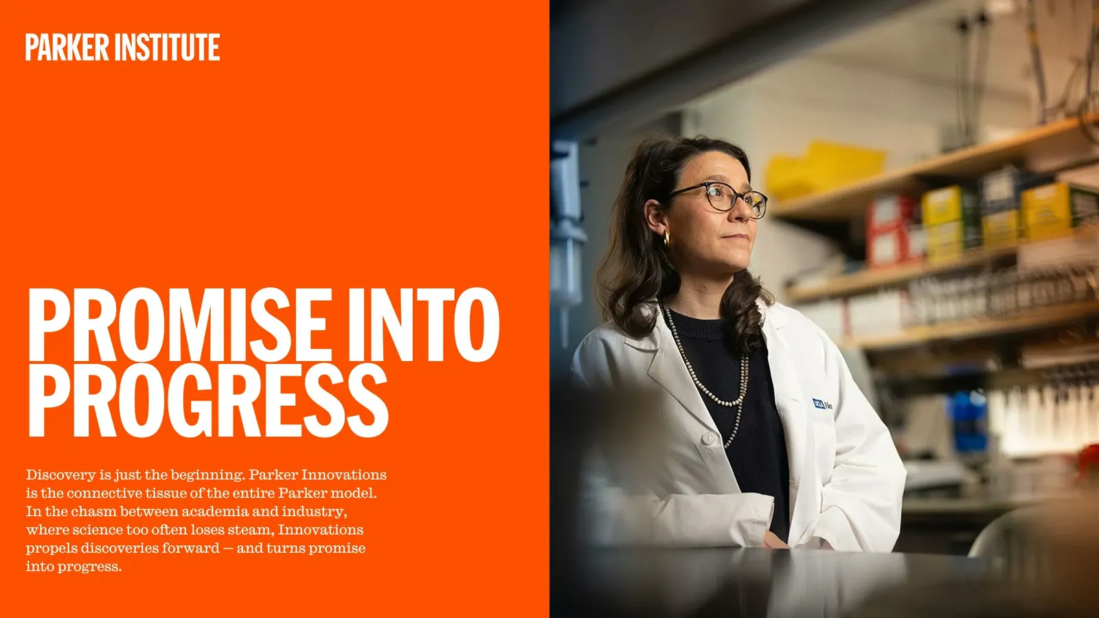
The identity pairs a condensed sans serif logo with bright, energetic color and a serif for contrast. Candid photos of retreats, lab work, and talks put people up front, while squares, animated and multiplied, count researchers, innovations, and companies formed. The same logic shapes the model graphic, which shows discovery, IP development, and company formation as overlapping layers. Pentagram's team, including Britt Cobb, Giorgia Lupi, Rachel Crawford, Ryan Yan, Yoshi Torralva, and Zach Scheinfeld, carried it onto the website, built with Decimal Studios.
Why it works
Cancer branding often leans on soft blues, hopeful gradients, and ribbons. Here, a tight condensed wordmark and saturated color read as confident, closer to a venture firm than a charity, which suits an organization that funds companies as well as research. The square is a smart unit: simple, countable, and easy to animate, so scale becomes visible without charts. The candid photography keeps the system from feeling cold, and the short name and tagline are easy to remember and repeat.
Logo
Typography
Applications
Images and video from pentagram.com, by Pentagram.