The Brand Monograph
Freetrade brand identity by Koto
↗Few studios get a second chance at their own brand, and fewer still make the return feel like a step forward. Koto created Freetrade's identity in 2017, then came back seven years later as the investing platform readied a round of product and service upgrades.
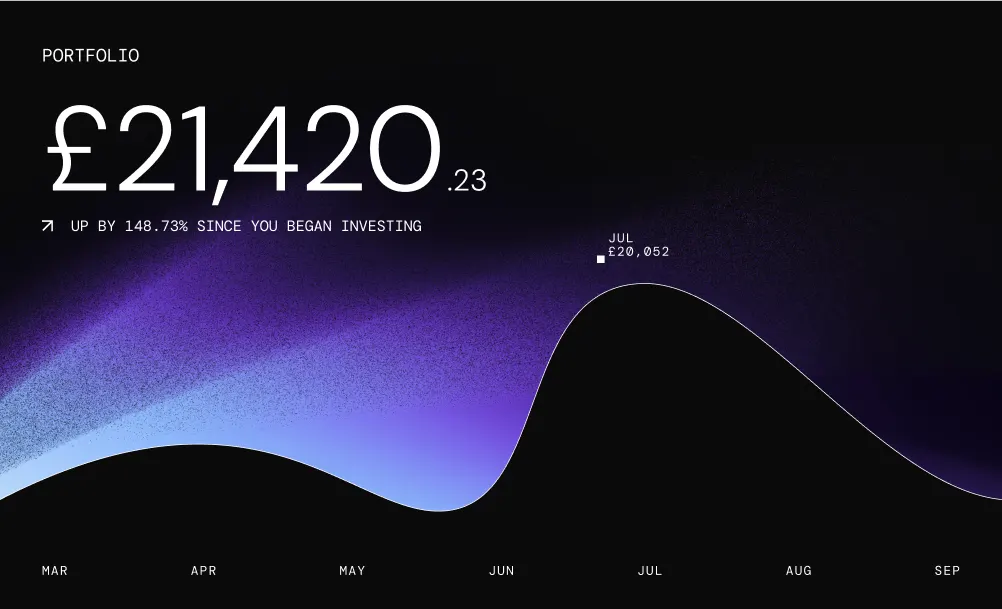
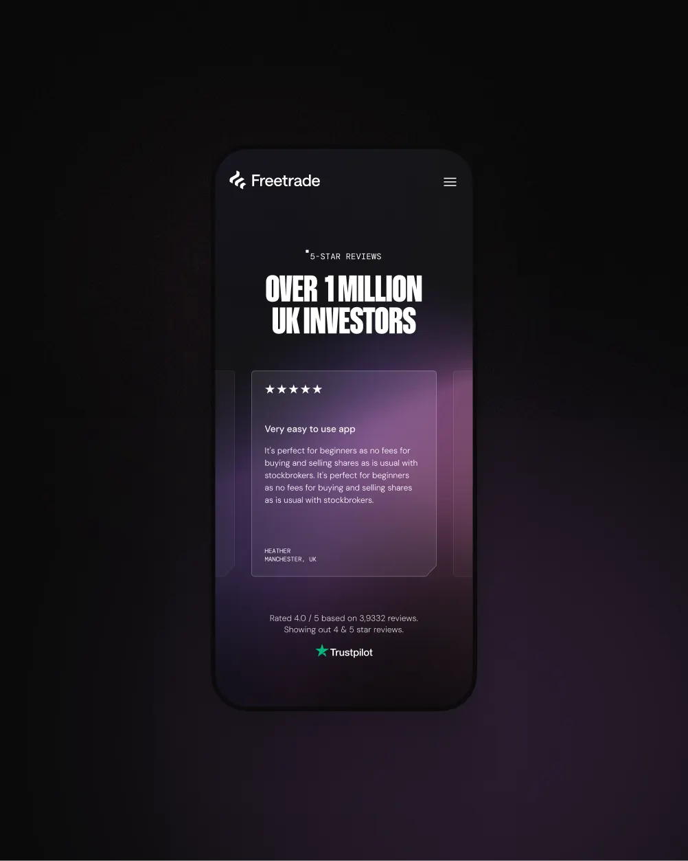
The refreshed identity swaps the usual finance-sector restraint for light and sky. Glowing horizon gradients and a digital-first palette set the tone, while animation drifts like auroras and orbiting planets. Typography, developed with Dinamo Typefaces and Newglyph, keeps everything assured and elegant. Koto carried the look into a design system spanning the website and app, with 3D celestial illustrations and space-inspired interface moments linking the two. Freetrade was acquired by the IG Group the following year, and the brand was cited in the coverage and investor reasoning.
Why it works
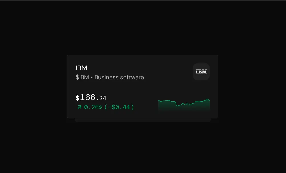
Investing brands tend to look like trading terminals or toys, and this one avoids both. Gradients and cosmic imagery make the future feel exciting without relying on charts, arrows, or green-and-red clichés. The refined type keeps that mood grounded, which matters when people are handing over their money. The strongest decision is carrying the same visual language into the app, so the promise made on the website is still there after sign-up. That consistency makes Freetrade feel distinctive and trustworthy in a crowded category.
Logo
Typography
Color
Applications
Images and video from koto.com, by Koto.