The Brand Monograph
New Zealand Rugby brand identity by re.design
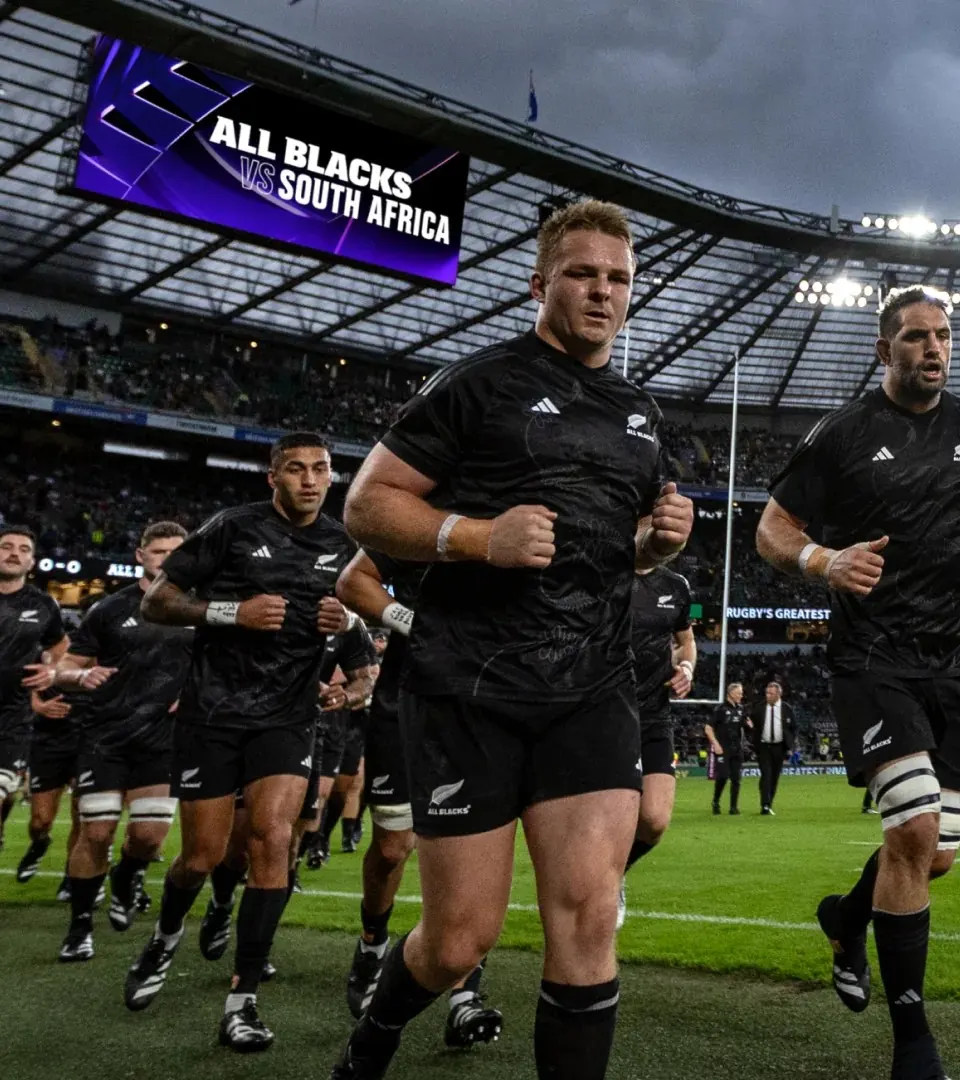
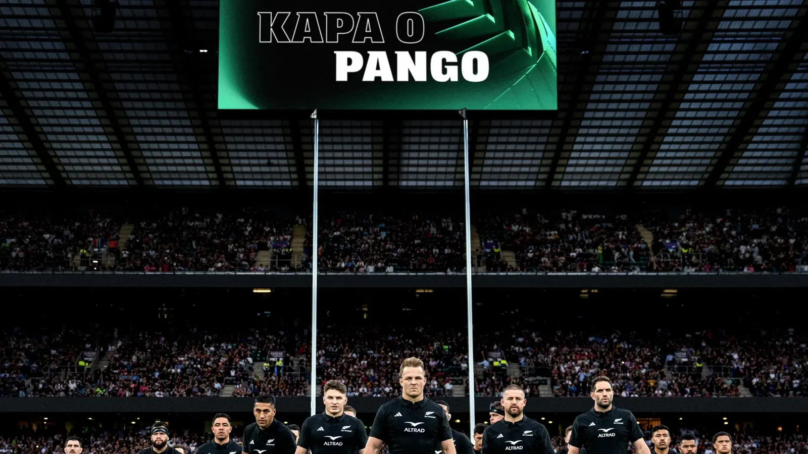
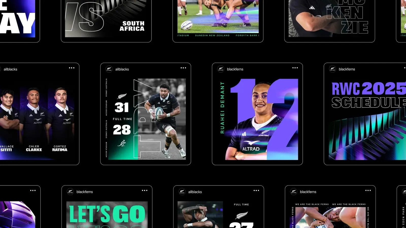
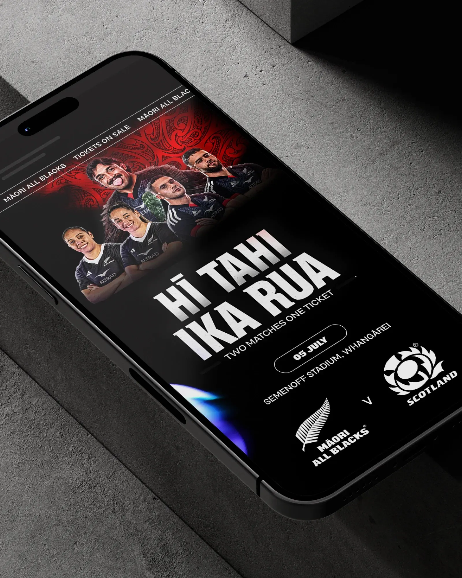
↗Most sports brands treat the women's team as a variation on the main event. re.design's work for New Zealand Rugby goes the other way. The All Blacks and the Black Ferns are handled as two halves of one system, and neither team serves as the template for the other.
The studio started from a practical problem. Interest in the women's game was climbing fast, yet the two national teams still lived in separate brand systems. re.design replaced them with a single framework that both teams share, defined as much by how it behaves as by how it looks. Motion carries much of that load. Developed with Luke Bell-Booth, a common way of moving gives both teams the same presence on screen, so the parity is something people see in use, not just read in guidelines.
Why it works
Anchoring parity in motion is a smart choice. Static assets can be matched on a spec sheet and still leave one team feeling like the primary brand. Movement is felt every time the brand appears, so it is much harder to fake. Building one system instead of two parallel ones also means every later decision, from a sponsor lockup to a social template, starts from equality instead of having to argue for it. For a category that often treats women's teams as an add-on, that is a meaningful difference.
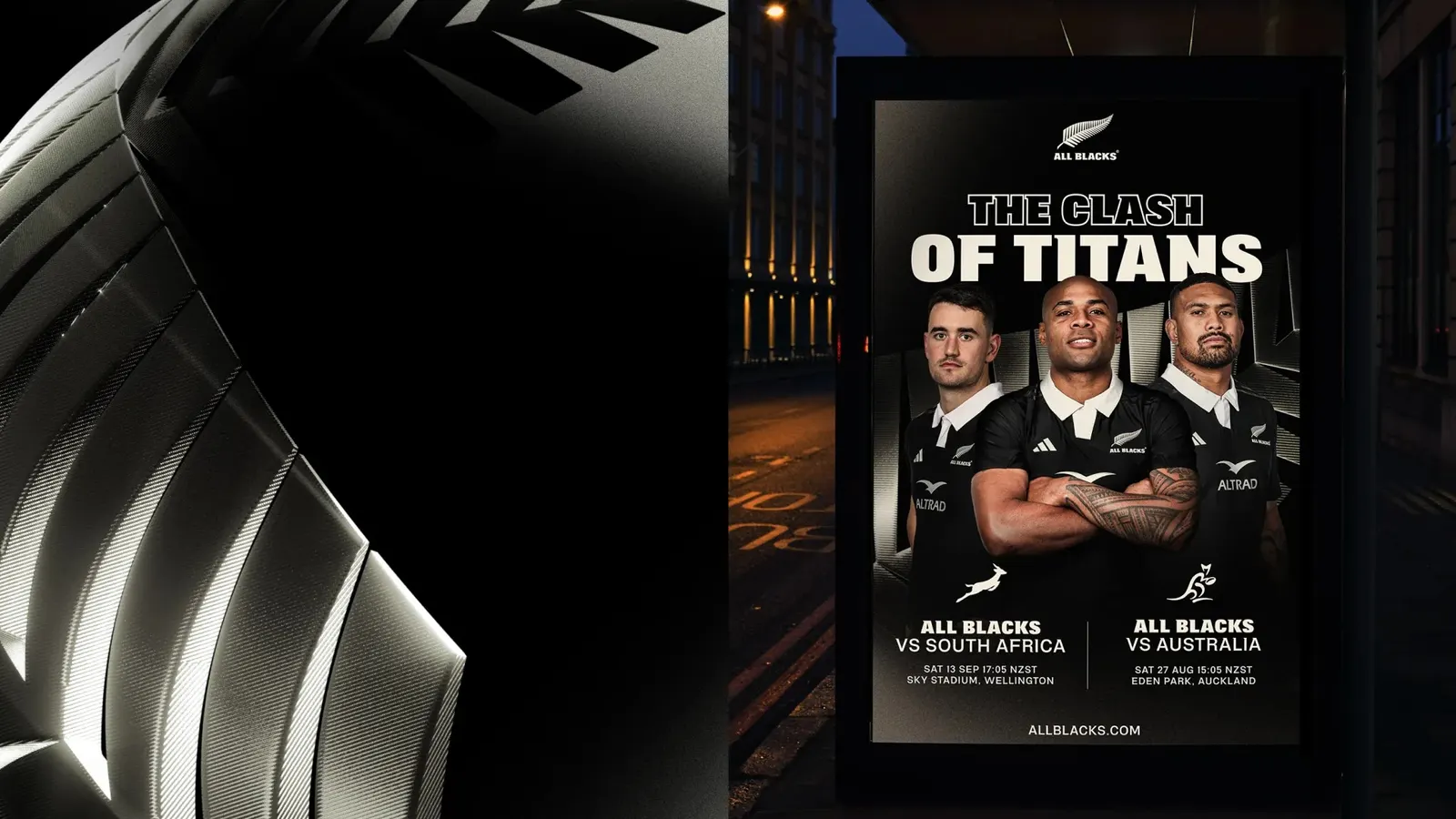
Applications

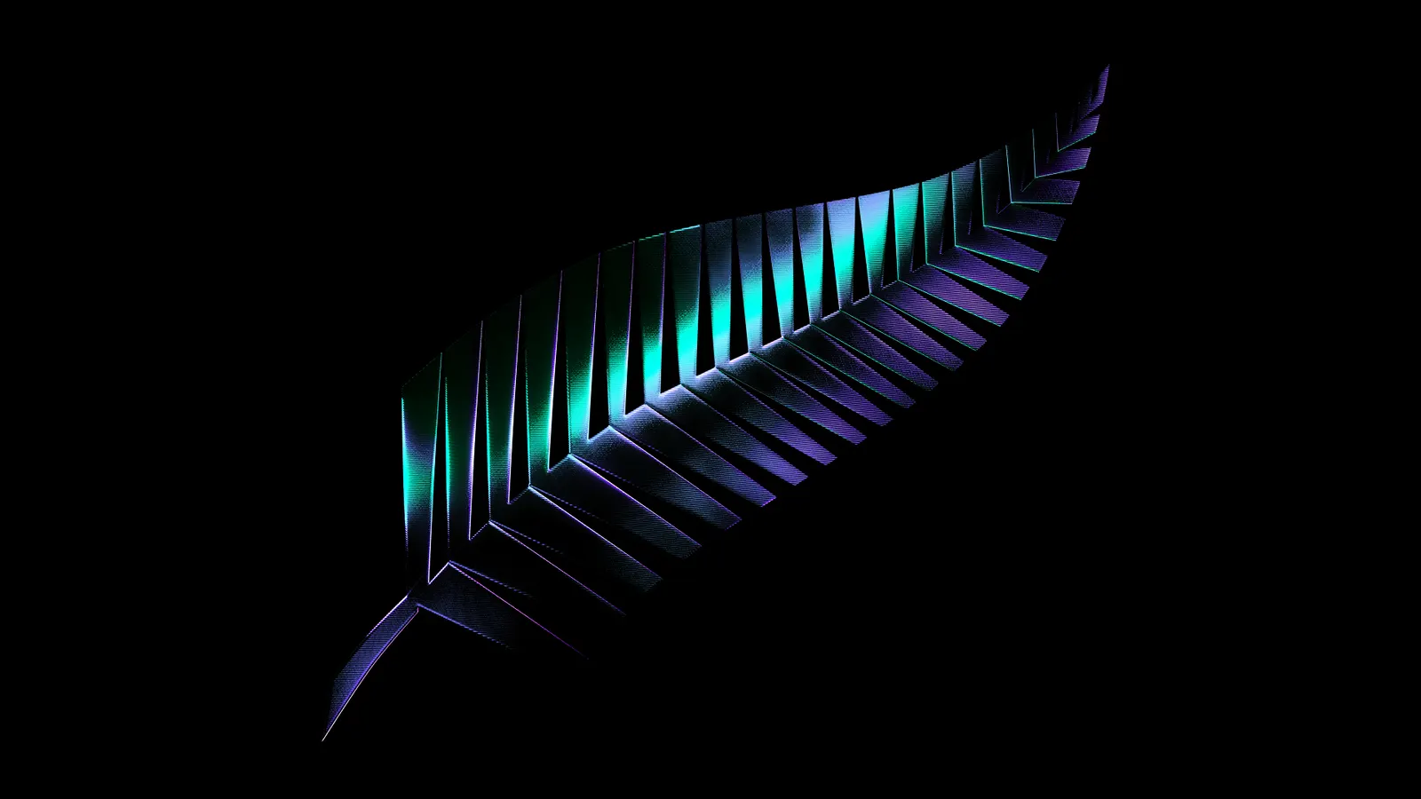
Logo


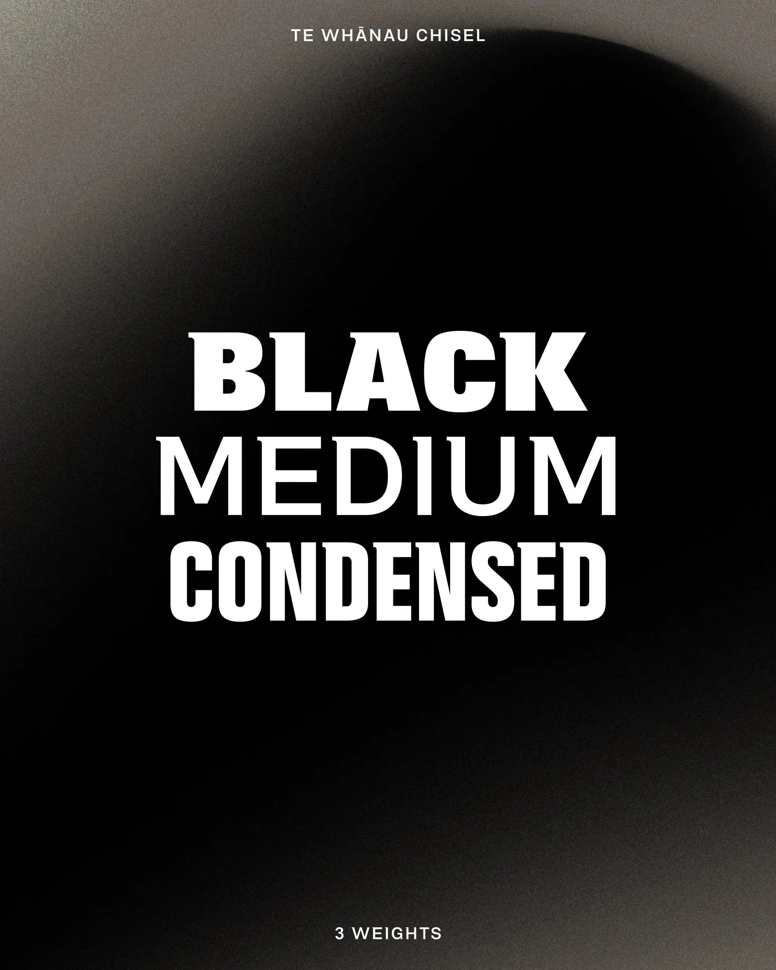
Typography
Images and video from re.design, by re.design.