The Brand Monograph
Ovii brand identity by Forner
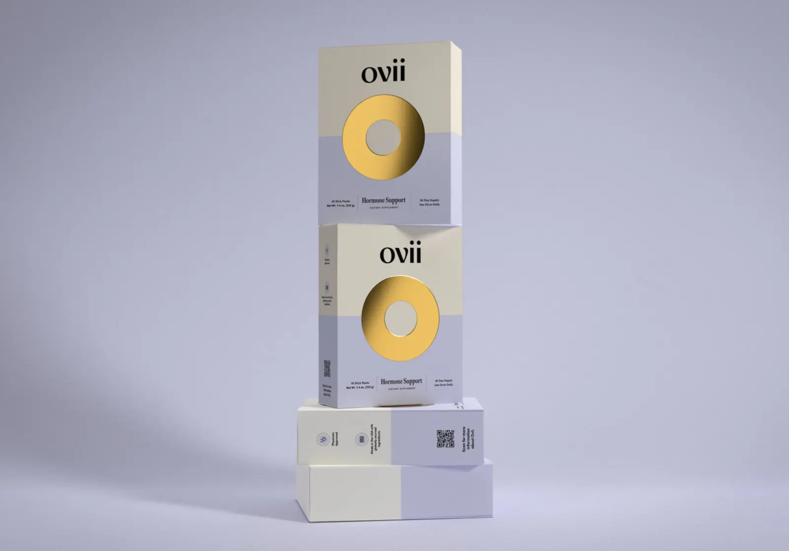
↗Forner's work for Ovii makes a medical product feel like it comes from someone on your side. Ovii is a once-a-day symptom solution developed by OB/GYN Dr. Thais Aliabadi for women with PCOS, who are often steered toward either long-term prescriptions or demanding natural routines. Forner handled the identity, strategy, and packaging, and built all three on the idea that authority and warmth can coexist.
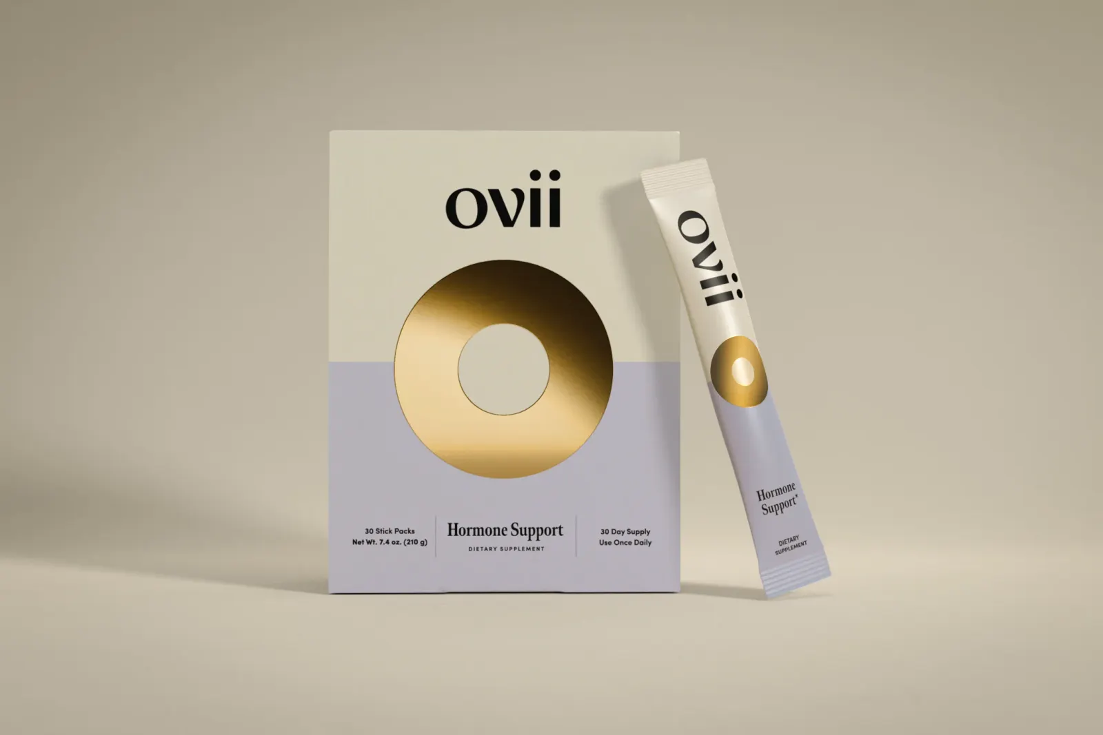
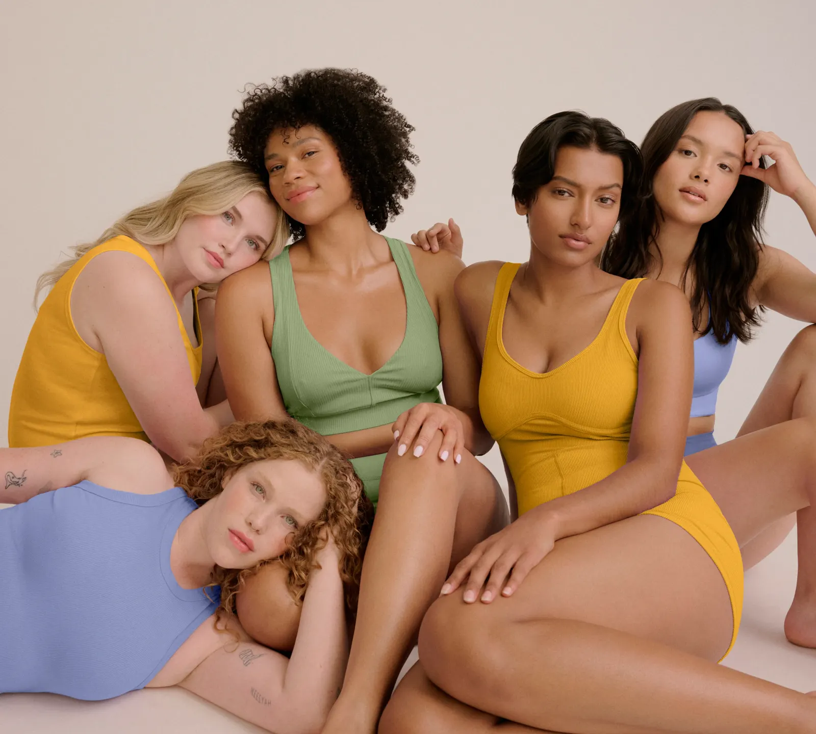
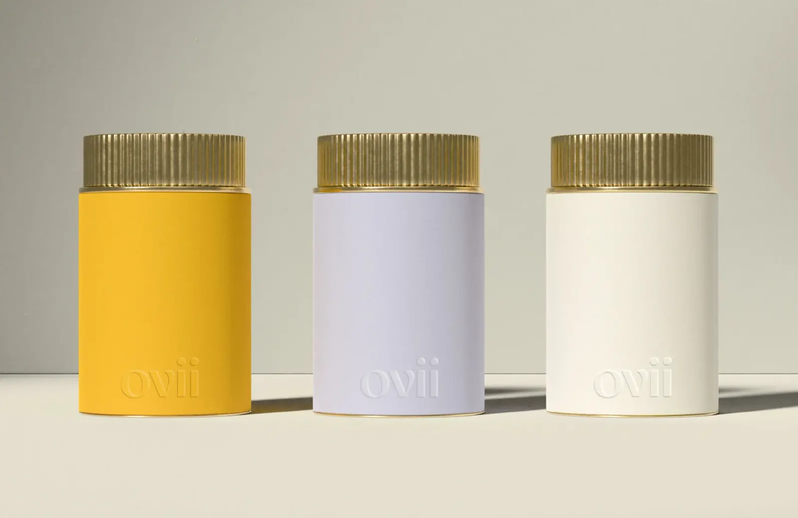
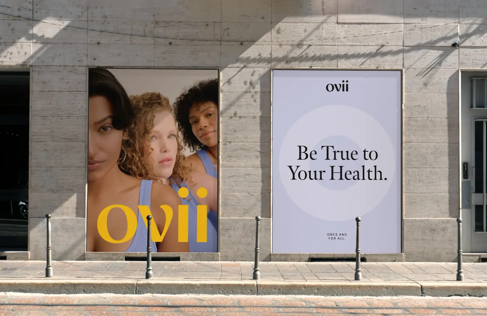
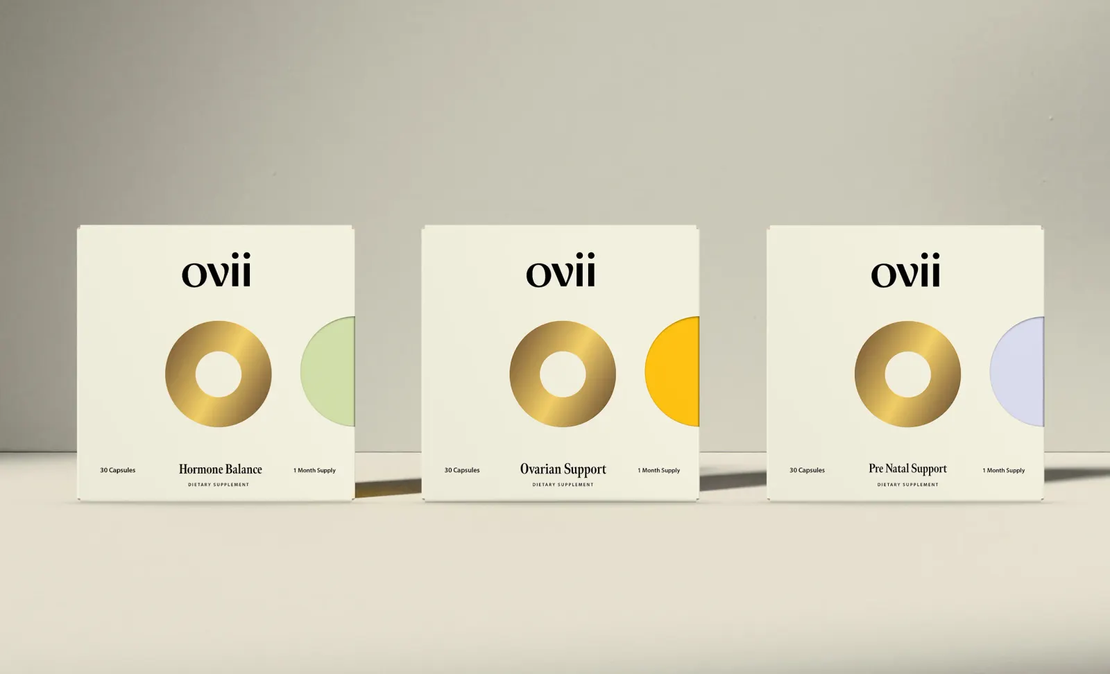
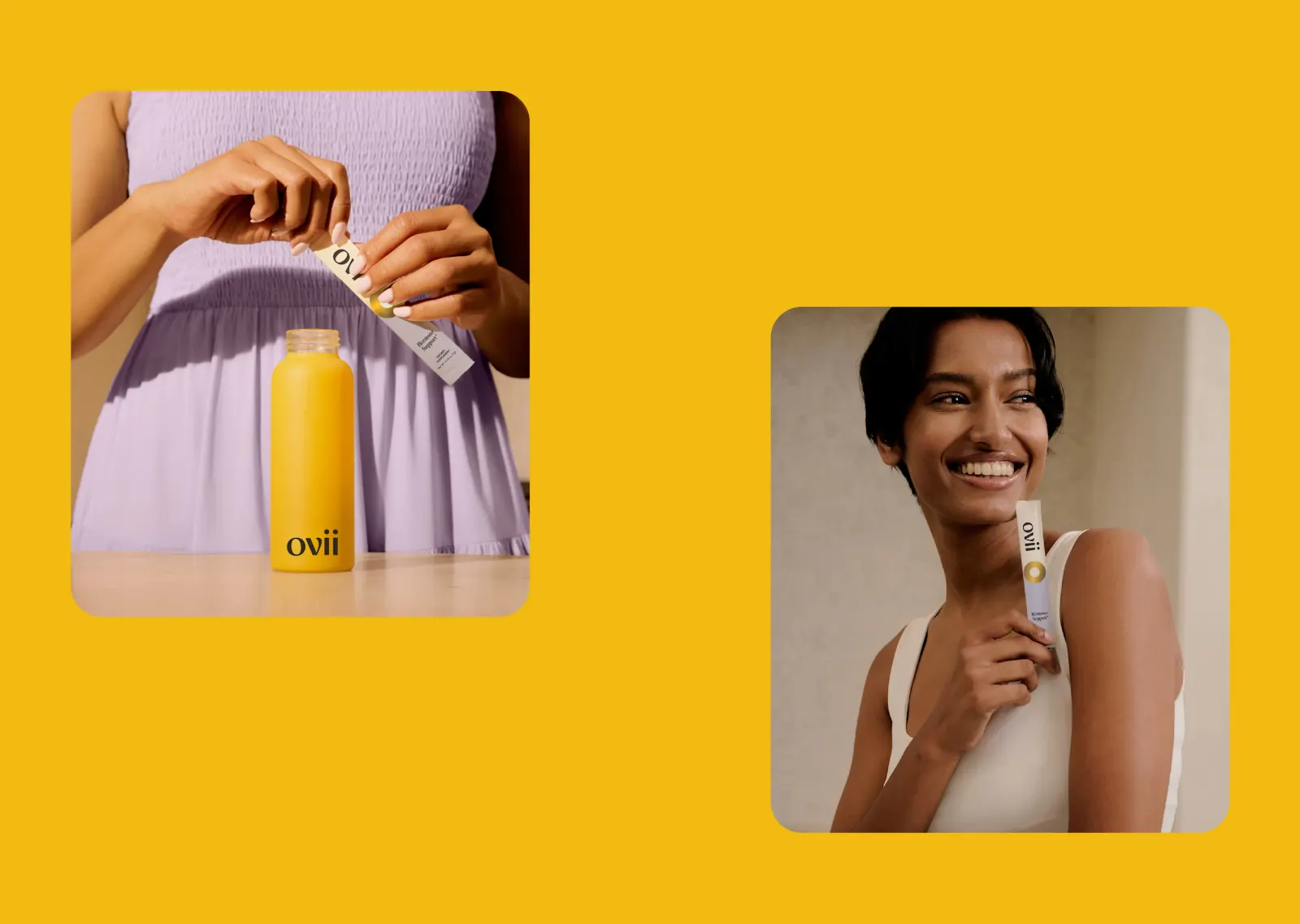
The craft shows in the details. A rounded "v" softens the logotype, the typography is friendly, and the palette is bright instead of clinical. A gold "O" acts as a mark of quality and a nod to treating symptoms as a whole. Photography features real women, and the writing stays firm but supportive, closing on a tagline that promises a single answer.
Why it works
Women's health brands often fall back on pastel clichés or clinical austerity. Ovii avoids both. The rounded "v" gives the name a human, approachable quality, while the gold "O" is a distinctive, ownable anchor that signals premium without feeling cold. Optimistic color and friendly type keep a serious condition from feeling heavy. Real women in the photography speak to an audience that has too often been dismissed, and the design lets Dr. Aliabadi's credibility carry the authority without needing to shout it.
Applications

Images and video from forner.studio, by Forner.