The Brand Monograph
Hatching Dragons brand identity by Kind Studio
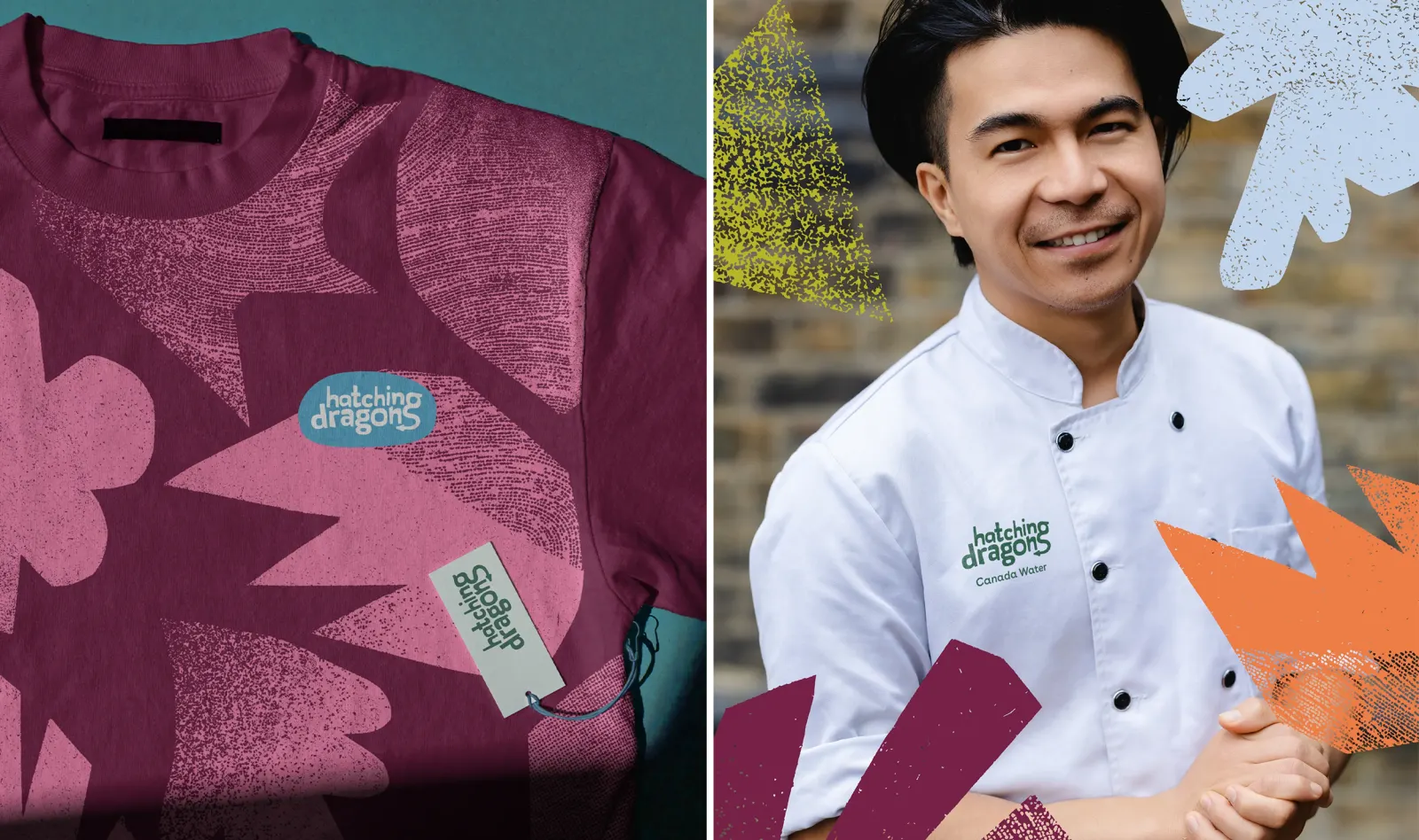
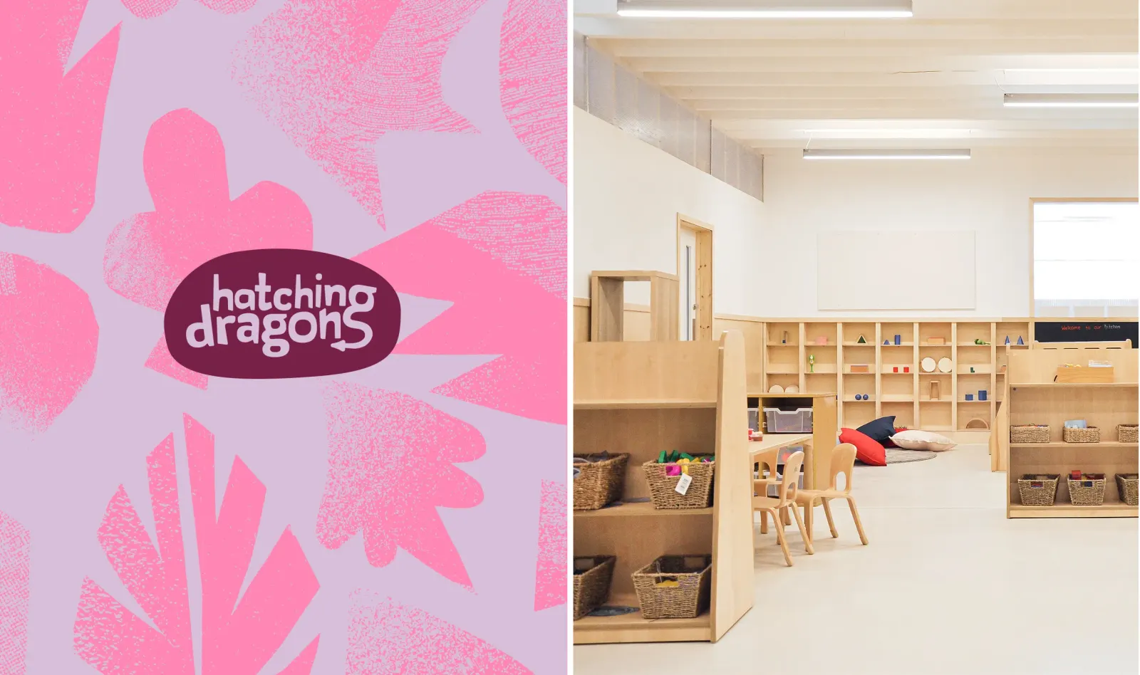
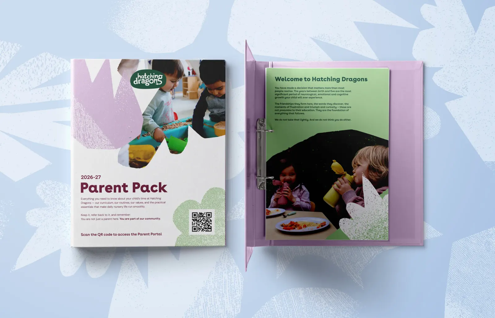
↗Early years branding tends to settle into a familiar look of soft shapes and a playful palette. Kind Studio's work for Hatching Dragons stands out because it is built for a different job: a brand that can travel. The ambition behind it goes beyond a single school or a single city.
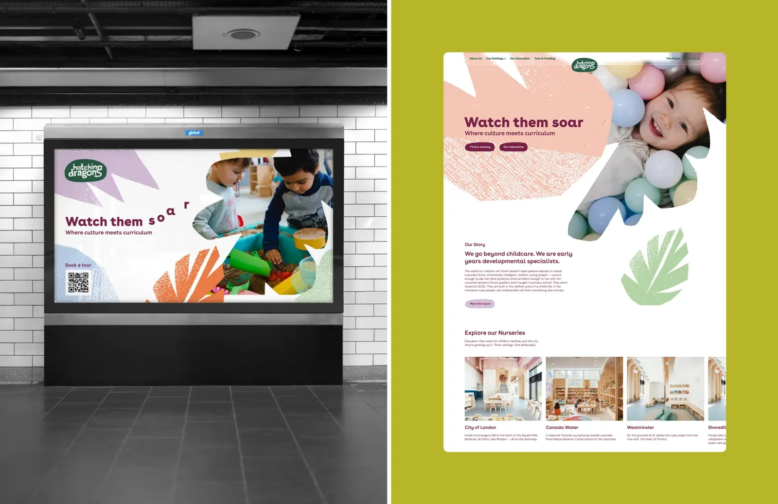
The brief asked for an identity and a digital platform together, so the two work as one system rather than a logo with a website attached. Hatching Dragons wants to expand, and it wants to shift how parents and educators think about the early years, with learning through exploration and fluency in more than one language at the center. Kind Studio's response is a brand meant to hold its shape as new locations, audiences, and languages are added.
Why it works
The name does a lot of the storytelling, and the studio's job was to give that story a structure that can grow. Hatching and dragons suggest wonder and potential, which is a smart fit for a brand that wants to be taken seriously on education as well as charm. Designing the identity and the platform together also matters, because parents will likely meet the brand on screen first. A system-led approach suits a proposition that must stay recognizable across languages and places without feeling like a template.



Images and video from kindstudio.co.uk, by Kind Studio.