The Brand Monograph
Fable & Mane brand identity by Alphabet
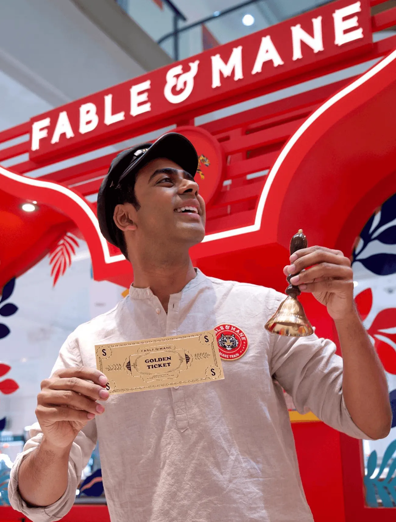
↗Few hair care brands start from a ritual as old as hair oiling and still look at home on a contemporary shelf. Fable & Mane does. Alphabet treated the founder's Indian heritage as the core of the brief and built everything around it: research, strategy, naming, messaging, identity, packaging, and the rollout across digital and print.
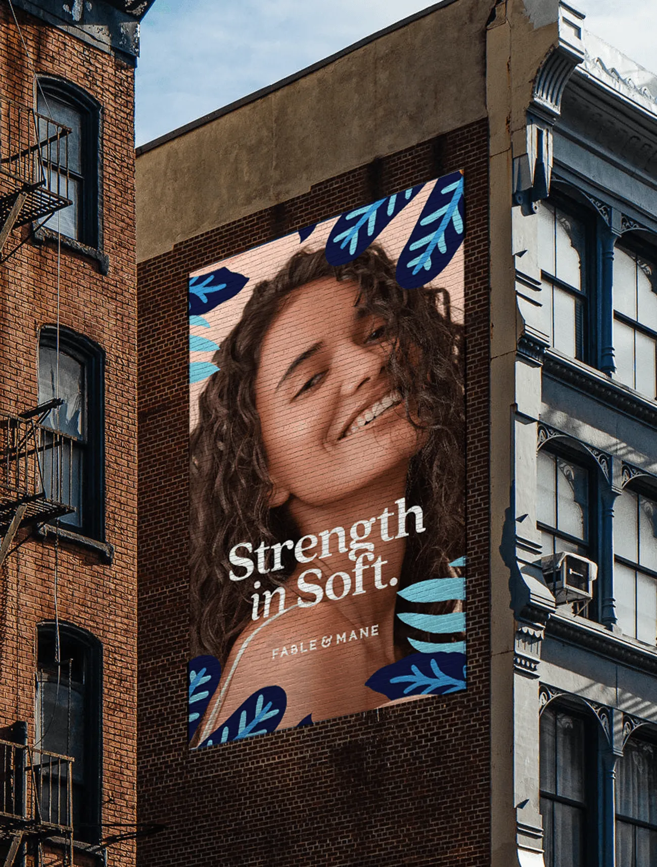
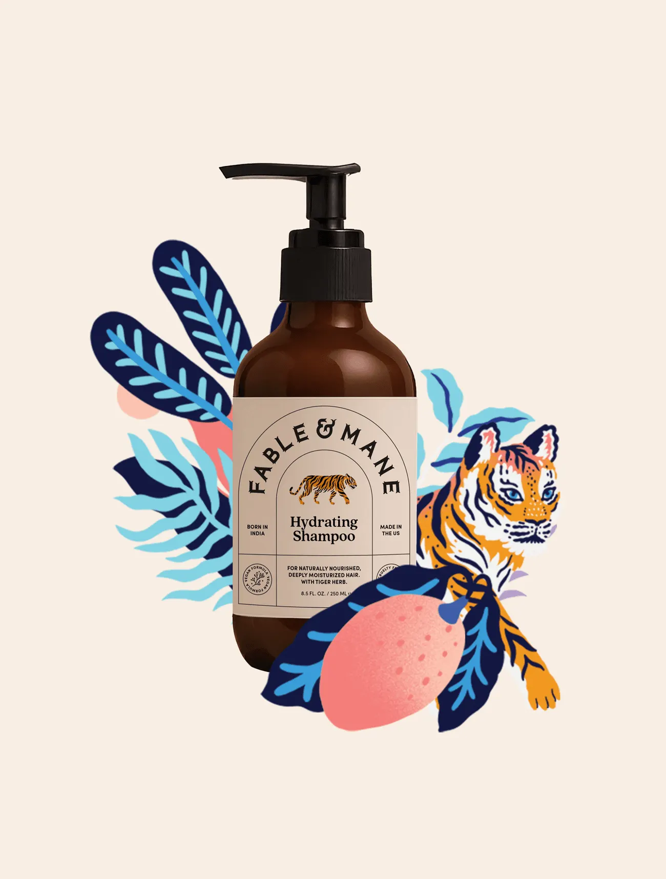
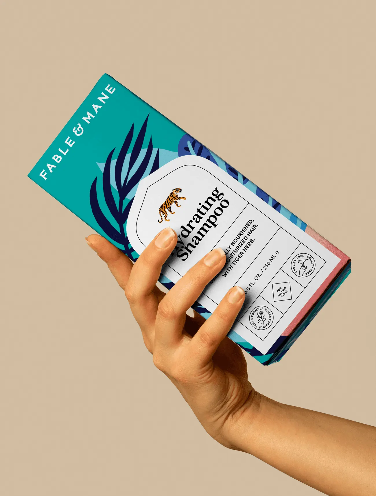
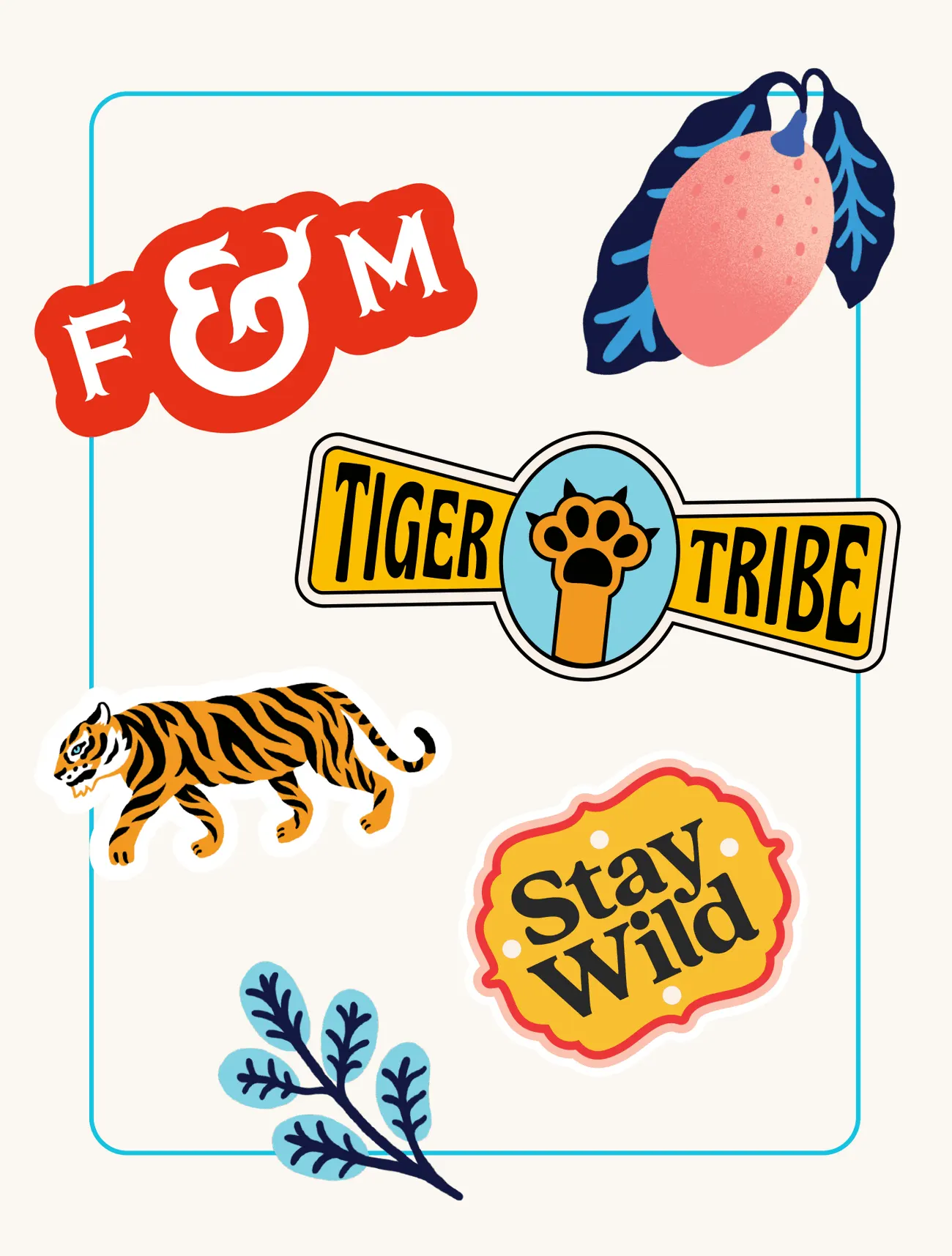
Two devices carry the idea. A tiger, a figure of strength and courage in Indian culture and Hindu mythology, sits at the center of the logo and imagery. On the label, a rounded opening borrowed from historic architecture frames each product. Illustrations by Marcos Navarro add color and narrative across the range, while clean photography and bright accents keep the brand feeling current.
Why it works
Heritage brands often tip into decorative cliché or stripped-back minimalism. Alphabet avoids both by letting form do the cultural work. The tiger gives the brand one ownable mark, and the rounded window is a structural device that repeats on every label, so the system can stay clean without losing its roots. Illustration lets each product tell its own story inside that shared frame, and the photography and color keep the whole thing from feeling like a museum piece. It reads as rooted but confident, which is a rare combination in the category.
Applications


Typography



Images and video from madebyalphabet.com, by Alphabet.