The Brand Monograph
Alchemy Cannabis brand identity by Underline Studio
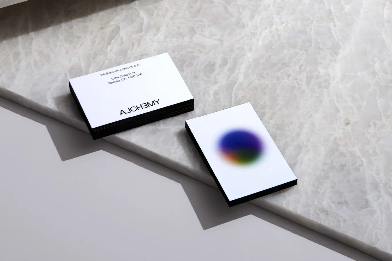
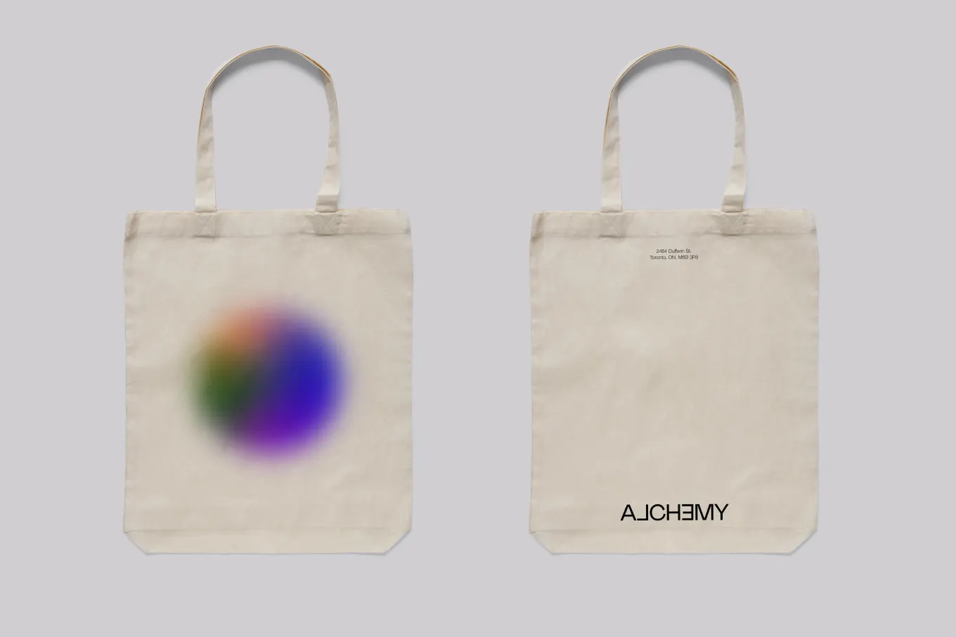
↗Most logos are built to hold still. Underline Studio's identity for Alchemy Cannabis does the opposite: the wordmark keeps shifting, which is a bold choice for a retail category that often leans on a familiar set of visual cues.
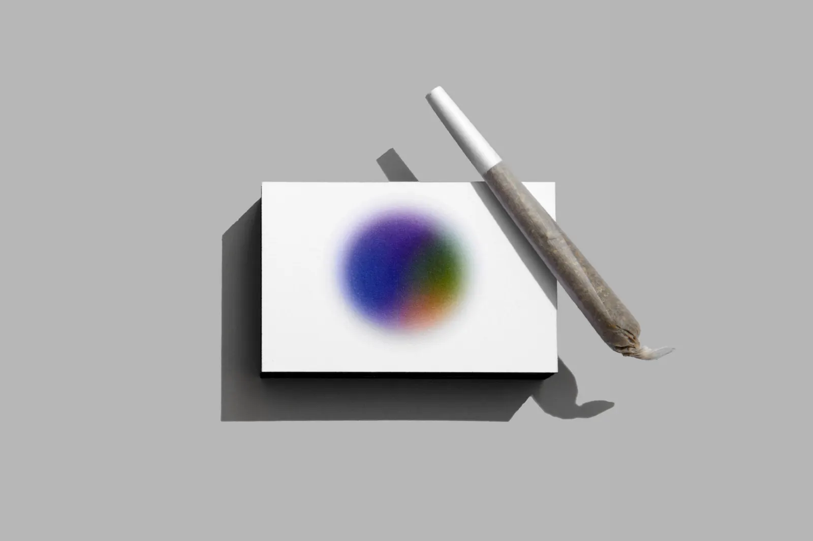
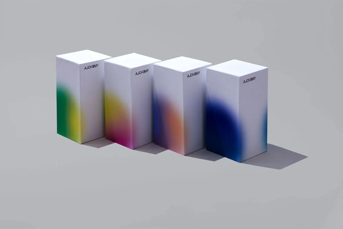
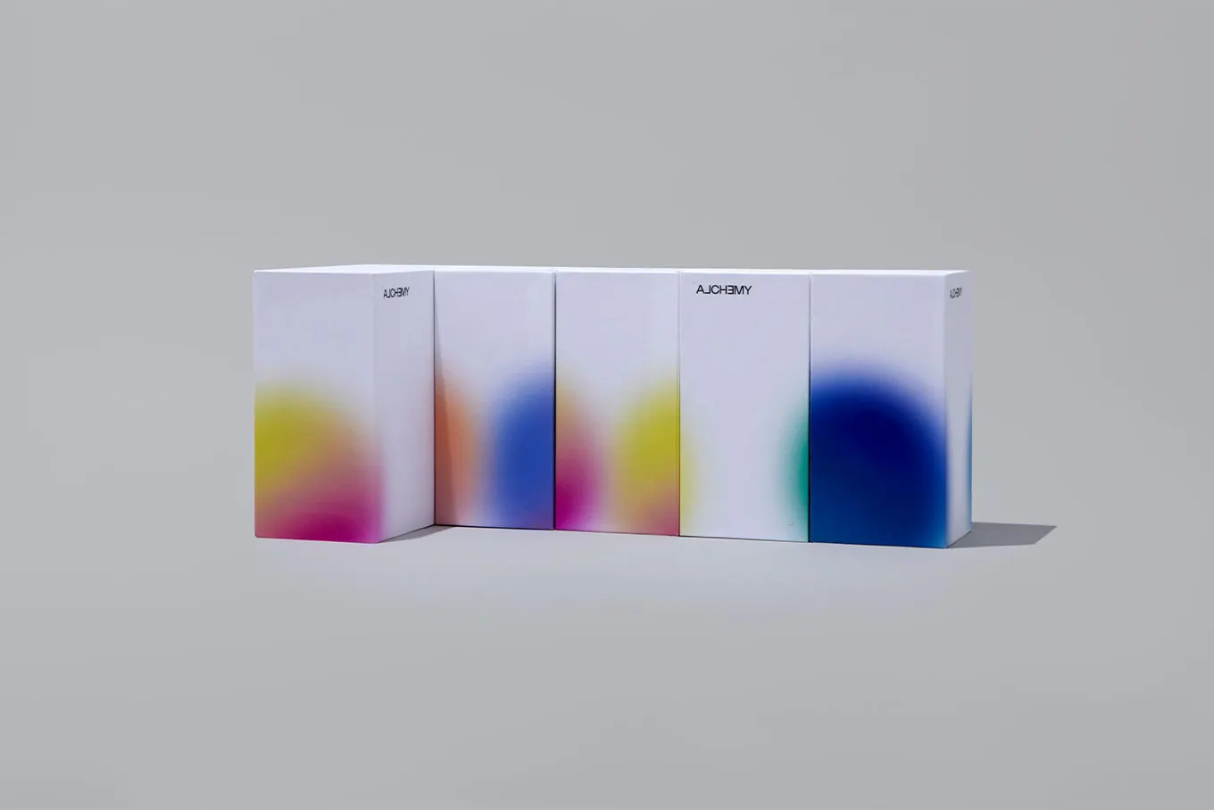
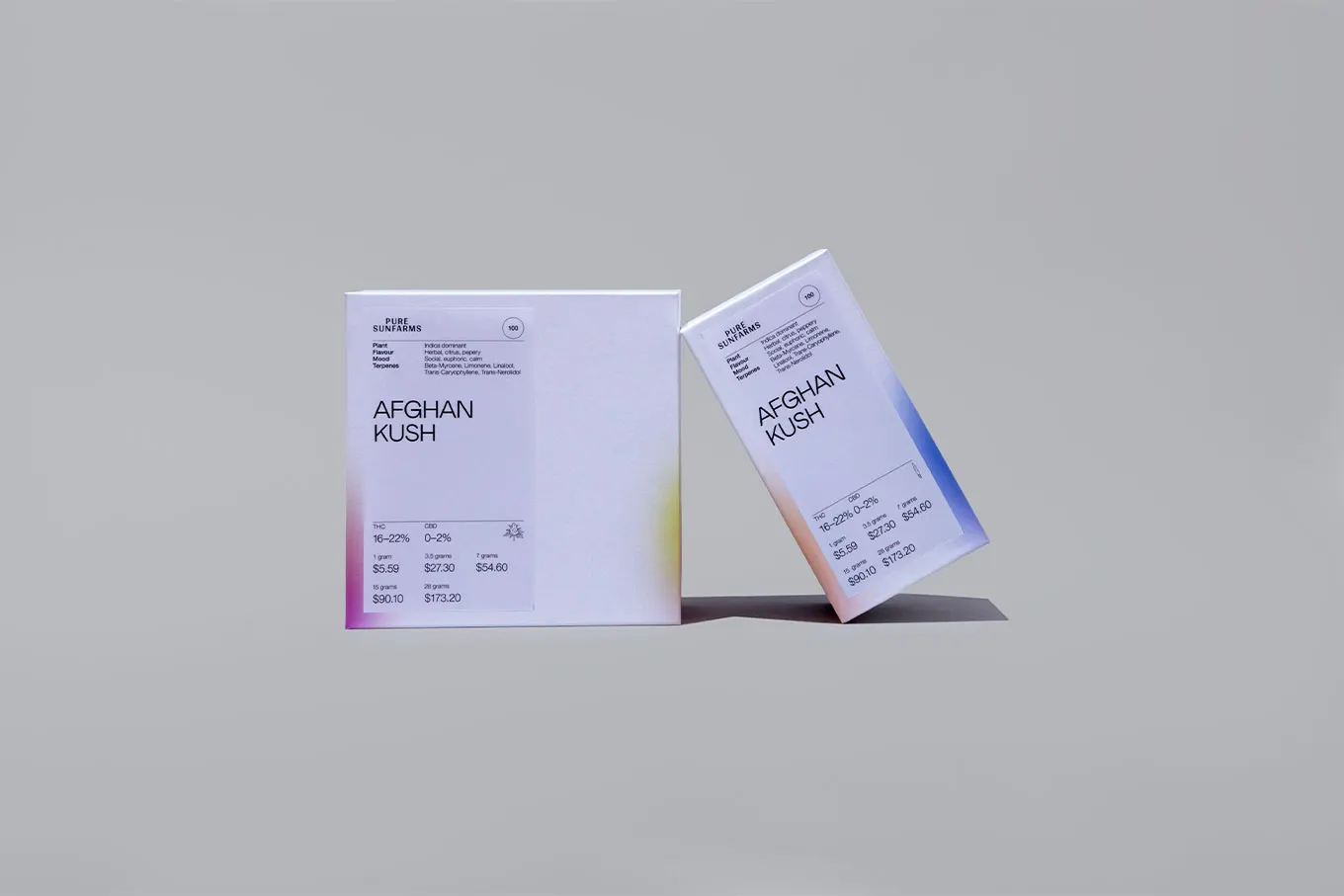
The client, Alchemy Canna Corp, is a newcomer to Canadian cannabis retail that competes on the experience inside its stores, a space designed by Studio Paolo Ferrari. Underline started from the name and from what the product does to a person's state of mind, and built the identity around the idea of change. The studio then carried it through packaging, signage, and print and digital collateral, so the brand behaves the same way wherever a customer meets it. Studio Paolo Ferrari also photographed the project.
Why it works
A wordmark that changes gives Alchemy an idea it can own in a category full of leaves and wellness shorthand. It joins name and product in one gesture, so the logo explains the brand without a tagline. It also fits a business built on atmosphere: a mark that varies feels closer to a space you move through than a stamp on a shelf. The tradeoff with any shifting mark is recognition, and the consistent system across packaging and signage is what keeps it from drifting into noise.
Logo
Applications


Images and video from underlinestudio.com, by Underline Studio.