 The Brand Monograph
Kuda brand identity by Barkas
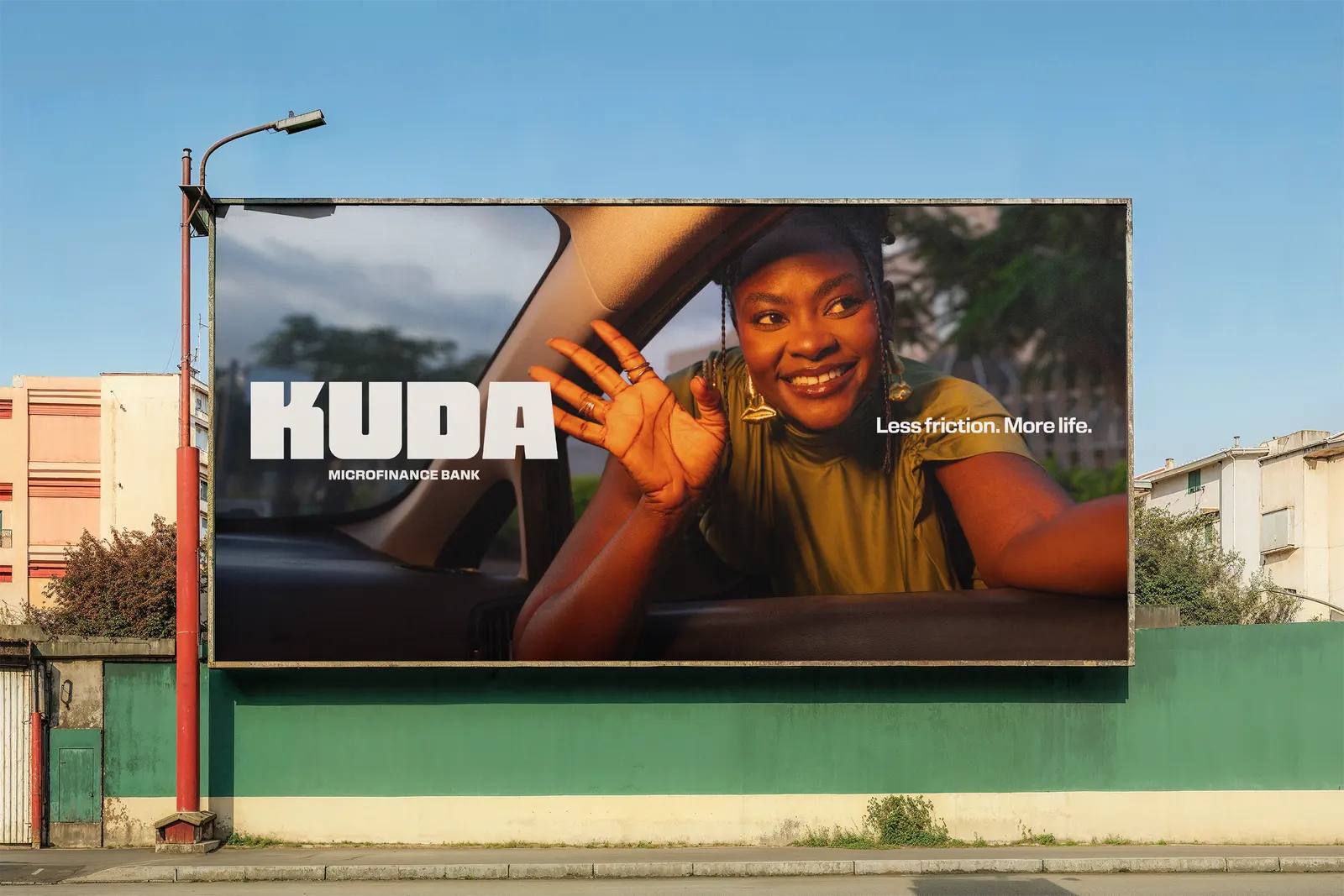
↗Few fintech rebrands feel made for one city and one generation. Barkas's work for Kuda does. The Nigerian digital bank had already built its name by undercutting the fees and friction of traditional banking, and the studio's task was to give it something more to stand on than a sharp product.
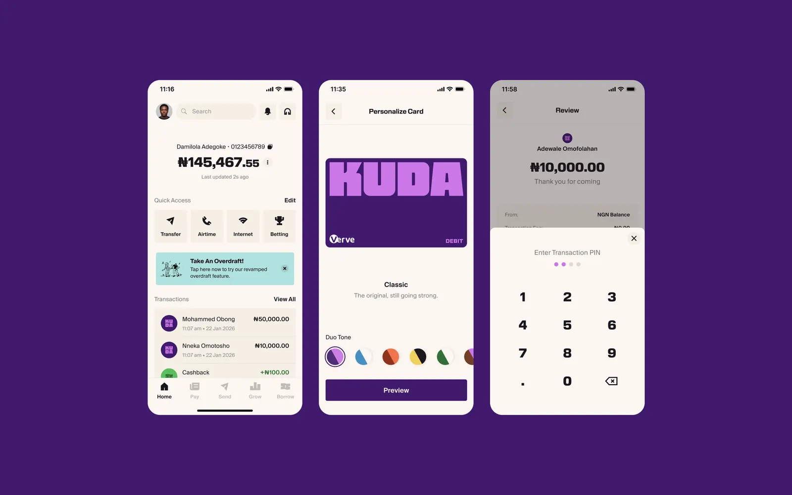
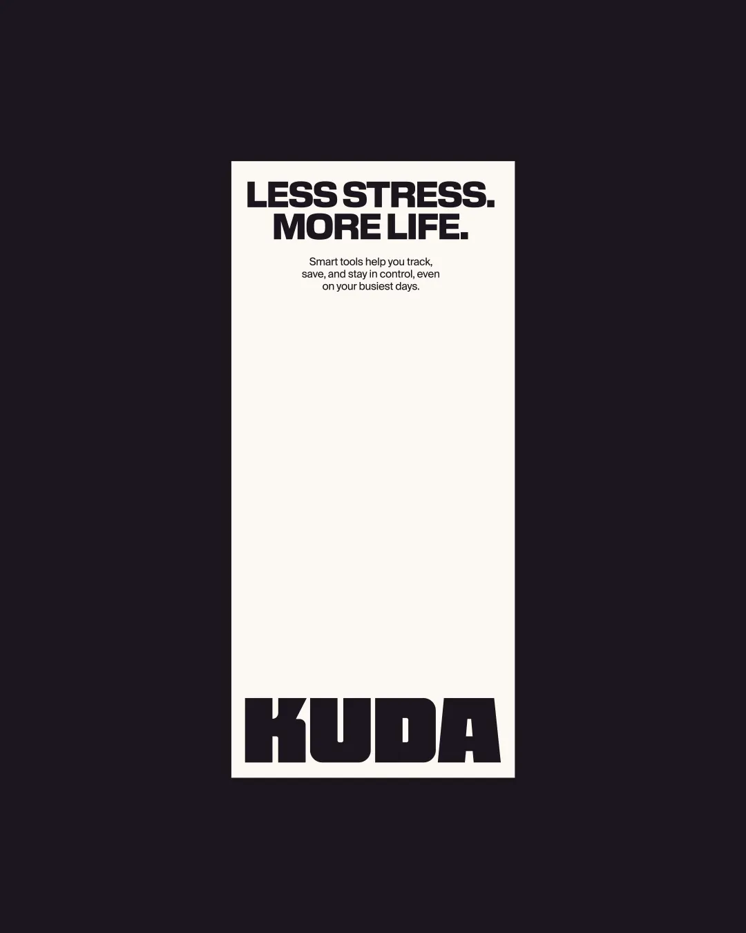
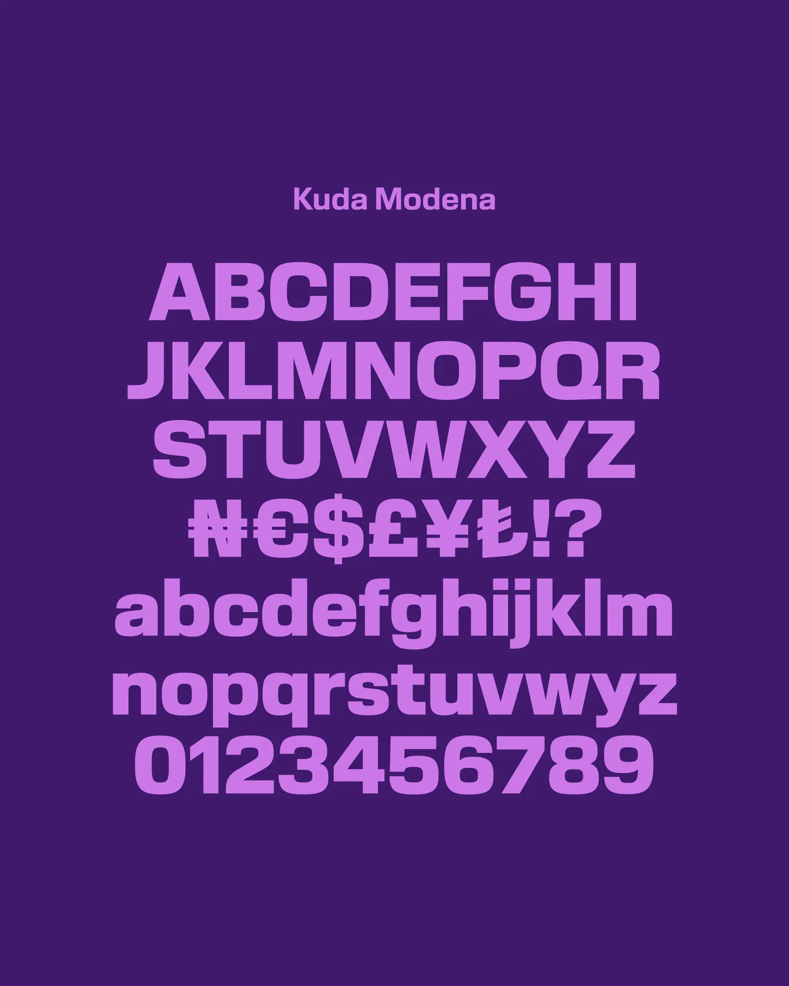
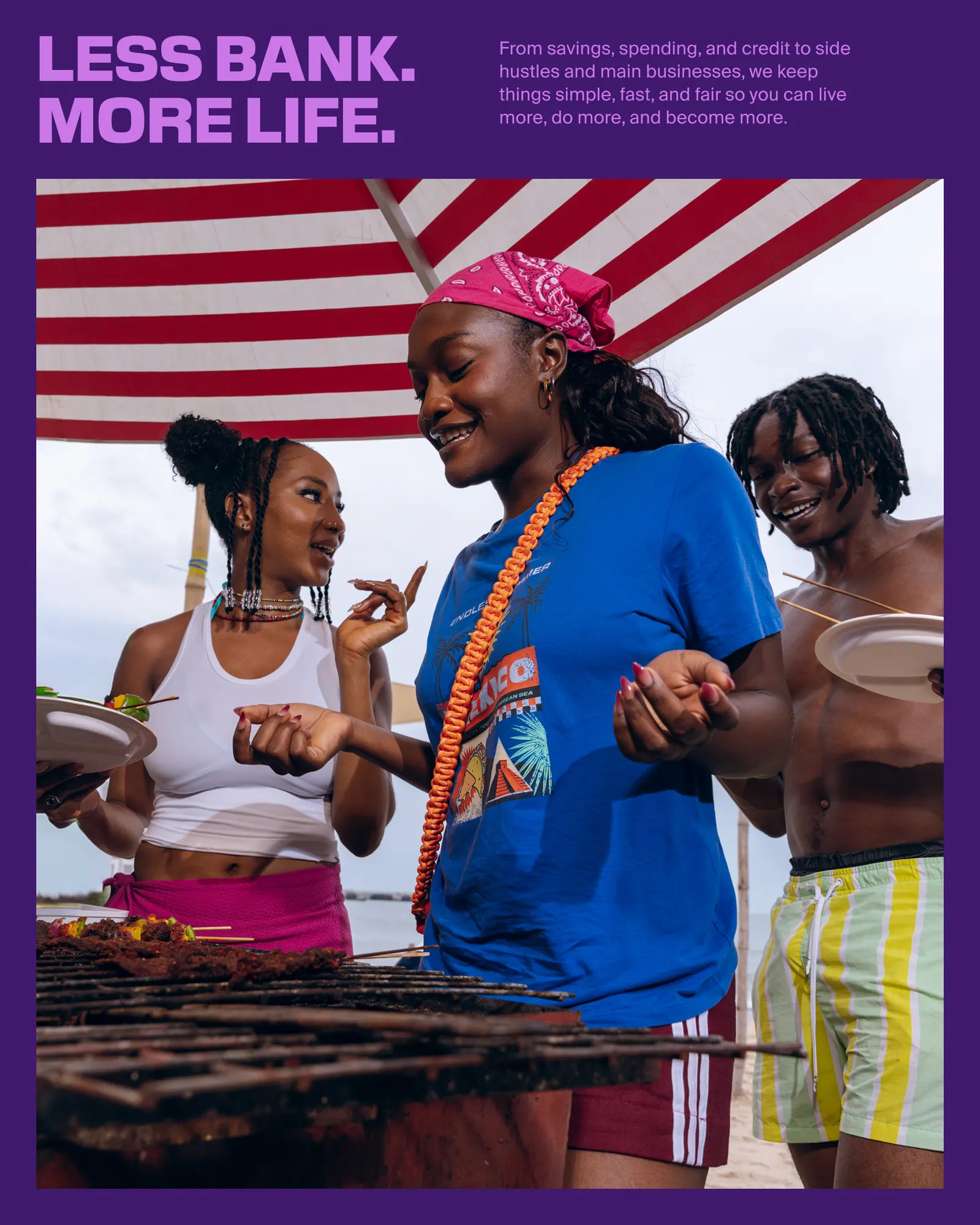
The answer is "More Life," a line that shifts attention from what an account does to what a person does with it. Barkas carried that idea across the brand, the product, and the website, working with the Kuda team and Lagos's creative community. Rachel Seidu's photography anchors it in everyday moments, while Adene Muyiwa and Charles Owen add illustrated character. Erkin Karamemet and Swiss Typefaces shaped the typography, Loup Garou handled motion and production, and West Solutions built the site.
Why it works
Banking brands tend to land on one of two defaults: stiff reassurance or flat utility. Barkas avoids both by putting people and culture at the center. Commissioning photographers, illustrators, and typographic specialists gives Kuda a voice that feels authored rather than assembled from fintech templates. The two-word idea also travels well. It is short enough to anchor a product screen or a campaign, and it talks about the customer's outcome instead of the bank's features. That gives Kuda a position competitors would struggle to borrow.
Images and video from barkas.com, by Barkas.

