The Brand Monograph
Coca-Cola brand identity by JKR
↗JKR's work for Coca-Cola is a lesson in restraint at scale. Rather than reinvent a brand with 140 years of recognition behind it, the studio sharpened the pieces people already know and made them work as one system across 200 markets.
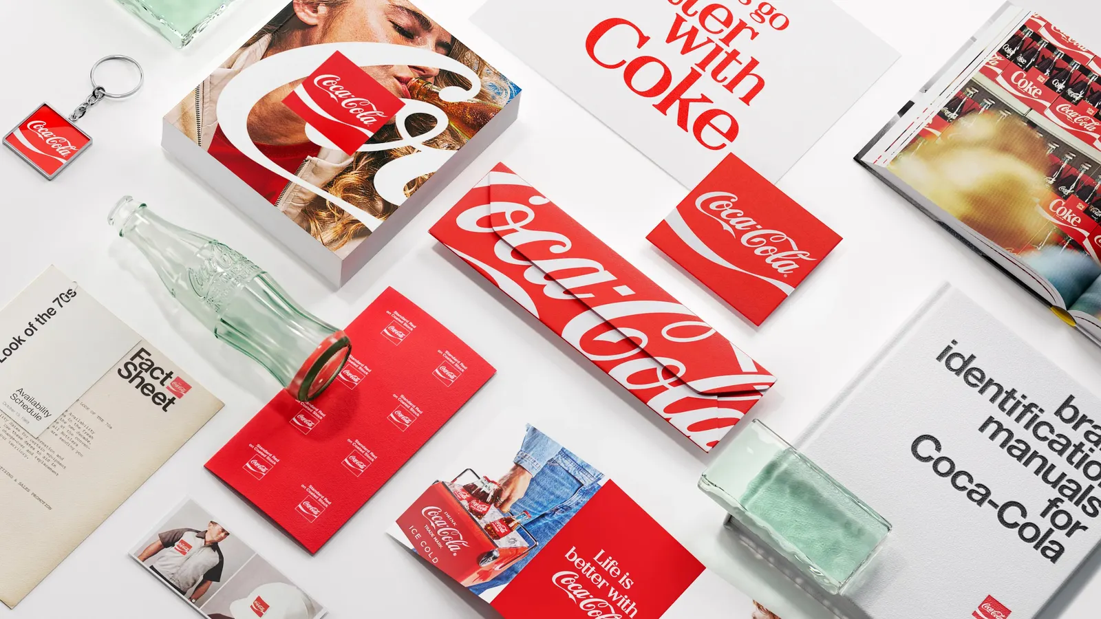
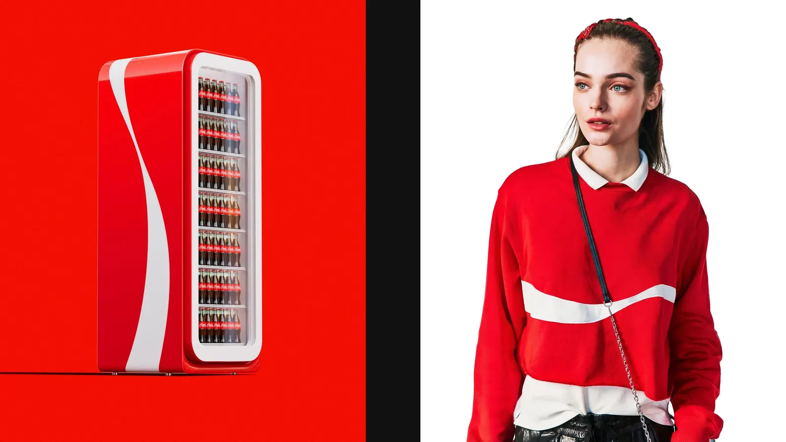
The brief was consistency: Coca-Cola and Coca-Cola Zero Sugar should read as the same brand on a shelf in New York or New Delhi. JKR reinstated the Arden Square as the brand mark and tightened the red and white palette. It then added the Dynamic Ribbon as a flexible, upbeat device that carries the identity across products, experiences, and campaigns. The Superultrarare contributed design and Brody Associates handled typography. Photography by Anna Palma, Guy Aroch, and Martin Wonnacott shows the system in use, and Forpeople and Monks developed the digital side.
Why it works
The smart move is pairing a fixed container with a fluid gesture. A square mark is easy to place on packaging, signage, and screens, so recognition doesn't hinge on one wordmark arrangement. Red and white is a narrow palette, and in a category crowded with loud packaging that discipline makes Coca-Cola easy to spot from across a room. The ribbon adds movement without loosening the rules. For an audience spread across 200 markets, repeating a few things precisely does more than introducing many new ones.
Logo
Applications
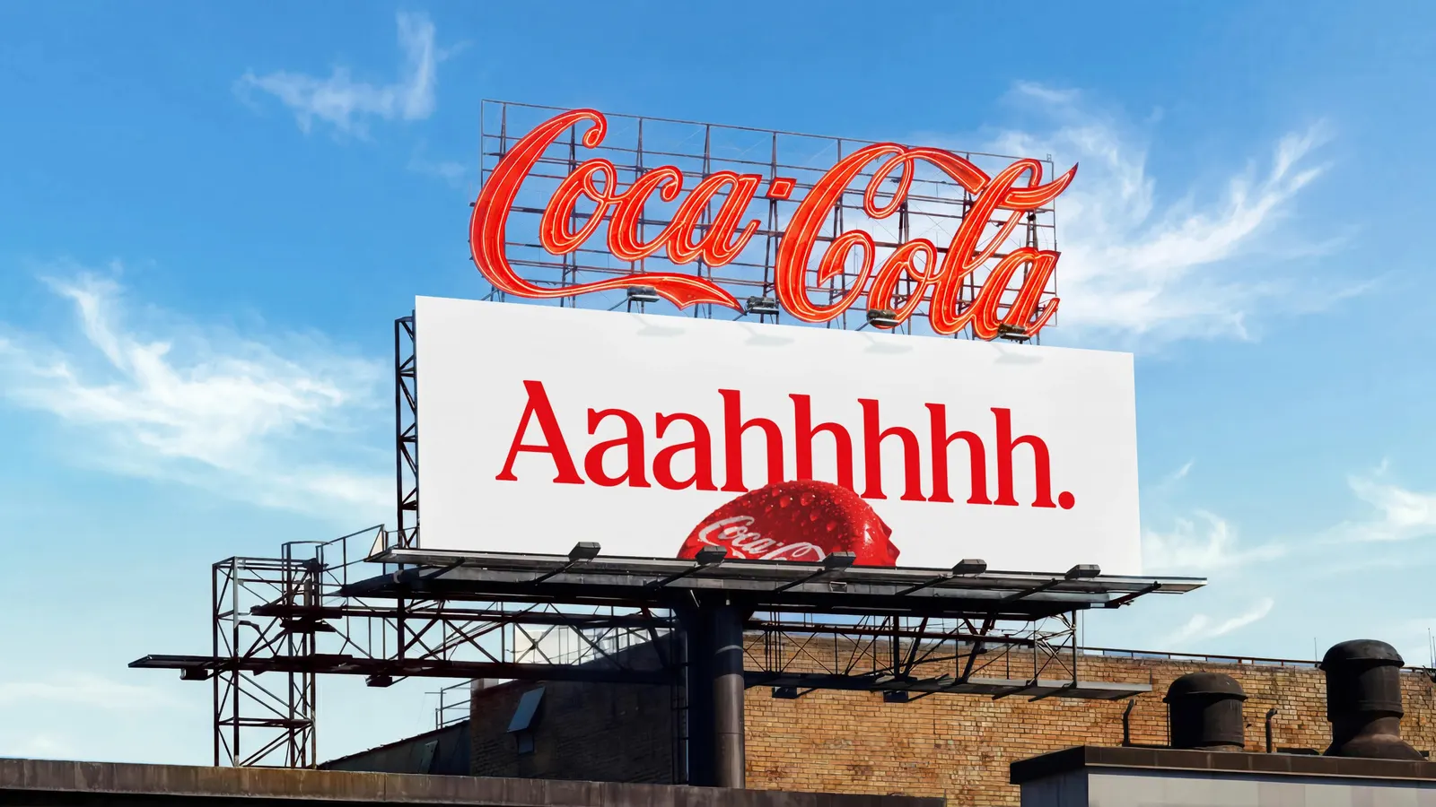
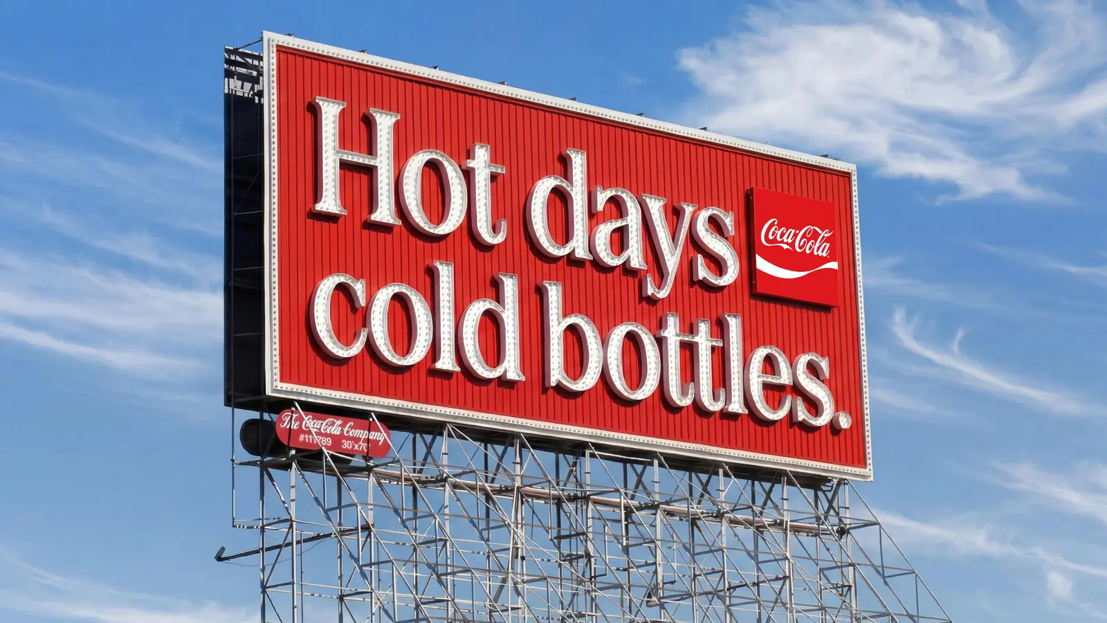
Images and video from jkrglobal.com, by JKR.