The Brand Monograph
McMaster Museum of Art brand identity by Underline Studio
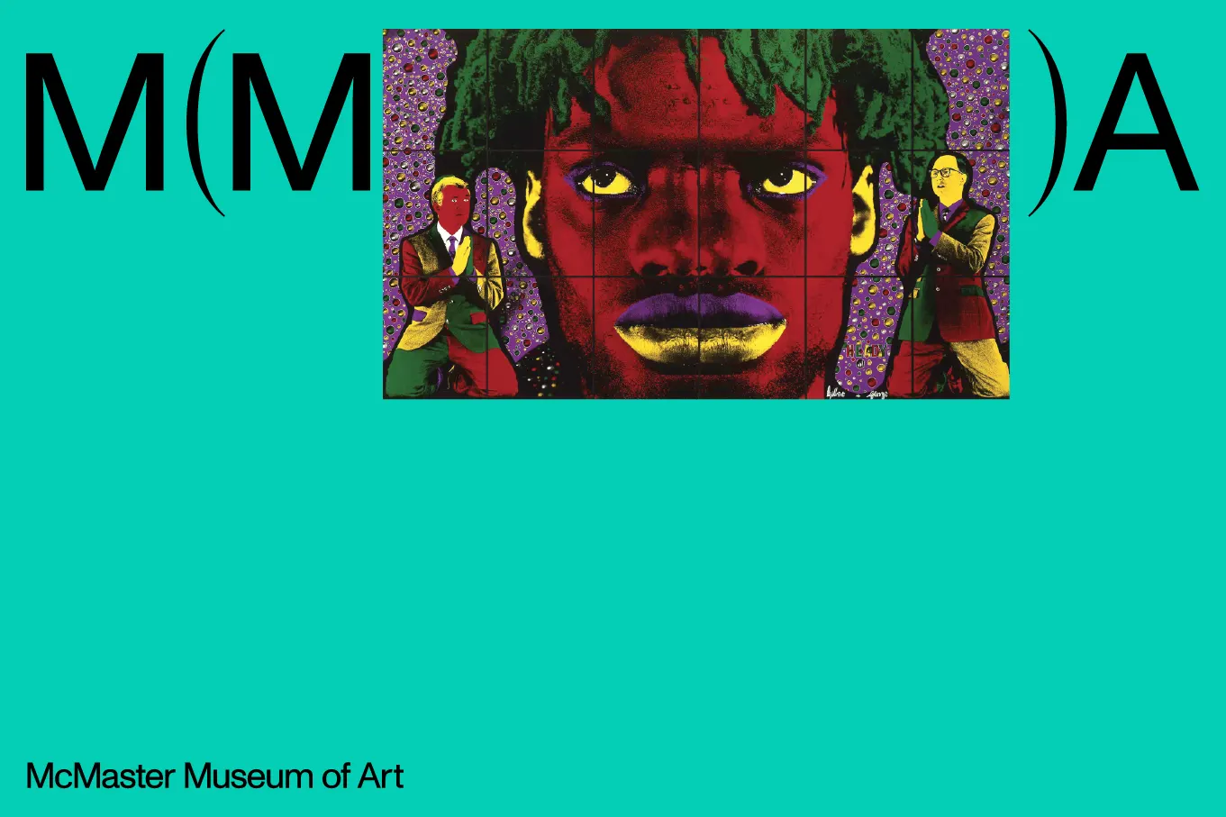
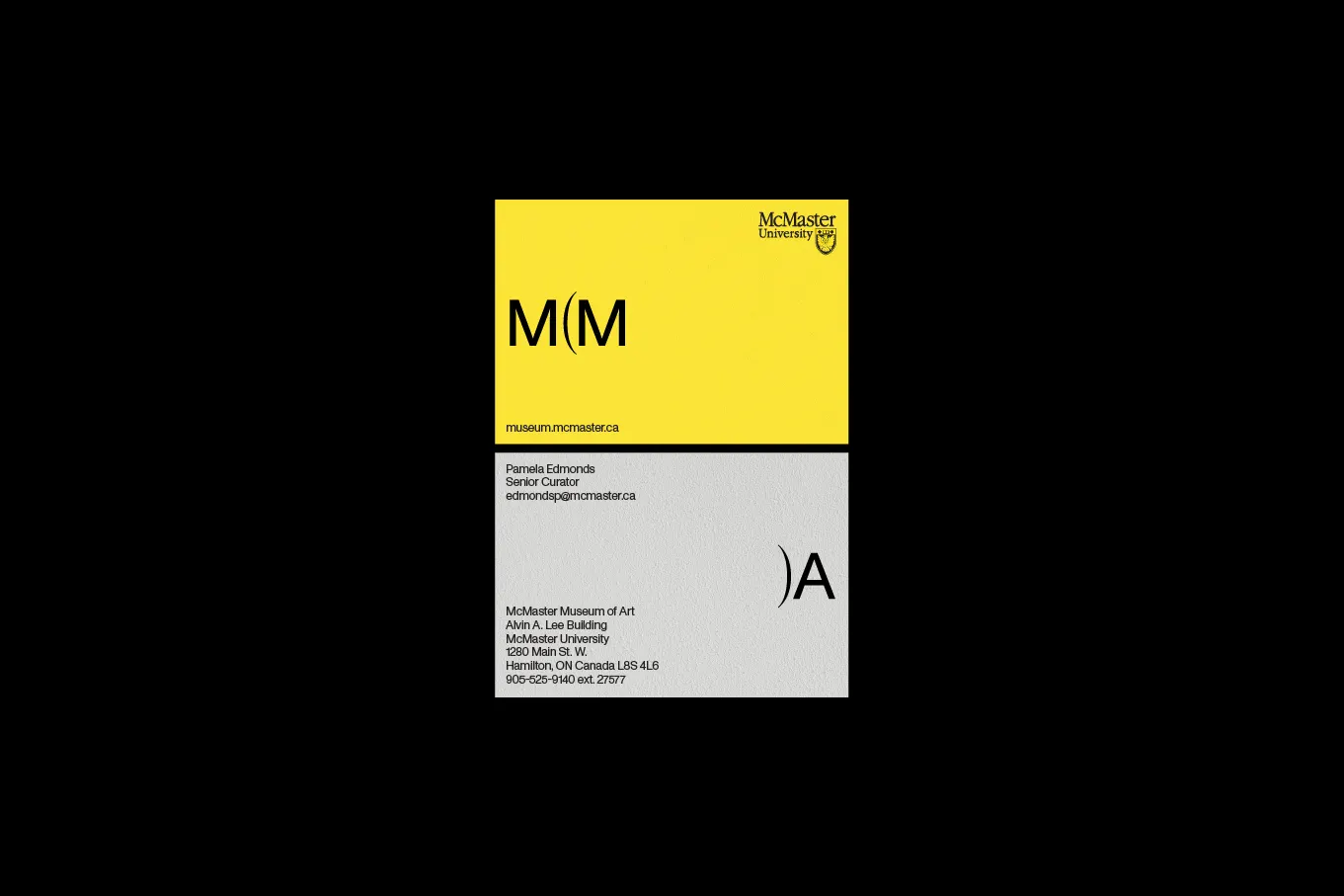
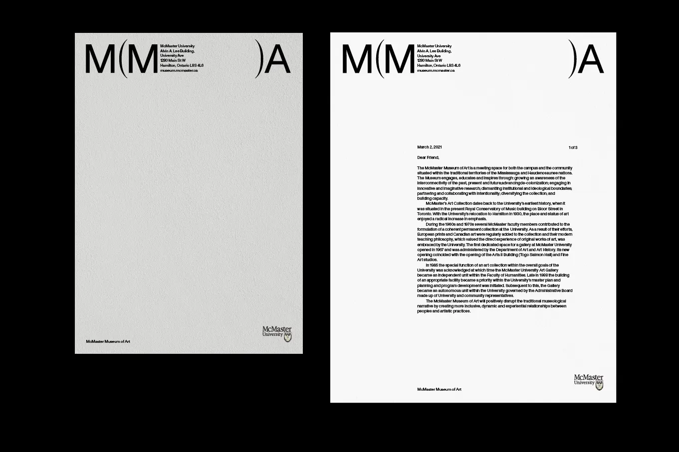
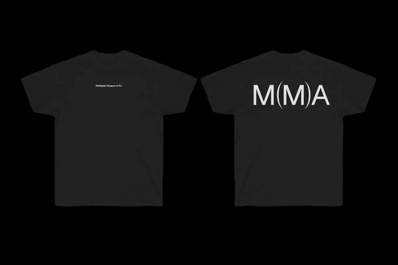
↗Underline Studio's identity for the McMaster Museum of Art rests on one small, almost offhand gesture: a capital M tucked inside a pair of parentheses. It looks obvious once you see it, and it carries a lot of weight for such a modest mark.
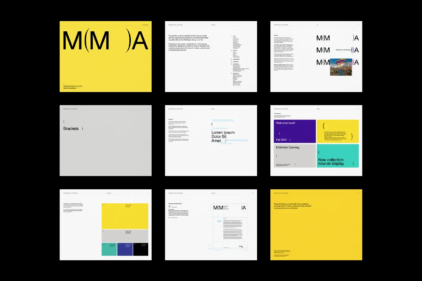
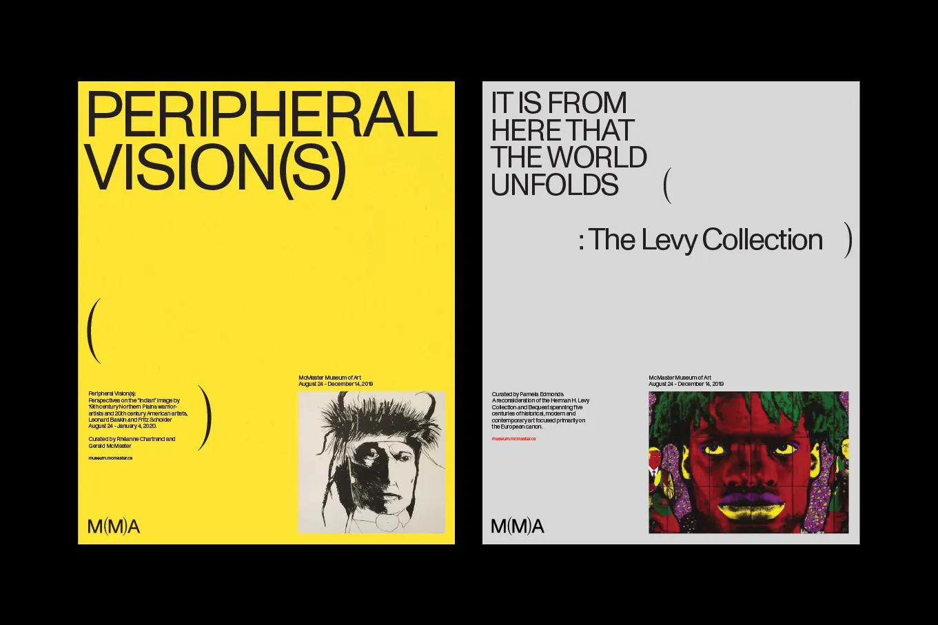
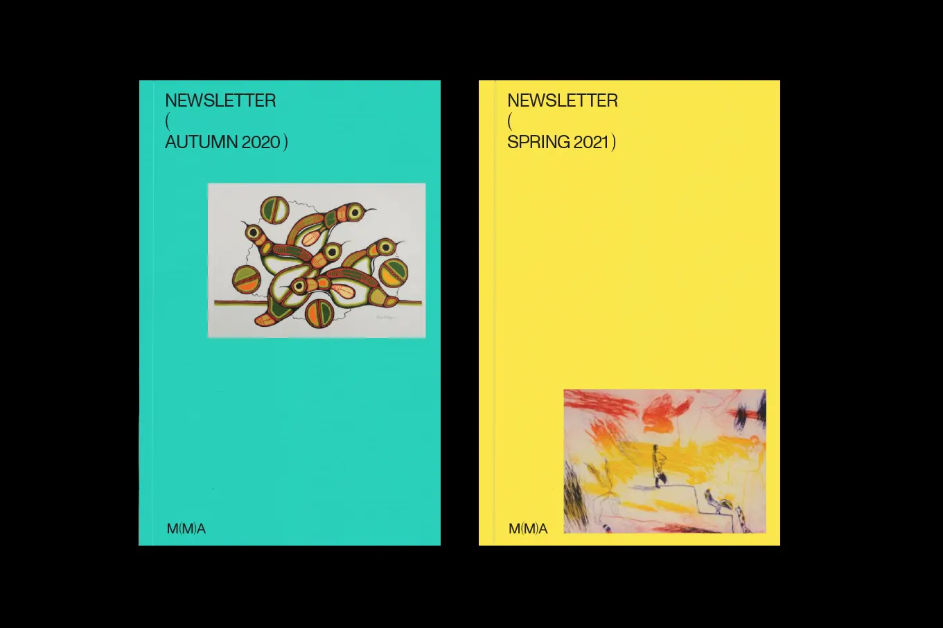
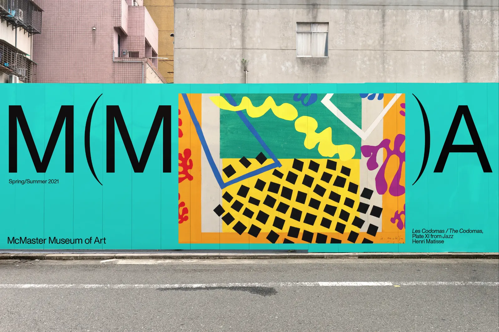
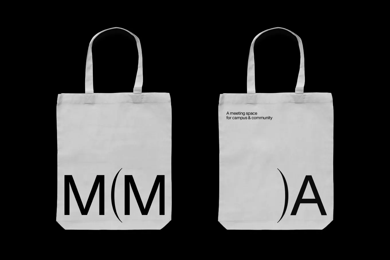
The museum sits in the middle of the McMaster University campus in Hamilton, Canada, and wanted an identity that signaled it would not tell the usual institutional story. The studio borrowed the grammar of the aside, a pause that steps outside the main sentence. In applications, the brackets stretch to hold words or artworks, so the frame changes with whatever it surrounds. Typefaces from Dinamo Typefaces and Pangram Pangram Foundry support the system, which runs across brochures, posters, signage, social media, and a website.
Why it works
Parentheses are everyday punctuation, which suits a university museum. Students and visitors read the mark instantly, with no explanation needed. Many museum logos lean on monumental serifs or austere monograms, while this one feels conversational and approachable, and that sets it apart in the category. Because the brackets act as a container rather than a fixed shape, the identity can hold art, language, and other voices without the logo competing with them. The mark behaves the way the museum says it wants to: it makes room for others.
Logo
Applications
Images and video from underlinestudio.com, by Underline Studio.